Play Environment Art
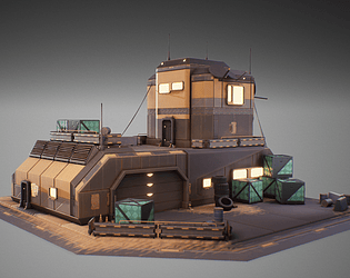
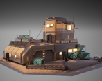
Valorant Inspired Workshop (UE5 Fan Art)'s itch.io pageResults
| Criteria | Rank | Score* | Raw Score |
| Final Presentation | #22 | 3.651 | 4.000 |
| Creative Development | #31 | 3.104 | 3.400 |
| Overall | #36 | 3.067 | 3.360 |
| Technical / Workflow | #36 | 2.739 | 3.000 |
| Research + Development | #40 | 2.921 | 3.200 |
| Project Documentation | #41 | 2.921 | 3.200 |
Ranked from 5 ratings. Score is adjusted from raw score by the median number of ratings per game in the jam.
Judge feedback
Judge feedback is anonymous and shown in a random order.
- It's a nice looking project but I feel like you decided what you wanted to make and then tried to attach it to a theme, because it doesn't really sell the brief as well as a lot of the other submissions. Try and optimise your UV space a little better, and straighten things wherever possible even if it causes minor distortions because it's better for packing and avoiding "jaggies" in your textures. Material definition looks a bit shiny to me but maybe that's just the style? Would have been nice to seen some of your high poly meshes in more detail. Overall a good style analysis even if it doesn't fit the brief.
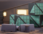
- Hi Eden, well done on submitting the project on time! It looks great especially for the short time frame! R + D 3/5 Overall good R+D. Appreciated the call outs for the textures. I would have appreciated seeing more close up asset breakdowns on a pureref etc. Having lots of reference of assets in different lighting conditions and angles is extremely important to make sure you’re truly matching the artstyle so I would have liked to see some more evidence of this.. You did well to know your scope and it was nice to see that you were able to achieve a lot in such a short time frame Creativity 4/5 I think you’ve nailed the look you were aiming for! Definitely kept in line with Valorant aesthetics and kept to the theme, well done. If you were able to do something a little more standout to the background/skybox/world building around the asset in the timeframe it would have helped it stand out a little more (although I think you’ve nailed the presentation on artstation :D) Technical 3/5 Great use of trim sheets and good texture setup. I think you had great technical texturing skills in this project. The use of trimsheets was really well placed. A couple areas where you could develop further is your high to low baking and UVS. Baking: If we take the example of the crate, you have a lot of edge loops and extra verts where the metal bands are. I feel like you could have relied more on the normal map when baking to have some of the same effect (just like how you did for some of the scratches and dents) and make the most out of the baking process. Ask yourself, do you really need that edge loop to make a bevel, or will the normal map provide the same thing? (Hint: normally the normal map can cover it). UVS: I noticed that you seem to have a lot of very small UV islands on the crate and on the set dressing assets. In future try and avoid these as when putting textures into a game engine, when compression kicks in, it can really affect the end result and will make it harder on you to texture. From a glance, if I were taking this asset, I would probably try and have 6 UV islands, for each side of the cube. You can totally still have different colour IDs! When baking, generally, the only hard edges needed are those of the UV island texture border as otherwise it can cause jagged baking errors. Even in maya if it looks broken with all the soft edges, if you bake it right it should turn out crisp :) Notably, it’s best to try and have a consistent padding space between each UV island (including the border). A couple of the UV islands are going out/touching the border of the 0-1 space, avoid this to avoid errors/overlapping textures in future! UE5 Notes: With post-processing make sure the box covers the entire scene. With any grayscale map make sure that you turn off SRGB/Turn it to Mask (otherwise it will throw off the values) Doc 3/5 I appreciate that you were able to keep the documentation pdf to 25 pages (as its not too long or short). I would have liked a couple more slides on UE5 setup though and a little more about your processes within designer etc. The perspective breakdown was a great visual. Following my thoughts on the research and develop, it’s important to have a lot of independent asset reference so would have appreciated some more screenshots of your Pureref with these. I would have liked to also see some sort of reflection about your processes - what worked and what didn’t, did you change any of your processes half way through? Did you achieve what you set out to do etc. These sorts of questions do get asked in interviews, so having practice like this is important! Pres 4/5 Great presentation of your process, having a matching valorant theme allowed your work to display as professional and clean. I did have a peek at the final artstation post and loved what you did with the final renders (although I had to grade the documentation on what you submitted); finding ways to make your work stand out is key to turn a project into a portfolio piece, and you’ve done this very well! Overall, very solid and I very much enjoyed reading through it :) I look forward to seeing your future projects!
- Clean project, good job!
Challenge Tier
Search For A Star
Leave a comment
Log in with itch.io to leave a comment.


Comments
No one has posted a comment yet