Play game assets
Yuàn's itch.io pageResults
| Criteria | Rank | Score* | Raw Score |
| Research + Development | #29 | 3.167 | 3.167 |
| Project Documentation | #29 | 3.333 | 3.333 |
| Creative Development | #33 | 3.000 | 3.000 |
| Technical / Workflow | #33 | 3.000 | 3.000 |
| Overall | #37 | 3.067 | 3.067 |
| Final Presentation | #44 | 2.833 | 2.833 |
Ranked from 6 ratings. Score is adjusted from raw score by the median number of ratings per game in the jam.
Judge feedback
Judge feedback is anonymous and shown in a random order.
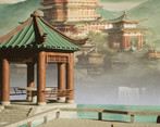
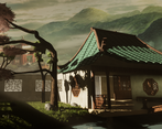
- I appreciate the cultural references but I feel a bit like there's not been much effort here to make the concept match the theme properly. 3D art is super new to you so keep on learning, you've made a good stab at the sculpting and asset work, but make sure you're using references and looking closely at how things grow, or are constructed, or acquire wear and tear in real life. It would probably have been easier to pick a slightly more enclosed environment so that you didn't have to think about the surrounding area and skybox.
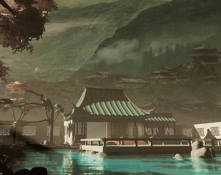
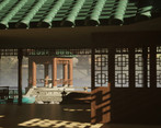
- Texturing and modeling detail is low. The global composition is nice but there are lighting issues with shadows being overcontrasted or not shaping correctly objects/not selling them. I would rework globally the material/texture/lighting/atmopsheric fog; reworking some geometry looking too low poly by adding chamfer would be nice too.
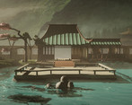
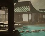
- Hi Fion! The commitment to some of the more advanced technical skills in this piece are impressive coming from a "non 3D artist". I think it really paid off and elevated your work. I thought the presentation of everything was really well put together, from the initial concepts to the asset lists and schedules. All very important when in a professional environment etc. I notice you had a water shader issue, and I very recently had a similar issue in UE5. This YouTube video might have some solutions for you: Single Layer Water | 5-Minute Materials [UE4/UE5] by PrismaticaDev. I don't know if you were trying to match the contrast of your background image lighting or were struggling a little with the set up but I do think the one thing that stands out in some of those shots is the harshness of the shadows. The distant "main" shot handles this better so maybe it was just a fog balance thing. If I could give one piece of advice to elevate your work further though, it would be that the assets could have a little more polygons. Think chamfered edges, or the odd 3D rivet or chip, just to push the silhouettes and help them catch the light better. These days engines can handle many more polygons, and while you played it safe keeping them low, I think here they can go a little higher. Amazing work,
Challenge Tier
Search For A Star
Leave a comment
Log in with itch.io to leave a comment.


Comments
I love how oriental this is! Beautiful!