Play asset pack
Subterranean Kitchen's itch.io pageResults
| Criteria | Rank | Score* | Raw Score |
| Research + Development | #2 | 4.333 | 4.333 |
| Final Presentation | #2 | 4.500 | 4.500 |
| Overall | #5 | 4.200 | 4.200 |
| Creative Development | #6 | 4.167 | 4.167 |
| Project Documentation | #7 | 4.167 | 4.167 |
| Technical / Workflow | #12 | 3.833 | 3.833 |
Ranked from 6 ratings. Score is adjusted from raw score by the median number of ratings per game in the jam.
Judge feedback
Judge feedback is anonymous and shown in a random order.
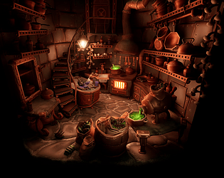
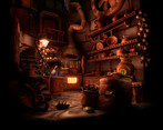
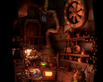
- Great stuff, a very appealing environment I'd love to explore. Great analysis of the art style, lovely composition and lighting, strong style. I would say don't skimp on the poly count, there is just no need these days, embrace Nanite! You seem to have made the low poly look part of your art style so I think you've gotten away with it but I'm seeing it a lot on these submissions and I'm trying to discourage it. Great job man!
- Potential slight mis-match between vibes of the child-friendly stylisation and the darker horror/apocalyptic themes? That seems like it would mess with the shape language etc. in the scene. It would have been really nice to see some development of you arrived at your own texturing style, based on your reference collection and concept development (which is extensive). You did do a breakdown of the geometry though, which was cool, although there are a few small inconsistencies! There's a few pans and bowls for example are really angular (8 edge divisions) compared to the other pots and props around them which are much more rounded, so they stand out as incongruous. Your UV maps I feel could definitely have been packed a bit better, as there is a lot of empty space - perhaps texel res across the scene could have been raised slightly? I like the really minimal lighting, and the way it creates pockets of shadow across the scene. It's hard to do wonky well and you've overall handled it really nicely.
- Lovely lighting, the use of accent colours to punctuate the scene is especially good. Some of the larger surfaces appear to lack depth in the relatively dark scene, greater contrast could be achieved by varying roughness and reflectivity in the materials more. Some of the cylindrical shapes could do with more sides, I realise that it's part of the style, but the hanging pans on the wall draw attention to themselves.
- Pretty clean. Some elements should be refine in term of mesh, they're too low poly. Apart if you reach mobile spec, you can use a bit more and make asset smoother. In general it's a good job, one of my favorite in the contest.
Challenge Tier
Search For A Star
Leave a comment
Log in with itch.io to leave a comment.


Comments
No one has posted a comment yet