Play game
Little wonder portal in the falls's itch.io pageResults
| Criteria | Rank | Score* | Raw Score |
| Project Documentation | #7 | 4.167 | 4.167 |
| Technical / Workflow | #20 | 3.500 | 3.500 |
| Creative Development | #26 | 3.167 | 3.167 |
| Overall | #27 | 3.300 | 3.300 |
| Research + Development | #29 | 3.167 | 3.167 |
| Final Presentation | #52 | 2.500 | 2.500 |
Ranked from 6 ratings. Score is adjusted from raw score by the median number of ratings per game in the jam.
Judge feedback
Judge feedback is anonymous and shown in a random order.
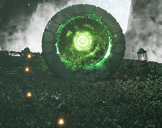
- Really nice VFX/tech-art work! Overall the final presentation is a little hindered by the high-contrast shadows/lighting baking the final image quite noisy, and the lack of variety of assets making the scene feel a little empty
- Although this was reviewed under the Env Art category, but as I'm a tech artist as well I've been asked to give feedback to you regarding VFX: The portal effect is effective and striking - it has good colouration in relation to the scene and appears to have the elements you would expect to see if it was sucking things in. I think you could make more of that feature by using whispy ribbons - like wind lines - because the effect from the side is not so dramatic. The water effects are ok and appear to have multiple layers. The larger particles clip with the geometry in places - perhaps a soft particle shader is needed. The scrolling texture layer could possibly be faster. Adding some spray bouncing off the rocks in places would make the overall effect look less uniform and add some contrasting movement to the waterfall. The particle sprites appear to be additive blended, reducing the brightness or count will stop the tendency towards pure white. It might be that way because you needed to hide the hard edges of the underlying layer, improving that, rather than hiding it would be the way to go. The scene fog - notably the rays of light - wash out the FX giving the scene less impact (particularly on compressed video)
- The documentation is generous and project references are nice. Though the execution is noisy. If you look at your references, there is a general elements they all share : contrast and layering. Most of the time, the ring/door/central asset is layered with fog and light. In your care, the ground is very noisy, such as the portal VFX at the center. In general your assets are lost in the amount of noise from the ground. I would propose to refine the lighting to focus on your main actor element, contrast more/adding shadows, draw a path to your element with lighting or adding more diversity on your ground treatment.
- Good amount of planning, good to see project management software being used. Texture work is a little generic, rather than having the stonework being all green it would have been nice to see more variation with parts nearer the ground or where moisture would collect being more covered in the green. Lots of experimentation trying things out and discarding which is realistically how a lot of development goes. Not sure why you made a water shader when there is one in UE5 already (and you can't see it in the final video anyway)? Lots of interesting effects going on on the portal, it would have been really nice to see the foliage reacting similarly as it's stillness is incongrous. I feel you overall lost some of the vibe of your original references by the time you got to the end result.
Challenge Tier
Search For A Star
Leave a comment
Log in with itch.io to leave a comment.


Comments
No one has posted a comment yet