Judge feedback is anonymous and shown in a random order.
Really nice research for the project and documentation. You have some really nice and strong poses in there! I would suggest a couple of changes to make it even better. I saw your comment about having to adapt to gameplay animation and having to sacrifice a bit in animation. There are a couple of things you can still do to try and push it even further. For example, during your idle, I feel like everything is moving a lot. The shoulders come down too much and the chest bends a lot. Also, your knee keeps popping, I'm sure reducing the overall movement will help you out with that.
For the turns, I would just look to one side so you can spend a bit more time in there with the chest steady, right now feels like a spring more than an actual chest. I would also suggest using more angles involved in your head rotation. Right now you are only using Rx or Ry (depending on the software) and I would involve all three axes, creating a bit of an arch, just a bit, doesn't have to be super obvious. We usually say, just so you can feel it, not see it. Right now the head leads the motion on the turn but afterwards, the chest comes back before the head and I would suggest the head leading.
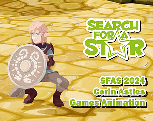
For when he is checking the shield looks pretty good, I would add some follow through motion as you hit a pose and stick there, hit another pose, stay there and so on, but I love how you involve the chest back a bit so the shield feels heavy. Same note with his head rotation, I would involve the other axes in there. Every rotation we do involves all axes except elbows, knees, fingers and those kind of straighter joints.
When he goes down to cover behind the shield, I like how he adjusts his screen left foot, but you are also sliding the screen right which would be very hard to do while you have your other foot in the air. Nice touch putting the hand on the side of the shield.
When he gets hit, I would add some offset between body and feet, leaving them behind and would add some frames on the fly back. When he gets up, would be nice to try and track his shoulders to the ground closer, so they are on the ground.
Some nice subtle anims that work well together. The recovery from being on his back might need some further polish/research as to how possible that is currently! Always worth checking realistic/ believable references, even for stylized character animations, footings in reality will help sell the move better..
Good job with this project! Your research section and your documentation overall look great. I love that you explained your thought process throughout – it is very considerate and great that you are already taking into account potential animation requirements for games.
I wish I had seen your animations working as gameplay animations (using blueprints) rather than in the sequencer so that is something you could do in the future if you want to present this as a showreel piece.
I love that you put your animations in a contextual environment and even did some post-processing tweaks.
Your animations present a decent grasp of animation basics and I love the creative concept behind the sequence!
Your idle would benefit from a stronger and more natural pose. Currently the character is standing with straight symmetrical arms and almost symmetrical legs and straight fingers on the left hand. You would rarely stand like that in real life unless you purposefully try to. Thin about your character’s personality and the situation that they are in – how would they stand? Are they alert or relaxed? You can look for references for poses or record your own and see how you would naturally stand – how your legs and arms bend, how symmetrical they are and how the fingers naturally slightly bend. Feel free to come up with a pose that is fitting for the situation and readable.
I like your idle variation but something that I notice both in the idle and in the variation is that the arms are twinning – they are both moving at the same time in the same way. It would be better if you offset one by a couple of frames so that it is slightly delayed compared to the other.
The charge would also benefit from a stronger pose especially when it comes to the feet. Currently the feet do not present a strong ‘braced’ stance. If you want to achieve that, one foot should be a bit farther back. The charge loop is also currently animating just from pose A to pose B with everything moving at the same time. I would make sure to at least offset the arms in this case so that the body animates first and then the arms follow.
I like the speed and the timing of the hit reaction and the slide back. I think the poses are good but once again everything starts and stops moving at the same time. This animation would greatly benefit from each body part being offset – first hips, then chest, then head then limbs with all four limbs being offset from each other by a frame or two.
The same feedback is applicable to the recovery. It would also need a little bit more work as when he lands on his feet, the torso feels a bit blocky. I would push the hips a bit more forward and delay/rotate the chest so that he still hands bent backwards a bit more. I would analyse real-life references of this move and push it a bit by exaggerating it. The feet also slide on the landing as they try to get back to their final idle position. You should always avoid foot sliding unless intended. You can do that in this case by planting one foot a bit further back from its intended location, then planting the other one (delayed) at its final destination. Then towards the end of the recovery, you can have an extra step in which the first foot moves to its final idle location. I appreciate that you had responsiveness in mind but never be afraid to add more settle at the end of big, powerful moves as otherwise they look like they end too abruptly. In practice, that extra settle is usually overridable by player input but in case they are not in a hurry, they can let it play out – this is how the ‘settle’ situation is often solved in games.
Either way, congratulations on this project. If you work a bit more mainly on stronger posing and adding overlap to your animations, it could become a great piece for your showreel.
Really good work, overall for the project I'd say you've done really well, though there are a bunch of issues I've noticed. I like your use of follow through and offsetting certain bones, but the next step to make the animations even better would be to pay attention to the settle, there is some nice motions during the look around and the charge release but the character just comes back to the neutral pose way too quickly and almost snaps into it, try to ease it into the idle pose and have some follow through motion on the arms, chest etc. during the settle. The spring back to idle after charge release also feels very unbalanced and makes the character feel like it's floating, overall a really good project though, keep it up!
Quite unique idea this is. Also overall, I think you've got some nice facial animation. The timing is quite well on the eyes. Love the detailed documentation and really like how you've got frames of yourself in different poses, in different environments. I always like like to see the journey of how something cool was made. I think you've got some amazing animation there but let's take it to the next level. There are a few things that could make this piece into a masterpiece.
The character in some bits looks like is rushing to do things. For example looking around and checking the sheid. I think you can give it more time when looking around or to check the shield. At the moment he checks it quite rapidly. It's hard to register it and before we do that, the character moves onto the next piece of anim. Think the same goes for looking around too. The character can take a lil bit more time in each direction.
At the moment I think the Idle look around looks a bit floaty as well and the answer would be in your graph. It'd be a combination of giving the character time to look and playing around with the graph and tangent to make it loop and make it feel natural.
Apart from this, I think the other animation pieces are quite nicely done. The timings are right. I do think you could add more overlapping motion on the body and limbs when the character knocks back.
For the idle pose, this is more of an opinion of making the pose more dynamic. What I mean by that is in your idle animation, I think the pose could be more ready to shield up, and more attentive and that would make it so much more powerful than an "A" pose.
Overall, You've got some nice and unique animation, just by working on a few basics would take this piece to the next level. I know this is out of context here but I love how you've got some lovely 2D animations on your website. Absolutely LOVE IT !!!
Incredible documentation here, I really felt like I walked along each step of the process with you from the initial brainstorming to the final render! I love your approach of seeing the game animation more from a design point of view too, understanding the limitations we have when it comes to meeting the rules and code set by gameplay designers; this shows a great knowledge of cross department information and will serve well when communicating to colleagues in such positions! I will say though, try not to limit yourself too much with responsive animation, it all comes down to what sort of game you are trying to create. We can use Red Dead Redemption 2 as an example of animation priority over gameplay, such as interactions with animals and looting etc. So try not to get too bogged down with responsiveness! Some really great references here too that you used, and acting out the animation yourself really helps sell the grounded and natural feeling of the animation. I understand you were not happy with the Kip-up and suggested looking at footage done by a professional, it’s never too late to grab more reference even when animating! Try to get as much reference as possible to ease the animation process! It’s really refreshing seeing you adjust the rig to your needs too along with working with the powerful animation layers, it’s great that you have an understanding of these tools and having a knowledge of rigging will help you communicate with your Technical Animators in your team if you need something! It’s good that you expressed issues you faced in the project too, such as when importing into the Unreal Engine, this shows great troubleshooting and autonomy when in the face of a challenge, so great job on overcoming these issues! Nice to see that you also worked with some Post Processing effects in-engine to get the vision you wanted out of the animation. The only part I feel like it would have been good to see would have been you testing out some other rigs and seeing what works well for the animation. I understand you have animated with this rig before and are comfortable with it but it would be good to see exploration of other rigs.
It is very refreshing to see more of a defensive take on the submission and I love the posing when the character crouches down and holds the shield! The idle animation is great, we really get a sense of this heroic character running across vast lands and having a bit of time to recover after a lot of running around; to push this a bit more, you could have some small facial adjustments and overlap movement to the head, since it feels like the head is following the body at the moment. There is also a tad bit of popping on the right knee when the character breathes in, you can adjust the rotation of the hip to fix this. The emphasis on the shoulders when breathing is great, it would be good to focus on the weight of the shield a tad bit more, so we can feel it weighing down the right side of the body a more which will help create a stronger silhouette, pulling the viewers eyes towards what the character is holding. The facial expressions on the Idle Variations are lovely, we start to feel the personality of the character when you add fine details like this. For Idle Variation 1, to help push a more natural feeling of the animation, you can lead the look around with the head first rather than the body, we tend to look with our eyes first, then head, then the body follows. The shield inspect on Idle Variation 2 is great, the rotation when looking from back to front feels natural and attached strongly to the arm. To add some subtle detail you can make the character blink as they lift up the shield, we normally close our eyes when taking in new information or changing where we are looking. I just want to point out too, great job on making all the animations match up with the starting and end frames, this will make the game animation much smoother when in a playable environment! I know you said that you focused on 2D before and that when you do 3D, you animate straight ahead, I know it can be more of a nuisance when animating in Blocked but you can really utilise your 2D skills here when doing your blocked out pass; I can see the 2D strength on your core keyframes like the crouching and it will be great to see some strong poses for the inbetween frames too by using your 2D skills! Treat it like drawing on Cel paper. For the knock back, watch out for unnatural position on the limbs, the left foot when sliding back seems to be facing too far inwards, adjusting the knee to follow the foot more should help fix that one! Along with this, you can delay some of the limbs when the character stops sliding back, the feet seem to land at the same time (we call this twinning (mirroring)) but offsetting either foot a few frames apart will make this feel more natural and not so straight to pose! Really nice anticipation on the Kip-up which helps sell the flicking forwards, but keep an eye on your Graph Editor there seems to be a bit of artifacting when the character lands and stands up, have some follow through of the hip when the character lands, moving forward and down, then to the idle position while having the upper torso overlapping the action.
Incredible submission here Corin, the amount of research you have done to get to this amazing animation is great. Along with looking at the animation from other aspects such as Game Design which a lot of people can overlook, I love your strong poses and facial expressions, it would be great for you to incorporate blocking and using your strong 2D skills to pose your inbetween frames too. I look forward to seeing more of your work!
I think you’ve got a really great set of animations here for someone who has more experience with 2d and cinematic animation. I like that you’ve added in some facial expressions to add more character, and how you’ve pushed the distance on the received hit to add to the style.
The ideas for the idle variants are good. With variation 1 I think holding the pose when he’s looking over a shoulder for a beat would be good to give him a bit more time to register what he’s seen, and varying the timings of the looks/holds to give some interest. You could also try and break up the movement on the different rotation axis more, and I would usually lead more with the head for this sort of movement. I often add blinks to some bigger head movements like this also, especially on cartoony characters.
With variation 2 it’s working nicely overall. For facial animation on more cartoony characters I often try to tie in the eyebrow movement with the eyes, so for instance you could delay the eyebrow raise you’ve got to happen as he opens his eyes on the blink, so both are moving ‘up’ at a similar time.
I personally might not lower him quite as much for the blocking stance, as a lot of enemy attacks in games will be more aimed towards the torso so will look more natural to be blocking this area. With the recovery keep an eye on the limbs so that they don’t land/do their movements at the same time, and think about the core weight of the body as he gets up to make sure the hips/central weight are over the feet for balance. I think it would also add to the cartoony feel to loosen up his neck/head as he gets hit back, rotating it to be more in line with his body as he slides back with the impact of the hit.
I would say that it would be beneficial to look into blocking out your animations first, as although your overall result here is good, in an industry environment you often need to show your work in a rough format to make sure you’re going in the right direction with an idea. Feedback and changes are then easier to make at this stage.
First of all I want to congratulate you on making your project, in my opinion self-discipline and willpower are important for this:).
I am an animator by speciality, so I will mostly comment on the body mechanics of your character, taking into account the peculiarities of gameplay animation.
About the idles - in my opinion you made too much amplitude on the chest, hands and shoulders. It feels like he's floating. The timing would be more natural if you phased the acceleration and deceleration to the keyframes. I like the aidle with the turning and looking at the shield. The crouch training animation looks really good. But your character flies off not at all according to physics, there is not enough deceleration at the top point of the flight path and acceleration when approaching the ground. Jumping up on your feet is the same problem, your character seems weightless, I would recommend to spend more time on compression, jump faster and land harder. I would also like to point out that you put together a very nice looking location, stylistically it's nice to look at!
Overall you have a good sense of composition and line of movement.
Thank you for a great job!


Leave a comment
Log in with itch.io to leave a comment.