Play asset pack
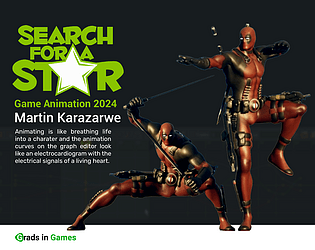
Dead_pool_animation_crowd_pleaser's itch.io pageResults
| Criteria | Rank | Score* | Raw Score |
| Research + Development | #2 | 4.199 | 4.600 |
| Creative Development | #3 | 3.834 | 4.200 |
| Overall | #3 | 3.871 | 4.240 |
| Project Documentation | #4 | 4.017 | 4.400 |
| Technical / Workflow | #5 | 3.651 | 4.000 |
| Final Presentation | #7 | 3.651 | 4.000 |
Ranked from 10 ratings. Score is adjusted from raw score by the median number of ratings per game in the jam.
Judge feedback
Judge feedback is anonymous and shown in a random order.
- This is a great piece of work! The grasp of body mechanics and timing is good and the creative vision is great. I personally feel your pain on the gimbal issue – I also dealt with it myself a few years ago but you handled it well. Your preparation, planning and scheduling were solid enough so that you had time for rework and fixes - awesome job on that! Your research & development as well as documentation were great. The amount of character you put into your work is at a good level for your chosen theme. The one thing that stood out to me as needing improvement was the back-to-idle transition from the taunt/idle variation pose. The character seems to lose balance there or stumble and I am not sure if that is intended or not. Either way – mind the center of gravity – the hips should be roughly above the balancing limb/s (be it leg/s or arm/s) in most cases and should look balanced from all angles. Overall, the release state looks great and the complexity and timing of the flips is impressive. Going through it frame by frame though, the same lack of balance can be seen in some poses – make sure that whenever he lands even briefly, he is still mostly balanced when it comes to center of gravity and hips-over-foot positioning. This can be considered as more of a polishing note in this case, as it is not as noticeable unless you take a detailed look at the animation, but it is something important to remember as strong balanced posing is the foundation of great animation. The same is applicable to the recovery state – in order to move his foot back to idle, his hips need to move a bit more over his planted foot and he should lean in that direction for the sake of center of gravity. In conclusion, I think this is a great piece of work for your showreel that would quickly get you noticed, especially if you present a playable version and if you work on the aforementioned balancing issues.
- First of all I want to congratulate you on making your project, in my opinion self-discipline and willpower are important for this:). I am an animator by speciality, so I will mostly comment on the body mechanics of your character, taking into account the peculiarities of gameplay animation. You've got a great fight scene. The only thing is that the animations need to be phased out, in some places the timing is too fast and the character doesn't have enough time to come into balance and doesn't have enough time to prepare properly. You've done a great job of choreographing the punches, but it feels like you just didn't finish the job a bit. He pulls out his swords too quickly and does somersaults too quickly, it doesn't feel like the weight of the character. The lines of movement are perfectly readable and the movement dynamics are great. Overall you have a good sense of composition and line of movement. You just need to pay more attention to the packaging of animation, and the search for body balance. Thank you for a great job!
- Really good body of work here. I like the effort you've put into researching and documenting your pose choices. Would be great in future projects if you concentrate on REALLY pushing your poses further in an attempt to make them more dynamic. Great work overall.
- You set your sights high for this set, and you’ve achieved a tremendous amount, especially given your minimal experience and the problems you encountered during development. I hope you are proud of what you’ve created, and I would definitely encourage you to continue with animation as I think you have a promising future. I think you’ve got a really good understanding of the human figure; your poses are strong and the amount of reference you gathered really paid off with creating overall fluid motions. With the feedback I have it’s about areas in which you can improve moving forwards, and things to consider overall which might help you, so I hope you can take it in a positive light. Think about the position of the hips while they’re in the air doing flips/rolls. If you continue the upwards momentum, you can avoid the feeling of rotating from a fixed point in space. Starting to experiment with the timings as well would be fun and can help create more impact, so for instance speeding up the beginning of a flip, and then giving slightly more time for recovery in some areas. Often I use a motion trail to check the trajectory or spacing between keys. Maya has it’s own one if you’ve not used it, there are better versions out there but it does an ok job. https://help.autodesk.com/view/MAYAUL/2022/ENU/?guid=GUID-A4F827EE-61C2-4F0A-9592-E91AA20F5D2C Try to avoid sections where the body is completely still also, like when he is becoming towards himself with his hand during your flip pleaser. When you come out of this movement it’s feeling quite fast for how controlled he has previously been, slowing down the body movement would give you less of a feeling of falling forward. When the character is coming down to the ground after a movement or step, often you want to bring the leg down ahead of the body in anticipation of taking the weight of the body. In this way the leg will go from a straighter position, to being bent when the weight of the body comes down onto it. Like you I also like to be able to select controls easily in maya. Often rigs will come with a picker so that this is easier to do this, but if not I’ve recently been introduced to dreamwall picker, which is a free tool to create your own for rigs. It takes a little setting up, but if you’re going to be using a rig for a while it can be worth it. You can find it here: https://github.com/DreamWall-Animation/dwpicker And the tutorial I watched to learn it was this one (im sure there’s plenty out there though) https://www.youtube.com/watch?v=yP8SKvDcgEE The movement where he makes the 3rd hit, I think it would be cool to have this hit happen sooner, for instance with the moment of impact with the foot. This would avoid the small hesitation he has before the slide back.
- Hi Martin! Hope you are doing well, Thank you for participating in the Search for a Star Competition! Feedback https://www.syncsketch.com/sketch/MjY5ZWM4ZGFk/ Recommended links to boost your animation skills: Reference: https://www.youtube.com/watch?v=gL0_ccwcqFA&ab_channel=Jean-DenisHaas Breaking Down Attack Animations https://www.youtube.com/watch?v=LewXWM7HDd8&ab_channel=MasahiroSakuraionCreatingGames Too Much is Just Right https://www.youtube.com/watch?v=zNBKzLzDKtM&ab_channel=MasahiroSakuraionCreatingGames Assigning Animations https://www.youtube.com/watch?v=fV8xIP480qk&ab_channel=MasahiroSakuraionCreatingGames How to Push Your Animation Poses https://www.youtube.com/watch?v=WWVD7pwDpJA&t=1s&ab_channel=AnimSchool Weight in Animation https://www.youtube.com/watch?v=b3oIxjzdMqY&ab_channel=AlessandroCamporota The Perils of Interpolation https://www.youtube.com/watch?v=oFwamE6Hy04&ab_channel=MasahiroSakuraionCreatingGames Knockback https://www.youtube.com/watch?v=HVktK4a9Yfo&ab_channel=MasahiroSakuraionCreatingGames Damage Animations https://www.youtube.com/watch?v=0xHE3ypX96U&ab_channel=MasahiroSakuraionCreatingGames Follow-Throughs Make the Impact https://www.youtube.com/watch?v=cIB0BUe6Ihk&ab_channel=MasahiroSakuraionCreatingGames Attack Poses https://www.youtube.com/watch?v=99gdMDF7V2E&ab_channel=MasahiroSakuraionCreatingGames
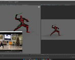
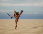
- Lovely documentation which felt very well thought out and planned, which shows in the animation itself! The intro to the Artistic motivation has deep understanding and knowledge about the character you are animating, it’s always great to collect many adjectives about your animation and character as this will allow you to put more detail in when it comes to animating the character itself. You’ve also gone through the brief in detail to make sure you have all the information you need, which is very important when it comes to working with a client and / or studio. Moving onto the influences and references; you’ve done a great job at this too. Having a lot of references about the character which comes from the mood board, ranging from drawings, to 3D and some finer details such as how to hold the sword; will help hugely when animating the character and help get the personality across! It’s also a superb job that you’ve not only got great reference but recorded the action yourself so you can feel more of a sense of how the body reacts in the motion. One thing I would have liked to have seen in these early stages of development is more exploration into what animations you wanted to make along with testing out other rigs, especially testing out your rigs in the Unreal Engine to make sure they work correctly, this will allow you to be more open to ideas and exploration! It’s refreshing to see that you’ve taken advantage of using Maya Sets, this will help you speed up the pace at which you animate; another tool I recommend you use is called Studio Library, this allows you to save poses which makes parts like going back to idle much quicker and easier! For your reference when animating, you use Keyframe Pro which is a great tool for animators, but what I recommend as well is to put your reference video in the Maya scene as an Image Plane which will allow you to overlap (set transparency) over your character making it easier to follow some motions! Sorry to hear that you ran into Gimbal Lock issues, that’s always a nightmare but well done for keeping the motivation to keep going on with the animations, this shows a lot of determination. If you do run into this issue again, there is a Curve Tool called Euler Filter which can correct any issues with gimbal lock but I use this as a last resort, so keep that in mind. It’s also good that you noted this down as it shows you’ve taken this issue into consideration! Getting feedback is a good aid to have when making an animation, so great job on seeking this out and receiving the feedback well! I would have liked to have seen some more reflection in the documentation on the feedback but this is a very minor thing. Great exploration into setting up the animations, character, rig and Level Sequence in UE; it would have been nice to see a bit more documentation when you were working in the engine so we can understand each step you did. Other than these points, you’ve done a top job at documentation Martin, well done! This animation has come out terrifically, the motions in the animation feels great and you really get Deadpool's personality in the animation with the “come here” gesture, crowd pleaser comes to mind when watching this animation which is amazing you’ve been able to convey that so clearly! The breathing and movement on the idle feels like the character has been doing some heroic moves just before which fits into that fighting personality, some small feedback on the idle is the arms are a bit mirrored, you could offset the pose slightly so one arm is more bent than the other - similar to how you’ve done the feet to help break up the symmetry in the lower body. The front flip is awesome, I love the attitude it brings across when the character lands on one leg and the motion is very fluid! One part which catches my eye a bit, is the legs at the end of the flip before the landing where they seem to blend into the one leg pose. To fix this issue, you could move the character slightly forward on the landing pose so the feet naturally fall into the position but the feeling of weight when landing is really nice! For the transition from the one leg standing pose to pulling out the sword, just watch the centre of mass on the character when they are walking to the next pose as it feels a bit off balance at the moment. Woah, the attack has come out amazing, everything is strung together well and we feel that this character has an efficiency with these dual blades. A few small things for feedback, the feet have good toe roll but sometimes they start rolling a few frames before landing and stay bent when the character is already off the ground, giving the feet another pass will bring the feeling of this light footed acrobatic merc across. Then to push the animation a bit further and get the punchy feeling across, you could add a bit more squash to the landings and then when the character pushes off, we will really feel the springy action! You could push a big squash pose a few frames before the big jump so the audience feels the build up of energy before this huge jump. The landing pose after this giant jump is really nice and has a great silhouette, which is very important, just watch out for the contact point with the floor since the legs start bending before they hit the ground. Overall you’ve done an exceptional job here Martin, the animation is incredible and really blew me away when I saw it! So much personality and smooth motions throughout the animation, and taking into account that this is your first animation sequence besides walk cycles is a huge step up! Your documentation was good and the references you got are perfect along with acting the motions out yourself! I look forward to seeing what your animation skills bring in the future! Cracking job Martin!
- First of all, I want to say that your posing is amazing. Really caught my eye. Quite impressive work. The arcs on those swords are clean as well. Always love to see flips and cool sword action in the animations when they're done nicely as most of the time it messes up with the gimbal. Now let's talk about how you can make this even more powerful. At the moment some actions feel a bit floaty and I think working on the timing could remove it. For example, whenever your character is doing the flips, he stays in the air for quite a while just before landing and that feels like there's no gravity in the scene. I think you can reduce the timing of the landing and could make it a bit quicker. The same kind of goes for the first slash. I think the Sword should instantly do a swipe but in the side view it stays in the slash pose for quite a while. This is just a small opinion on the idle pose. Nothing wrong with the current idle but we could make it even more dynamic. At the moment it looks like he's doing all these crazy stunts but the idle is an "A" pose. To take it to another level I think we can make him stand sidways with his legs turned at an angle and he looking over his shoulder. A bit like this https://pin.it/7Bmm8NQWG. In the pic, the character has eyes so it's quite obvious but I think can take some inspiration from it. Overall, Amazing work. Love your Posing and readability in the animation. Love your detailed document as well. Your references are really good too. Just need tiny bit of work on the timing and some basics, and I think you'll be a great candidate for a Junior animator role.
- Some nice aspects to this presentation. A few weighting/timing issues with the animations themselves, but overall a good understanding of workflows.
Challenge Tier
Search For A Star
Leave a comment
Log in with itch.io to leave a comment.


Comments
Omg. I absolutely love your animation!
Thank you Philimation