Play game
Doc On The Lock's itch.io pageResults
| Criteria | Rank | Score* | Raw Score |
| Creativity | #6 | 4.000 | 4.000 |
| Gameplay Implementation | #22 | 3.000 | 3.000 |
| Overall | #24 | 3.000 | 3.000 |
| Features & Additions | #26 | 2.500 | 2.500 |
| UI/UX Consideration | #29 | 2.500 | 2.500 |
Ranked from 2 ratings. Score is adjusted from raw score by the median number of ratings per game in the jam.
Judge feedback
Judge feedback is anonymous and shown in a random order.
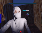
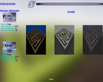
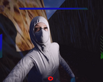
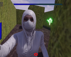
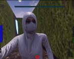
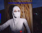
- This was very good and you should be proud of what you achieved. Some general comments: - Your planning was excellent! Focusing on making a vertical slice and then polishing and adding things is the correct way to handle a project like this. Its also good that you dropped features based on the time you had remaining. That's the better thing to do as opposed to just trying to add half finished features. - With a game like this with a unique movement mechanic and gameplay, a Tutorial level is really important, especially in a game with a maze. This level would allow people to understand how the game works, how the character controls and how to collect data. - Your Main Menu was functional but it would have been good if there was a landing screen with sub pages (Play, Options, Exit). The Main Menu is often the first thing people see of your game, so it can be worth spending the time to add a bit of polish. - In game HUD is difficult to see in the darker levels, look at adding boxes around them, or contasting colours behind them to make them clearer. I'm guessing you kept it vague because "excellent UI is like a joke, once you explain it it’s not funny anymore!" Which is true to a certain extent, but with unique games/features it can be worth adding at least a Help screen on the Main Menu or a Tooltips button so that if people want it explaining they have the option. But as I said this was good and you should be proud of what you made.
- There is an introduction into the game's world via an intro video which is a nice touch. There is also character and level selection which adds value to the game. I liked the unique camera view but I think that there is still room for improvement as it seemed to me it was moving around a bit too much. It would also be nice to be able to control the tilt as well. Unfortunately, I noticed that there are still debug drawings in the game and also the game crashed when pressing 'ESC'.
Challenge Tier
Search For A Star
Leave a comment
Log in with itch.io to leave a comment.




Comments
No one has posted a comment yet