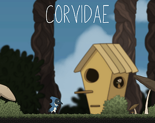
Play game
Corvidae's itch.io pageResults
| Criteria | Rank | Score* | Raw Score |
| UI/UX Consideration | #1 | 4.667 | 4.667 |
| Overall | #2 | 4.417 | 4.417 |
| Gameplay Implementation | #3 | 4.667 | 4.667 |
| Features & Additions | #3 | 4.333 | 4.333 |
| Creativity | #6 | 4.000 | 4.000 |
Ranked from 3 ratings. Score is adjusted from raw score by the median number of ratings per game in the jam.
Judge feedback
Judge feedback is anonymous and shown in a random order.
- This is very impressive, you should be proud of what you've made. Just a general note, based on the documents, it didn't seem like you planned and allocated what time you were going to spend on the project, and how long tasks would take you. This is important to do as it tells you from the beginning whether you've overscoped and you can also use it to help cut back/scale features if during development you find yourself short on time. That way you can also make sure you have dedicated time to QA and playtesting at the end of the project. But like I said, this was very impressive!
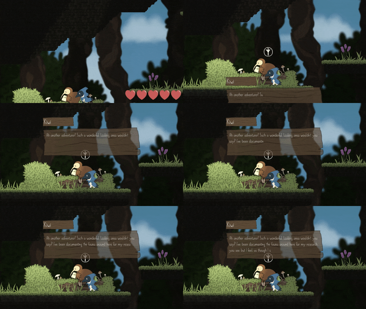
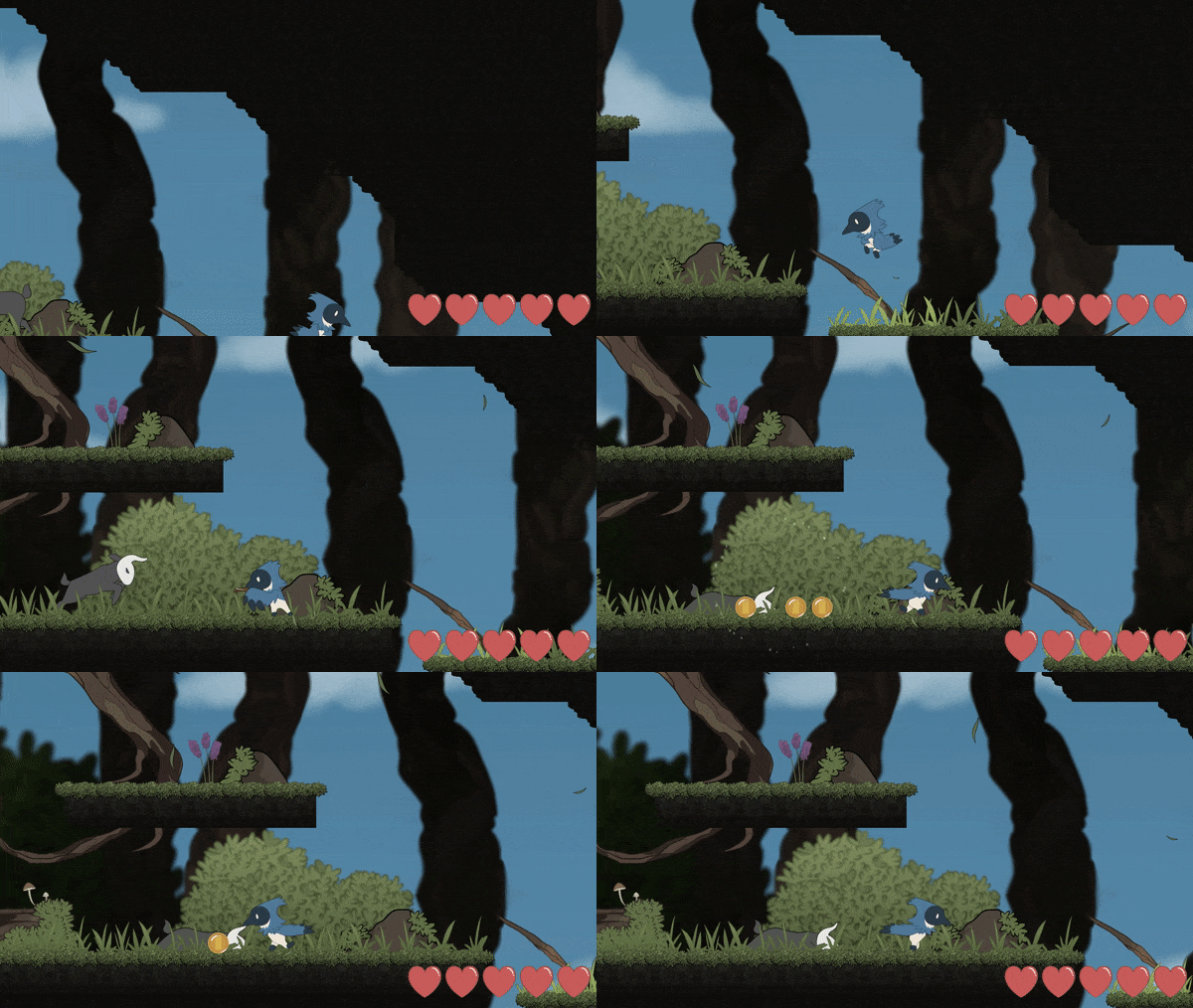
- I think this game is pretty neat! It’s well-made and very stylised. I was happy to see an inventory system, mini map and AI :) I’m pleased someone implemented PS4 Controller support! Good job! In terms of in game what you could improve: A quick tutorial on the game to further guide the player. Controls however are well-laid out and explained and it’s fairly easy to pick up the game! Features like the mini map / inventory need to be mentioned immediately in order to help the player and let them know about all these cool features! Your documentation could do with some improvement here is how I would go about it: Expand on the diary, give us the git commit log and timestamps and then for each of the features you’ve implemented, explain them a bit in detail and how you implemented it. It’d be nice to see how it works behind the scenes and lets us know you can communicate technical detail. You mention in your tweets about render textures and you could maybe talk about that aspect / what went wrong? / what went good? It would be good to see more design notes on the game itself before programming but more so a light rough walk through of what occurs in the game before it is made. Just so it shows you’ve spent time planning beforehand. In terms of the creativity, I think visual design wise. it's great but the documentation could be better laid out w/ table of contents, more images, code snippets, unity prefab snippets etc to help explanations / show working. I think the itch page looks great, the gifs and the control scheme being there with a background are good things to see! Sound is present in the game and used in UI, deaths etc. I think the only thing letting you down in the creativity section is your documentation could be improved. Stay safe! - Stuart P, d3t.
Challenge Tier
Search For A Star
Leave a comment
Log in with itch.io to leave a comment.


Comments
This is delightful!! really lovely job. :-)
aww thank you!!! <3 <3