Play game
Maze of Menace's itch.io pageResults
| Criteria | Rank | Score* | Raw Score |
| Features & Additions | #6 | 3.500 | 3.500 |
| UI/UX Consideration | #10 | 3.500 | 3.500 |
| Overall | #11 | 3.500 | 3.500 |
| Gameplay Implementation | #14 | 3.500 | 3.500 |
| Creativity | #16 | 3.500 | 3.500 |
Ranked from 2 ratings. Score is adjusted from raw score by the median number of ratings per game in the jam.
Judge feedback
Judge feedback is anonymous and shown in a random order.
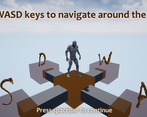
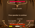
- This was good, you should be proud of what you made. Some general notes: - As you mentioned towards the end of your doc, its really important to allocate time at the end of the project for bug fixing (play testing should be much earlier - when you have a playable prototype). Some bugs only appear when everything has been put in, so its important to make sure you have time to test everything. - Balancing is a very difficult thing in games, an easy win for a project like this is to add a difficulty screen (Easy, Medium, Hard), these options then pull different levers in your game (critical zone, enemy damage, etc.). - Whilst the boxes for the maze are different to other games, the idea/style didn't quite work for me. I kept pressing the wrong direction button, or I would end up navigating to a cube for it to be a dead end. Being able to see the connections from a cube would have helped for the second point (some labels would help for the first). - Look at adding a map, or give the player an objective on the screen, so that its clearer what they need to do. But I like said this was good, you should be happy with what you made.
- I think the mechanic is well implemented and shows good work done. I appreciate the amount of documentation provided in the documentation which is really important and many times lacking. I could understand a bit more of the idea behind. Despite the good work, I consider that creativity can be improved by adding ideas that are not so stereotypical. Some times the combats can be somewhat boring. An area where some new ideas could make big impact.
Challenge Tier
d3t Rising Star
Leave a comment
Log in with itch.io to leave a comment.


Comments
No one has posted a comment yet