Play asset pack
Spirit Core's itch.io pageResults
| Criteria | Rank | Score* | Raw Score |
| Creative | #1 | 4.500 | 4.500 |
| Technical | #3 | 4.000 | 4.000 |
| Presentation | #5 | 3.500 | 3.500 |
| Research + Development | #5 | 3.000 | 3.000 |
| Overall | #5 | 3.600 | 3.600 |
| Documentation | #6 | 3.000 | 3.000 |
Ranked from 2 ratings. Score is adjusted from raw score by the median number of ratings per game in the jam.
Judge feedback
Judge feedback is anonymous and shown in a random order.
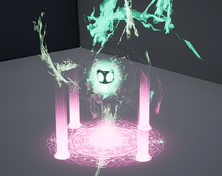
- The end result of the Spirit Core effect is a nice start Xaver! I like the build up of the Spirit Core effect and idea of the ghosts flying in. To improve this further I'd add some tessellation to the ghost ribbons so they're less 'pointy' as they fly in, also a smooth opacity fade falloff, with some subtle smoky ethereal particles left behind them. I'd possibly add a tiny bit of screenshake to make the final build-up more impactful. Another nice touch would be to make the cylinder glows that rise from the ground less uniform and more like ethereal flames flowing. Nicely presented Xaver, it showcases the Spirit Core effect off well! If I was to add anything extra to the presentation I'd possibly put it within an environment. Your documentation could do with some reference or a mood board, and technical breakdown explaining how you achieved the end result. Nice work overall Xaver, I can't wait to see more of your VFX work!
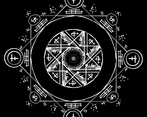
- Hello Xaver, I just wanted start by saying how amazing of an effect this is! this is miles ahead of the stuff I was creating as a student and shows a really clear understanding of the processes and tech needed to make VFX! I've been given a guide to run through so I'm going to run through that with you and explain why I gave you certain grades and give some tips and tricks to help you improve for next time! Research and development – I love your story board, it has a really good anticipation, staging and impact. Then you have the aftermath at the end which is perfect. You mention that it’s based off effect from magic the gathering and league but you never showed these effects or tried to deconstruct them to figure out how they could help with your effect. Also, you didn’t make a mood board which is on the list that I should be grading you on but if I’m honest I haven’t made a mood board since Uni so I think it’s not super important. Technical Art – first I’m going to say it’s not easy to animate something and bring it in engine and get the VFX to work in time. When I was a student I would make effects in sequencer too, I didn't know how to use BP’s either. My advice to you is to try BP. Yes, they are very daunting at the start but once you get use to them, they are much easier than making animations and it's a lot quicker to make changes to a timeline in a BP than reimport an animation from a different software. The coiled meshes that you are rotating your ghost on is very good but when I was watching the video I could see the polys right away and it takes away from the effect. Let me give you a little piece of advice I learned the first year on the job. It's a VFX artist job to make the effect look as good as possible, it’s a tech artists job to make sure that the artist keeps it performant. Now this doesn’t mean we add a super high rez mesh but it does mean we push to get a higher rez mesh in. I would have probably have put 3 times the number of polys in the mesh that you made for those ghosts, I might have had to reduce that but I’d never start low poly. Not unless I knew I was making a game that had to be super performant. Also little extra tip if you go into the texture and set it to be clamped in the x/y axis tiling method, use the drop down in the texture panel, that will stop the texture from tiling and appearing in the corners. Also also if you use a Fresnel in the material the ghost will fade if they are flat against the camera this is a good trick to stop them looking like they are on a flat plane give it a go and see what you think looks best! Creative Art – Visually I would have like to have seen more of a build-up in the cube as it gets closer to the explosion, like if gained more energy as each ghost was going into it and it shook more the Higher it got. If I really wanted to nitpick I'd also say that the explosion could have had more energy. Like the effect goes in but it doesn’t come out again it's just pops up behind the cube and I think if you have it scale outwards and maybe make it a bit bigger with other elements coming out of it. That would really sell that it’s an explosion. Even if you are making a non-realistic effect you should always grab a reference from reality to work from, a quote from my teacher “A VFX artist is only as good as their reference.” so look into explosions and find one that you think has the same feeling that you are looking for in your effect. Documentation – documentation and research and development should really be one group. You did great, I only ever do a quick concept and little bit of reference finding. Then I make the effect and it get rejected by the higher ups and I got to almost start from scratch again. My Advice to you is that you got to have thick skin and be prepared to do things multiple times. It happens we can’t get it right every time. Final presentation – one thing that always annoys me personally about student work is that they make it difficult to find their work. Unfortunately you’re a prime example of this, there is no mp4 for the judges to watch, when I opened the editor I got a blank level and had to find the level you were working in. Once I hit play on the level the default character was facing away from the effect you were showing. If I was an interviewer I would have stopped after there not being a video. No professional in the industry is going to give you more than 10 mins of their time before they decide if they want to give you an interview. Please sell yourself with this time! Make showreels, short videos, Artstation pieces or blog posts. Again, a show reel! It’s so important to have a show reel, one day this week to put it together and you might get more than 10 mins. It is industry standard and will be expected. Also put your showreel everywhere! Blogs, linkin, twitter, artstation ect. I might get told I’m in an interview and I only get your CV. If you don’t put links to your show reel on the CV I’ll be going into that interview blind and normally if I had seen your show reel I’d be going into that interview with question tailored to you based on what you showed me in your show reel, which is a much bigger advantage. Always always record footage and make a show reel. I just want to finish this off by saying that I might have been focusing on how to improve rather than what you did right and honestly you did almost all of it right, I had to go through your files to fine these small issues and I only bring them up so that you can learn new things and get better. The concept is great! Really unique and different I love it! I love the use of turquoise and pink. Very good use of colour theory. the animation on pentagon thing, I don’t know the correct temiology, is also a nice little extra touch. Extra bit of advice look into decals, it wouldn’t be a better option than what you used but it’s something different and it’s good to learn new things. I addore your beams of light coming out of the circles on the floor, honestly that can be a hard texture to make and you aced it! More advice in games we use power of 2 to make textures so they should be 2048 but a 2k texture is a bit big for that effect so my advice would be to make the ghosts 512 or 1024 depending on how big they can be on screen. You also have made some amazing textures. I would struggle to make textures this good. You’ve got some real talent, my main advice grab a real world reference for the explosion and a reference from a game for timing and experiment with BP’s the more you learn now the more likely you are to get hired. You’ve got a lot of skill polish it up and hopefully we will meet up some time, it’s a small industry after all! Cheers, AF – VFX artist
Challenge Tier
Search For A Star
Leave a comment
Log in with itch.io to leave a comment.


Comments
No one has posted a comment yet