


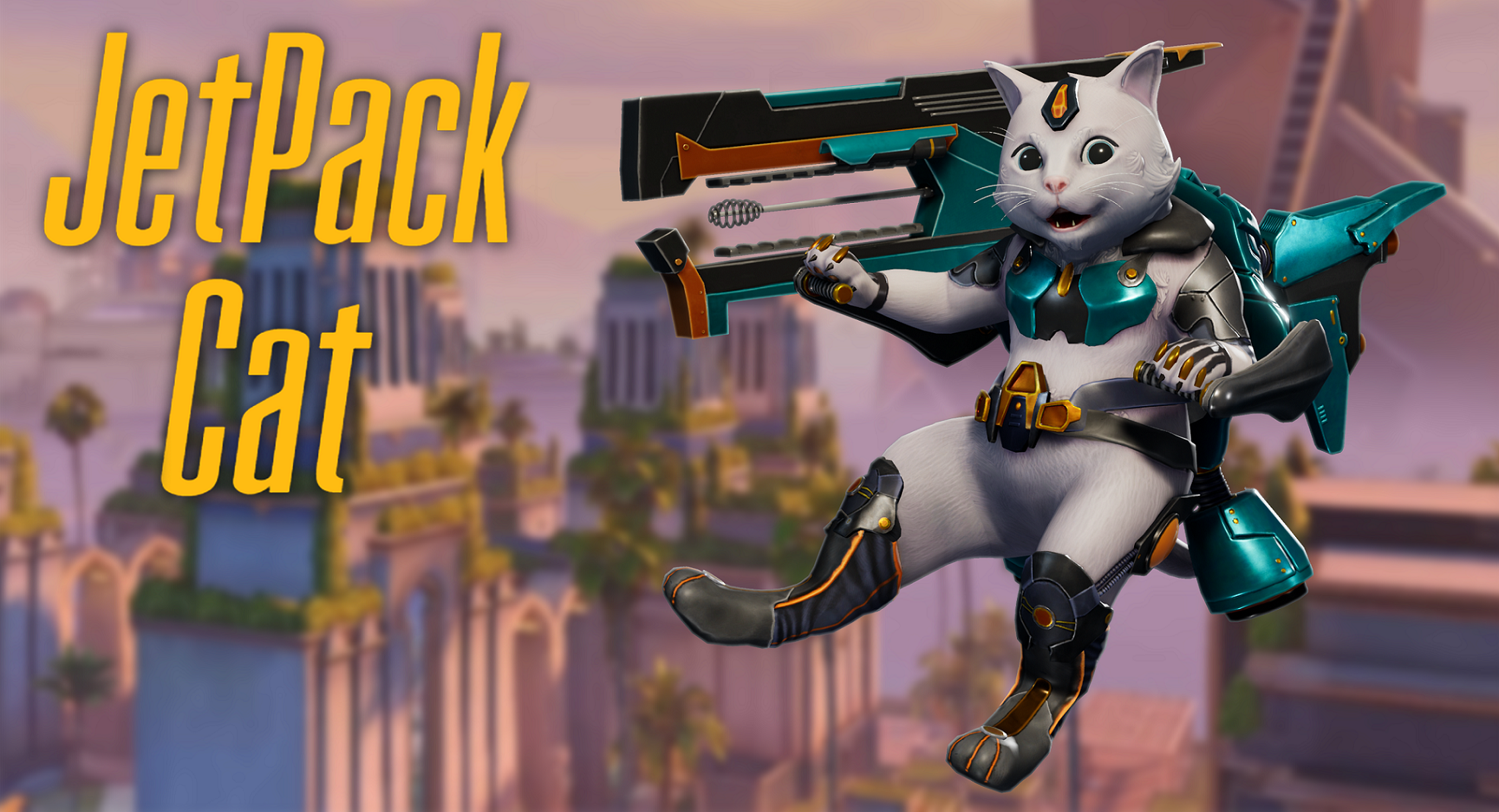


Play Character
Jetpack Cat's itch.io pageResults
| Criteria | Rank | Score* | Raw Score |
| Overall | #1 | 4.600 | 4.600 |
| Presentation | #1 | 4.800 | 4.800 |
| Documentation | #1 | 5.000 | 5.000 |
| Technical | #3 | 4.400 | 4.400 |
| Creative | #3 | 4.400 | 4.400 |
| Research + Development | #4 | 4.400 | 4.400 |
Ranked from 5 ratings. Score is adjusted from raw score by the median number of ratings per game in the jam.
Judge feedback
Judge feedback is anonymous and shown in a random order.
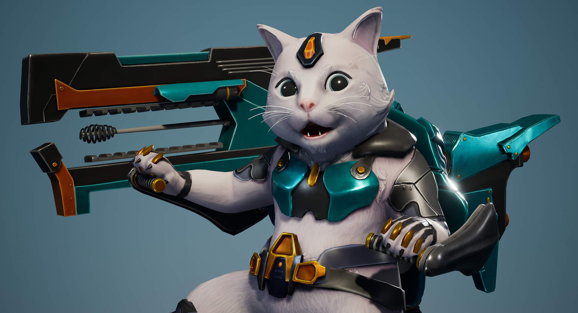
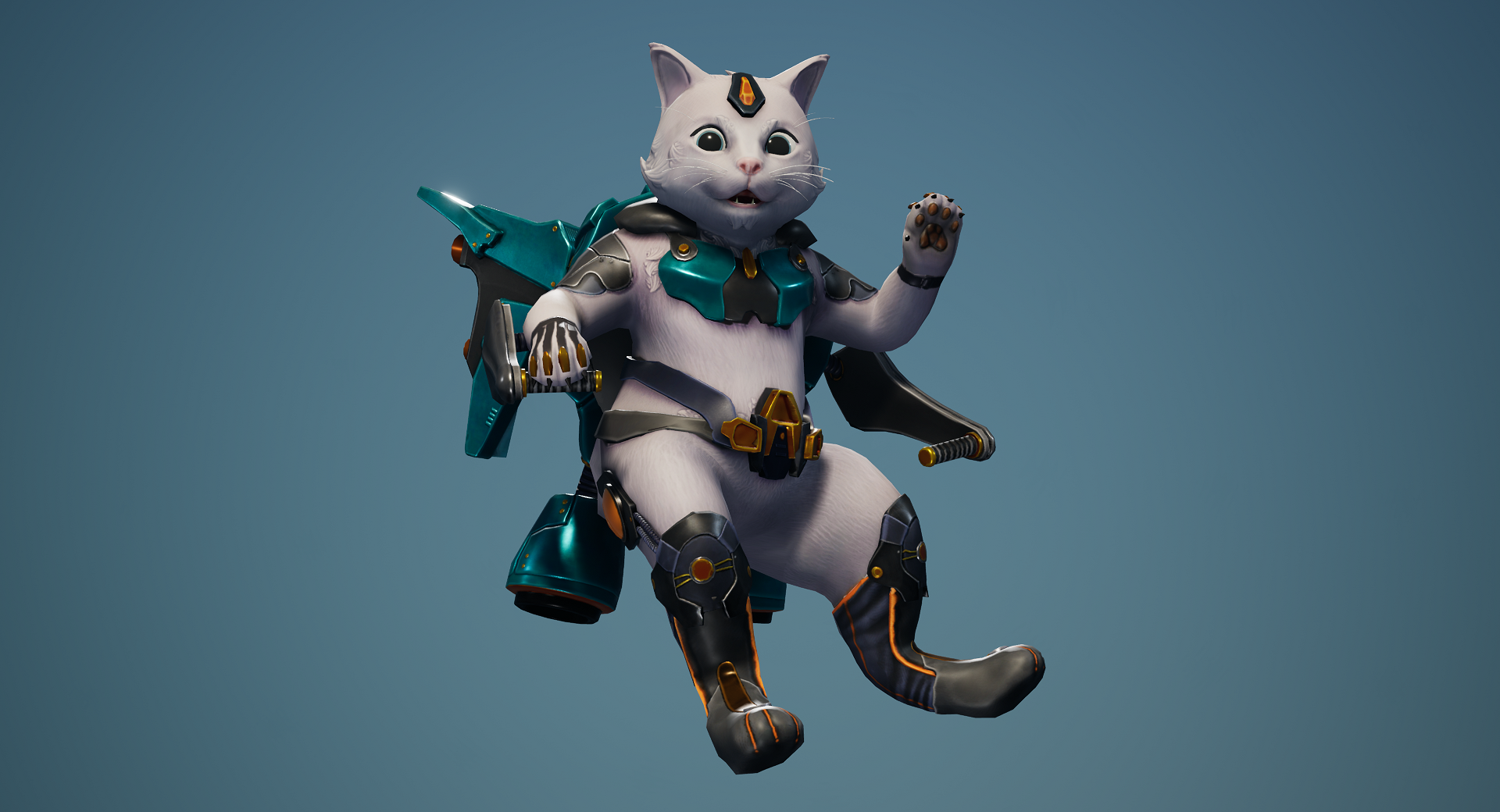
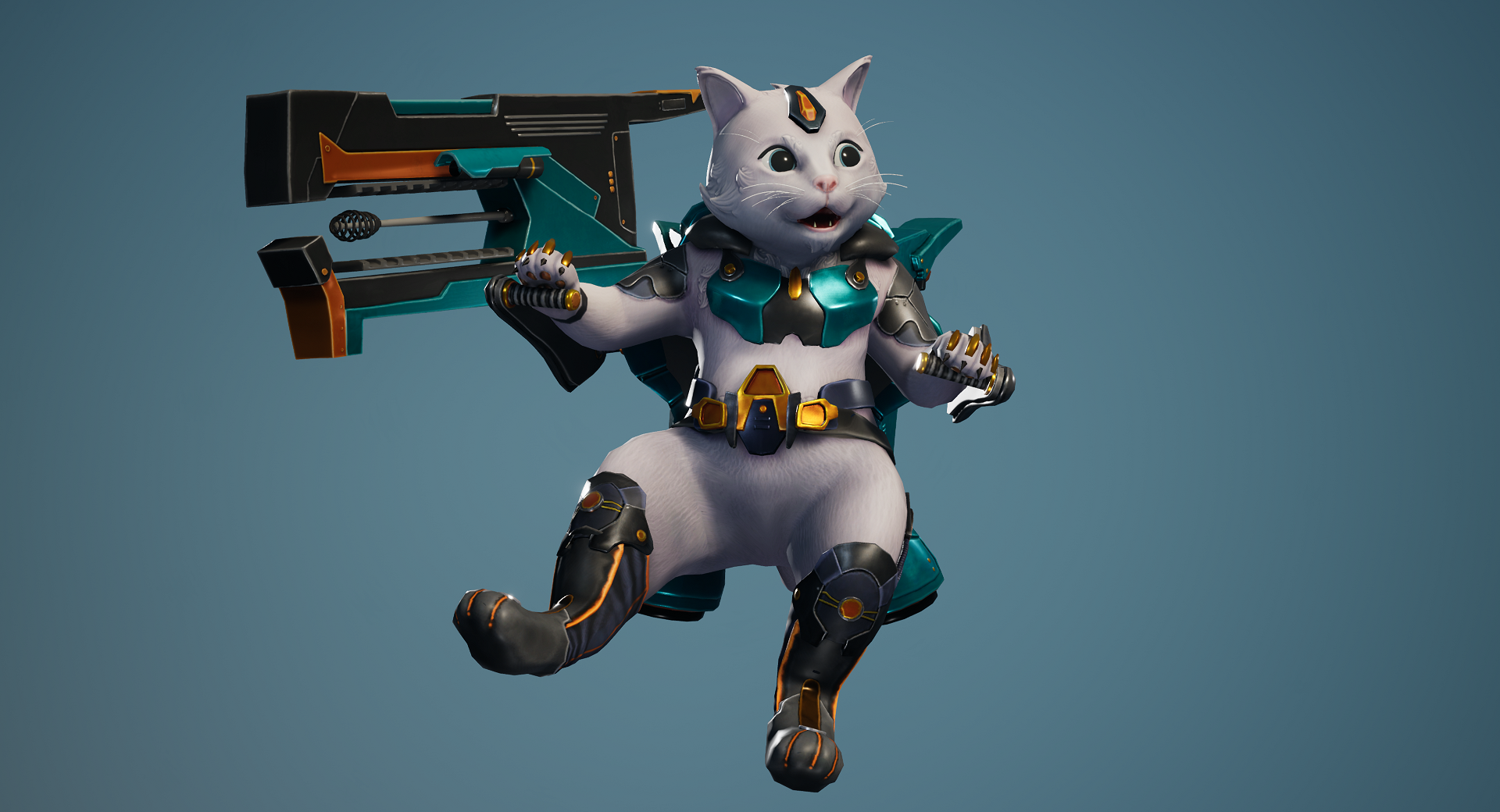
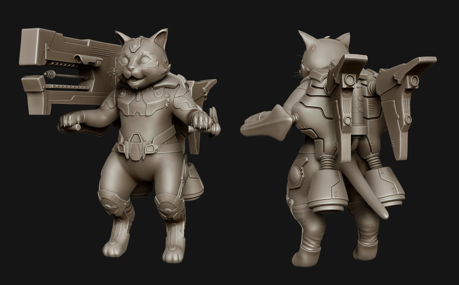
- Very nice piece! Overall the design is good, you captured the OW style well in detail distribution and general feel. The face has a nice appeal. Critiques: Although the distribution of detail in the design is good, consider the scale of the character compared to other characters in the same world - when you think of it that way, the design elements could be simplified further. As for the modeling itself, the jetpack has some nice stuff going on, so does the belt. The chest and shoulder pieces are problematic as they are both too thin for the style, and the shape of the chest plates too smooth at every corner. When you look at the hard surface approach in OW, everything has thickness and bevel, everything should be a trapezoid silhouette from the side view. Again, the jetpack is executed the best, especially the exhaust round thingies at the bottom look really good. The gun is getting there, but the bevels are still on the thin side, and the silhouette lacks sophistication from some angles where it remains very boxy. Make sure you have enough geo in your edges to support the bevel, some of the objects are getting a little too low poly compared to the cat itself. Additionally, some objects are just too small and high frequency for the style, such as the little cord connecting his leg armor to the thigh plate. For the cat, the fur treatment is nice overall, I like your clean sculpt! The proportions of the character are also really appealing and well-balanced, it looks tough to execute well and you did a great job. In the textures, there could be more rest areas where you don't render the fur as much, and it should be a bit 'creamer' like hammond's fur. The amount of tufts on the face are also a bit overkill and small compared to the overall character size, for example the eyebrow tufts could be bigger and break the silhouette more, same with the cheeks. For the render, I think adding VFX for the jetpack and smoke trails would really sell it, even if its just in photoshop to give the idea. You could also consider blurring the background more to imply dynamic movement. The colours of the background you chose don't match up super well to the reflections on the character, I would expect more pinks in the shadows for instance. I think also adding more fresnel to the fur would really sell it and help the creamyness its lacking. The eyes are super cute and executed really well! Tl;dr, great piece, needs chunking up hard suface and more sophistication in the large shapes.
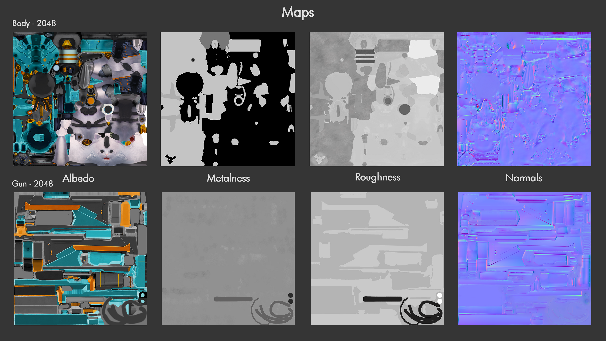
- Hi Beccy! Good job finishing the character for SFAS. Overall your presentation is solid and the character came out nice! The first thing that stands out to me would be to add the visual effects as seen in the concept, those would push it to the next level. Modeling: I feel that you got most of the concept in the 3d model, however there are some deviations, notably the roundness of the jets on the backpack, the nozzles of the large boosters on the bottom of the backpack, and the shape of the gun is missing some roundness, and the bit on the end of the tail is missing. Some of the silhouette is different as well, the feet and hands I feel were overly simplified, and the ears could have used some breakup in the silhouette with some fur poking out. Most Overwatch characters usually have smoother forms when it comes to gear or accessories, it's very rare to see boxy shapes in the character or weapon design. It's also really hard to find polygon edges in the silhouette for OW characters, so some areas could have used a few more triangles to round things out more. The gun could have used some more polygons too, currently it looks very lowpoly; in Overwatch the gun model is very important for first person view, so the model (for fan art at least) should be high enough poly that it would stand up in first person view, so make sure to have the proper amount of beveling and depth to the weapon. The gaps between each of the backpack panels are very thick and flat in appearance; I would take a look at Hammond's ball, and see how there is variation in the thickness of the beveling, and how nothing cuts straight into the mesh. Also be careful not to make corner edges too sharp, it's better to leave a bit of roundness to them so they get some highlights from the normal. Lastly, the tufts of fur on the cat could have been simplified more, there is a bit too much detail present in the sculpt. Texturing: I recommend learning Substance Painter, or 3D Coat for a modern PBR pipeline. While the results you achieved in Photoshop are good, I feel that they could be pushed further with tools that are dedicated to painting 3D models. The fur for the cat is also a bit too over detailed compared to how the Overwatch team handles furry characters, Hammond has a lot of simple flat colors, with large changes instead of adding in fine hair details. The texturing on the jetpack is also a bit on the flat side, a lot of it is one color. Looking at some Overwatch characters, there are distinct chips and changes of color around some edges of the armor/vehicles, this would have been nice to see here. Technical: In Unreal, pushing the shader further would have helped the character shine more. Adding a slight fresnel to the albedo on the fur would help the fur feel softer. Definitely do some research into how to push shaders in Unreal, there are tutorials online that you could definitely learn from. There are also clipping issues present throughout the model after you posed it - the right knee armor clips through the fur, the right shin guard clips through the kneepad, and the belts around his waist have stretching/collapsing issues. There is a small texture seam on the back of the characters head. Overall though, this was a solid piece. Keep these points in mind on your next work, and you'll have some great art in your portfolio. Looking forward to seeing what you do in the future.
- Hi, this is a excellent piece of work. Its just lovely! The way you have added only slight sculpted fur placements, and the rest in the texture as strands, works very well, and a hard thing to get right. You have a good artistic eye and that is a very lovely portfolio piece anyone would be proud of. Congratulate your lecturer too for asking you to retopo, he was very right! It’s a interesting thing with clean topology, its less necessary in todays games, but still always expected. In the end the way the mesh is processed needs nice clean loops since its how not only the model deforms, but is computed. Yet a tri here or there is less important now since tri stripping (the way the model is computed) has altered since the original playstation, but still helpful for deformations and just clean topology, that will stand you in good stead when heading for that job, and your first year in that job! I have no tips due to mistakes in creation on this, there isn’t any, its good. However be aware substance painter may be required when entering the industry. Its absolutely fantastic you can happily use Photoshop, is a great foundation, which opens the door easily for quixel also. But the majority do request a substance painter knowledge. So might be wise taking a look at it. On page ten of your document you say you extracted some parts from another but found it hard getting a clean shape from the mask. If you poly group from the mask, and use the smooth groups brush carefully. Problem solved. And careful zremeshing 😊 Good luck in your first role, im sure you wont have trouble cracking it if all your work is of this standard. Was a pleasure to view and mark.
- This is really great - two areas that you look into to take it even further would be to add some effects/particles and emissive items on the weapon and jetpack. Then the small tufts of fut on the face would work better if they blended with the flat fur, at the moment they feel a little too detached from the fur.
- Wow wow wow! Amazing piece of work. It immediately stands out as something of studio quality, and looks like it would fit in an Overwatch game. As I understand you were rushed with this project, the decision to use a pre-existing concept was sensible, allowing you to focus on the technical fidelity. If you'd had more time, it would have been nice to see your own concept following Overwatch design elements. Overall the sculpt was executed excellently. I think the fur needed softening out a little to match your reference of Hammond, the sharp tufts of fur felt quite out of place compared to the smoothness of your sculpt, especially on the leg area. From a rigging perspective the arms being bent at the elbows might prove challenging to a rigger depending on the complexity of arm animation. This ideally should have been straightened out. Otherwise, your hard surface components were executed excellently and the sculpt was very successful. The topology follows good form, however there are some inconsistencies in density - such as a lack of edge loops around the hips/groin area compared to the paws. Would not affect animation too much but I can see this being improved if we are nit-picking. Your UVs have been packed pretty nicely, there are some islands which could have been straightened out more to prevent anti-aliasing. The texturework is very nice. I would have liked to see your model with the unlit Albedo and Roughness maps on in your documentation so I could comment on this more. However roughnes values appear to be sensible and everything is clearly readible, so no complaints here! Something I would like to see is more of a lower eyelash, as Overwatch characters have quite defined eyes on top and moving round to the lower eye as well. Excellent documentation and final Renders - I appreciat ethe Hero shot. If I didn't know Overwatch I'd assume it was a legitimate splash screen!
Challenge Tier
Search For A Star
Leave a comment
Log in with itch.io to leave a comment.
Comments
No one has posted a comment yet