

Play asset pack
Merlyn's itch.io pageResults
| Criteria | Rank | Score* | Raw Score |
| Technical | #18 | 3.500 | 3.500 |
| Creative | #26 | 3.250 | 3.250 |
| Presentation | #29 | 2.750 | 2.750 |
| Overall | #29 | 3.000 | 3.000 |
| Research + Development | #37 | 2.750 | 2.750 |
| Documentation | #39 | 2.750 | 2.750 |
Ranked from 4 ratings. Score is adjusted from raw score by the median number of ratings per game in the jam.
Judge feedback
Judge feedback is anonymous and shown in a random order.
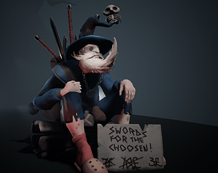
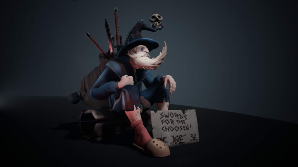
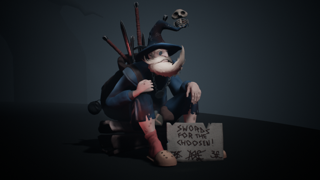
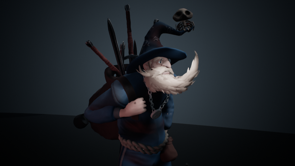
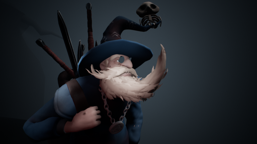
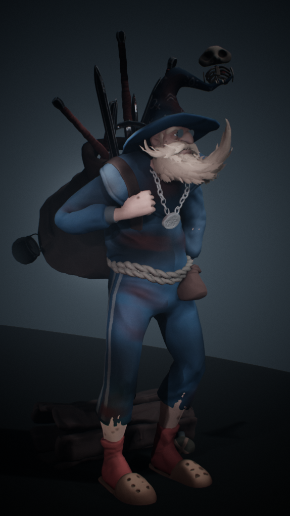
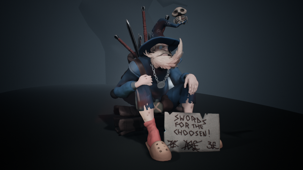
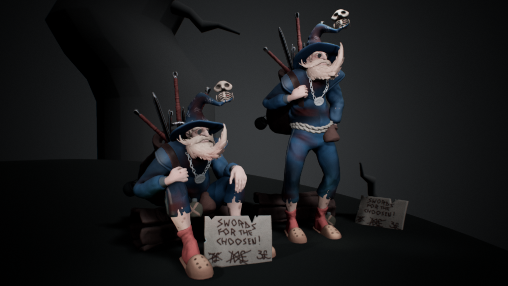
- Topology is good but a bit iffy in some places, the distribution around the stomach area could be fixed and the wooden board doesn't need all of the edge loops running through it. Albedos look good and fit the concept but the material definitions are a little off, they all look quite similar. Great hair :)
- A lovely concept well developed to your final piece. It is well conceived as a piece of stylised work. I myself took part in that very same artstation challenge, was great fun and a good development to my own characters. Keep it up!
- Hi Emma, nice job finishing the character for SFAS, although I think you submitted it late. Make sure you submit projects within the deadline, even if you will keep working on it afterwards. I agree with your assessment, you should finish up the environment to match the original concept better, before posting it to your portfolio. I have some general notes for the character and areas you can improve. - Cloth - Cloth is the second hardest thing to get correct for characters after anatomy. While Marvelous can provide a good base, it is not enough to take a Marvelous sim and do some light sculpting on the mesh. Although the character is stylized, you still need to make the folds, creases, overlaps, and stacking of the cloth believable for the character. When creating clothing, it's good to find some reference from your own closet that has material properties similar to the material you want to create for the character. Try wrapping it around your arm, leg, or other around your neck, stack it so it folds on itself, really try and observe how the fabric is acting. The final results feel very soft, and a lot of the forms I would expect to see are missing from the character. - Anatomy - The character is mostly hidden in cloth, but for the areas that we do see, a bit more time working out the forms and pushing the character would benefit him. The hands feel very soft and rounded, while the concept has hard bony areas on the knuckles and joints. The face has a lot of recessed areas, notably the eyebags and crows feet. The ear also should have anatomy sculpted in instead of being left relatively flat. Proportions - Various props are mismatching the proportions of the concept. Unless if called out in documentation or feedback, when recreating a concept you should try and match the proportions as closely as possible. This also goes for posing as well, try and match the concept closer, it has a nice feel which could help out your presentation. - Hair Rendering - It would be nice to get some fade off and transparency on the haircards to closer match the softness of the concept. - Materials - Currently all materials feel very samey, there is not a lot of roughness/specular breakup between cloth, metal, and leather. Definitely take a closer look at materials individually, find references that really match what you are after, and try to copy the material parameters as close as possible. Once you have a base for the roughness, then you can tweak things to stylize them a bit more. The skin could use a stronger subsurface effect, where the skin goes from light to shadow, there should be a reddish transition, which the render scene lacks. You should also bake a thickness map and plug that into the opacity slot in the skin material. Texturing - The head should be split out into its own texture map, and be at a higher resolution relative to the body. The eyes need more resolution and proper gloss. Technical - When posing your character, make sure elements arent clipping through the body. The shoulder strap goes right into his ribs and stomach, the left sleeve clips through for arm, etc. Your AO map on some assets has black clipping, try to eliminate this from your AO maps. In a game production, these would cause issues if the character is animated and those areas are exposed. Also make sure that there are no holes in your geometry. The shoulder pads can be seen through when viewed from the sides. The glasses have too much refraction, and are causing issues at certain angles. Also, the lenses should be UV'd and textured, it's an area where you can add grunge and gloss breakup. Rendering - Add a skybox to the scene for metal reflections. UE4 has HDRI dome support, so adding in an HDRI will be a good base to light from. Metals appear black without things to reflect, so it's very important that you put something in the scene for them.
Challenge Tier
Search For A Star
Leave a comment
Log in with itch.io to leave a comment.
Comments
No one has posted a comment yet