Play asset pack
Judgment Day's itch.io pageResults
| Criteria | Rank | Score* | Raw Score |
| Research & Development | #2 | 4.273 | 4.273 |
| Presentation | #6 | 4.364 | 4.364 |
| Overall | #6 | 4.127 | 4.127 |
| Creative | #7 | 4.000 | 4.000 |
| Documentation | #7 | 4.182 | 4.182 |
| Technical | #7 | 3.818 | 3.818 |
Ranked from 11 ratings. Score is adjusted from raw score by the median number of ratings per game in the jam.
Judge feedback
Judge feedback is anonymous and shown in a random order.
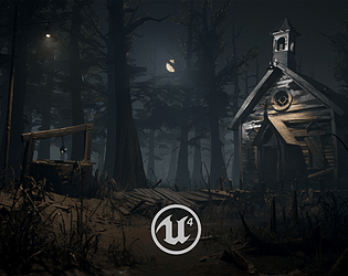
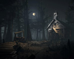
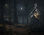
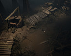
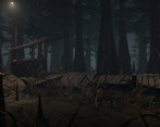
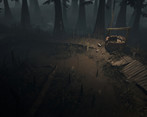
- Documentation: Very strong documentation detailing the way your working all the different steps from Research - Blockout - Material Creation. Great idea to get a blockout in as soon as you can and with some basic colour/materials on it, as well as some basic scene lighting, all helps solve problems early on. Very good use of silhouettes and shape language to help show off the area and direct the players eyes. Good to see that you are working out problems, either with mapping position/silhouettes or material creations and you figuring them out or making compromises based on time constraints and not just throwing them away and ignoring them Custom Shader creation for blend materials very nice touch and shows that you have a grasp on in game techniques. Using Masks on props to get most out of tileable materials also very good! The work you have submitted is top quality. It was good to see how you mind worked as you went through all the different aspects of the production, and you should be very happy with the end result. Since this is meant to be a swamp it might be nice to have some of the trees different shapes and sizes, some gnarled etc with heavy moss growing all over,trees falling over etc, but because of time constraints i understand. The composition of the main shot is very nice. The spotlight above the entrance door might be a bit strong, plus it is difficult to make out the light source. With all the fog in the scene there should be abit of god ray coming from the light bulb. I can see it abit with the light over the well but not from the church light, there is also no light bouncing from in underside of the light shade. (This is only a minor fix :) ) When looking at the image of the top down of the path it seems very odd that there is a well planted in the middle of a path in a swamp. All roads lead to the well as it were. If you want to walk to the church you must first bypass the well :) UE4: Hole in ground mesh around well. I know that the judging is based on the images provided, however in game it would need to be fixed. Nice to see the use of a simple shader to make the vegetation look like its moving. Folder and file names could do with a small clean up ( Project name instead of My-Stuff) also delete unused models like blockout. Its fine for this competition, but you dont want to be submitting unwanted/un-needed models/textures etc. You have abit of light inside the church coming out, you could push that abit more to see it coming through the from window besides the door and the circular window, depending on how the interior lighting of a church like that would be. Over all this is a stunning piece. I fell you could push it a bit more, but you should still be well proud of what you have done with this. Documentation: Very stong documentation detailing the way your working all the different steps from Research - Blockout - Material Creation. Great idea to get a blockout in as soon as you can and with some basic colour/materials on it, as well as some basic scene lighting, all helps solve problems early on. Very good use of silhouettes and shape language to help show off the area and direct the players eyes. Good to see that you are working out problems, either with mapping position/silhouettes or material creations and you figuring them out or makeing comprimises based on time constrantes and not just throwing them away and ignoring them Custom Shader creation for blend materials very nice touch and shows that you have a grasp on in game techniques. Using Masks on props to get most out of tileable materials also very good! The work you have submitted is top quality. It was good to see how you mind worked as you went through all the different aspects of the production, and you should be very happy with the end result. Since this is meant to be a swamp it might be nice to have some of the trees different shapes and sizes, some gnarled etc with heavy mose growing all over,trees falling over etc, but because of time constraints i under. The composition of the main shot is very nice. The spotlight above the entrance door might be a bit strong, plus it is difficult to make out the light source. With all the fog in the scene there should be abit of god ray coming from the light bulb. I can see it abit with the light over the well but nor from the church light, there is also no light bouncing from in underside of the light shade. (This is only a minor fix :) ) When looking at the image of the top down of the path it seems very odd that there is a well planted in the middle of a path in a swamp. All roads lead to the well as it were. If you want to walk to the church you must first bypass the well :) Hole in ground mesh around well. I know that the judging is based on the images provided, however in game it would need to be fixed. Nice to see the use of a simple shader to make the vegitation look like its moving. Folder and file names could do with a small clean up ( Project name instead of My-Stuff) also delete unused models like blockout. Its fine for this competition, but you dont want to be submitting unwanted/un-needed models/tetures etc. You have abit of light inside the church coming out, you could push that abit more to see it coming through the from window besides the door and the circular window, depending on how the inderior lighting of a chuch like that would be. Over all this is a stunning piece. I fell you could push it a bit more, but you should still be well proud of what you have done with this. Very Well done.
- All images were a little dark, so lift the values a little. It is great to reference other artists work, but it would have been nice to see something more original and personal to you. The scene is well executed and only needs some minor polish to bring it up a little. However, there are some bigger issues which I think need addressing. The moon angle and fallen bell. I have done some paint overs for you. Itch does not support image embedding correctly, so you need to paste the link below manually. https://drive.google.com/drive/folders/1-0WD-7I70oytgThjm8dF_QZfwG46EQhJ
- Would have been good to see a bit more reference but it's good to read your breakdowns of what you have gathered. Great to see that you thought about the style you wanted to achieve and research into compositions. Good to see a block out with some lighting and material work in it. Model and texture work looks good and consistent. Good to see use of tiling textures and modular kits. The trees look a little unnatural in that the bases are really broad but then they aren’t that tall. I think making them taller and of different sizes would have added a lot to the mood of the scene. I like the set dressing and unevenness of the props; this adds a lot in narrative and this really that something bad is going to happen if we linger too long. I like the colour contrast in the lighting and the fog adds a nice amount of depth. Great looking scene!
- I went trough submission screenshots and this one caught my attention, good job!
- The second I saw your submission I thought of Jay's Slaughterhouse and then of Outlast, so well done there! I totally get what you were trying to say with this piece. I think you framed it really well, I like how you break up patterns and straight lines. Overall, I think you're a brilliant artist. If there's a few things I would comment on, it's to try and make best use of your lighting and setting and bring in normal details and a more detailed roughness map. I totally get that you were trying to go a bit more stylised, but in this dark setting it's the contrast of light and dark that tell you what a shape is, rather than color. And you need more roughness detail to enforce that this is a misty, damp setting. Second, I would look at introducing more volumetric fog on the ground, so that the tips of your grass stalks protrude through. Third, I would try and introduce a blue, cold light somewhere in there. I think you tried that, but it might be too white and not bright enough to offset the yellow. And try to differentiate the moon and the artificial light somehow, by making one colder than the other. Last thing that I think would make your scene feel like it's alive, besides fog (since fog generally creates the impression that a moving scene is standing still for a second, if that makes sense) is too add some flies/mosquitos around that light or maybe a raven or two on the well or the church roof. Really good job on this, loved your documentation as well! And well done on submitting on deadline, 54 seconds is close :)
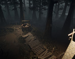
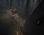
- Artist – Dom Brookes Category: Sumo Digital Rising Star Assessor: Anthony O Donnell – Lead Artist at Firesprite Work name: Judgement Day Research and Development /Documentation The document is well written and goes into great detail regarding the creative journey and production process of the piece. Technical Art Texel density is high and fairly consistent across the scene. Channel packed maps were used and correctly setup. Master materials with exposed parameters were used effectively. Tileable textures and trim sheets were also used well. The dithered water setup for the scene works visually. Materials and Textures Textures were generally well made and suit the context of the scene. FYI the "ORD" maps were saved with a blank alpha channel which doubles the texture size. Creative Art The overall scene works great as a final piece. There are many small well considered details around the scene such as the bricks from the broken well discarded around it. The careful placement of the wooden planks along the walkway really sells it as a structure weakened over time sinking into the swamp. The placement of trees, grass and fallen branches / trunks all support the composition. The lighting in the scene is setup well depicting a set mood and keeping the viewers eye on the church via the use of intensity for value contrast and warm colours around items of interest making them come forward compared to the colder receding values of the background elements. Even the shapes of the grass , hanging down and distorted and their colorization support the visual intent of the work. The careful management of colour vibrancy in the scene suits the horror theme chosen. Final Presentation Overall it is a well considered scene which has been produced in a sensible manner. The final images look great and lead the viewers eyes where they need to go and carefully captures the mood set out at the beginning.
Challenge Tier
Sumo Digital Rising Star
Leave a comment
Log in with itch.io to leave a comment.


Comments
Great work done here.
Well executed, color palette works really well, I am glad to see how you established your composition by placing simple shapes in engine and set up the mood before starting, that always works and also well explained in your documentation.
Composition wise, my suggestion would be to use some billboards around the scene to give it more depth.
From the tech side, I think there is an issue with reflections in the scene, the water, mud and wood planks are bland, by fixing reflections will increase the quality of your scene .
Overall, the scene is lovely, easy to read and I like the color palette , great job.
Brilliant! Thanks for the feedback, I'll be sure to check out the reflections. :)
Research & Development
There's some nice and clear research and comparing in the beginning. Research is geared to working towards the end goal.
Creative Art
Materials, lighting and composition work very well together. The broken wood trail looks interesting, with mud covering parts of planks as well. The end result reads very well, and is well stylized to appeal to that. The deformations of the church' roof's front panel are a bit exaggerated, and the structure is a bit low on the polycount side, you could add more geometry to the roof tiles, for example, to get a bit more room to play with shadows and silhouettes. The props are a bit hidden in the scene as well.
I might suggest adding also some bushes or other foliage as in some of your reference images, to cover up a bit more of the ground level. The pointy looking smaller tree trunk feel a bit like a distraction to me than something that would add to the scene that much.
Technical Art
Final work includes game-ready assets. It's great to see you tackled Substance software with the scene, as it is pretty much the industry standard nowadays. Lighting and atmosphere adhere to the feeling of a swamp in a great way. The scale of things seems good to sell the feeling. Studios also use a lot of tileables and trim sheets to cut down on the texture usage and keep the results modifiable.
Documentation
The text is very thorough and chatty. The amount of text and explanation seems a bit too much for me, but your opinions and way of thinking really shows in there, which is a good thing. The process shots are also good to see.
Final Presentation
Scene looks good, lighting is there, composition works with lighting and atmospherics. The final renders could showcase a bit more closely the surfaces of textures, mesh modeling and props, but the selected few showcase the feeling of the scene very well.
Thanks for the valuable feedback! :)
It's great if I can be of help. If you want to adjust the changes or would like to know more, you can also DM me through other medias such as ArtStation or Twitter.
Cheers!
-Teppo
Brilliant, thanks. Would you mind if I contacted you about future projects for feedback too?
Not at all, please do if you feel like I can be of help!