Play asset pack
The Iron Sarcophagus's itch.io pageResults
| Criteria | Rank | Score* | Raw Score |
| Technical | #5 | 3.875 | 3.875 |
| Presentation | #8 | 4.125 | 4.125 |
| Overall | #10 | 3.800 | 3.800 |
| Creative | #12 | 3.750 | 3.750 |
| Research & Development | #14 | 3.750 | 3.750 |
| Documentation | #25 | 3.500 | 3.500 |
Ranked from 8 ratings. Score is adjusted from raw score by the median number of ratings per game in the jam.
Judge feedback
Judge feedback is anonymous and shown in a random order.
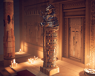
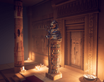
- This is some very strong work, from an artist who clearly has both talent and a comprehensive understanding of modern game technology and workflows. The result is striking, well lit and composed with an excellent balance of low, medium and high frequency detail. Obviously time was a constraint on this, which is a shame as with more work this could really become a stand out portfolio piece that would go a long way to help this artist gain a place in the games industry. The diorama approach was sensible given the time available, but if this was turned into a fully fledged environment, with more props, attention given to the roof and hand drawn wall paintings/hieroglyphics, this would make for a very strong lead portfolio piece.
- Submission Title: The Iron Sarcophagus Submission Tier: Search for a Star Assessor: Dominic Shaw Artist @ Firesprite Research & Development There was some good amount of research done for the project and the idea was very thought out. I would have liked to have seen some time plans and asset lists as this really helps with project management. I noticed that in your documentation you didn’t manage to achieve everything planned and the use of time plans would have really helped to finish the whole project. Creative Art Overall, this is a really good attempt at making the environment and there are some nice props in the scene. The environment is pretty appealing and you show a good knowledge of game art workflows and the pipeline needed. The only things that jump out at me that I think need improving are the decals of the paintings on the wall as you can really tell that they are just images placed on the wall. They need more roughness variation and cracks to really sell that they have been painted on the wall. The other thing is that the environment seems way to clean for the type of environment and idea that you were going for, I would grunge the environment up more, making the walls and floor more dirty which will help sell the mood and idea that you choose to do. Technical Art You have a really good knowledge of the props workflows and some good Zbrush skills. You have used modularity and channel packing quite well to keep the environment optimized. If you are going to do a unique sculpt for the floor tiles, I would focus more on edge damage and cracks because if not you may as well just use Substance Designer for the texture and then map it to a simple mesh. Documentation There are some good breakdowns of each of the processes that you took to make the environment with some good breakdowns and intentions for each stage. Final Presentation The final renders are nice and appealing, they catch your eye and show off the focal point well. Overall, I like the environment, you have a good focal point and the quality of work is decent. I think that moving forward to help improve the environment, I would focus on improving the wall painting material and the damage on the architecture such as more edge damage and dirt.
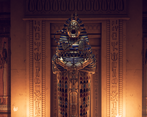
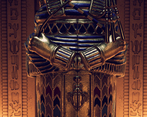
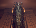
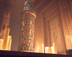
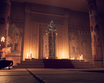
- The assets look well made and the lighting and mood are very nice. There are some epic shots in here!
Challenge Tier
Search For A Star
Leave a comment
Log in with itch.io to leave a comment.


Comments
Research & Development
There's historical knowledge infused with something original. Both sides are well shown and spoken out about. Steps taken and thought processes are well captured in the texts.
Creative Art
The scene shows interest as an Egyptian tomb. The creative part of torturing devices and screaming man fall a bit short without a lot of other elements to support it. Lighting is beautifully crafted, the main attraction reads and shows well and the Color LUT settings add a lot to the final scenic feeling. To generate a bit more interest, you could push the silhouettes a bit with breakage and irregularities with geometry. The ominous aspect could also benefit from some wear and tear, as well as material blending. The paintings are maybe a bit stretched; given more time, they could be utilized to fit with the ominous feeling and story as well.
Technical Art
Color LUT and post process work great, lighting's beautifully crafted but could maybe be a bit more optimized with the implementation of spotlights instead of point lights. Use of decals for paintings works great. Polycounts seem pretty much spot on, and LODs work well for the pillar. There's a good use of tileable texture in the ground. The step could also use maybe tileable materials with vertex painted material blending. Material instancing would also be nice to see in terms of optimization.
Documentation
Steps taken and thought processes are well captured in the texts. Text is maybe a bit chatty, and a bit elongated as such, but gives a sense of character. Images show process well throughout the process.
Final Presentation
Screenshots are of High Quality and easy to look at. The compositions work very well.