


Play asset pack
The Bell Room's itch.io pageResults
| Criteria | Rank | Score* | Raw Score |
| Research & Development | #15 | 3.600 | 3.600 |
| Creative | #20 | 3.400 | 3.400 |
| Overall | #26 | 3.200 | 3.200 |
| Documentation | #30 | 3.200 | 3.200 |
| Presentation | #34 | 3.000 | 3.000 |
| Technical | #38 | 2.800 | 2.800 |
Ranked from 5 ratings. Score is adjusted from raw score by the median number of ratings per game in the jam.
Judge feedback
Judge feedback is anonymous and shown in a random order.
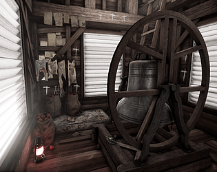
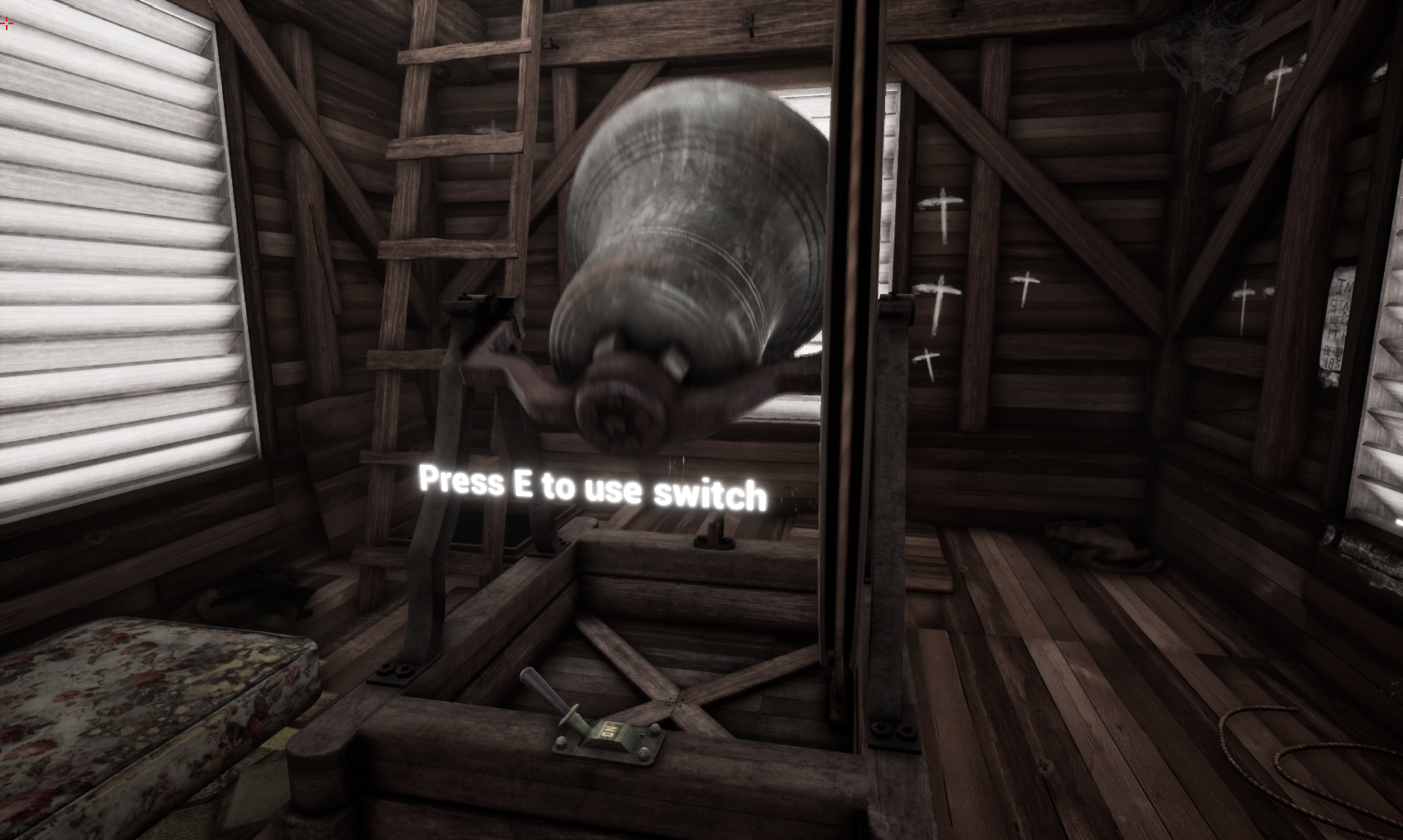
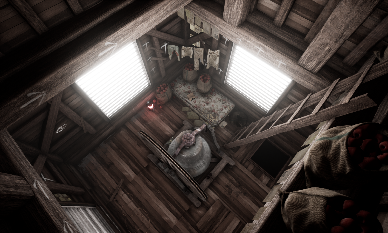
- Very nice idea and well thought layout. Some areas that could be improved would be, based on the documentation, as follows: for a foggy & mysterious atmosphere, the interior should be darker, specially closer to the ceiling, the light from the windows could be reduced to half, resembling more Outlast, complemented by some volumetric fog or dust . The lamp should be moved closer to the point of interest, which is the lever. The player should not be guided to an area with no action objective. The bell being the main point of interest should be detailed, specially the moving parts or the ones closer to the camera, but the base of the bell could be heavily optimized, being mostly build out of rectangular shapes and simple geometry.
- An intriguing and atmospheric environment, this is a well thought out and executed project. It shows a good approach to planning, a clear grasp of of the technical requirements and a good eye for narrative detail, which is always key to making an environment really engaging. My feedback would be in two main areas. One is the lighting - I like the idea of the foggy environment outside the church, very atmospheric, but as this environment was only going to be the interior, the lighting should be authored entirely to best show off that. Currently the lighting is too uniform throughout the space. I think picking a single direction for the light from outside, (allowing the slats to cast shadows) combined with turning down the overall brightness would allow for a more intimidating horror game atmosphere - the lantern could then become a lighting counter point, as it's rather being lost at the moment in the wash of outside light, with the bell offering a chance for interesting specular highlights. Placing another lantern in the area at the top of the ladder would allow for pockets of illumination to give more variety. My second point would be the wood treatment - it all has the same hue values currently, leading to it all looking too similar. A single brown is dominating the scene. Colour sample the image on the bottom left of the environment mood board - there are muted blues, greens, red and yellows in there, and the wood displays large variation in tone, dust patina, grain patterning, silhouette and general wear and tear. The use of a modular plank approach is good, but adding more variation as per the reference would really help this environment.
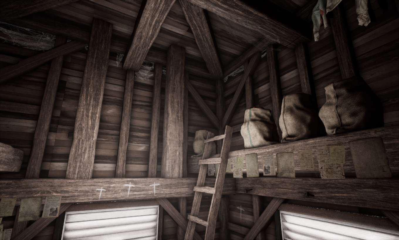
- Research & Development Research shows interesting and specific reference about architecture and props, picked up clearly with a goal in mind. The material reference could maybe show a bit more high frequency detail to nail down the feeling (the wood is a bit stylized with its grain right now). Creative Art Images show a cohesive whole. The setting is interesting, and feels grounded in reality. The color usage and materials support the rough climate and environment bestowed upon the human living there. Analogous color palette with spider webs support the narrative feeling to the very extreme. All in all, there's a scene, idea, feel, and all the decisions feel like being done upon these to pack the scene into a whole. The bolts add a lot of interest, and the scene has nice blend of big, medium and small shapes. Paper decals could maybe be separate planes for more flexible approach, and being able to change their compositions a bit and could showcase maybe some shrinking or bending in their silhouettes. Plane clotheslines look a bit funny when getting up close, but can be discarded quite easily due to other polish. Some clipping aspects could maybe be further tackled with looking how the structures are made in real world and implementing those. Technical Art The meshes look optimized. Apple placements feel organics. Plane decals look interesting, and them being used for spider webs add a lot to the scene. You could maybe experiment with the deferred decal actors in the future (it's a separate actor found in the modes panel). The gameplay implementation is a nice addition with the on screen instruction. Apple sacks might do with fewer polygons, but look very nice. Post process adds a lot to the polish of the scene. Documentation Texts are nice to read and show well the decisions. Images look very nice. Final Presentation Images look sharp and interesting. The scene is a viewing pleasure.
- Good amount of reference and I like that you’ve called out the things you like in the images. Also good to see you pulling colours and materials out. Good to see a drawn concept piece and plan of the environment you aimed to create. It would have been good to see a block out of your environment. I can’t see anything in the documentation of your process but your final images look nice. There’s consistency to your models and textures. It would have been good to see the warmth of the lantern colours you picked out in your reference coming through in the scene and help to create some colour contrast to the final look of the scene.
- Research: Really good research into both the environment and assets. Great consideration of narrative and direction. Great collection of moodboards and colour palettes. Good references to other games with similar environments. Very good. Creative: Scene looks good, its awesome that you added a function that links up with your narrative. The scene has a good selection of props scattered about. The materials seem very desaturated compared to some of your reference materials. Lantern is also quite saturated. The floor could use some more props to break up how uniform the planks are. Finally the window shutters are super bright, they are really intense, they could use a bit of darkening. I can feel the hunt showdown vibes from this so you’re on the right track. Great reference for the theme you’re going for https://www.artstation.com/artwork/v18e33 Technical: I saw you had some issues with the decals which is a shame but the ones in the scene are decent. More of these would have been nice. Nice to see some blueprint but would also like to see your material setups in UE4. Assets are higher poly than they need to be. The bell has a lot of supporting loops that are not needed. Don’t be afraid to optimize more. Presentation: Overall the lighting is quite flat. I know you were going for the foggy theme but I think the lighting could have been done better, you could maybe have used the lantern to cast some big light inside. With the shutter setup you have it wouldn’t be that dark in there. Maybe along these lines: https://www.artstation.com/artwork/KqJD4 Documentation: Solid breakdown on the blog. It’s good to see that you tried different techniques to achieve your results. Take it further by including texture flats, more materials setups, lighting, etc Conclusion: Great effort, work on your materials and lighting more to really make this pop.
Challenge Tier
Search For A Star
Leave a comment
Log in with itch.io to leave a comment.
Comments
No one has posted a comment yet