


Play Environment Art
GREEN HILL ZONE GARDEN's itch.io pageResults
| Criteria | Rank | Score* | Raw Score |
| Technical | #55 | 2.236 | 2.500 |
| Documentation | #62 | 2.460 | 2.750 |
| Presentation | #67 | 2.012 | 2.250 |
| Research & Development | #72 | 2.012 | 2.250 |
| Overall | #73 | 2.057 | 2.300 |
| Creative | #87 | 1.565 | 1.750 |
Ranked from 4 ratings. Score is adjusted from raw score by the median number of ratings per game in the jam.
Judge feedback
Judge feedback is anonymous and shown in a random order.
- Hello Yuk-Tin Yau, It's an interesting projet there. Nothing very original in term of subject/creativity, but it's a good exercice to try to replicate some games, especially cartoon ones. Few comments: 1/ You shouldn't build the "sonic_environment" as one piece, 345.655 tris is obviously too much for one asset. You should subdivise and use modular assets for the fences, trees, totems, ground. Every asset having their proper collision, ect... By doing this, you could up the quality of your textures/render with smaller size. 10mb of texture for an asset is a lot, you need to think that in a big level, it plays a lot (takes time to load, it could cause out of memory). 2/ Lighting setup is wrong : In world properties, you setup the number in a way that it shows you probably don't know how works. There is a long way to understand how works the lightmass system, but there is some tips : Static lighting level scale is a value working with the indirect lighting quality. By default it corresponds to 1:1. If you want to have a more precise baked lighting, you need to lower the resolution (same for the cell size for the indirect lighting, volumetric). So, let say you want x2 more precise in term of scale, you will have 0.5 for level scale and 5 for indirect lighting quality. The indirect lighting quality basically a parameter changing the sampling, more the scale is small, more you'll need to process this samples, like in a classic 3D render. These parameters in the world settings are just some basic adjustments affecting the baselightmass.ini, which is fine for personal project. You shouldn't use a so big smooth value. To be in the details, you'll have to check in the baselightmass.ini. You should take a look of this presentation : "https://www.slideshare.net/EpicGamesJapan/practical-usage-of-lightmass-in-architectural-visualization-ue4-lightmass-deep-dive" 3/ You choose to use static lighting, which is fine, but you did a mistake : you didn't set the lightmap resolution of your object (64x64). If you worked modular, it will be less dramatic, but in that case a lightmap of 64x64 on a so big piece will never give you enough texel, so crappy lighting in perspective! On that case to resolve it, you should be at least on a lightmap of 1024x1024 (it should be definitely less in modular). You could also maybe boost the indirect lighting of the skylight to have more sky reflection, or putting a proper cubemap. Your ground normal map is too strong. 4/ We can see the uv seems on the totem, hide it! you could use extra geometry or decal or paint on the top based on an extra uv. Apart some technical fails, the project is good. You could definitely improving the project by the lighting and post processing. Quentin Papleux, Sr. Lighting artist, Sumo Digital
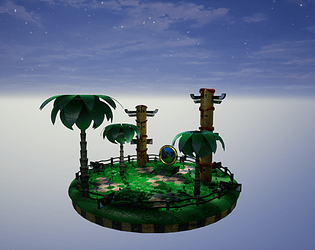
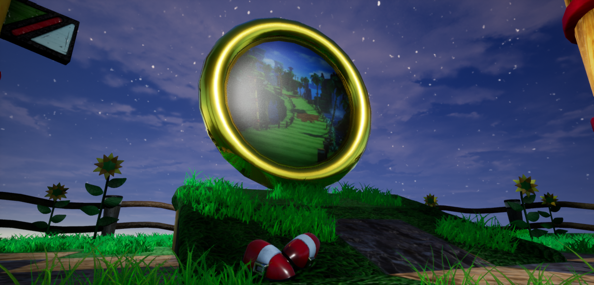
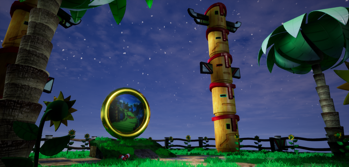
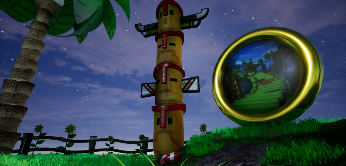
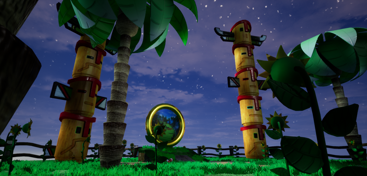
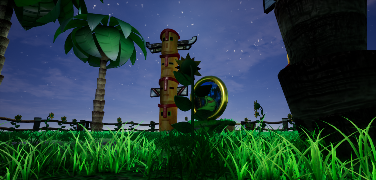
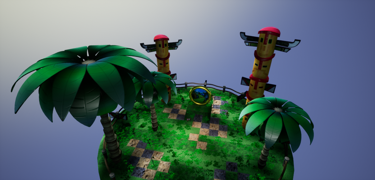
- Good to see references from games that inspired the piece and an initial drawing of what you wanted to achieve. I think more could have been done in the block out to match your drawing though. Block outs don’t have to be simple objects only; bend, twist and shape the geometry to better match what you want to achieve. Keep refining the block out until you’re ready to create final assets. Baking has been used but some larger objects would have benefitted from using tiling textures eg. ground, ring, tree bark. It’s also a good idea to group assets of the same types onto the same texture sheet eg. foliage, wood, totem. Good to see shader work and how you created the grass. Good to see directional lighting being used and a skydome implemented. This could have been pushed with a little fog and post process information. The only thing that shows me the scene is “Sonic” themed is the gold ring. I preferred the square platform as you saw more of that stand-out checkered look that is so apparent in the games. You could have also added a few loop-de-loops in the background to cement the theme.
- Artist – Yuk Tin Yau Category: Sumo Digital Rising Star Assessor: Anthony O Donnell – Lead Artist at Firesprite Work name: Green Hill Zone Garden Research and Development /Documentation The document is nicely presented and gives insight into the creative process and workflows used. The scene began from sketches and went into a blockout early which is good. Technical Art Polycount is generally too high for a scene such as this one. Particular elements such as the horizontal piece of the fence and the palm leaves. The central hero asset of the ring could have had more edges smoothing the result better given its prominence in the scene compared to the fence. Tiling textures could have been used for a lot of the "base" such as the iconic chequered rock and grass. This would have allowed for a higher texel density across the scene overall. As the leaves are so similar it would have been possible to make and texture 3-5 and just copy them around as opposed to using the UV space on the texture sheet to include every instance. Seeing the grass get made from geometry and baked down was good. Alpha overdraw was cut out also. Channel packing was used and correctly set to linear. Materials and Textures This project was a good one to learn how to do stylised textures for personal development. Material parameters were utilized well to provide colour variation and flexibility across material instances. Creative Art The idea of a rest area for Sonic to relax was good. The environment does capture some of the essence of the game. Areas in which it could match the intended look of Sonic Generations better would be a warmer hue to the greens as the current lean towards blue. Some of the assets are good such as the palm trees and totem poles but they are too rigid. Adding some rotations to the totem heads and curvature to the palm trees would match the intended playful style better. Final Presentation The scene captures some of the essence of the Green Hill Zone and with a few tweaks would be a lot closer. The lighting sells the environment to me as a night time setting, it doesn't feel like a night time scene this could maybe be played up to be Sonic's evening rest area to support the narrative ? The lighting setup does go against the very light , warm and vibrant look the Green Hill Zone is known for which was shown in the moodboards.
- Research & Development Research shows interest towards the franchise. Mood and reference boards could help push the boundaries in terms of lighting, color and shape language. Creative Art The turntable reads as an iconic representation of a level from Sonic the Hedgehog universe. All in all it's a colorful scene showing clearly the subject matter. More research into stylized art and how to make interesting assets might be useful. The trees could be bent for example. I'd also like to see something unique in the scene, as it's been in so many Sonic games, and could probably use a bit of a remake for some aspects. Technical Art The mesh would benefit from having assets imported as separate meshes. Meshes look nice polycount wise with leaf being basically the only thing that could probably use a smaller polycount. Grass texture could use a bit more use of the texture space; you could also possibly use a texture with a different aspect ratio, just remember to translate it also to your UVs. Post process and lighting work well. Sky actor works well. Documentation Documentation reads well and shows different steps of development. Final Presentation Final images look nice and sharp, showcasing the subject matter well.
Challenge Tier
Sumo Digital Rising Star
Leave a comment
Log in with itch.io to leave a comment.
Comments
No one has posted a comment yet