Play Submission
Woodland ritual's itch.io pageResults
| Criteria | Rank | Score* | Raw Score |
| Technical | #62 | 2.066 | 2.667 |
| Research & Development | #70 | 2.066 | 2.667 |
| Documentation | #74 | 2.066 | 2.667 |
| Overall | #79 | 1.911 | 2.467 |
| Creative | #81 | 1.807 | 2.333 |
| Presentation | #83 | 1.549 | 2.000 |
Ranked from 3 ratings. Score is adjusted from raw score by the median number of ratings per game in the jam.
Judge feedback
Judge feedback is anonymous and shown in a random order.
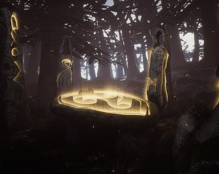
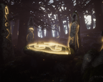
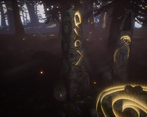
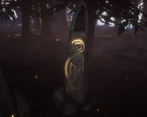
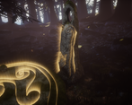
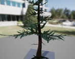
- Research & Development I like how you showed different ideas. Project outlines and the rest look interesting. There are interesting images from games and real world. You could explore some more history and mythologies; for example one example from Finnish nature that comes to mind would be 'Hiidenkirnu', or as English Wikipedia calls it 'Giants' Kettle' https://en.wikipedia.org/wiki/Giant%27s_kettle Some natural formations that feel eerily humanoid , to me, call out for a sense of mysticism, in similar ways like your celtic research. Creative Art The idea of magical runic circle is an interesting subject that calls for exploration. The markings look interesting and having lights to them adds an interesting touch. The scene right now is a bit filled with detail with not so much space for your eyes to rest. The fog could maybe be more present supported with maybe whims of it being drawn towards the subject. The emissive is a bit all around, and could benefit from some additional shader work to not appear maybe that uniform everywhere. Looking closer at specific references could help getting tree shapes, branches and such feel a bit more lifelike to support grounding the place into the real world. Also, having references of trees that support the feeling of the haunted, untouched forest could help nailing down some of the aspects. Having maybe two post-processing volumes there, first, unbound one, with a feeling of being drawn towards the circle and another one closer to the rocks might give an interesting flavour to the scene. The emissive could also maybe be bit less obvious from the distance (maybe flicker to some extent?) with the area being a bit more lit to call the player towards the rock. You know, a bit like with 'New weird' style. Technical Art Trees are a bit maybe too optimized, but the rocks could define their shapes maybe with lesser polycounts. Terrain also has an interesting tesselation going on, but doesn't seem to benefit a lot from it. Soundscape is an interesting addition. Particles work wonders to the scene. Documentation Texts are well written. The process is written and broken down well. Final Presentation Images show the scene well. There are good quality screenshots.
- Hello Fearghall Thomas, The idea about the scene is not bad, it worth more development though. Main issues with your scene is the lighting : it's too dark, we cannot see the details. The exposure is not set correctly in the postprocess. The bloom is a cheap effect when you apply it on all the screen, you should use a threshold between 0 and 1 and not negative. I wasn't able to see the project normally since the master material doesn't compile, There are a bunch of compilation errors there, so I get the checker texture instead. I cannot review more unfortunately. The texture folder is empty. Project organization is good, organized, nothing to say about this aspect. The "Idea generation" in pre-production is a good idea. It's not the most important part, but you should clean and try a more "clear" layout for your documentation. The current document is presented more like rough notes than a final presentation document. You should try to fix the issue with the textures then focus on lighting composition for this scene, try to get some mystic mood. You should lower the emissive of the beam lines you created, maybe focus more on the table and less on the side. You need to prioritize and give the instruction to the eyes to see the main actor. Quentin Papleux, Sr. Lighting artist, Sumo Digital
- Good level of reference though it would have been good to see more detailed annotations. Small tests of art style would also have been good to see. Really good to see lighting and camera angles in the block out though I think the scene would have benefitted from more refined geometry and the scattering of smaller assets as an early set dress. Great to see use of Substance Designer for tiling texture creation. The stone rune asset UVs could have done with massaging: generally seams are placed where the player is less likely to see/notice them. The trees look quite unnatural and the branches are too angular. Having the lighting blocked out in the beginning helped a lot. Some refinements that may help the final look: Break up the area behind the altar with more undulation in the ground; Darken the Skydome; Add volumetric fog and have it lit by the directional light to create god rays; push the fog starting distance back to separate the foreground from the background.
Challenge Tier
Sumo Digital Rising Star
Leave a comment
Log in with itch.io to leave a comment.


Comments
No one has posted a comment yet