


Play asset pack
Phil's gas station's itch.io pageResults
| Criteria | Rank | Score* | Raw Score |
| Technical | #8 | 3.750 | 3.750 |
| Creative | #10 | 3.875 | 3.875 |
| Presentation | #10 | 4.000 | 4.000 |
| Overall | #13 | 3.700 | 3.700 |
| Research & Development | #23 | 3.375 | 3.375 |
| Documentation | #25 | 3.500 | 3.500 |
Ranked from 8 ratings. Score is adjusted from raw score by the median number of ratings per game in the jam.
Judge feedback
Judge feedback is anonymous and shown in a random order.
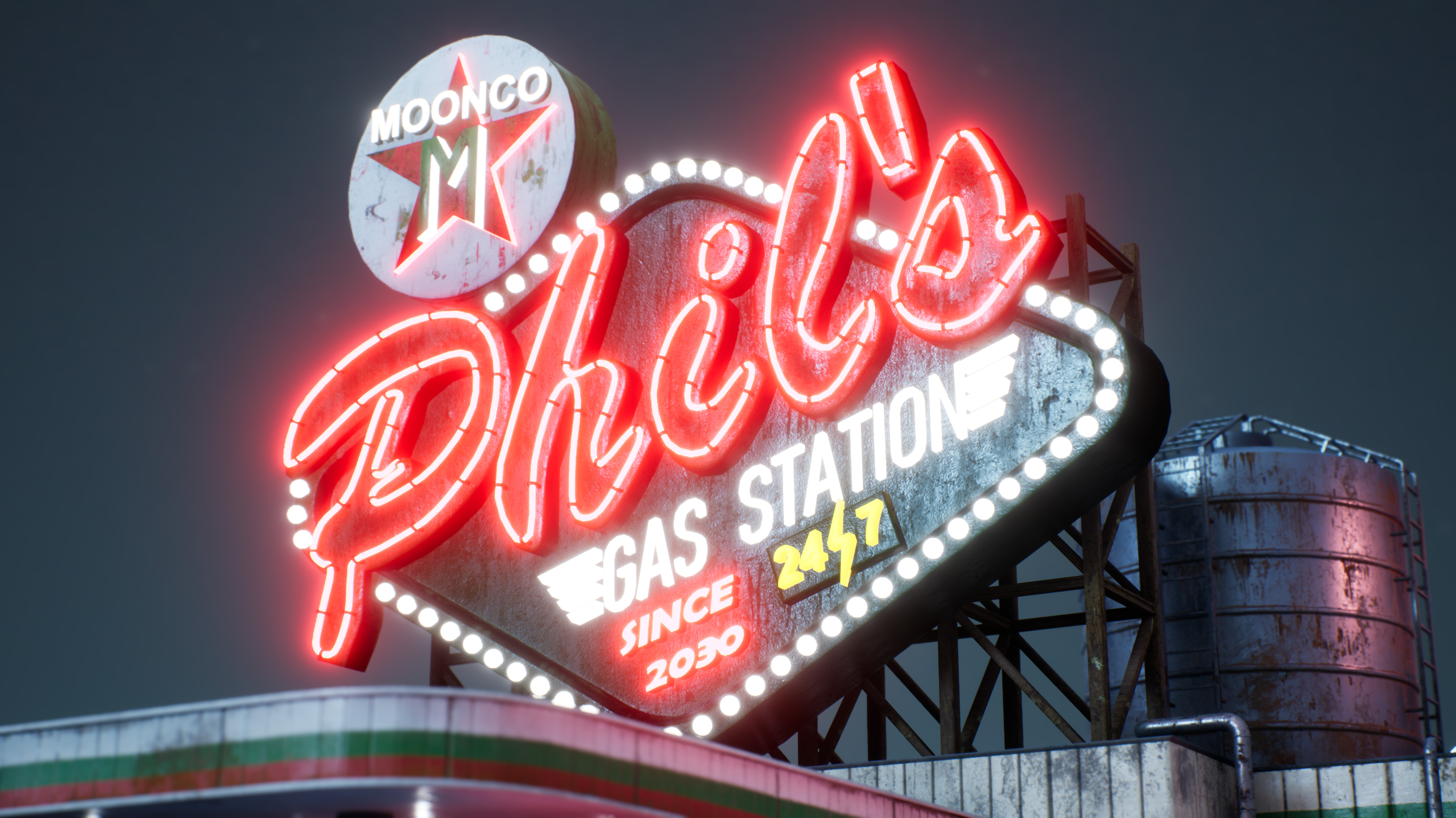
- Hello Kiril Zangagolev, First well done for your work, a lot of interesting things there. I would give you one important advice: Try to be more organized on your project, especially about naming convention (for the level or assets). Even if you work alone, bigger will be your project more it will be complicated to find the assets. You need always to think that you could have other people working with you, at the moment you're working on something "final" you should take some time to clean the project. The mainSING could be definitely more optimized. You are using light bulbs with too big polycount currently, for this distance you will barely notice a difference with a low polycount sphere smoothed (And you wrote a note about spline creation, making low poly since they're going to be emissive, why not there?). You could definitely improve the lighting and reflections in general to provide a better render, by putting smaller sphere reflection captures around the building (oil tank, ventskit...). You could also add some bump for the bricks (tesselation, ect) for close shots. Changing the threshold for the bloom to 1 to avoid the bloomy blur on all the picture, killing the details on the distance. In the bloom advanced pane, you should change the size scale to avoid this artificial bloom effect (restreint in the distance, not enough atmospheric). On the top of that, you could sharpen more your scene by using this command or to put in defaultengine.ini of your project to provide a clean render : r.Tonemapper.Sharpen 1 (or 2). In global, nice work! There are improvements from lighting side or texturing but it's a good project. Quentin Papleux, Sr. Lighting artist, Sumo Digital
- I enjoyed this scene a lot, nice work! There are a number of design and logistic issues which need to be addressed however. Think about how this space would exist in real life and how the world would interact with it. Make sure to collect and study reference on how weathering occurs and do not rely on your own memory and judgement. I have done some paint overs for you to help explain these points. Itch does not support image embedding so you need to manually paste this link. https://drive.google.com/drive/folders/1-98UyPNsQKtKQwZ1CAc6tP7tyPUfwW4X
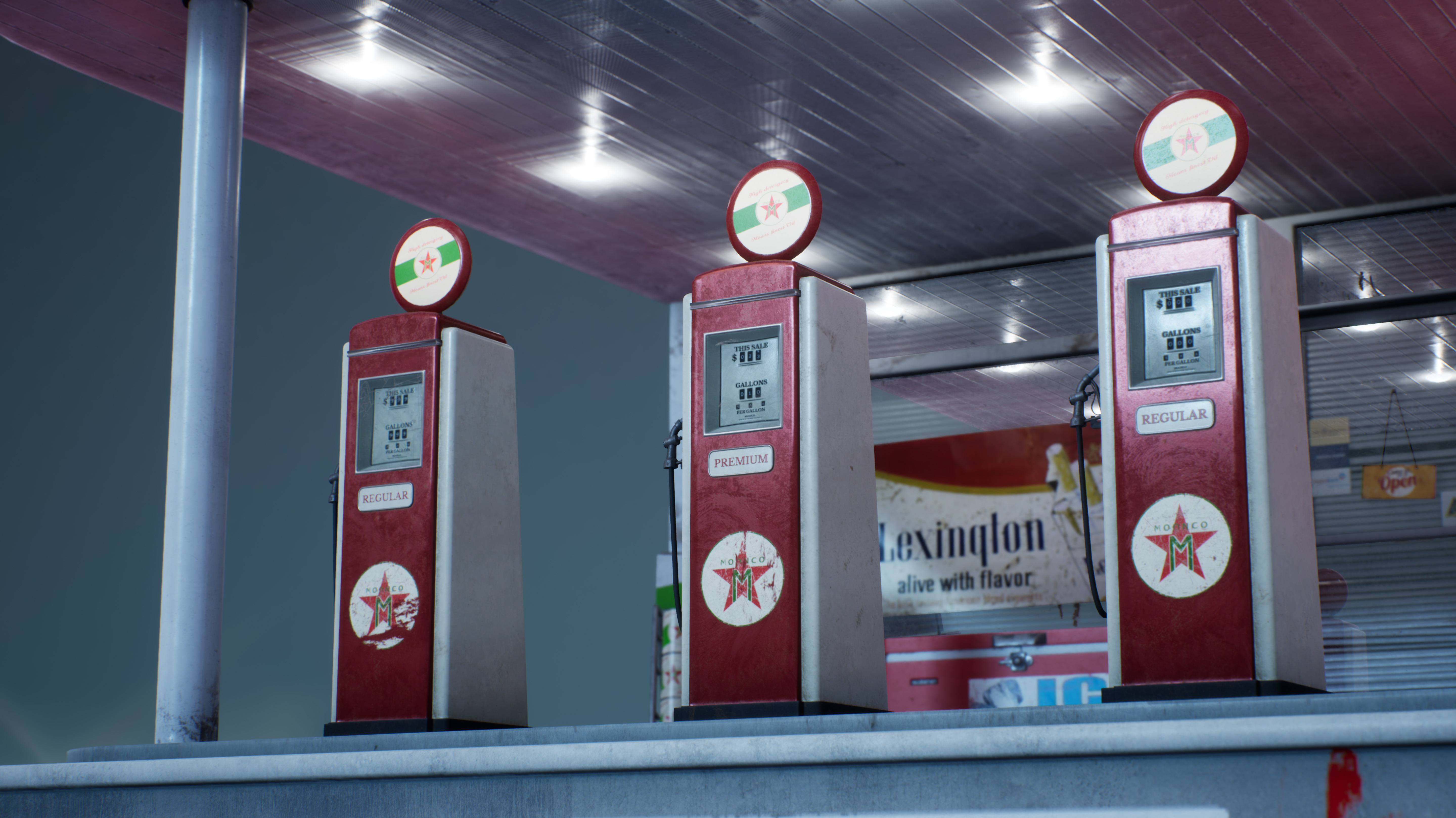
- Hey, First off, congrats for submitting! This is a cool rising star piece, really enjoying the concepts and the shots. Now to deep dive your technical, firstly, when I open your scene, I can see that your clouds are not rendering. The issue lies with poor setup of the fog sheets. The fresnel value you tried to use renders them invisible, remove that node unless you know what you are doing with it. Secondly, then the plane you are using causes issues, one because it appears to stretch your fog texture on the pink fog. I just replaced it with the default plane you have in there and it looks much nicer (scale 15 in X and Y, not X and Z to make it work). You can select every fog sheet and replace at once, also, it drastically reduces your polycount. The scene comes in at 1.4 million tris with the fog on, which for a scene this size is unnecessary. That reduces it to 682,000, which is still a little on the high side. This is when I noticed your cables, they are another 505,000 tris in the scene. Consider reducing the complexity of these, for what they add, they do not do a lot, I think the main thing to do would be half the mesh triangles in Max. And then for the final bit of optimisation you can be doing, please use LODs, the auto- computed distances mean you will barely notice the switch and if it becomes annoying then you can turn it of for very specific pieces where you might not want to see a pop. I would look at tweaking some of the settings on the window, and the props themselves do not hold up close up, so either fix that or don't show it. It also appears like someone had massive fingers and left a giant finger print on the pumps? Be careful that everything tells the right story for the scene. If we also take a look at the overdraw, by going to the optimisation viewmode, you can see you have quite an issue here, the best way in my mind to solve this would be to have a large pre-rendered background plane, with some smaller detail planes animating how you have here, otherwise using this much transparency will often kill a games performance without special techniques or optimisations. Overall you sold me on the image, I left feedback here because I really liked the story you told with the piece and want you to continue with it. Thanks, Chris Harper Snr Technical Artist @ Splash Damage
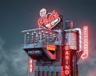
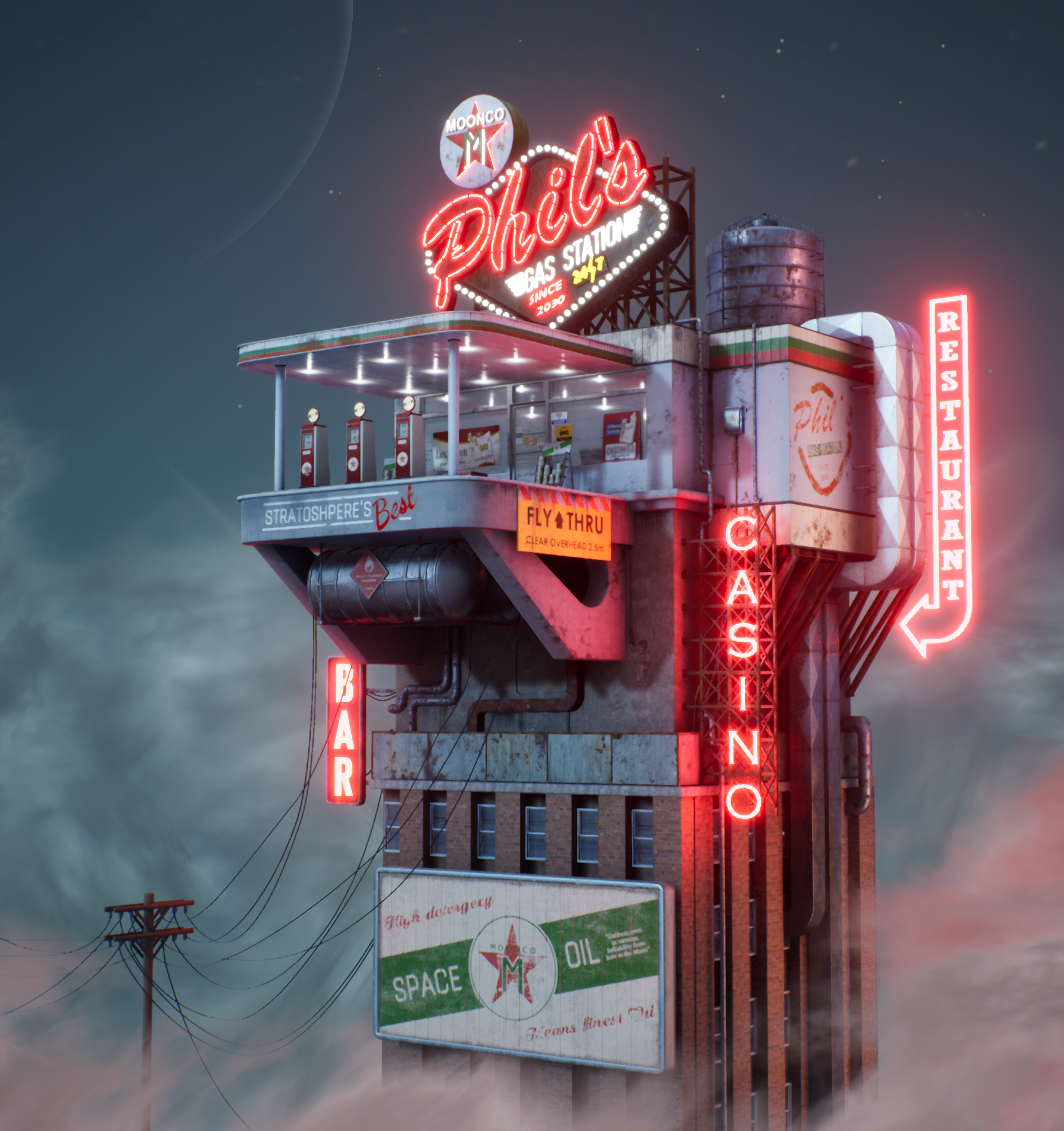
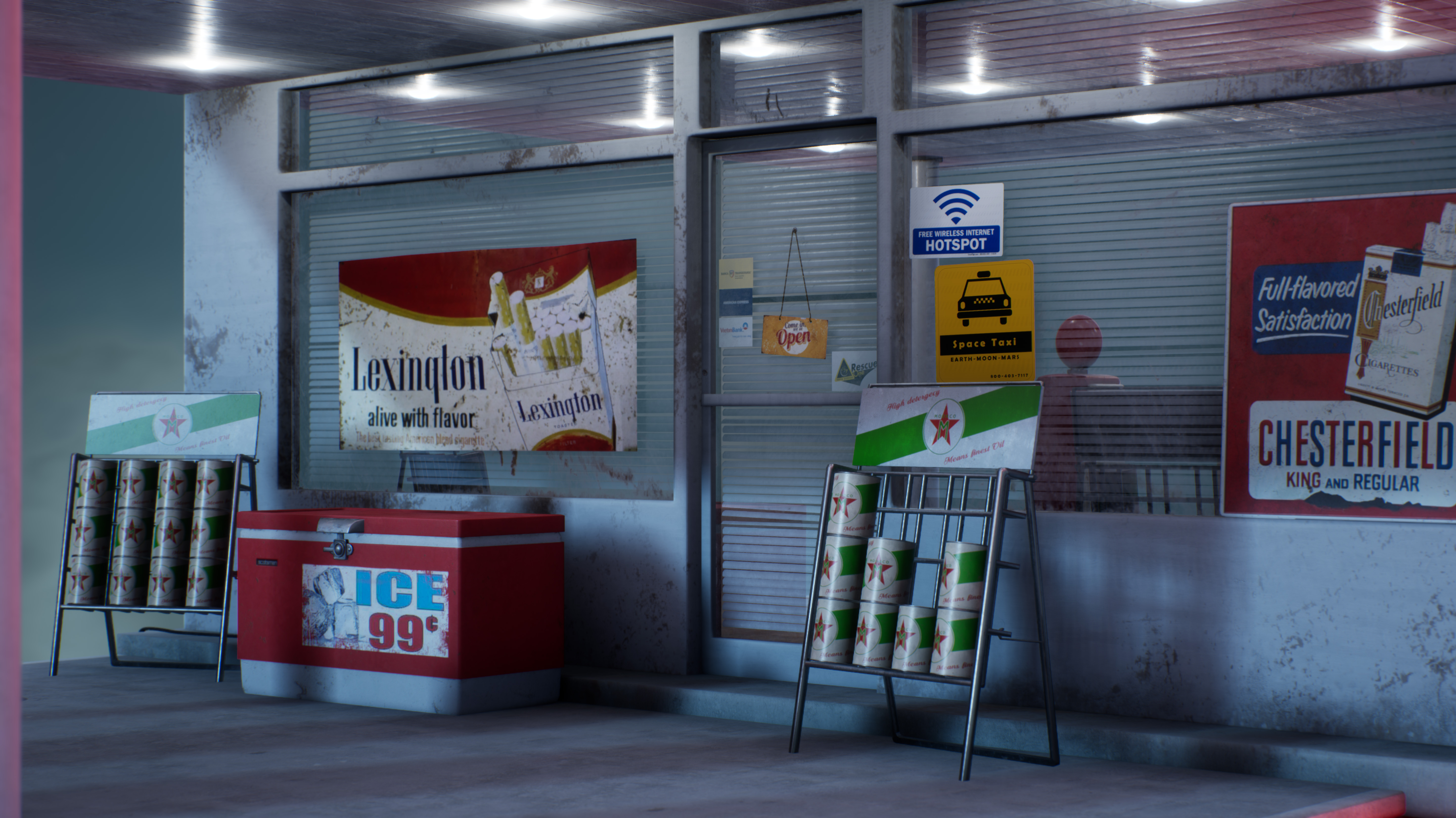
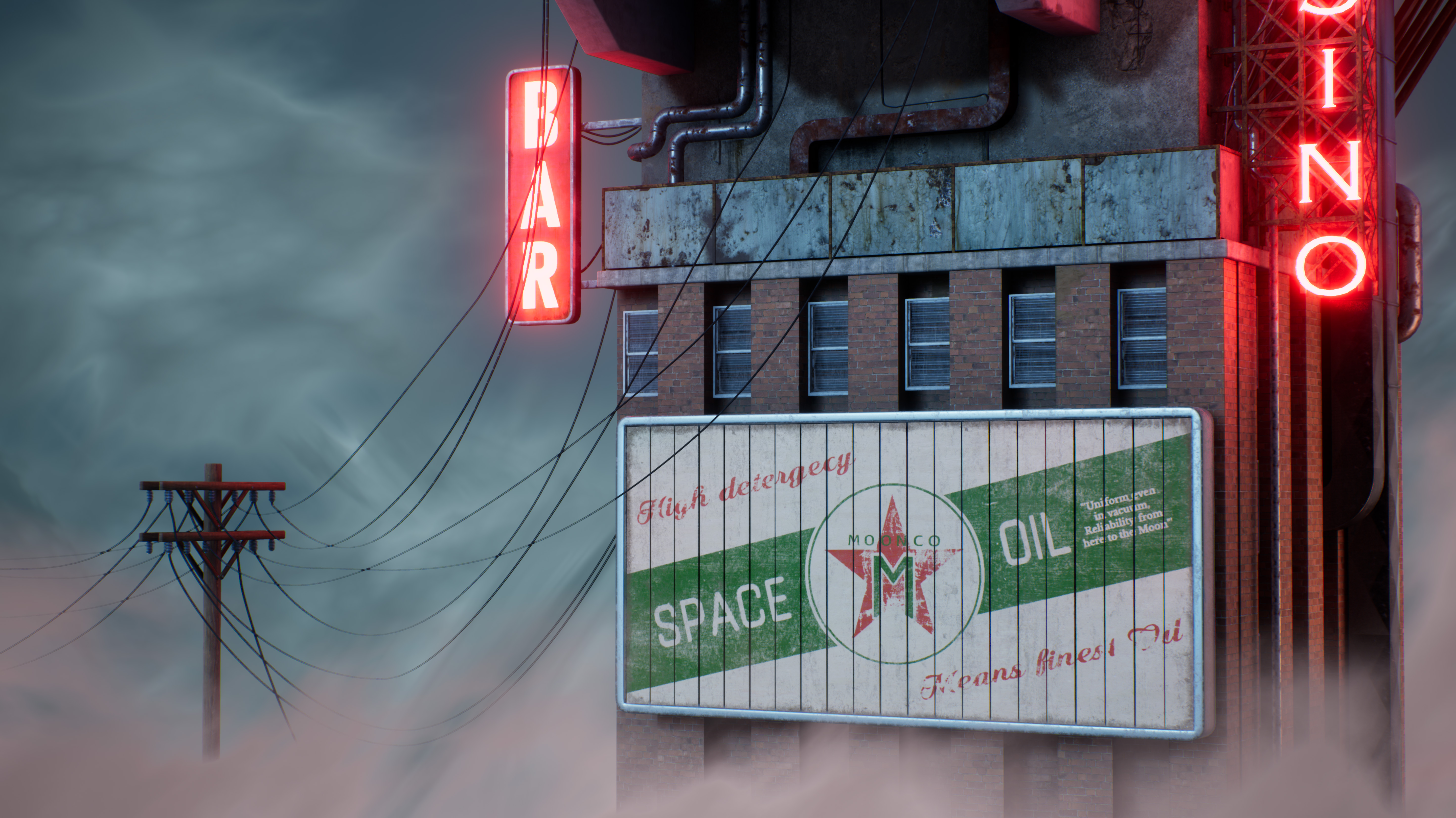
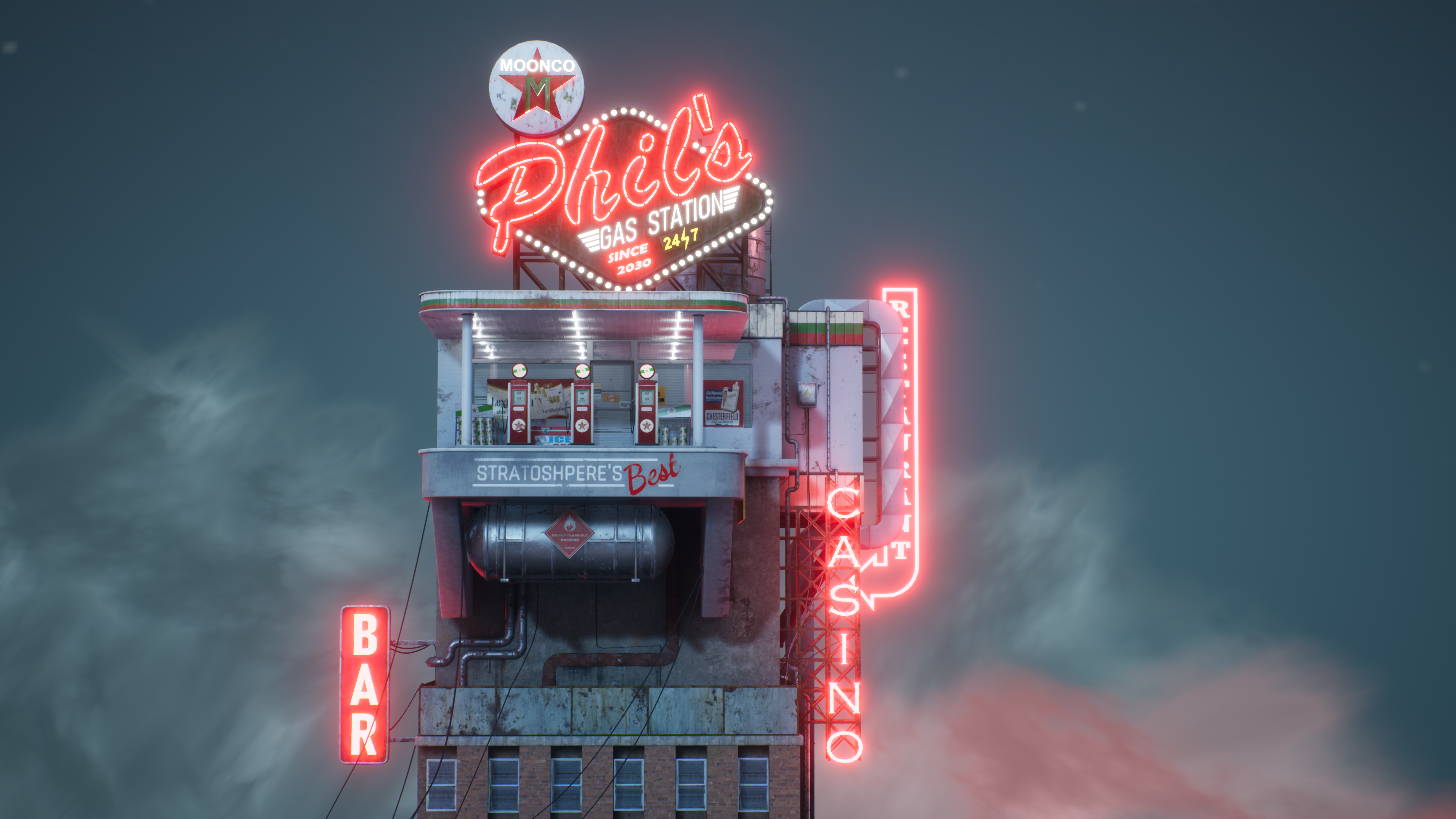
- Research & Development There's clear main concept and research into gas stations with similar aesthetics. Documentation is a bit light on prop, lighting and material references. Creative Art The scene looks great. Material distinction and color usage is great. Lighting works wonders and emissive surfaces add to the feeling. Retro aesthetics feel good. The scene hits it pretty close to the main reference. To take the scene to the next level, I'd suggest looking a bit more into how things are built in real life; like how window and door frames are built. Gather some good references and add border trim, and use concrete support thicknesses of real life to support structures in a more mature and real life like manner. For example, fly thru platform would be quite heavy in real life if made out of concrete, which is a bit against the cloudy sky like setting. The props feel a bit simple; looking for some more references would help with pushing that realism to the next level. There's some nice decal usage, but it could be pushed to add some of the grime to the models. Technical Art Masked approach seems interesting, but also a tad heavy with the material you're using. There are maybe too many parameters to adjust things with. Commenting your material graph would be considered a good bonus. Material attribute usage like this was new to me, nice one. Fog planes work well, but have lots of unnecessary (?) subdivisions; I'd suggest researching volume textures and raymarched heightmaps if you want to push those to the next level. Blueprint spline mesh is a nice approach to cabling. The scales of objects feel a bit cartoony, and not 100% in line with concept either. Documentation Documentation is short and sweet and lots of pretty pictures. Browsing through it was a very pleasing experience. Final Presentation The final images show the subject matter well and in high resolution.
- - Design looks great. - There is a lot of content on show given the limited time. - Overall scene composition, choice of camera angles for shots, use of colour palette demonstrate strong artistic skills. - Strong skills demonstrated in modelling, textures, lighting, graphic design for the advertisements and logos. - The scene itself seems very heavy for a real time environment, couldn't get it to load beyond 39% in unreal even with a powerful PC. Part of the skill of real time environment art is getting things to look great but be set up to be as optimal as possible. - Suggest adding some light to the gas pump displays similar to what would be found on a table top juke box. - Little bit of a normal map would be a nice addition to the bricks - The lighting and atmosphere works really well. - Really nice use of emissives for the neon. - In the documentation suggest showing images of the wire frame so modelling detail can be judged and texture page layouts, these will help with job applications too. Especially important given issues loading the project in unreal. - Given a lot more time / as a future update suggest adding a retro flying car. - Materials work well.
- Artist – Kiril Zangagolev Category: Sumo Digital Rising Star Assessor: Anthony O Donnell – Lead Artist at Firesprite Work name: Phil's Gas Station Research and Development /Documentation The document was well written and presented. Some insight was given to areas of the production process. The concept chosen was a really good choice. Technical Art Geometry The polycount on architectural elements is a little high for some bits but good generally. The fog sheets are excessive in terms of polycount with no clear reason as to why. An assumption is displacement / tessellation was intended to add volume to the fog clouds ? Channel packing was used and setup correctly. For assets which had baked normal maps there were visible bake errors such as gradients across large flat surfaces and faceting baked from shading issues on the higher resolution mesh. Materials and Textures There is appropriate roughness variation across the scene for different surface types. Considered grunge / dirt placement adds further roughness variation across the scene. Generally the environment has a grubby look in keeping with the concept. The layered material approach is interesting but comes at a heavier pixel cost. As it was unclear which textures were Megascans but a lot are from what was checked against the library I've not provided feedback on the specifics of the texture creation / quality. Creative Art The artist has done a good job in recreating the concept. There are some proportional / relative scale issues but they are minor really. A few wall surface have a noticeably lower texel density than the props placed on them. The use of decals does add a lot of variation to the scene quickly with little repetition. Final Presentation The final images look great and the work is a pretty faithful reproduction of the concept aside from a few details such as the accuracy of the sign design , "chunkiness" of details and level of dirt / grunge in the concept. It's a very strong piece overall which succeeds in matching the concept.
- Submission Title: Phil’s Gas Station Submission Tier: Rising Star Assessor: Dominic Shaw Artist @ Firesprite Research & Development The chosen concept is pretty interesting and you have done a good job and matched the concept pretty well. I would have liked to see asset lists and time plans in the documentation as I think that this is a really important stage of any project. Creative Art Overall, this is a really good attempt at making this environment and the final images are pretty appealing and are presented well. You’ve done a good job at matching the concept and I’m pretty confident that if you were given a concept in a studio environment that you would be able to make it. Technical Art You show a really good knowledge of the workflows that you need to make environments, the layered assets workflow is pretty cool and you have broken up the props quite well. You have some really good shader knowledge and have made the environment quite efficiently with the master material and channel packing. The one thing that sets this project back for me is the fact that you used Megascans assets for your tile-able materials which makes it hard for me to judge how good you are at creating tile-able textures. You have a good understanding of vertex painting and setting up the textures but I would prefer to see some Substance Designer work as I think this would be much more beneficial. I understand that there are time constraints for this project but Substance Designer is a great skill to have and not every Game studio will allow you to use the Megascans library so you can’t rely on this. I think that in the future you should keep using your same workflows but use your own textures instead of the Megascans library. I would stay away from Megascans completely in your portfolio as this is where you are proving to people that you can do the job. Other than this, the project is a really good environment and you should be proud with what you have made. Documentation There is some good prop and workflow breakdowns in the documentation which gave me a good insight into how you approached making this environment. Final Presentation The final images are presented really nice and the image is very eye catching and appealing. You have matched the mood, composition and lighting pretty well from the original concept and the overall quality of work is pretty good. Moving forward, in future projects, I would love to see some Substance Designer work from you and also a project where you are working from your own concept/ idea so that employers can see how well you understand mood, composition and lighting as in this case, the three aspects was provided to you in the concept
- I like that you chose a concept to follow but try to back it up with other reference. It would have been good to see more annotated references too. Good to see a rough block out but try and build it in the engine with as much detail as you can at this early stage. I do like that you got setup up your lighting and fog early on. Your models look good (though I can’t judge the wireframes). Make sure you use hard and soft edges (and split you UV islands accordingly) to stop any weird mesh shading. Good to see the use of RGB masks in your materials. It would have been good to see a breakdown of any tiling textures you did create. It would have been good to add in discarded debris/litter on the floor of the gas station to help make the place look more lived in. Good use of PBR. I like the lighting and that you have the bright neon lights against a moody background. It would have been good to have them slightly different hues and perhaps a few with broken elements.
Challenge Tier
Sumo Digital Rising Star
Leave a comment
Log in with itch.io to leave a comment.
Comments
No one has posted a comment yet