

Play asset pack
Shrine Of Ganesh's itch.io pageResults
| Criteria | Rank | Score* | Raw Score |
| Presentation | #1 | 4.545 | 4.545 |
| Documentation | #2 | 4.364 | 4.364 |
| Research & Development | #5 | 4.000 | 4.000 |
| Overall | #5 | 4.145 | 4.145 |
| Creative | #6 | 4.091 | 4.091 |
| Technical | #9 | 3.727 | 3.727 |
Ranked from 11 ratings. Score is adjusted from raw score by the median number of ratings per game in the jam.
Judge feedback
Judge feedback is anonymous and shown in a random order.
- The feedback for yourself from me is quite simple: I admire the work you did in the short space of time and it's very clear you are already well on the right path to being able to be "industry" level. I recognise the time constraints and reasons for only using decemated models, however, that being said, it's great for a prototype or something you need to make fast, but the way in which zbrush decemates is pretty nasty and creates lots of poles, which are the little stars you see everywhere, which can mean you hero piece probably has about 8x the amount of polys than it needs to look the same. So as a Tech Artist, i'm saying this is really wasteful for production. I'd advise retopo or at least look into ZRemesher for Ganesh, and also take a look at your pillars, the bases are super high poly for the detail they have, again probably because of decimation, and the scene can be greatly optimised. I gave 3 stars to creativeness because I felt that the scene was quite sparse, it didn't offer a huge amount of storytelling as well. That being said, it's very clean and well presented. You could potentially do with looking into light propogation, and increase the light bounces to two, or for simplicity of this static scene, raising the gamma of the shadows, they are too dark and it creates very black areas. In addition the volumetric fog murders performance, this doesn't matter for visuals, and it's unlikely you'll be editing that stuff in dev, but it takes up 20% of my total GPU power and I have a 1070Ti. If you want to not melt peoples machines, maybe consider tweaking the settings. Documentation and presentation is very clear and it looks lovely, so congratulations, you should be very proud. Really great. Chris Harper Snr Tech Artist @Splash Damage
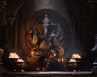
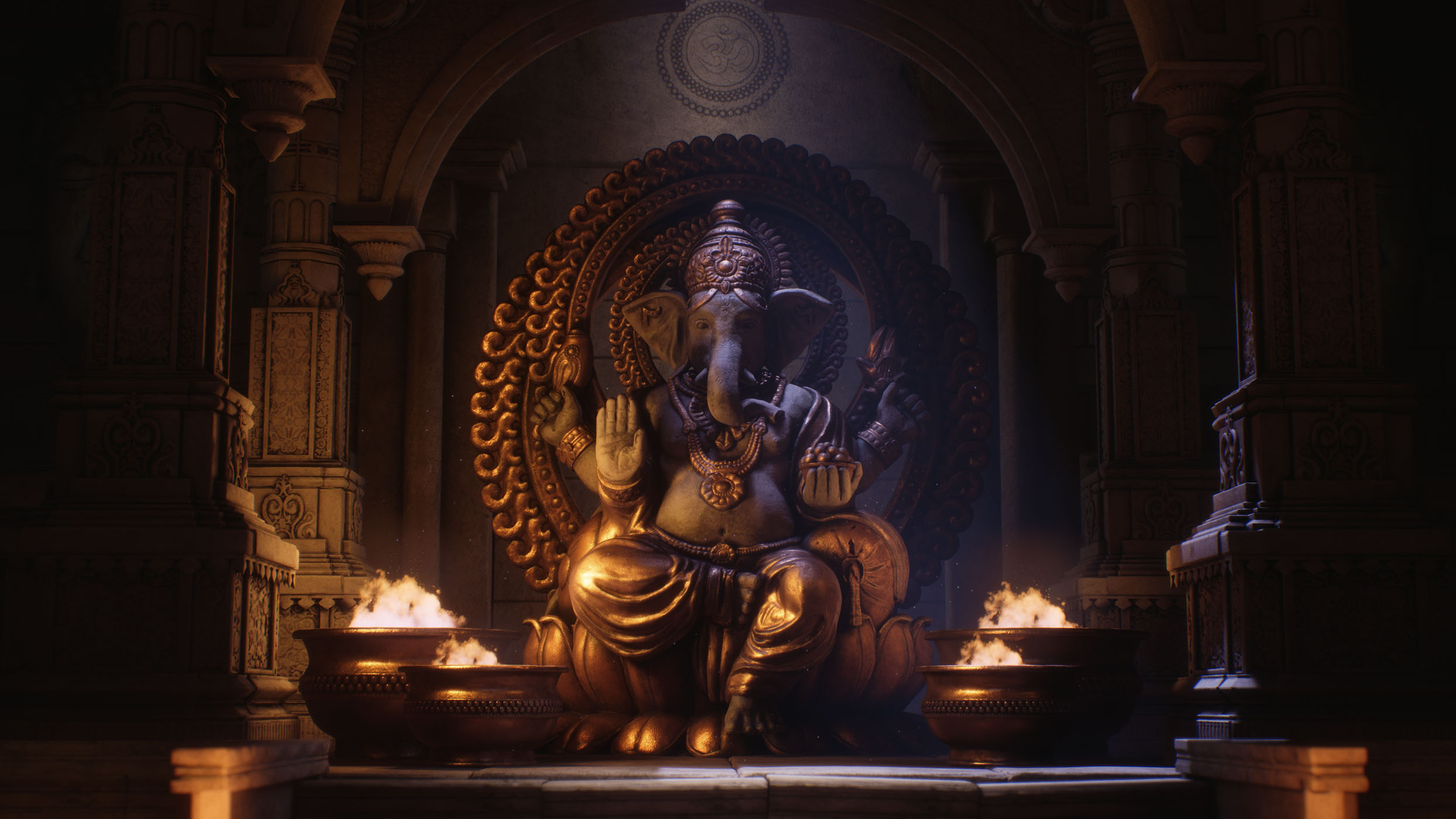
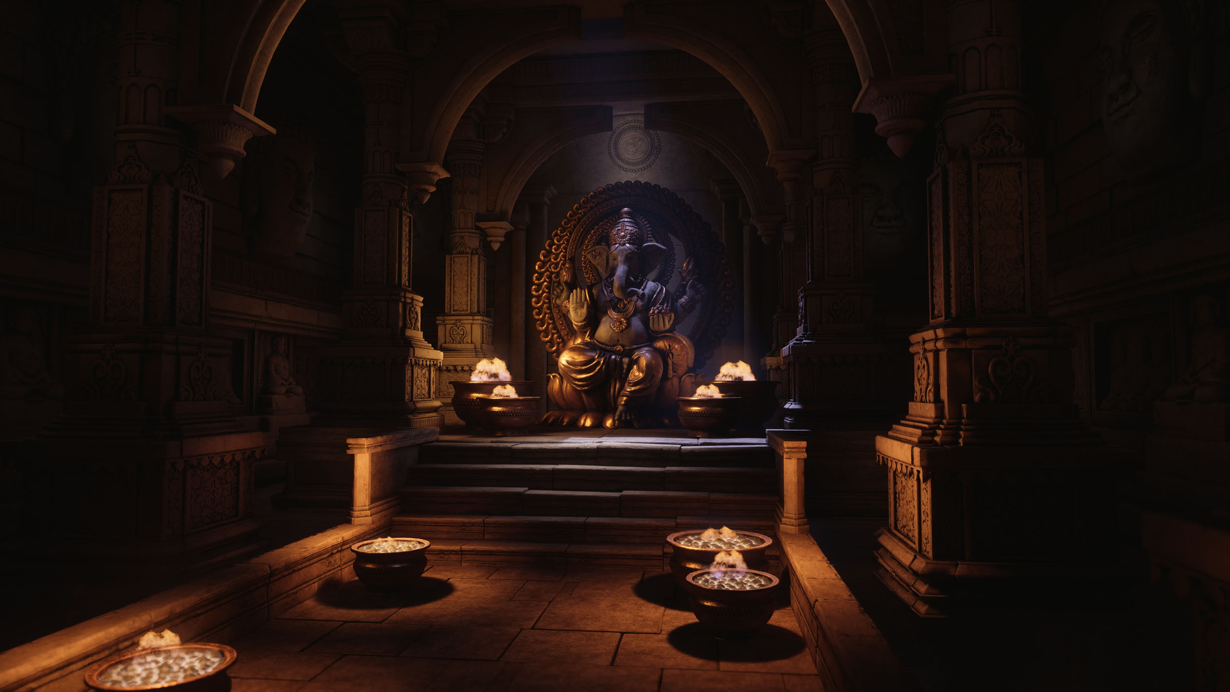
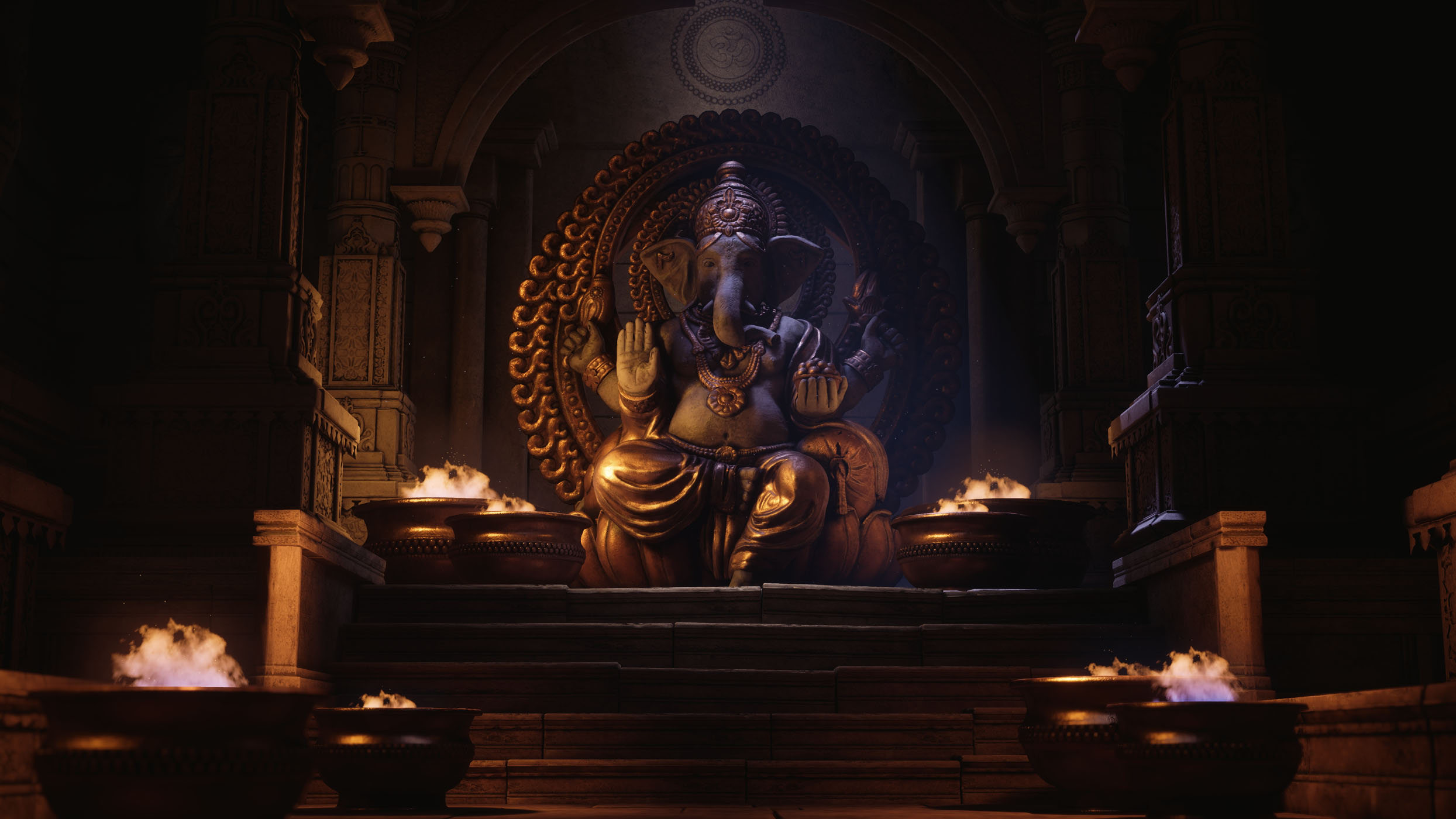
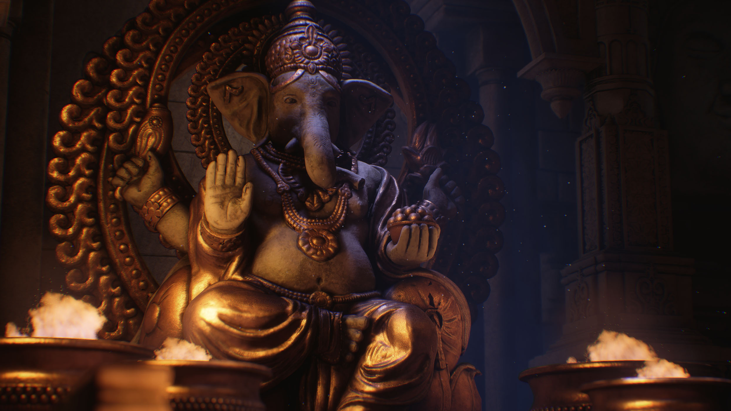
- - The lighting and atmosphere from the dust particles is excellent - Good use of effects with the flames to help bring the scene to life. - Tri count extremely high for a real time environment, further development would be nice to see some heavy optimisation and examples of wireframes in screenshot to show clean optimal modelling especially important for industry job applications. - The materials in general work really well showing stone and metal elements lots of contrast and interest. - Further development include some food offerings and incense sticks with smoke vfx. The food offerings will help demonstrate natural modelling skills. Some fabric / cloth in the scene would be nice to see too. - Art bible and documentation is excellent with lots of detail. Nice to also see the scene planning.
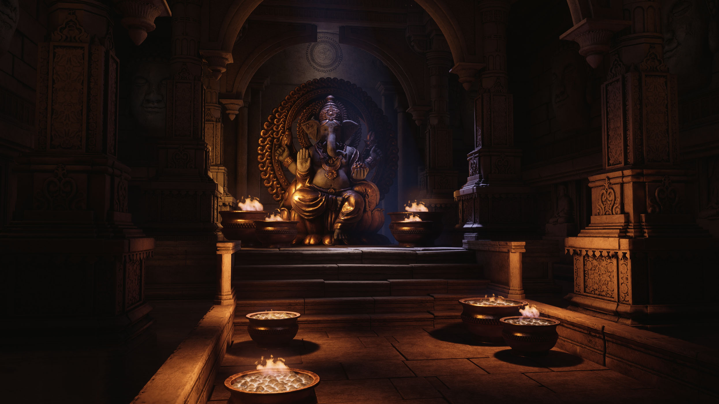
- All the images are a little dark and could do with a slight value shift. Check your histogram range! I enjoy the colours and think they fit the scene well, however, the orange is a little too dominant and puIling focus away from the main subject. If you squint your eyes or look at the images very small, you can see what I mean. The brightest areas are the stairs leading up and the statues knees! With some slight adjustments to the intensity of lights, I think you can bring focus back to the subject. Other than that, your next step will be to add some subtle details to ground the whole environment together. I have done some paint overs to help explain. Itch does not support image embedding, you need to paste this link manually. https://drive.google.com/drive/folders/1-3mGi79KxHTZSSxLw4kjFPgyZfvRotAg
- Great to see lots of reference and it annotated. I also like that you drew out a rough plan to what you wanted to achieve. Good to see an asset list. It would have been good to see more of a block out before diving into production. Sculpts are excellent though the game meshes could have less geometry in them. You might have found it easier and quicker to bake the sculpts into trim sheets to use around the scene and in your modular kits. The lighting really brings the scene to life; the colour contrast works really well here. I also like that you have some unevenness in the steps. Although a small detail it adds a lot to the scene. Great work!
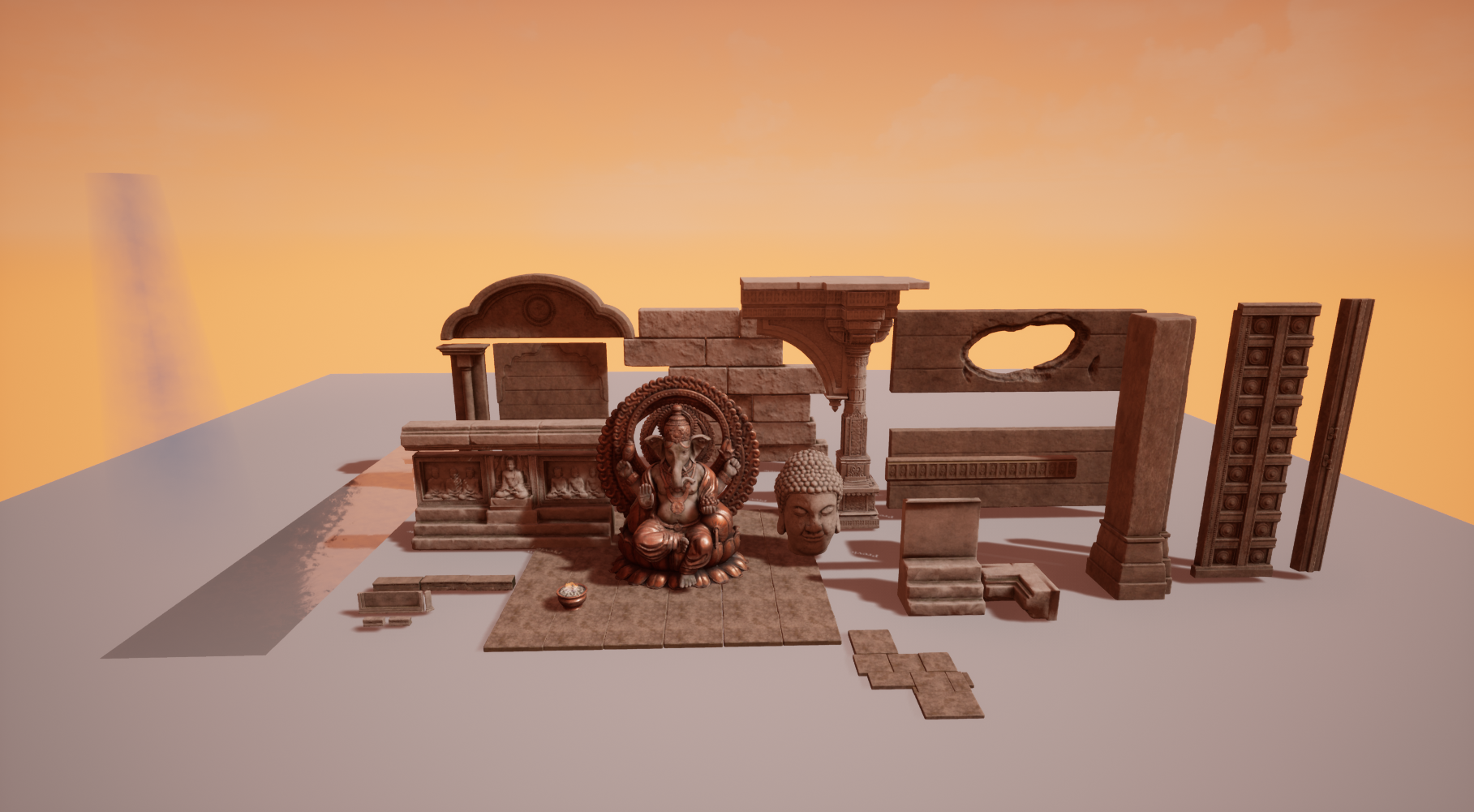
- This is a very strong piece of environment work, one which I would say is of a professional standard that would not look out of place in a modern AAA game. The planning and documentation are both meticulous and well explained, the workflow well executed and allied to the clear creative talent of the artist, has produced a standout entry to this competition. I also like the amount of thought given to the more technical aspects, such as LOD's, texture and mesh re-use, master materials and mesh culling. None of this is 'sexy' but is all very important for an artist to understand once they are working in the industry. This artist clearly has a solid grasp of those aspects of the craft, which go a long way to making the difference when a company is deciding who to hire. In terms of feedback, there's not much, but I would say: - The scene could do with some colour accents. The lighting is offering a nice counterpoint to the brown/orange of the scene, but it still needs some smaller details. Look at the Uncharted reference - those environments are careful to include other colours to help introduce visual interest. The red plaster walls, green vegetation, jade globe and desaturated stone paired with gold all help produce a more varied palette. It's a small thing - in this scene, it could just be some votive offerings around the base of the statue, or perhaps some jade trims or patterning to help offset the brown and orange - but it really helps make a scene come alive. - The stone work could do with more tonal variation - the shot of the individual assets illustrates this, as all the stone work is of the same tonal value. The floor tiles for instance all look identical. The example of stone flooring in the art bible shows stone with both tonal and a degree of hue variation. Objects gain different tonal patinas with age, despite being made of the same material. - It's relatively simple to animate light intensities in Unreal, via a light function material. Having the fire bowls light flicker would really help with the atmosphere.
- Research & Development: Great choice of subject to make the environment from and the narrative of having a hidden underground place of worship provides a nice opportunity to really bring it to life. You’ve got a great selection of references to work from and made reasonable choices for which key assets to work on for the scene in the allotted time. You touched upon your influence for the environment, and the research into other temple structures & lighting that you’d like to have all works nicely together and I can clearly see how you arrived at the final concept. Creative: The composition is great, the structural elements & lighting frame the key focus and draw your eye nicely to it. I like the detailing in the walls and pillars is great, and you have nice reads with the large, medium and small details. The push the scene further, you mentioned in your art bible that it isn’t particularly well kept. Though I do like the scene being generally clean and easy to read, it would be nice to add to the idea of it not being as well kept as it is. E.g. plants/greenery growing out from crevices, maybe hanging down from where the directional light is coming from, the use of subtle decals to breakup the floor a bit more, maybe there is a bit of damage to the structure to show it’s age a bit more. Having said that I know it would have added a lot more time to the development, and so I think that what you’ve achieved is wonderful. Technical: I was surprised to see the amount of lights used to achieve the final lighting as I would have tried maybe to play with the bounce light settings to brighten up the sides rather than having a lot of fill lights as it’d be more physically correct and easier to manage, though I can understand why you chose to highlight them in this way and it still works nicely since you’d expect blue bounce light anyway. The scaling feels good with nothing looking out of proportion, the zbrush & designer workflows look good with the lighting and effects adding a lot to the scene. The meshes are on the heavy side and it appears as though the dense triangulation meant that UVing it was a bit tricky as there’s a few notable issues with stretched textures and areas the islands haven’t been split in a reasonable place showing light bake inconsistencies. Ideally you would retopologise, UV & seam appropriately ready for the HP bake. That being said, it is a small scene and not a game, so the time saved might have been worth it since you wouldn’t notice in the screenshots without getting up close. Overall the base colours are good, though I’d keep an eye out on those black areas in the unique mask for the pillars to make sure they don’t go below 40/255 as this wouldn’t be physically accurate. Presentation: Presentation is very nice, it’s all composed nicely, the warm-cold lighting works great and has a good degree of contrast to really make the overall shots pop and have depth. The documentation was nicely laid out and easy to read, and the downloadable asset files were organised neatly. Documentation: The project is very well documented, you’ve included how you’ve tackled and approached everything, you’ve blogged quite often throughout the project at different stages showing the progression. It’s great to see the workflow you used to make the assets and have included annotated screenshots of the WIP’s along with your thoughts and reasoning.
- love the scene and lighting however I think the fire particles need to be more diverse, and not so generic. What if one of them is off? what if that one that is off has made the scene smoky? The movement of the camera is great but pay attention to what you are placing on the foreground.
- Artist – Kyran Roe Category: Search for A Star Assessor: Anthony O Donnell – Lead Artist at Firesprite Work name: Shrine of Ganesh Research and Development /Documentation The art bible , blog and document are very well presented giving a detailed insight into the creative journey of the scene. The art bible was very clear and on point with well chosen references picked to purposefully guide the work. Many of the decisions made at this stage are evident in the final environment. Planning was sensible and managed well. A clear iterative blockout process was followed to establish the scene complexity and composition early on. Technical Art The large pillar mesh created in Zbrush was well done but could also have been done with a mix of trim sheets and baked elements also. As mentioned in the production document decimation master was used for the models. This would be my main issue with the scene. Also areas like the pillars with the reliefs the detail could have been done via normal map use or parallax occlusion mapping. Even with decimation master the statue could be more optimal. Materials and Textures A master material setup was used with exposed parameters. The use of material instances too. Roughness and AO maps were not set to linear. Channel packing wasn't used. Material definition on the Ganesh statue is nice with considered variation in the roughness maps. This was not applied across the other surfaces in the scene which are more uniform. This could be an area with more time to improve the piece further. Creative Art The quality of the assets created is high. Each element of the scene was produced to a really good level. Strong observational skills along with artistic skill allowed the assets closely match the reference. Final Presentation The final piece is well crafted with strong lighting which come together to create a very high quality final piece of work. Tackling such a mix of organic and harder surface assets can be very challenging. Kyran managed to hit the quality bar he aspired to. Well done.
Challenge Tier
Search For A Star
Leave a comment
Log in with itch.io to leave a comment.
Comments
Research & Development
Creative Art
The scene looks like a very high quality piece of art. I was stunned by seeing how simple the sides of the temple and textures were. The color coming from lights adds a lot to the scene, and makes it very pleasing to look at.
To push it further, you could implement vertex blending, decals and introduce some sharper looking breakage and edges to the rocks. Also, as simple as the cavity mask approach to the baseColor is, I'd suggest not to do too many things maybe with it. The end results might look cool in Unreal, but the results might vary in other engines. You have very nice looking sculpts on top of which you could add some more unique texturing into the mix as well, or when it comes to this scene, maybe with more mask based approaches.
Effects also add a lot to the scene.
Technical Art
The scene is pretty heavy polycount wise, but the texture cheap approach keeps the scene running well on a today's PC. Lighting and effects also add a lot into the scene.
Documentation
There was a lot of nice thought process within the art bible, blogs and project documentation. Workflows were documented nicely, and the shaders were broken down in the documents.
Final Presentation
Final presentation looks very nice with lighting, contrast materials looking and working very well together. The elephant in the room *cough* looks very good and the metallic additions add a lot of interest to the end result.
Thank you very much for this awesome feedback!
I wish you the best, and hope you could make out some parts what I was trying to convey through my text. If there's something that you'd like to ask about, you can also reach out for me through other medias such as ArtStation or Twitter.
Cheers!
-Teppo