


Play game
Ayleid Ruin's itch.io pageResults
| Criteria | Rank | Score* | Raw Score |
| Creative | #11 | 3.833 | 3.833 |
| Presentation | #20 | 3.500 | 3.500 |
| Technical | #22 | 3.167 | 3.167 |
| Overall | #29 | 3.133 | 3.133 |
| Research & Development | #36 | 2.833 | 2.833 |
| Documentation | #65 | 2.333 | 2.333 |
Ranked from 6 ratings. Score is adjusted from raw score by the median number of ratings per game in the jam.
Judge feedback
Judge feedback is anonymous and shown in a random order.
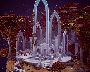
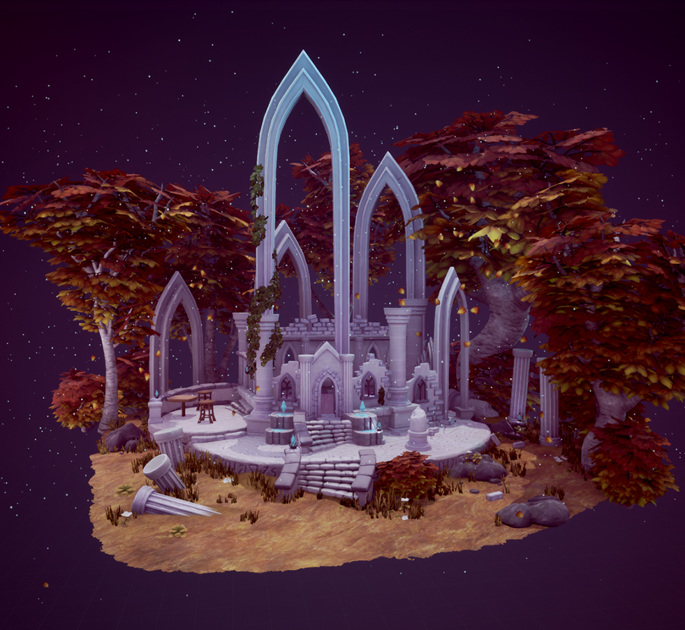
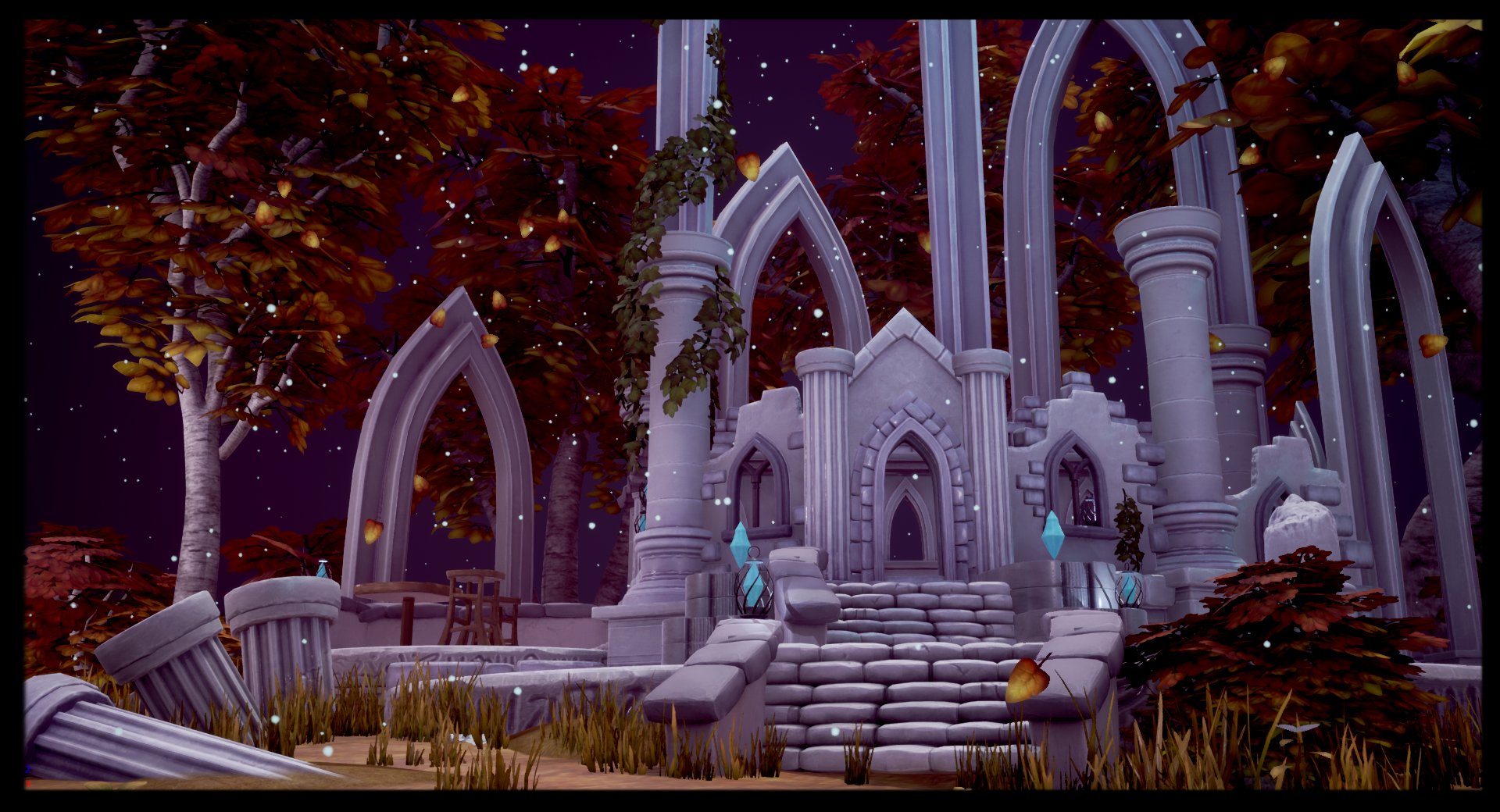
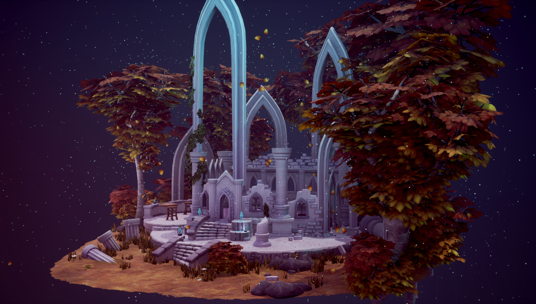
- It would have been good to have a break down of the reference you found; what you liked/didn’t like. I like that you’ve drawn out a picture of what you were aiming for and have added colour too. The block out looks good and there’s a good amount of detail in it. I also like that you painted over a screenshot of the block out to really hone into what you wanted to create. I can see that you’ve highlighted some props and the workflow in your documentation. It would have been good to see more of this and your scene assembly. Your trees would have benefitted from having more angled fronds. Look at real-world references for this sort of thing. Your model sculpts look good but I can’t comment on your in-game geometry as there aren’t any wireframes. I can see the colour scheme coming through from your screenshot/paintover but I think you could have pushed it further. The scene arrangement and set dress looks good and I really like the alpha edge to the plinth and that it’s floating in a starfield. Good work!
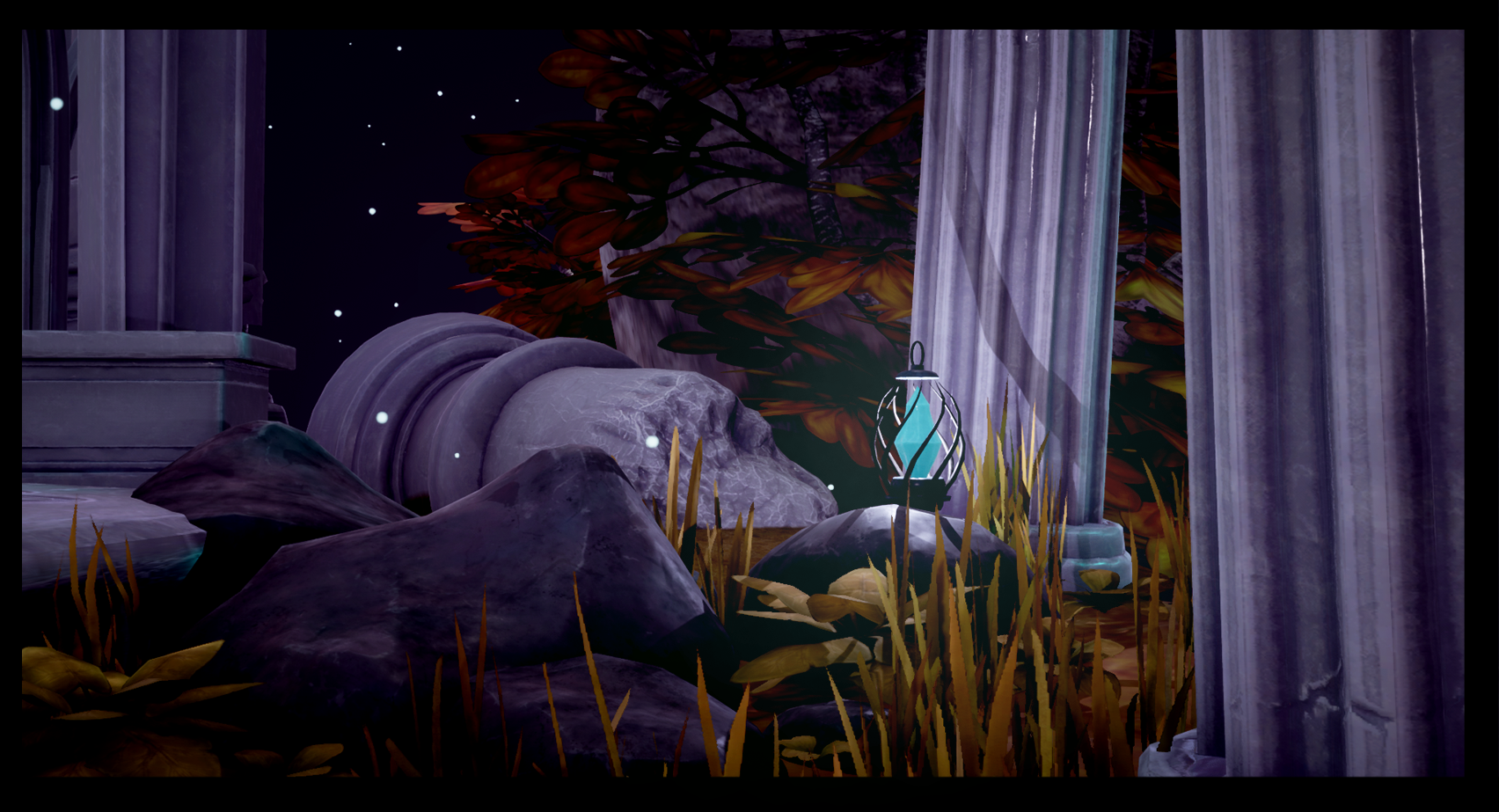
- This is a polished and accomplished piece of environment art, impressive stuff! The composition is strong, with a good mixture of detail frequency and form scales, from the large arches down to the steps and lanterns. The subdued palate helps convey a peaceful atmosphere, and I like the combination of man-made and natural assets, it's a good balance. Even if the documentation was written at 23:57pm, it still did a good job of explaining your processes and thoughts. In terms of feedback: - There is a strong ambient level of lighting which I think is flattening off the whole piece. I think it could benefit and would look more striking from having smaller, more intense areas of lighting to help move the eye around. I would be inclined to light the lanterns/crystals (make the blue crystals fully self-illuminated), have pools of illumination from them, darken the rest of the piece and maybe have an angled directional light simulating the moon catching the arches. - The stonework could do with a bit more hue and tonal variation. I know it's stylised and not intended to be grungy/realistic, but it's all very similar in hue and tone at the moment, ruins display more variation thanks to weathering - this can be represented even in a stylised form. - Trees are very, very difficult. These are a good attempt, but there are leaf scale issues - leaves don't vary much in scale on trees, even stylised ones! The leaves at the top of the trees are rather large in comparison to person scale details, like the stairs.
Challenge Tier
Search For A Star
Leave a comment
Log in with itch.io to leave a comment.
Comments
Research & Development
The fantasy aspect shows in the research and reference. Closer detail from real world reference is a bit lacking in the Documentation, but the end results look nice and stylized.
Creative Art
The scene reads well, and looks like a nice scenic, stylized turntable. The scale gets maybe a bit lost with the stylized decision, but the end result with nice contrast in color usage makes it very pleasing to look at and gives a magical feeling along with particles and gradating color hue and value. The gems also add to the magical feeling. The bushes and grass also add nice feeling, separating the structure and ground from each other.
Technical Art
These are definitely game-ready assets. It was nice to read about tackling the particle system, it really adds to the scene. The lighting works well, and the renders look nice and crisp. For Stylized assets and scenes, I believe the goto workflow really is still Zbrush paired with Photoshop or Substance Suite. Scales might be abit funny, seeing as how table and chairs are the same size as the door in the middle parts, but that's probably a style decision, right?
Documentation
The font is a bit hard to read, but the thoughts have been written very well in a brief format. I would have wanted to read a bit more about thought processes, but apparently your time limit prevented you from doing that.
Final Presentation
The quality stands out, the color and shapes read very well and it feel very magical as an environment.