Play asset pack
Skipton's itch.io pageResults
| Criteria | Rank | Score* | Raw Score |
| Creative | #73 | 2.000 | 2.000 |
| Research & Development | #75 | 2.000 | 2.000 |
| Presentation | #82 | 1.714 | 1.714 |
| Overall | #83 | 1.771 | 1.771 |
| Documentation | #83 | 1.571 | 1.571 |
| Technical | #85 | 1.571 | 1.571 |
Ranked from 7 ratings. Score is adjusted from raw score by the median number of ratings per game in the jam.
Judge feedback
Judge feedback is anonymous and shown in a random order.
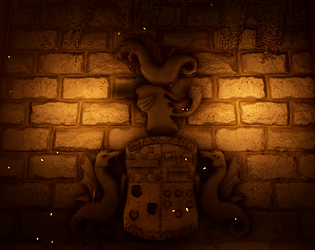
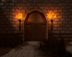
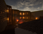
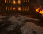
- Research & Development The courtyard at Skipton castle is really interesting subject, as it is fairly in tact compared to many other castles which are in ruins. However, I am not convinced by the idea to mix it with the Dark Souls aesthetic, which has a very stylised and unrealistic take on this stuff. I think these two ideas are more or less in conflict with each other, and betrays quite a muddled approach. It would have been far better to just go with the reproducing the courtyard as is, and making it as realistic as possible OR making a high fantasy stylised castle courtyard. There is some decent reference gathering in evidence, but it merely illustrates the above point - that these two aesthetic goals are incompatible. A really good piece of concept art could have proved me wrong, and shown how they could have been brought together, but this was not attempted. Technical Art The project is very weak on a technical level. There is not much evidence of an understanding of modular design. The modelling is very basic, barely more than blockout for the most part, and looks unfinished. The materials are of a poor quality. The stone is noisy and unrealistic. It looks more like concrete. There is virtually no attempt to engage with the surface - for instance differentiating between stone and mortar. There is little understanding of designer evident. The cracks on the brick in particular look really bad. Overall the colours are way off, there is little evidence of any understanding of PBR and realtime rendering. It is a pity because the actual reference shows a great depth and variety in these surfaces - for instance the sandstone walls show different colours of sandstone, pinks and reds and greys and greens and so on. Zbrush is mentioned in the workflow outlines, but I struggled to see where it had been used. There were at least two really perfect showcases for a really nice sculpt and bake - the crest and the wall around the tree. Neither looks like it has been sculpted at all in ZBrush, neither looks like it has had any time spent on it at all. The stone walls could have been a really strong statement, having such good reference from the Skipton Castle shots. You can see that the stone is dressed and finsihed to quite a high quality, and is quite sheer and smooth. However what we get in the final project is a default to the standard and cliched lumpy bevelled stone wall. Creative Art There is very little evidence of creativity in this project. Despite starting with some very rich source material, the final result is disappointing and underwhelming. There was no engagement with the aspects of the reference that were so interesting. For instance, the pebble cobblestones under the well could have been a really awesome designer show piece, but wasn't attempted. The tree in the centre of the courtyard is really interesting centre piece, however what we have in the final project is very disappointing. I understand that time constraints play a factor here, but here are some examples of alternative solutions: Use Speedtree to generate a good looking asset and make it clear that it was used, along with textures because of time constraints. You may well have got a pass for this. Another solution would be to remove the tree entirely and leave the well as it was originally designed (the tree was a later addition, planted after the restoration). Viewing the Roughness buffer the scene is very inconsistent - for instance the stone on the bar windows is full white, while the stone on the walls is full black in places. The use of moss decals and blending is well-intentioned but completely lacking in the execution. The grass is poorly made and poorly placed. There is little evidence of the most fundamental art skill - observation. Observation of the the way the crest was constructed, the way the walls were finished, the way the windows are constructed. It feels unfinished, which of course kills any sense of aesthetics and mood that was intended. Documentation The documentation was present. The reference was adequate. The material renders were of a particular poor quality however. Final Presentation The final presentation did nothing to elevate the project. The lighting and composition of the final shots is completely uninspiring.
- Your geometry should be the focus here. You have a good grasp of the texture side of it, but if you ignore the shape and form your scenes will look imbalanced. Keep working on your shape language.
Challenge Tier
Search For A Star
Leave a comment
Log in with itch.io to leave a comment.


Comments
Research & Development
Creative Art
Lighting is nice with strong color along with dust particles.
I'd suggest taking reference images of Skipton castle courtyard and breaking down different parts of the images. How are the actual things constructed? How do your meshes compare?
A nice practice might be to steer clear of the textures a bit, and work on the silhouettes of objects and make them look closer and more interesting to how they look in the reference images before going into the texturing parts. After getting the roundness and such looking similar, you could start going into the unwrapping stages and figuring how to get certain texel densities. 512 or 1024 texel density is good for today's video games. From there, you can calculate how many tiles you should have in your texture maps (2k map with 1k texel density means, that the texture would cover 2x2 meters of a wall.)
After these, you could start expanding your knowledge. For example, you can have a look at other people's submissions on this page - you can learn a lot with an open mindset.
I'd steer a bit clear of the ZBrush at this point, you can add a lot more interest into the scenes by adding meaningful polygons.
(Food for thought; In triple-A production the first steps are to make the areas feel nice and good. This is referred to as whiteboxing phase, due to how it looks; there are no textures and the player path, guidance, sense of space etc. are in the key focus. From there, when it starts to feel good, you start adding more interest to the meshes; this is referred to as a greyboxing phase, where the meshes start to look more intriguing and bigger chunks are broken down to modules. Afterwards comes alpha, beta and polish during which you add textures, sculpted additions, vertex blending, decals and other polish.)
Technical Art
The assets are a bit on the low end. Tileable textures are used well in the scene. Scales of things could benefit from extra minutes of Googling for asset dimensions.
Documentation
The documentation is clear to read in a text format. Images and progress shots with thoughts behind reference and mood boards would have been a nice addition.
Final Presentation
The Crest shot looks very nice, and the shapes and forms are easily distinguishable.