Play asset pack
The Lion's Courtyard's itch.io pageResults
| Criteria | Rank | Score* | Raw Score |
| Documentation | #3 | 4.286 | 4.286 |
| Research & Development | #5 | 4.000 | 4.000 |
| Overall | #9 | 3.886 | 3.886 |
| Technical | #10 | 3.714 | 3.714 |
| Presentation | #12 | 3.857 | 3.857 |
| Creative | #18 | 3.571 | 3.571 |
Ranked from 7 ratings. Score is adjusted from raw score by the median number of ratings per game in the jam.
Judge feedback
Judge feedback is anonymous and shown in a random order.
- Your next step with this scene should be to start adding more lived in and finer details. Think about how the space would be used in real life... Where people walk, how the environment interacts with it and how weathering would occur. Before this though, there are a few minor technical adjustments that need to be made, such as albedo values and clipping geo. I have done some paint overs for you to help explain these points. Itch does not support image embedding so you need to paste this link manually. https://drive.google.com/drive/folders/1-G86AT09YN8aNx03qMOBwBt2cZDFRA8m
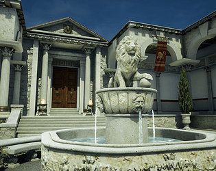
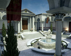
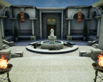
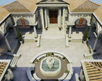
- This is really lovely scene. I think the original idea was nice and unique, and you captured the atmosphere you were going for. The composition works well and there are nice details around the scene, but it doesn't feel too busy. The rough brick feels a bit too different from the smooth surfaces around it, as if it's from a different age. I would have used a smoother brick to make it blend in more. In the texture the bricks themselves feel very worn and broken, but they still have sharp 90 degree angles, which feels weird. The mosaic material is stunning, I really love it. With all the floors, it would help to subdivide the surface a bit more and have cuts around the edges where the walls start. This would make it feel more purpose-built and realistic. I like it that you put in the extra effort with the roof and used whole tiles. The silhouette works very well. Adding the stone relief around the fountain's base looks very nice, but I think it would look even better if the tub wasn't convex and curving outwards. This could also help with the general feel of the central circle. At the moment it feels a bit cramped, and the outer marble edges feel wider and blockier than they need to be. If you wanted to take this scene further, I'd suggest adding some decorative railings around the edges of the raised walkways, and maybe throw in some ivy on the walls and roof to break up the symmetry. In general, I'm super impressed. Your modelling and compositional skills are fantastic. Any problems I could see are things that junior artists would have in a studio environment as well. You shouldn't have any issues finding a job.
- Great work here. Especially impressed with the documentation.
- This is an excellent entry to the competition, one of the most impressive I've seen this year. It starts with comprehensive research, a clear and focused vision of what the artist wishes to create, and follows that up with an impressively methodical and logical approach to scene block out, lighting and subsequent asset creation. There is also an extremely accomplished level of technical skill and know-how on display - cutting edge software and authoring techniques are all employed to great effect. Feedback: My main area to look at would be tone and hue variation. The final scene is reading as too similar across large areas, even with the addition of foliage and the banners. The walls, floor, pillars and central fountain are all dominated by the same very pale off white tone and hue. Just changing a few areas and adding in some stronger colour accents could really push this environment on. Possible things to try would be looking at giving the tiled floor much more variation, adding terracotta and even onyx patterns (the top left 3D env example on your mood board has an example of this), possibly changing the marble of the pillars to be a red/brown to compliment the banners, and changing the gravel surrounding the fountain to a tan/brown stone colour. This will help break up the desaturated pale marble areas, and give the whole scene more variation. A look at your original mood boards will show that those environments all have more colour variation - just a few changes could really push this already impressive piece to the next level.
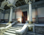
- Research & Development There's a lot of cool reference. Detail and materials are not showcased very well. There's maybe too many asset references to clearly show what you wanted to achieve with each of them. Creative Art The scene reads as a beautiful courtyard with lots of cool details and ornaments. Structures look great and interesting. The cloth is a nice addition, and metallic and wooden materials add interest to the scene. I simply love the ornamental detail to the top of the pillar, it's fantastic. I'd love to see some narratives, material blend and hitting the same quality with tiles as you did for the amazing looking pillars, fountains and such. Material work looks nice and is presented well. Adding irregularities to meshes could help with pushing the real-life aesthetics. The ground could use some irregularities. Scale of mosaic feels a bit funny. Layout is slightly dull as a player space, but at the same time feels true to the source material. Technical Art There are nice techniques from ZBrush, Substance Designer and photos for asset creation. Fountain could maybe benefit from dividing it to multiple materials (trims, tileables, uniques and decals). Making master material and making other materials instances of it might prove efficient. Effects, lighting and postprocess look nice. Meshes look optimized. Documentation Text is easy to read and shows processes very well. Renders are a pleasure to look at. Final Presentation Images present the scene well. The composition is a bit off, and hides a lot of high quality detail which is more present in the document.
- It would have been good to see some annotated reference of things you liked/wanted to include in your piece. It’s interesting (and good) to see that you focused on creating your tiling textures first before creating your block out. You obviously had a clear idea of the approach you wanted to take with the creation of the scene. It’s good to see a simple, yet refined block out. With the roof tiles, I hope they’re a texture rather than lots of individual meshes! All your model sculpts look good and I like that you found reference for each one before plunging into them. Good use of PBR and modular kit parts. Good to see that you have created variation in your plant fronds. Lighting looks good and it’s nice to see the use of a LUT. It would have been good to see a bit more set dressing in the scene to make it feel more lived in. Really good use of game workflows and a good looking scene at the end.
Challenge Tier
Search For A Star
Leave a comment
Log in with itch.io to leave a comment.



Comments
No one has posted a comment yet