

Play project
German Christmas Market's itch.io pageResults
| Criteria | Rank | Score* | Raw Score |
| Documentation | #30 | 3.200 | 3.200 |
| Research & Development | #33 | 3.000 | 3.000 |
| Overall | #58 | 2.360 | 2.360 |
| Presentation | #70 | 2.000 | 2.000 |
| Creative | #73 | 2.000 | 2.000 |
| Technical | #81 | 1.600 | 1.600 |
Ranked from 5 ratings. Score is adjusted from raw score by the median number of ratings per game in the jam.
Judge feedback
Judge feedback is anonymous and shown in a random order.
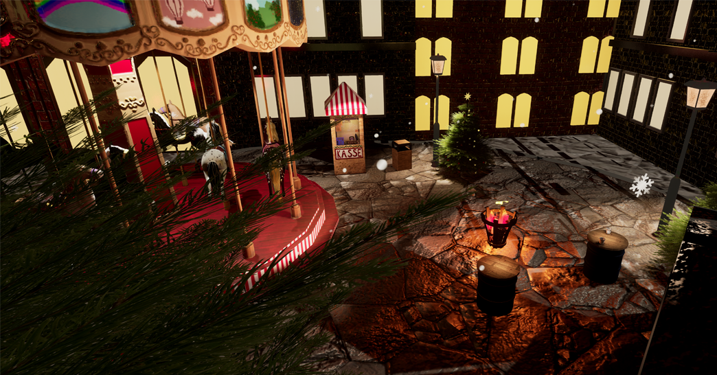
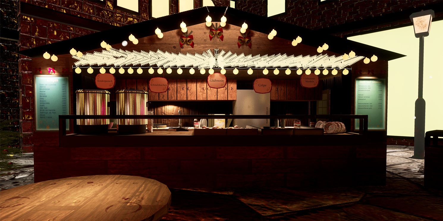
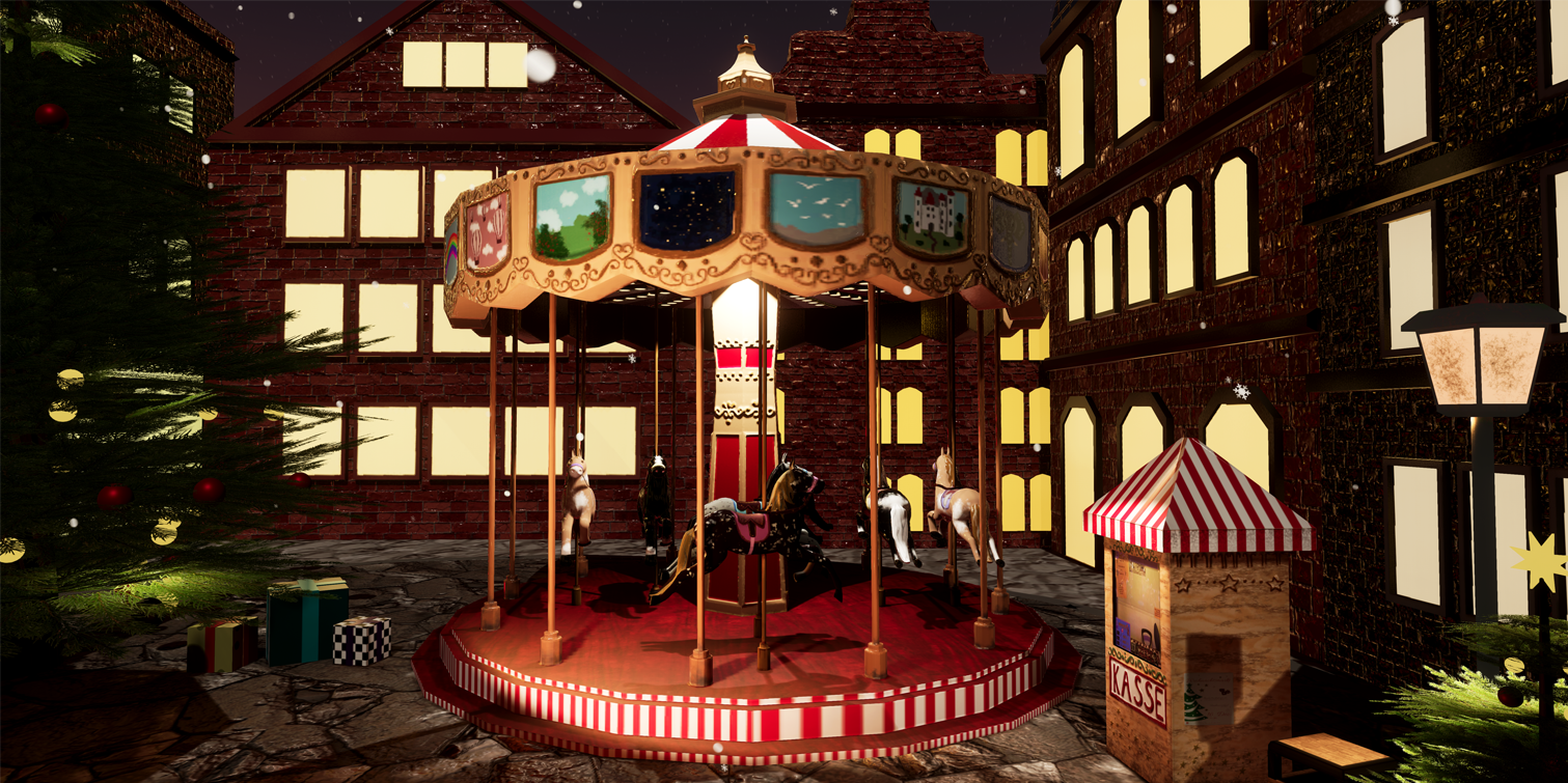
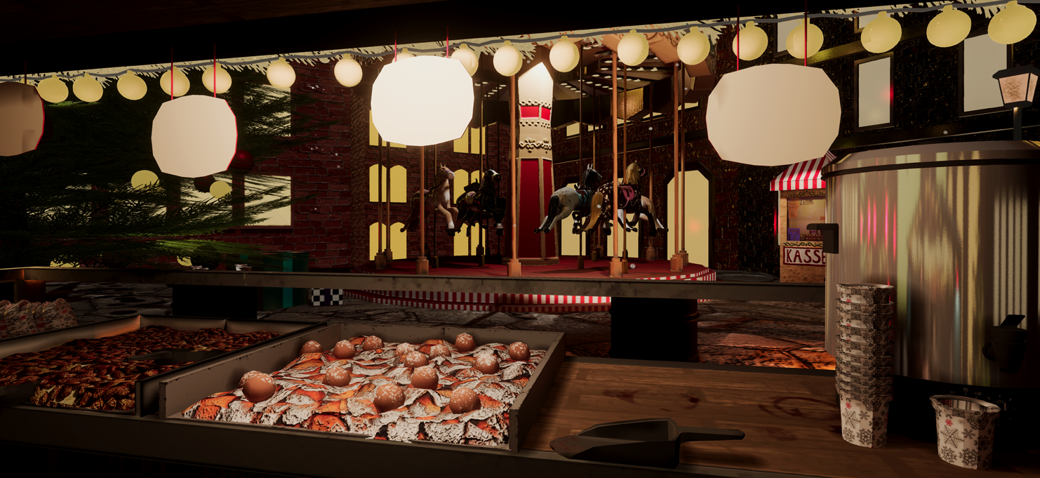
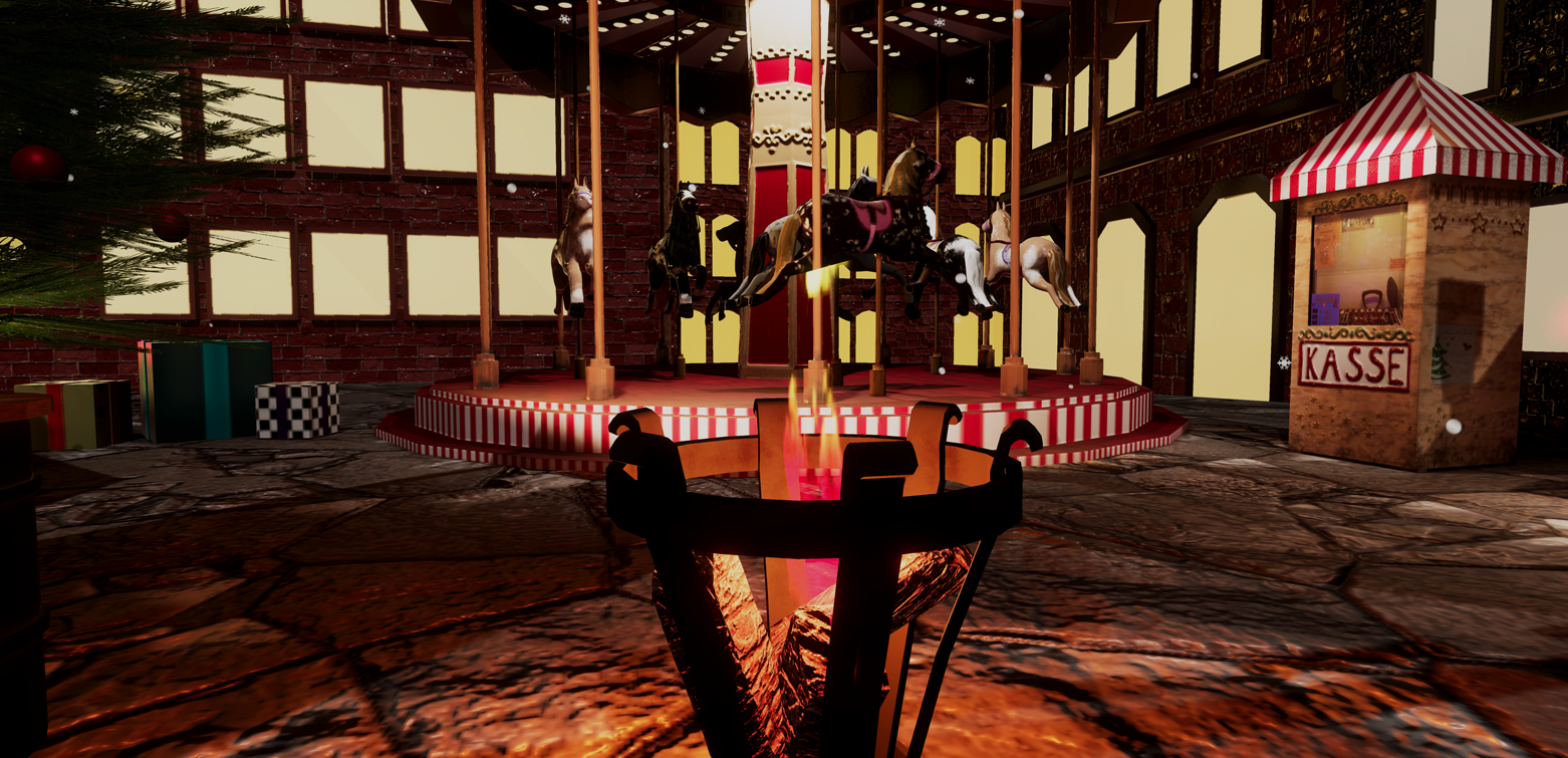
- Hey Miranda, Firstly, welcome to the UK and I'm glad you found the Christmas markets just like home! I think that first of all the idea you sold me in the documentation is wonderful, but it didn't come out technically in the end. The lighting is not that of a dreamy wonderland, which both your mood-board and words express in the documentation. I remember the things I wish I was told back when I was learning - so - I'm going to attempt to do that for you, please take this as nothing harsh, just direct and brief feedback and I'm trying to help you out. There's a few things I can see that would help you with this: First of all, find a few other digital artists who have hit the mood you wish to, and learn from it. Lots of tutorials exist for creating dreamy lighting. I can point you to use Post Process effects more, especially Bloom. Google how to add bloom to your scene in UE4. In addition to this, colour grading is a wonderful way to add more of the mood you wish. See: https://youtu.be/qqowJhNw7SY Secondly lets address your asset budgets and methodology. Concepting is good, I'm not sure how useful your concept is to you, if you don't have traditional artistic skill. 1) Start to practice 2) Just do the block out and maybe draw over that to see if looks right? There's more than one way to do things. And if it looks good and helps you, no matter the method, it's not cheating. It's just being clever, and don't let anyone tell you otherwise. Triangle count. 369,000 tris for a booth with details is.. not OK. This seems like quite a low poly scene, I'd expect the whole scene to come into around that number (minus characters) in a AAA title, so it's probably a little high for one asset. I can see why it happened, there's a lot in those details attached - remember if its really small, it doesn't need to be a lot of polys. No-one will notice. The tinsel could be a few planes, but then place planes that lie across it so that it looks like this -> +. Will save you a few hundred thousand polys there. When sculpting, please avoid hand sculpting unless you can do it cleanly, use other techniques. Overall as well, the scene feels bare, remember to tell stories with your work. I know you were running into performance issues, but remember to use what I've just said and you will have plenty room for more lights and a smoother and easier to work with scene. A note for UV's, for example with the Christmas tree from your documentation, you could have overlapped your UVs there and got a tonne of extra resolution, with a smaller texture, same in many other places, look at overlapping and reusing UV space, can save you a lot of time and effort. I'm noticing some overlapping done in the engine version, did you write the doc before finishing? Chris Harper Snr Tech Artist @ Splash Damage
- Good amount of reference and good to see a drawing of your proposed layout. 30x30x30metres is a huge space so never feel like you have to fill it! Remember to always check the scale of the assets you create as well as any real world dimensions. Good to see a block out. It would have been good to see a bit more detail in it though. I think this would have made you aware of the scale of the scene and how much you would need to create for it. Your models look a little low-res (no bevels). You don’t need to have all the edge loops flow through the model and you can separate models off and have the meshes intersect if it’s easier. You might have found it easier to create the stalls, tree and carousel from a modular kit of parts and tiling textures (modular kits allow you to create the detail once and then duplicate this mesh around the scene). With any kind of foliage paint a few fronds in Photoshop and UV meshes to match them. You can then build up the tree with these knowing that you only have to create one texture. The scale of the wooden planks on the stalls is too big and the PBR values look incorrect. This is the same for the wood on the other assets too. The UVs of some of the buildings look a little skewed as well. Your Christmas decoration is ridiculously high-poly! Bake this detail down onto a plane instead. The lighting looks a little flat. Adding in a directional moonlight would help create colour and shadow contrast in the scene. Adding a little bit of fog would have given the scene some depth too.
Challenge Tier
Search For A Star
Leave a comment
Log in with itch.io to leave a comment.
Comments
Research & Development
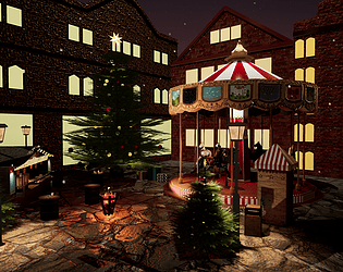
There are lots of beautiful images diving into the subject matter, with lots of high quality reference images.
Creative Art
The scene captures the Christmas Market feeling well. Contast, color and composition work well together. In today's workflows, you can basically model all the visible structures and how real world objects are put together.
Technical Art
To get an extraordinary leap into next level, I'd suggest couple of terms you could research a bit more into; texel density and tileable textures and their usage through scaling the UVs of the mesh. To break too obvious tiling and to create interest, we also can add material blends, that's maybe for the future. In the industry we use a lot of the same texture space with our UVs to try to optimize the memory usage.
Branches of Bell and Christmas Decoration might benefit from using the same material with opacity mask as within the tree.
The snowflakes are a very nice addition.
Documentation
Text is well written, and you can make out the progression from the document. Used software is also listed nicely with assets, and the wireframes and textures are showcased in a very clear manner.
Final Presentation
The screenshots are nice and sharp, the compositions work and the results are showcased well. The detail and passion for the theme shines bright like a diamond.