Play asset pack
Trollskull Tavern's itch.io pageResults
| Criteria | Rank | Score* | Raw Score |
| Documentation | #85 | 1.549 | 2.000 |
| Research & Development | #87 | 1.291 | 1.667 |
| Presentation | #87 | 1.291 | 1.667 |
| Creative | #88 | 1.549 | 2.000 |
| Technical | #89 | 1.033 | 1.333 |
| Overall | #89 | 1.343 | 1.733 |
Ranked from 3 ratings. Score is adjusted from raw score by the median number of ratings per game in the jam.
Judge feedback
Judge feedback is anonymous and shown in a random order.
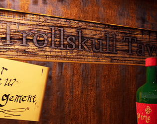
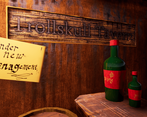
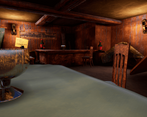
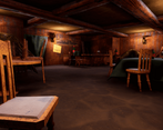
- It would have been good to see some annotated reference and a block out of the scene. It looks like you’ve modelled individual assets for the scene but I think using modular kits and tiling/trim textures would make building the environment quicker and easier. Props don’t appear to have baked normal information and PBR doesn’t look to have been used. I like that you’ve added light sources for the lights but the lighting is still quite flat.
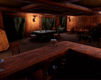
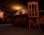
- Research & Development The research shows interesting illustrations. I'd suggest looking into real-world reference for objects, materials, structure, detail, lighting and mood to form a better idea and to achieve that specific goal and to achieve more convincing end results. Creative Art Lights and color look good and make the scene feel interesting. There's a good use of different shades to the wood. The scene looks a bit closed off with continuous wood wall and no clear windows and doorways, or lights and effects that could hint such. Technical Art It's great you tackled Zbrush and Substance Painter. Kudos! Lighting seems pretty optimized, post process works well. Meshes could use a few more polygons to round surfaces. I'd suggest looking into texel density (512 is common for 3rd person titles, 1024 for first person titles), tileable textures, one-way tiling textures, trimsheets, decal actors, mesh modularity and scales of objects (Google is a friend, I use it for dimensions all the time!). It'd be a good policy to model for example the wooden back supports of the chair, and metallic rings around barrels should keep the wooden planks together. Documentation Text is written well. Images support the text. Final Presentation Good quality renders that showcase the subject matter.
Challenge Tier
Sumo Digital Rising Star
Leave a comment
Log in with itch.io to leave a comment.


Comments
No one has posted a comment yet