


Play asset pack
The Witch's Hut's itch.io pageResults
| Criteria | Rank | Score* | Raw Score |
| Documentation | #40 | 2.907 | 3.250 |
| Creative | #51 | 2.460 | 2.750 |
| Research & Development | #60 | 2.236 | 2.500 |
| Overall | #60 | 2.326 | 2.600 |
| Technical | #64 | 2.012 | 2.250 |
| Presentation | #67 | 2.012 | 2.250 |
Ranked from 4 ratings. Score is adjusted from raw score by the median number of ratings per game in the jam.
Judge feedback
Judge feedback is anonymous.
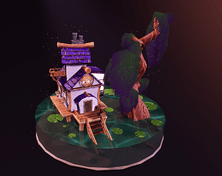
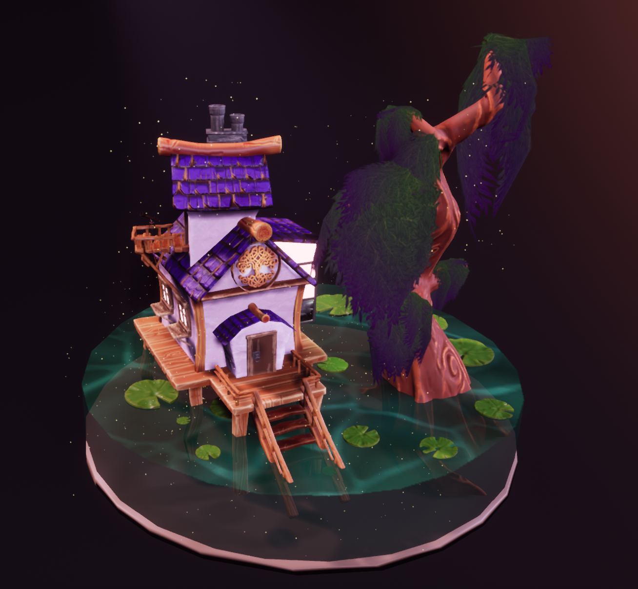
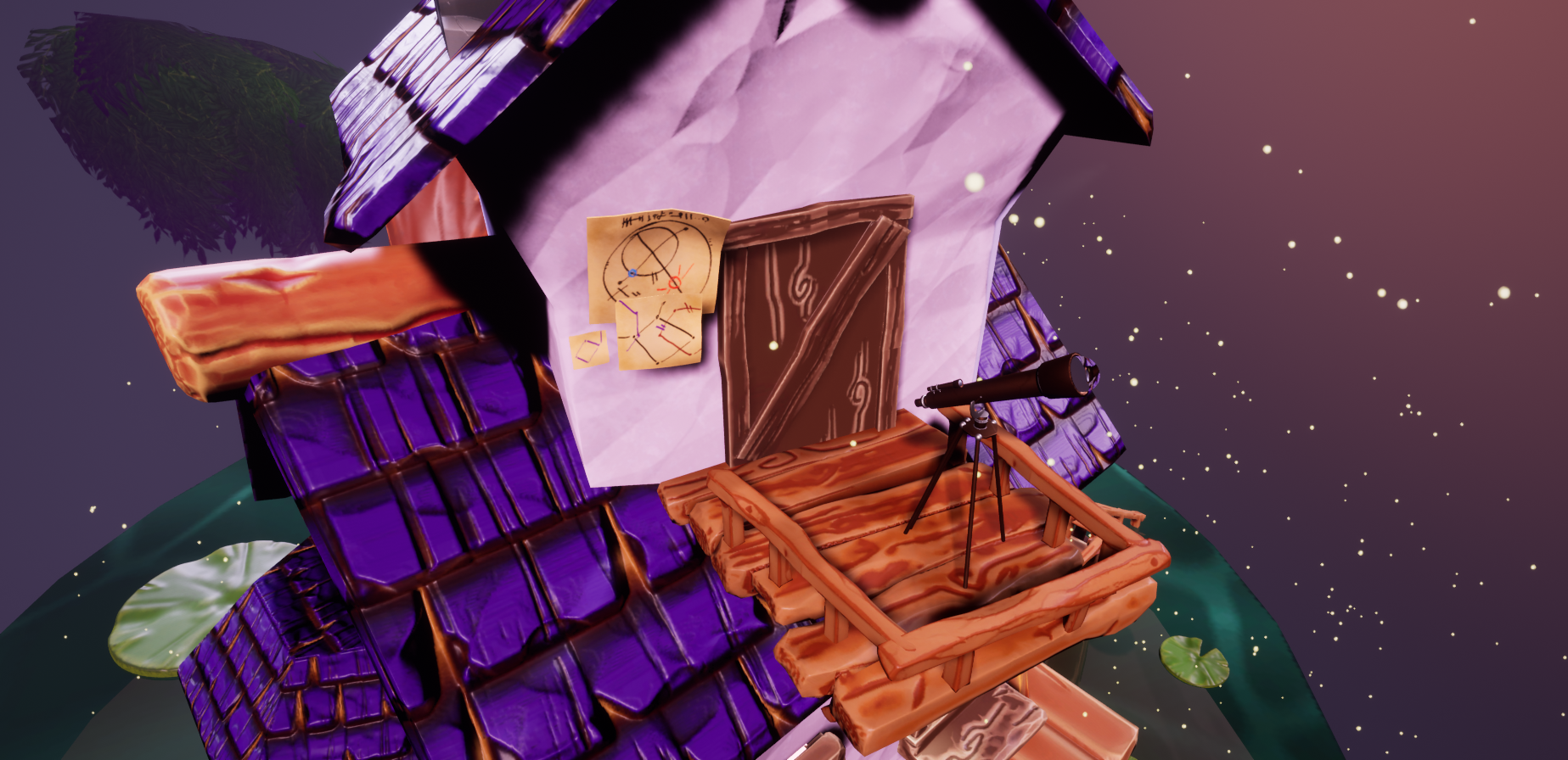
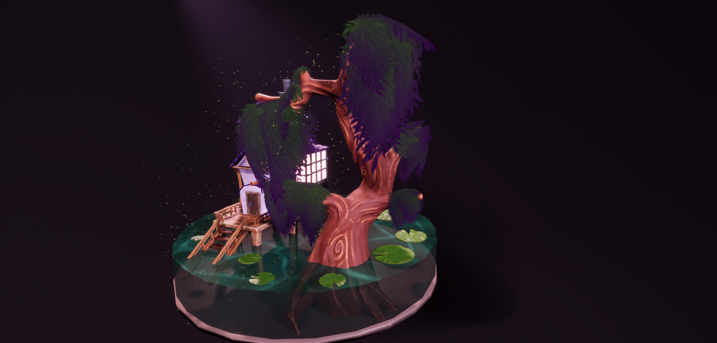
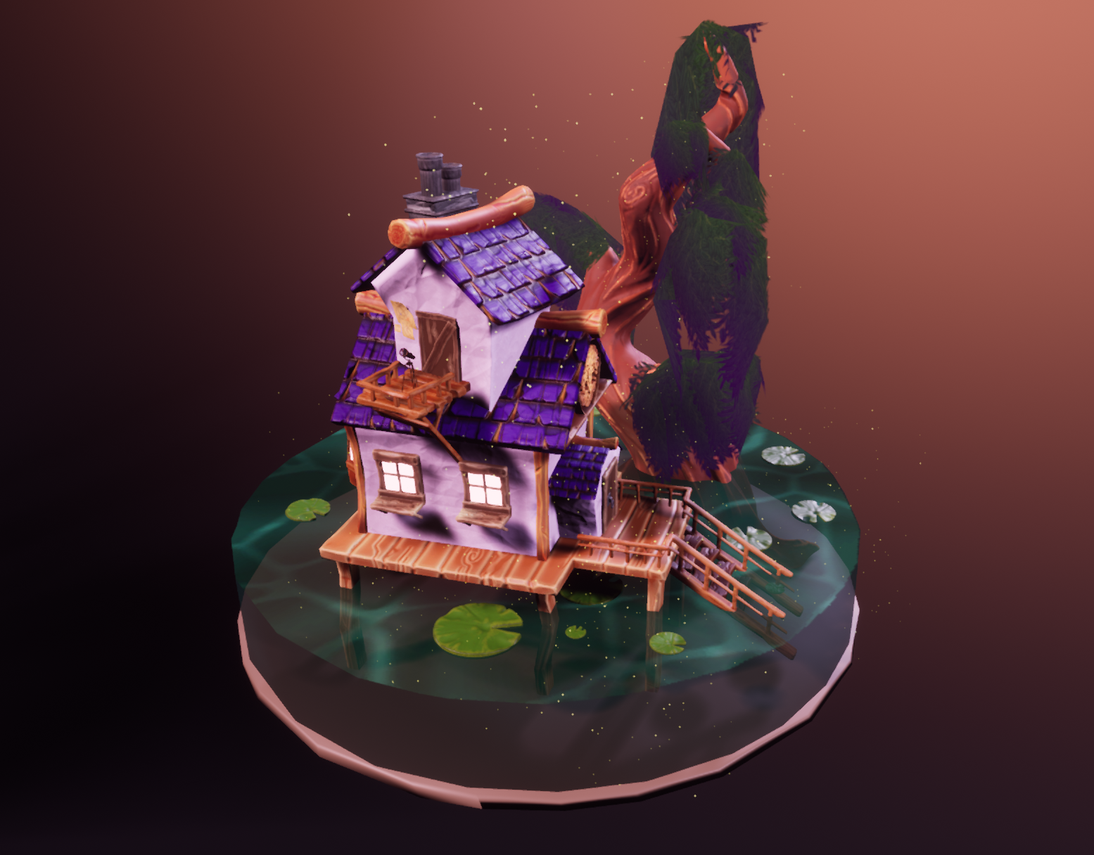
- Would have liked to have seen annotated reference and art style testing. Nice detailed block out. Using a modular kit of parts opposed to a full ZBrush sculpt would have made construction easier. I like the tree sculpt and I’m glad you got some leaves on it. Not all of them have to be angled downwards and it would have been nice to see a few leaf board variants. The house texture looks odd. Even if you’re creating a stylised look do reference the real world as this will help make materials/assets more cohesive. When creating UVs, orientate the pieces to be right angles as they will be easier to work with. Be aware of hard edges when baking and split the UV islands accordingly. Move away from using one UV seam (ZBrush). Some of your geometry looks pretty high res (telescope, lily pads). You want to bake the high resolution detail down into a low res mesh. Not everything needs to be baked; you can get away with a lot by using tiling textures and bevelled geometry. As PBR hasn’t been used the materials look a little flat. I like the water column though it would have been good to have a smoother circumference as the facetting is quite noticeable. The telescope and drawings add a nice touch of narrative.
Challenge Tier
Sumo Digital Rising Star
Leave a comment
Log in with itch.io to leave a comment.
Comments
Research & Development
The visual interest shows well interesting buildings and elements of swamps. Style guide shows several different styles.
Creative Art
The color and stylized approach work well in the image. Material definitions could maybe be pushed a bit further. The turntable looks great with fireflies in engine.
Technical Art
The scene is mostly on gameart level polycount wise. There are a few things I'd like to mention, though; Seeing roof tiles in different scales on different roofs also feels a bit odd, along with the house feeling a bit like it's been built with rock, the round tree meshes are a bit on the high end on polycount in contrast to the wooden pier the house is founded on, which is a bigger mesh chunk. Lilypads could be maybe almost flat planes with applied alpha texture.
As you mentioned about the UVs, you can get pretty great results with automated UV packing in many of the modeling programs. It's mostly about knowing what texel density you'd like to hit, and working from there it becomes more of a problem solving type of thing!
Using tileable texture means having a texture, where if you place the same texture right next to it, it would be a seamless transition between images. Using such texture with a bigger surface calls for scaling the UVs of the mesh in your modeling package.
Use of engine's linear gradient is something I probably wouldn't have thought about, which is super nice, and actually produces a cool effect. For your next scene, you could try looking for similar gradient feature in Painter to save a bit of shader instructions by baking it into the texture. :)
Documentation
Documentation showcases well different parts of production. The text is easy to read, and filled with pretty pictures.
Final Presentation
The presentation showcases different aspects of the scene well. The images look nice and crisp. Water, lillies and fireflies are a nice addition in the scene.