

Play asset pack
Gladiator Arena's itch.io pageResults
| Criteria | Rank | Score* | Raw Score |
| Research & Development | #49 | 2.500 | 2.500 |
| Documentation | #65 | 2.333 | 2.333 |
| Technical | #69 | 2.000 | 2.000 |
| Overall | #72 | 2.100 | 2.100 |
| Presentation | #73 | 1.833 | 1.833 |
| Creative | #79 | 1.833 | 1.833 |
Ranked from 6 ratings. Score is adjusted from raw score by the median number of ratings per game in the jam.
Judge feedback
Judge feedback is anonymous and shown in a random order.
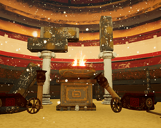
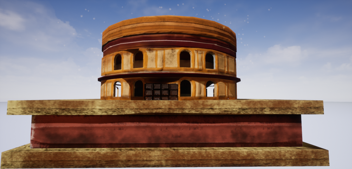
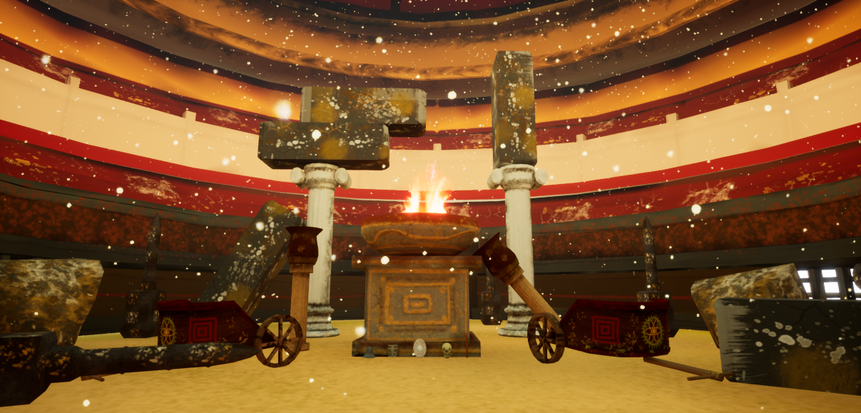
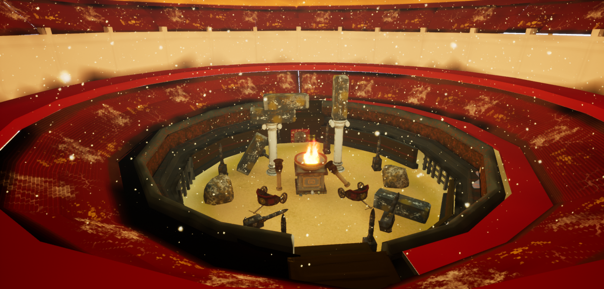
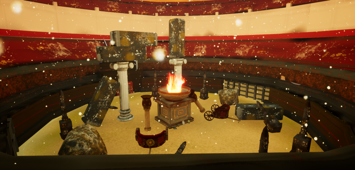
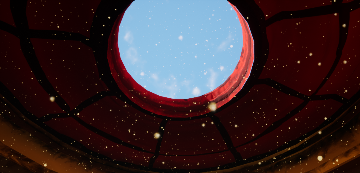
- Artist – Alex Bush Category: Sumo Digital Rising Star Assessor: Anthony O Donnell – Lead Artist at Firesprite Work name: Gladiator Arena The production diary was written well and nicely presented. A good amount of research was done to inform the piece. The subject matter is very interesting, the artists passion for this came across. It is an ambitious scene to tackle given the amount of work required. Referencing gathering and initially sketches to blockout was a sensible approach. UV layout of the assets could be improved a lot as there was a lot of unused texture space due to awkwardly angled UV shells. A tighter packed layout could allow for assets to share a texture sheet. Channel packing was used but was set to sRGB and not linear. This kind of scene would have worked better utilizing a modular workflow , tileable textures and trim sheets. This would allow for a greater focus per element for the artist. The textures generally lacked fine detail and did not always reflect the material they were representing. Creatively the scene leaned on realistic reference from photographs but ended up with a stylistic aesthetic. Lighting wise the lack of shadows flattens the scene. Having the directional light burst through a larger opening on top and the awnings casting the background areas into shadow would have given the images a more pleasing look focusing the viewer in on the central assets. This would be a quick fix worth implementing. There are some nice details within the scene. The final images display the assets as a diorama but don't feel natural in their placement. Some thought to the context of the scene such as is it pre or post combat would help define how to dress the scene.
- I can see you have referenced films and games and supported it with images from the real-world. It would have been good to see a small test scene showing the art direction you wanted to take the scene in. It’s good to see the progression of your block out and that you modified it over time to get a better composition. The modelled assets look a little low-res and your UVs need some work (try not to have pieces at jaunty angles as they won’t bake as cleanly and will be harder to texture). Using a modular kit would have been better for the colosseum and less time consuming. Your sculpts and bakes look a little soft which gives the scene a more stylised look rather than realistic. The lighting is flat and the colour scheme you’ve chosen is a bit jarring. I think it would have been better to focus on the interior only rather than the exterior as well. I don’t think the white “sand” works well and adds unnecessary noise to the scene.
Challenge Tier
Sumo Digital Rising Star
Leave a comment
Log in with itch.io to leave a comment.
Comments
@Teppo Yiltalo Thank you for the constructive feedback. Really appreciate it.
Research & Development;
You seem to be excited about the history of Gladiator arenas. The Arenas should be an open space with multiple props, as mentioned in your paper, but it's not quite as well translated in the Submission. I'd also like to see research into how the structure building was approached at the time a bit more.
Creative Art;
I like the colors of the scene, they make it really pop out. Subtle tones and materials definitions could be pushed a bit further. It's a common standard to do things with tileable textures and dividing things into smaller chunks instead of making things unique. This way, we can get 512 and 1024 texel density content running on game engines.
Technical Art;
The meshes seem pretty well optimized. As previously mentioned, I'd suggest doing some research into tileable textures so you can hit texel densities of 512 and 1024. A basic scene lighting in UE4 can be achieved quite fast with a tutorial such as this one;
Object scales can be tricky to eyeball. I used to have hunches before and they resulted in images looking rather incorrect and funky. A simple solution is to Google for dimensions of objects such as tables, chairs etc.
Judging by the PDF you have basic knowledge of using Zbrush and Substance Painter. That's great! Go ahead and have some more fun with more detailed props to start pushing yourself to the next level. :)
Documentation;
There's definitely evidence of excitement in the documentation, and there are lots of images and WIP shots. The layout is a bit retro to my mind, but the readability hits it home.