Play asset pack
Temple of Ares Interior's itch.io pageResults
| Criteria | Rank | Score* | Raw Score |
| Creative | #32 | 3.000 | 3.000 |
| Presentation | #40 | 2.714 | 2.714 |
| Overall | #44 | 2.686 | 2.686 |
| Documentation | #47 | 2.714 | 2.714 |
| Research & Development | #48 | 2.571 | 2.571 |
| Technical | #49 | 2.429 | 2.429 |
Ranked from 7 ratings. Score is adjusted from raw score by the median number of ratings per game in the jam.
Judge feedback
Judge feedback is anonymous and shown in a random order.
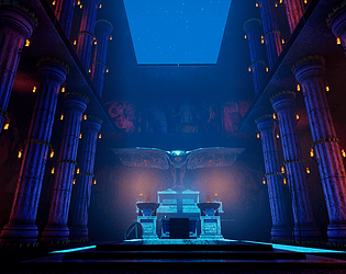
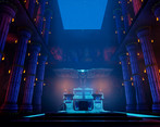
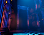
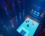
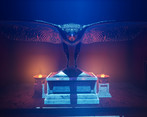
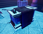
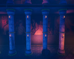
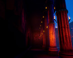
- Artist – Wil Johnson Category: Search for A Star Assessor: Anthony O Donnell – Lead Artist at Firesprite Work name: Temple of Ares Interior Research and Development /Documentation The document was well written with a clean and visually appealing presentation. It goes into some detail regarding the development of creative decisions and the production process. Elements of the reference can be clearly seen in the final artwork. Technical Art Polycounts are high in areas where edges exist that do not contribute to the silhouette or any technical considerations in any meaningful ways. UV layouts are good. For some assets a tiling texture setup or trim sheets would have been more suitable as an approach such as the columns. The current method resulted in the columns having a texel density lower than is ideal. Channel packing was used and setup correctly. The vulture is the focal point but the polycount is on the high side given the form being represented. Creative Art The lighting and layout of the scene all support the focal point of the vulture statue. Modelling is decent with shapes / forms recreated well. Final Presentation The final shots are nicely composed images. The lighting setup is very bold for this type of subject matter utilising strong blues with accents of pink / orange which gives the work it's own flavour. Overall the scene and final images are good. Use of atmospherics give the scene a foggy, mysterious vibe.
- Hi there! First of all, good stuff getting everything done in the time frame. Now onto how we can learn and grow from this. When I was looking into your scene the first thing I noticed was the lighting, some of it was very atmospheric, but the blue of the moon was a bit too much, so I dropped that way down to around 1.5 lux. And focused more on increasing the ambient feeling to the lighting. It's very hard to deal with moonlit scenes as in reality our eyes do a lot of adjustment. The best reference is yourself on a moonlit night and seeing how others have done it successfully. A lot revolves around the dealing with ambient light. In your case finding a careful balance between the indirect light intensity and skylight ambience. Second, you have some z-fighting going on, especially on ceiling areas and where you have overlapping meshes, this isn't good. Solve this by either moving the meshes to be slightly offset, or better yet, don't have them overlapping. I can also see some strong wastage of polygons on the pillars. They could be cut down and normal mapped in such a way that no-one would notice. Shield and props don't need to be so high poly either, I reckon this scene could look the same at around a total of 200k tris. Not the 700k. All stuff to think about for going into a studio - as it will become more important. Personal work, it's less important for, just important to know it's important and how to do it. If you know what I mean? There's a troublesome cubemap reflection which keeps getting clipped out of existence as well causing some oddities in the scene rendering. It's nasty. Worth looking into fixing :) Thanks, Chris Harper Snr Technical Artist @ Splash Damage
- It would have been good to see more reference and it annotated too. Good to see a block out though the environment is very symmetrical. A few broken columns and break up in the floor would have been good to experiment with at this stage. It would have been good to see more of your process in creating your assets. From what I could see you might have found it easier to use tiling textures instead of baking assets down individually in Painter. I do like the colour contrast in the lighting but it looks a bit too strong. Not having all the torches lit would have also created a good amount of breakup throughout the scene.
Challenge Tier
Search For A Star
Leave a comment
Log in with itch.io to leave a comment.


Comments
Research & Development
The research into the subject matter could be a bit more thorough. I see a couple of reference images without a separate mood/reference board or research into how the things were builtand formed.
Creative Art
The use of blue and purplish red along with cyan works wonders on the scene. The scene feels energetic and colorful.
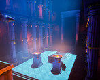
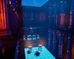
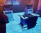
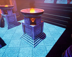
Pool, lanterns and the fire pits add a lot into the space. The weapons also look remarkably well done.
To push the scene further, you could divide the floor into difference spaces by using different decorative trims and materials. The sides could be composed of different materials, for example. The meshes could also be pushed a bit further with added geometry and vertex blends. It might look a bit better if the metallic trims would also be a bit less shiny and new as well. The shape of trims seems a bit contrasty compared to the pillar.
Technical Art
Considering you started 4 months ago, it looks very good.
Reuse of texture space and use of tiling trims and tileable materials is something we use a lot in the industry. Firepit mesh showcases a few polygons that don't seem to contribute to the final look and feel of the asset. You can use vertices for material blends, to control shading or give shape or form to the object, but on a flat surface without material blends, it's a bit of a waste to render those polygons individually by our graphics cards. Some of the rounded surfaces you have might have a bit too many polygon however, but they do look nice and round. :) The sense of scale might also come a bit more across objects we see in our everyday life would be of correct sizes such as door.
One key to start thinking about possible use of tiling materials and trims is to be able to hit the correct texel density for a scene. 512 is common in today's games for 3rd person games, 1024 for 1st person titles. Hitting those calls for some thought process. It's common for games to also make use of vertex blending and decals.
Documentation
Texts tell about the progress in a very nice manner, and the images are placed in an informative manner next to the subject matter.
Final Presentation
The final presentation looks good. The images show the result well and accurately and are of high quality. The composition works and the focal point is obvious.
I would have liked to see more closeup shots of the weapons you put into the scene, I only more closely noticed them when opening the scene myself.
Hi Teppo,
Thank you very much for your thorough feedback on my environment.
I will take all of your comments, particularly in regards to the research and technical skills, into my next iteration of this environment and future projects!
Thank you once again for your time, I really appreciate it.
Wil