


Play asset pack
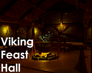
Viking Feast Hall's itch.io pageResults
| Criteria | Rank | Score* | Raw Score |
| Technical | #19 | 3.200 | 3.200 |
| Documentation | #30 | 3.200 | 3.200 |
| Research & Development | #33 | 3.000 | 3.000 |
| Overall | #35 | 2.920 | 2.920 |
| Creative | #42 | 2.800 | 2.800 |
| Presentation | #56 | 2.400 | 2.400 |
Ranked from 5 ratings. Score is adjusted from raw score by the median number of ratings per game in the jam.
Judge feedback
Judge feedback is anonymous and shown in a random order.
- Hello GBeswick, Well done for the modeling and cartoon style of your props, it's not the most easy style but it works! Unfortunately you took a bad direction with the lighting in your scene and it killed the beauty of your assets : the scene is too dark and contrasted. You should definitely work again on the lighting (Especially the ambiant lighting / skylight) and give a first clean white layer of light allowing to see the details of your asset / normal maps. Then starting from this, you can start to tweak the lighting and the postprocessing to get something more darker and adding some light sources with your torches. You could definitely have 4 stars with this assets if the final composition was at the level of your asset creation! You should also probably try a cartoon shading in your materials with this style of assets, you will get a cool render! Quentin Papleux, Sr. Lighting artist, Sumo Digital
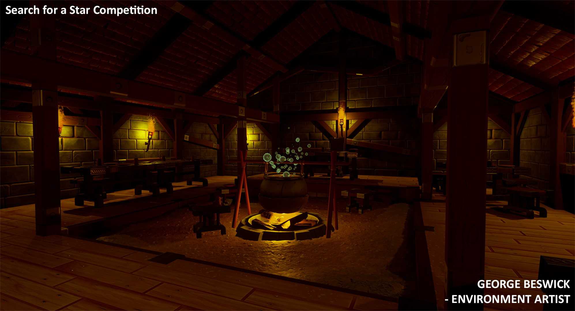
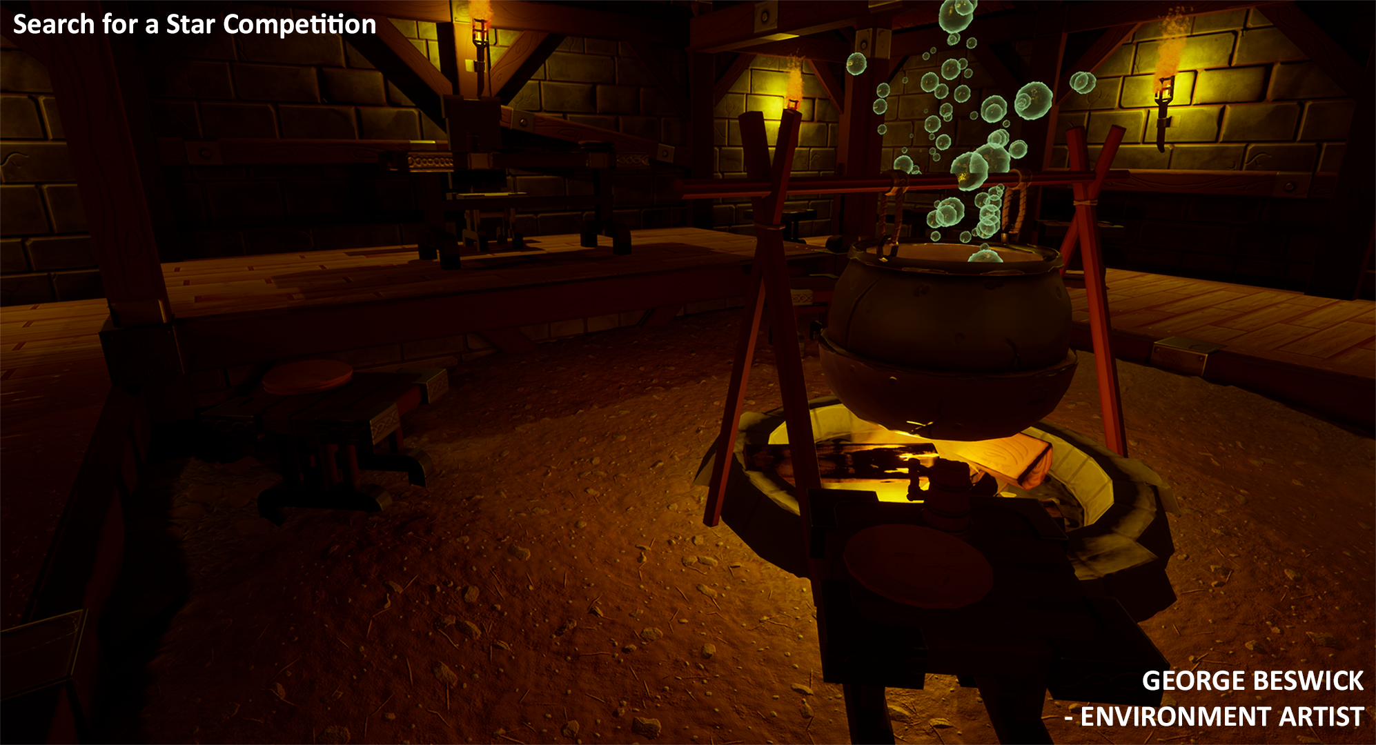
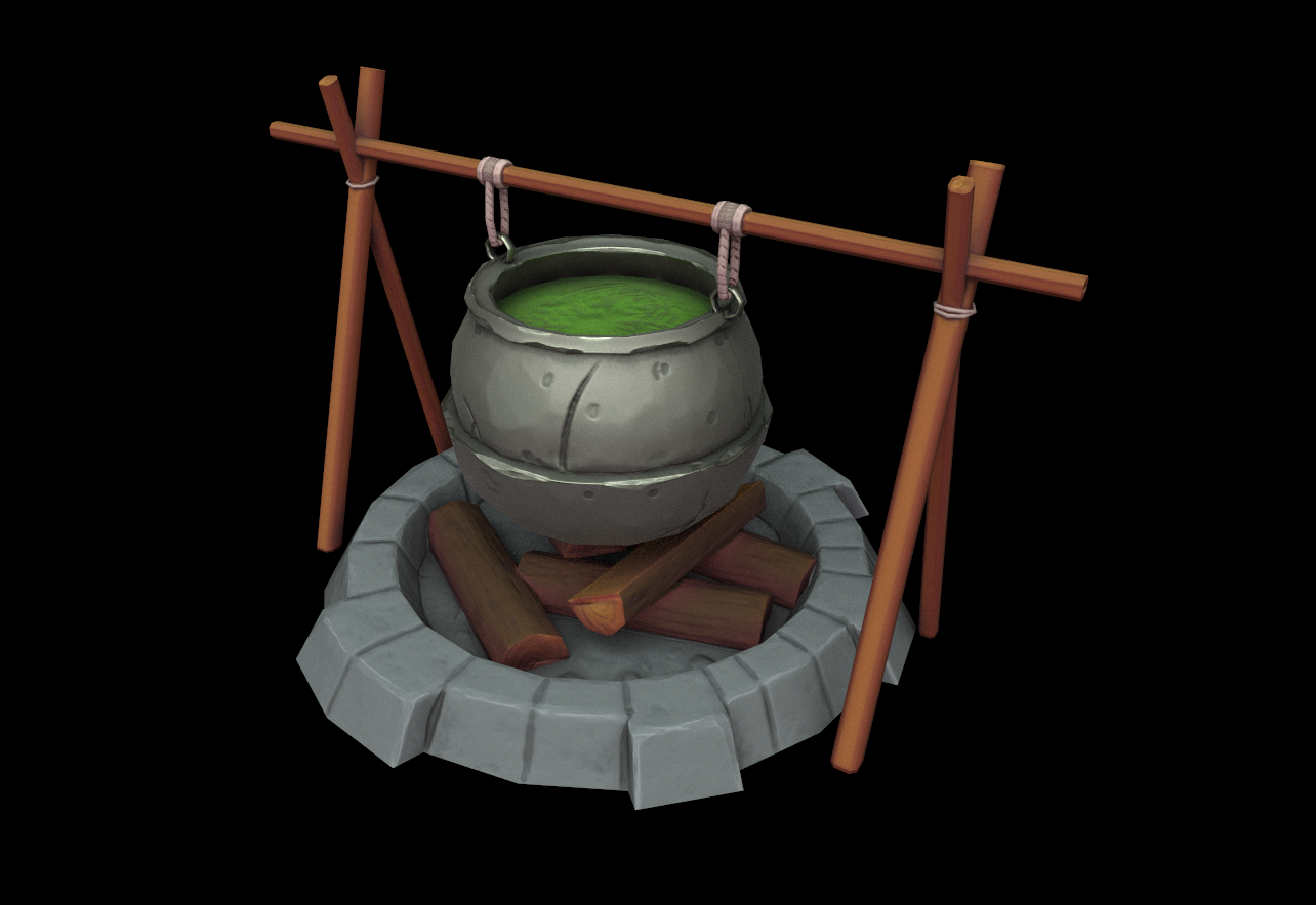
- Research & Development Research shows some areas that look similar to the one you'd want to accomplish. I'd suggest taking one as main reference, pushing it to the furthest and once you've used most of its interesting features, maybe add prop ideas from another one you find interesting. The props could use high quality references that show real life assets, how they are built and how the material should look up close. Creative Art End result is a rather dark scene with an attention catching cauldron of green soup (or poison?) in the middle. Simplified asset direction look pretty in the render and they could be showcased a bit more with brighter overall lighting. Wall scones are fighting a bit for attention. Irregularities to meshes could add a lot to the feel of the place, and the layout is a bit narrow for player movement. Technical Art Some terms to look more into; tileable texture, texel density, trim sheets, material blending, reusing texture space It might be nice to add googling for dimensions into your everyday life to get correct item scales (I personally do it all the time, it's nothing to be embarrassed about). The particle using such warping displaced material might be a bit overdoing it when taking into consideration also the size of those things. The meshes seem well optimized. It'd be nice to see some additional shapes of planks with bends and such to be added in there. The landscape is a bit low resolution for, you could up the polycount there, and add additional rock meshes and meshes to showcase dirt accumulation and putting the wooden supports of the floor into the ground. Documentation Text is good, and images show and tell a lot. The breakdown of materials and workflow is great. Final Presentation Images are of high resolution and showcase the scene to a good extent. Simplified prop shots look interesting.
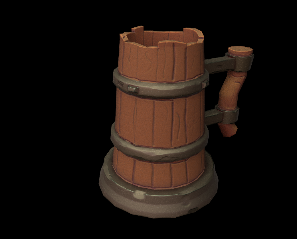
- Really well done on your prop modeling and sculpting, that's some impressive stuff. It's also great that you first worked with particles in this context, being a game dev (or artist) is all about learning new stuff on the job and having to apply it directly. I really like the theme of your project and your references were well on point. Wish you'd named the source and what made you choose them briefly. But you're right in that your project fell a little bit short because of props, and that's ok, because this is now an opportunity to go back and flesh this out into an amazing portfolio piece. I think the biggest missed opportunity is to add some beams going across. You're right that these would obstruct some areas and would actually help you in breaking up patterns and create a 'fuller' space. Think back to the inns in Skyrim, do you remember the garlic dangling from these beams? You could also have bits of rope dangling, suggesting that something was once there and now it's gone. Something as small as this would really help tie your narrative together, that this is a disorganized space made to be functional and to serve a purpose, and not some sort of impeccable temple. That these halls were once filled with messy, reveling vikings or warriors. Think using fur pelts on the floor and benches, weapons left around, a helmet on the table (a warrior needs to relax sometime right). Fill your hall with tables and those tables with tankards, introduce other props you'd expect to find in a mead hall, such as wooden bowls, fruit or bread. Candles on the tables. Maybe a shield or a crest on the wall. Or even reuse the fur pelts. And never be afraid to use that rotation widget to death, even if you're only rotating something by 6 degrees, it beaks up a pattern and it makes identical props look less identical. Try it on your pillars or your wall sconces, very few things out there are straight cut and aligned. As for your centerpiece, I think what's missing is a story there as well. Add a fire poker maybe, a small bundle of wood next to it, maybe whoever is in charge of it has a tankard of mead as well? Or left their apron behind? I think you need to work on your lighting a bit more as well. Some areas are very dark and it's a bit like there's no other lights at all except those small area spotlights. With the added beams going across the room, adding some light at around table level would cast some really nice shadows and really tell the story of things happening at the tables while night creeps up on the revelers from above. This is a good example of what I mean when I say add light at table level and let it blend into the roof: https://www.artstation.com/artwork/Dxln6A You also need a cold, blue light somewhere in there to offset all that yellow. Don't be afraid to add lights in places you wouldn't physically have one just to lighten a dark area, with the right values it will look right. Lastly, add some fog! Fog always brings a picture to life and I imagine a mead hall would be quite smoky. I'm super excited for you and your project!
- Submission Title: Viking Feast Hall Submission Tier: Search for a Star Assessor: Dominic Shaw Artist @ Firesprite Research & Development The project had some nice prop reference and I liked how you tested the style that you wanted first on the table prop before tackling the whole environment head on. You could have created a mood board full of style reference which could have helped when creating your assets. There is also some good breakdowns of the props and I like the sculpts that you made! Creative Art Overall a good attempt at making this environment and I like the focal point in the middle of the room that you walk around. The lighting is a bit dark in areas and there is a bit too much contrast in the scene so I would recommend doing another lighting pass to avoid the really dark shadows. I like that the scene is quite small and cosy which creates a nice mood but it would have been nice to have more space around the tables for the player to navigate. The environment could do with a few more props and storytelling elements to fill out the scene as it’s a bit bare at the moment. I couldn’t see the engine file but from the documentation you provided, I saw that the props only had diffuse and normal maps shown. It would have been nice to have some PBR materials in there such as roughness, ambient occlusion and metallic maps which would have helped with the reflections in the environment. I apologies if you have used these maps and If so, I would recommend having another pass at the roughness of things as the bricks look a bit shiny. Technical Art There is some good use of modular workflows in the beams you had and some good use of vertex painting on the floor. I would have personally used vertex painting on the roof too to break up some of the tiling. I noticed that you did the roof material in Substance Designer which is a good workflow, you could have removed some of damage in the tiles to create a none damaged version and then use that as a second material to vertex paint between. The dirt material that you used to vertex paint on the floor I would have made darker as dirt as mud is usually darker than the floor. I would have also used Substance Designer on the brick material has there was a lot of wasted space on that texture sheet. The props that you made was nice, you could also try adding some ambient occlusion dirt and a good trick for stylized assets is to overlay the curvature map as small edge highlights. It was hard to judge some of the technical side of the project due to not having an editor file but overall, I can tell that you understand the workflows needed for game art and it’s a good attempt at the environment. Documentation There was some good prop breakdown but it would have been nice to see more of an environment breakdown with time plans and assets lists. These really help with the production of environments as there is so much work that goes into them and it’s good to keep track of everything. Final Presentation The final renders are nice with a good focal point but there are a lot of dark areas in the image due to the lighting. Overall, I liked the environment and I like how the environment is quite cosy and small because most Vikings halls are usually quite huge spaces, so this was a nice change to see. I think that it’s still lacking some storytelling and filler assets but I’m pretty confident that you could add more props in the same style. Moving forward I recommend another lighting pass to remove the dark shadows and add some more maps to the materials.
Challenge Tier
Search For A Star
Leave a comment
Log in with itch.io to leave a comment.
Comments
No one has posted a comment yet