

Play asset pack
Prisoners Cell's itch.io pageResults
| Criteria | Rank | Score* | Raw Score |
| Research & Development | #51 | 2.460 | 2.750 |
| Technical | #55 | 2.236 | 2.500 |
| Documentation | #62 | 2.460 | 2.750 |
| Creative | #63 | 2.236 | 2.500 |
| Overall | #63 | 2.281 | 2.550 |
| Presentation | #67 | 2.012 | 2.250 |
Ranked from 4 ratings. Score is adjusted from raw score by the median number of ratings per game in the jam.
Judge feedback
Judge feedback is anonymous and shown in a random order.
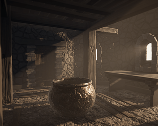
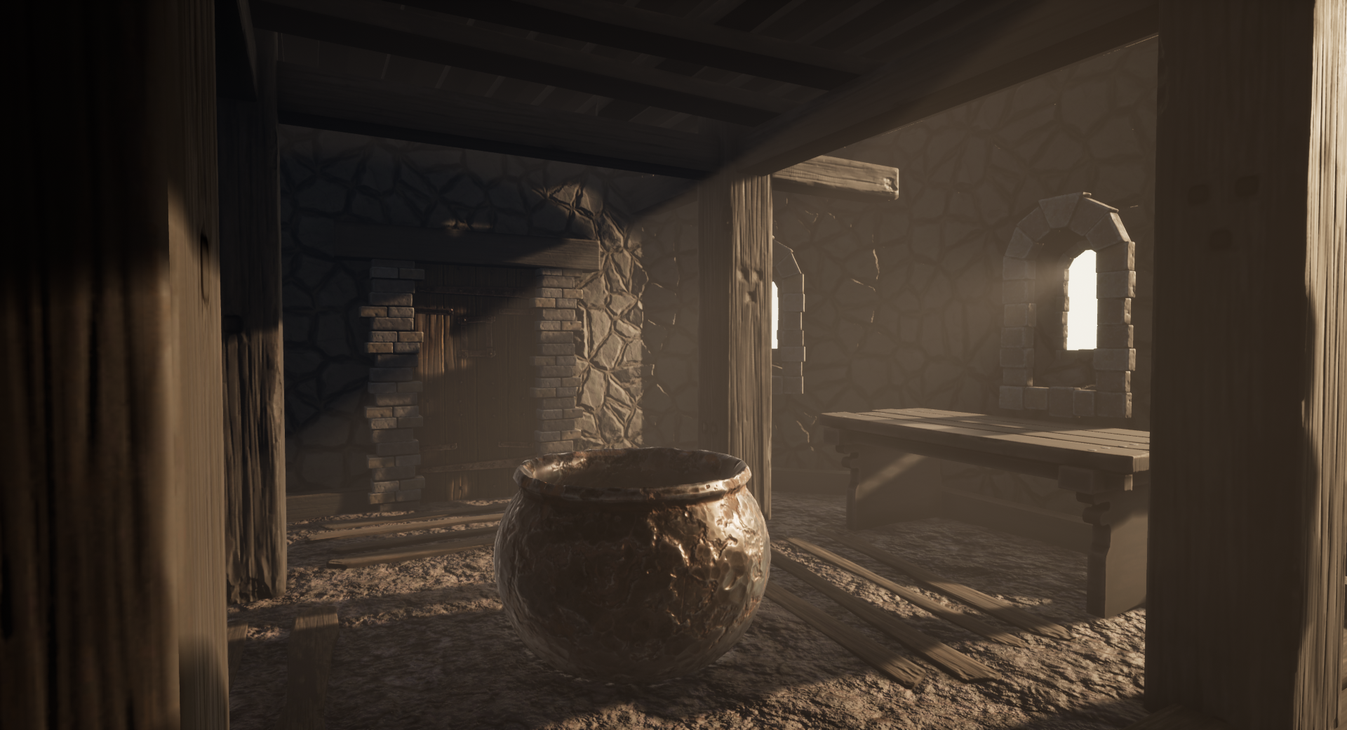
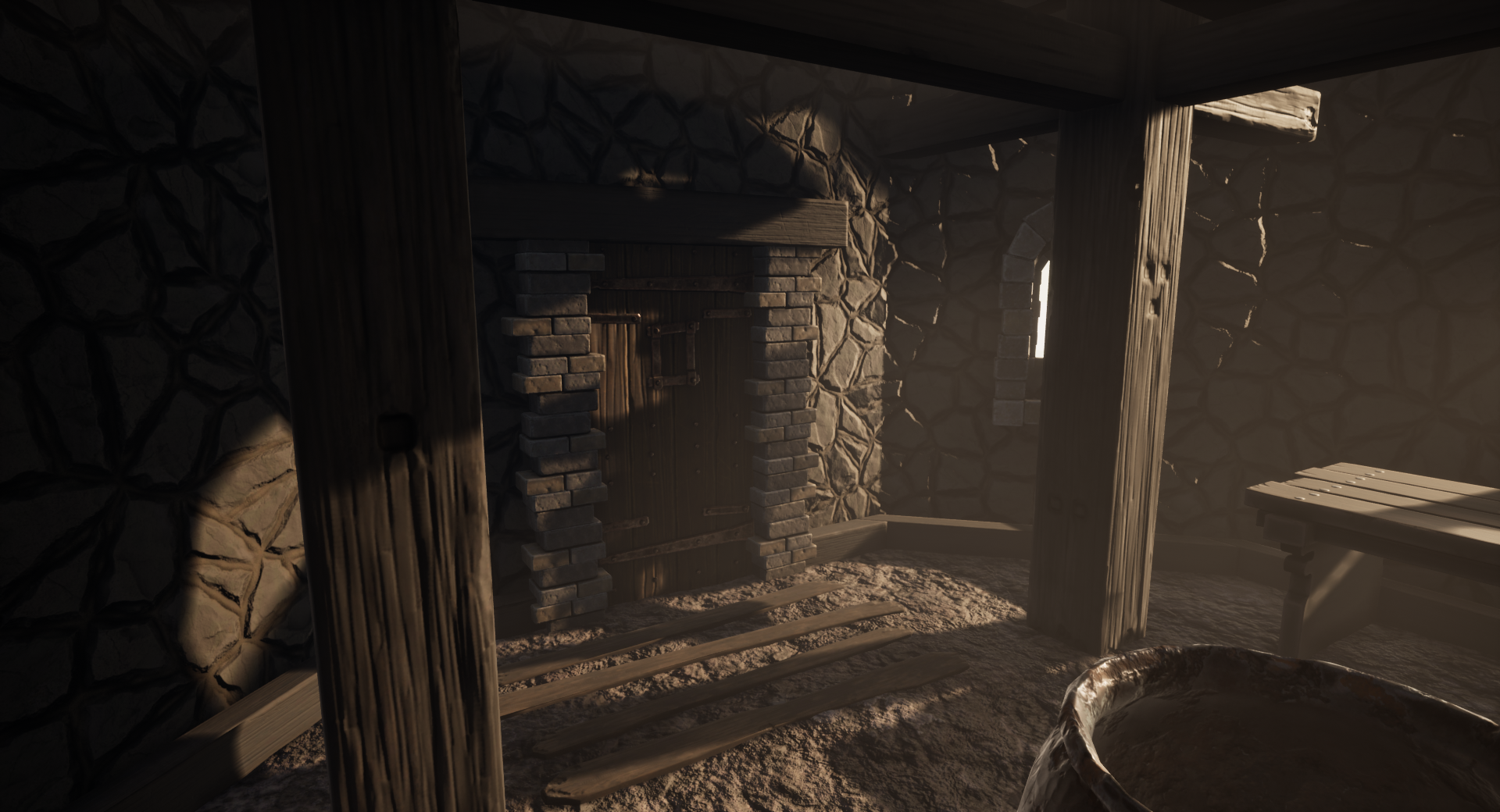
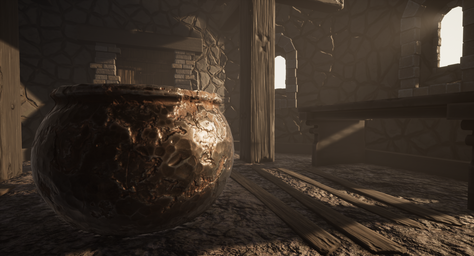
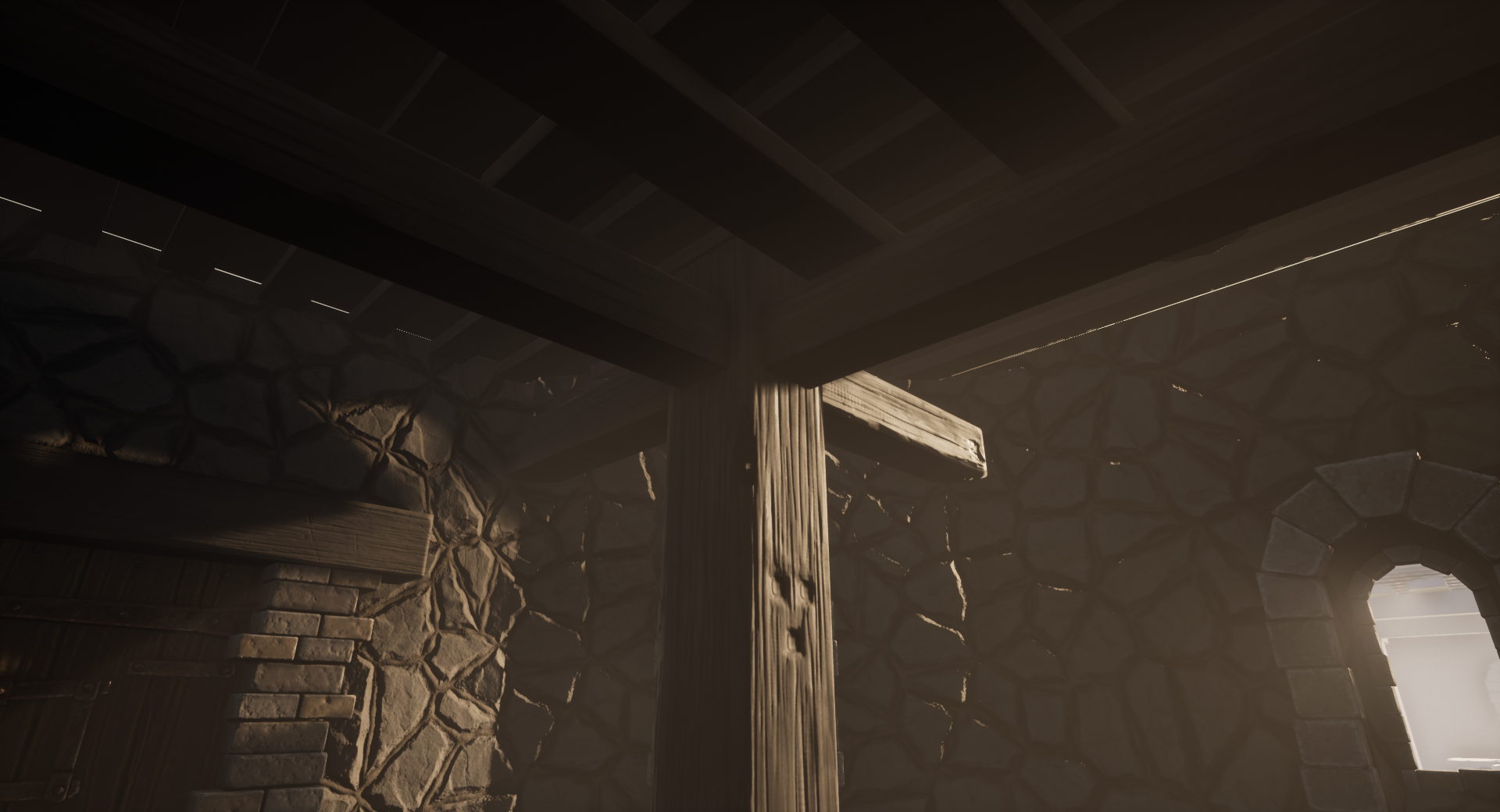
- A good amount of reference though it would have been nice to see some annotation. Block out looks good and I’m glad you are sticking to a smaller environment. The cauldron looks a little out of place. This could be because of its size but it makes the block out look more like a witch’s room. Sculpts and models look good (as well as UVs). I like that you have baked a kit of parts to assemble some of your assets. The sculpt of the cauldron looks a little overkill. I’d imagine it having a few dents and scratches instead of heavy erosion. Good use of tiling textures though they could have both done with more height and colour variation. It would also have been good to have some grout between the bricks, especially around the door. The composition of the scene works but the overall image is just brown. It would have been good to get materials of different shades in there but it is good to see that you’ve used PBR. I would advise you to use a single directional light instead of several spotlights to cast light through the windows. It would have been good to see a contrast in the lighting too eg. blue/white light from the outside, orange light from candles inside the cell.
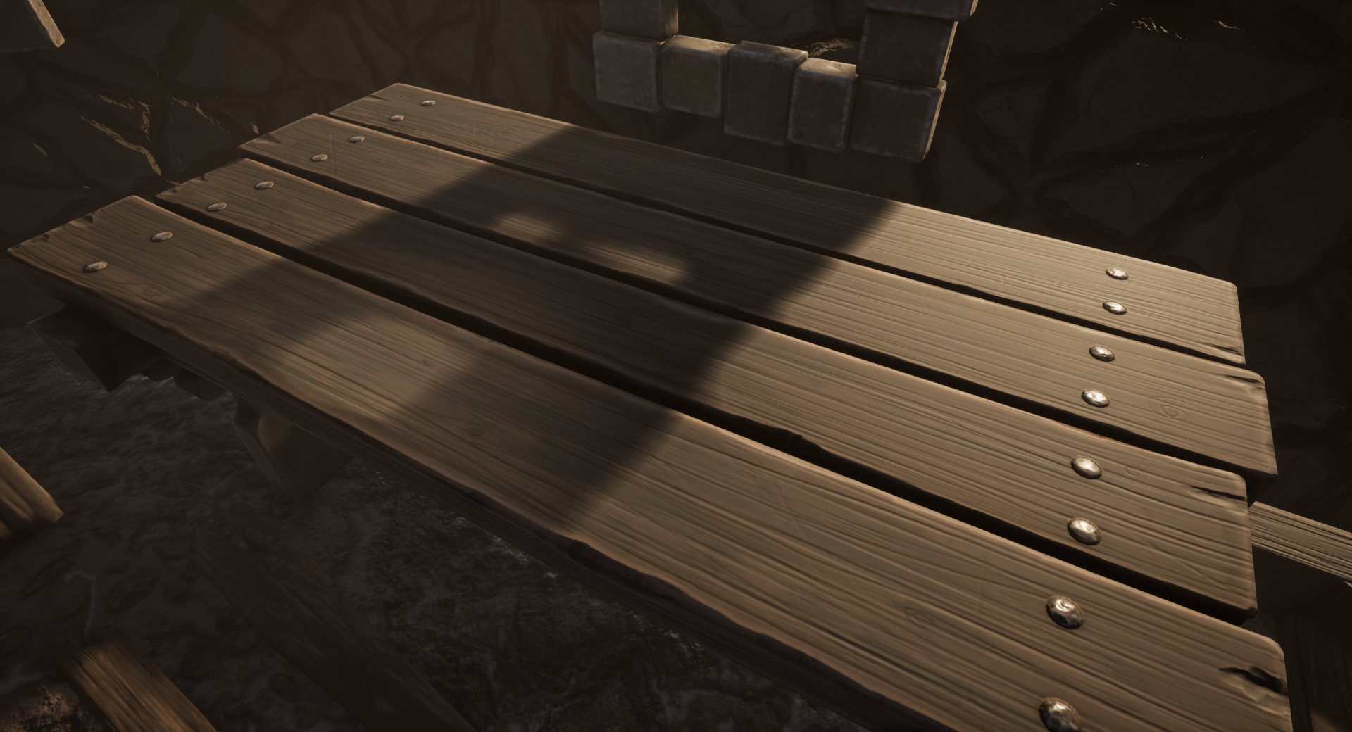
- Research & Development Nice references. Interesting wear and tear. Creative Art The scene reads as a place where there's a bit of light. Not all hope is lost. Analogous color palette supports the feeling of being locked away in a cell, and not that much to do. Materials themselves look quite interesting, but the choice on the wall and as the brick pillar don't support the prison feeling or how the structure is built that much; the wall feels a bit too fine and architectural, and the brick formation with wooden timber on top feels a bit more like a support pillar. The wood could use a bit more rougher cuts and wood grain to cater to the prison feeling, and wear tear and dirt. You maybe overdid the cauldron by a bit, but what's the thought process behind it, by the way? Huge cauldron in a prison cell -> it's a bit contrasty to how I would perceive the idea of treating the prisoner, especially in Game Of Thrones like setting. Judging by the summary, it was supposedly more of a witch' lair, with books, candles and such? It could show a bit more with all the decisions regarding the scene. Technical Art Good use of face-weighted normals. Lighting seems okay. Window rims look interesting with mesh modelling. Nails add interest to table. Nice use of channel packing. Cool sculpt work on table. Ground material looks intriguing. I don't think the tesselation brings good results as is to be left on. You may want to check the real world scales of objects and feel the space as a player. Material blending could add to the scene along with decal work to give a bit more of a dusty and hopeless feeling to the place. Documentation Short and sweet. Lots of images. Cool. Final Presentation Sharp images, easy to look at. Kudos.
- Submission Title: Prisoner’s Cell Submission Tier: Rising Star Assessor: Dominic Shaw Artist @ Firesprite Research & Development There was some really good research and reference gathering done for the project and it was nice to see real world reference. The block out for the level was pretty good and I think to help the project management it could have benefited from time plans and assets lists to really plan out the work. I think the project will really benefit from the props that was in the original block out that you didn’t get time to finish and I would recommend finishing them to fill out the scene before posting the scene to your portfolio. Creative Art The environment matches the initial idea quite well, it feels like a prison cell and it’s a good start. I think to match some of the reference a bit more the lighting could be a bit darker to really focus on the directional light coming in through the windows which will make a nice darker mood. There could be more dirt and grime around the environment to really make it feel like a dirty prison cell and a place where you wouldn’t want to spend your time in. I think to help the composition of the environment it would benefit from either scaling the cauldron down or removing it because the cauldron and door are fighting for the focal point. Technical Art You showed that you know the process quite well with the use of the trim sheet and modular parts such as the bricks and windows and you showed optimization techniques such as channel packing. However, I think you could push these things even more moving forward, the trim sheet you made was only used on one asset whilst with an environment like this that is covered in wooden beams you could have gotten way more use out of one trim sheet. The channel packing was good but you need to make sure that you do this on the textures that you have made inside of designer too. I think that you could push the modularity a bit more too, breaking up the walls and beams into pieces. I did like how you used the same brick mesh to tile around the door though. The main thing that would be nice to focus on is improving your designer skills, you have some good base textures in there but it would be nice to look into creating texture variations and use vertex painting to blend between them. This way you could get more grime and dirt everywhere. Documentation There are some good breakdowns of the props and textures in the documentation and the approach taken was quite well to make this environment. You show a good understanding of the workflows needed to create game environments and now It’s just about refining your skills in each area to improve on materials, use of modularity and then learning more advanced workflows such as vertex painting. Final Presentation There are some nice final renders for this environment and a nice close-up shot of the table. To improve the shot of the table, I would add a few filler/ storytelling props to help make this image more interesting to the viewer. Overall, I think this is a good start to this environment and moving forward I would love to see the props added from your original block out such as the books whilst also adding a few extra things such as hey piles and cages to the windows which are seen in the original reference. I would also try to dirty up the environment a bit more, other than that a really good job!
Challenge Tier
Sumo Digital Rising Star
Leave a comment
Log in with itch.io to leave a comment.
Comments
No one has posted a comment yet