Play environment kit
The Lost World's itch.io pageResults
| Criteria | Rank | Score* | Raw Score |
| Research & Development | #36 | 2.833 | 2.833 |
| Documentation | #36 | 3.000 | 3.000 |
| Technical | #45 | 2.500 | 2.500 |
| Overall | #47 | 2.600 | 2.600 |
| Presentation | #50 | 2.500 | 2.500 |
| Creative | #67 | 2.167 | 2.167 |
Ranked from 6 ratings. Score is adjusted from raw score by the median number of ratings per game in the jam.
Judge feedback
Judge feedback is anonymous and shown in a random order.
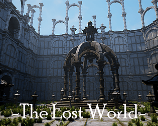
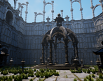
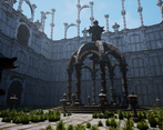
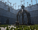
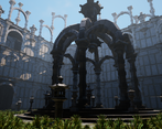
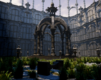
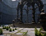
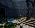
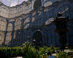
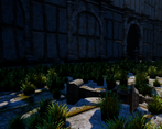
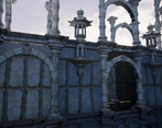
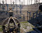
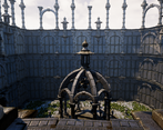
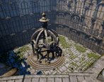
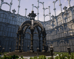
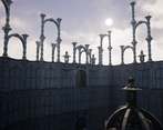
- Artist – Callum A Category: Search for A Star Assessor: Anthony O Donnell – Lead Artist at Firesprite Work name: The Lost World This is a strong start to a scene with good potential. The assets currently in there are well made. Research and Development /Documentation The document is well presented and details the creative decisions along the way nicely. A good workflow was used to build the scene from whitebox to final. The inspiration and it's influence on the work thus far is clear to see. Technical Art The time saving decision to use a trim sheet and tileable textures is a good one. There's decent variety in the assets despite a limited texture set being used. Channel packing was not used in all texture sets but would be a good optimisation to further reduce the texture memory footprint. The stone floor tiles had the green channel of the normal map inverted this needs to be "flipped" to match what UE4 requires. Given the limitation of trim sheet use larger surfaces such as the base of the pagoda resulted in noticeable texel density changes and warped UV's. More geometry would help with the stretching and detail map overlays in the material to hide a lower texel density in areas. Geometry Polygon distribution is fairly sensible across the board with no major issues. Materials and Textures The sculpted meshes for the tileables and trims were well done and it adds a lot to the visual interest of the scene. Creative art The scene as it is now is a strong base to build upon with the core elements present. What is lacking is more variety in assets and texturing. Vegetation has been restricted to grass currently but could be expanded upon to include growing up walls, trees and plants growing in areas receiving a lot of light as per the reference images. Moss build up on the assets via a blend material would also add a lot. The grass placement could be used as a compositional tool to lead the player around the scene subtly along with lighting. Final Presentation The final images are good but lack variety in colour / details. The arched monument makes a focal point but it's purpose is not clear currently. Adding some elements to build a narrative would strengthen the image. Looking forward to seeing how this piece develops.
- Good to see some reference and an analysis of lighting and composition. I also like that you drew out a plan of what you wanted to create. Good to see a block out with some lighting and set dressing elements early on. Good to see the use of trim sheets and that you used these in the creation of other props. Your grass clump looks too thick and it would have been more efficient to bake several arrangements onto boards and scatter these throughout the scene. It would have been more realistic to see the grass sprouting from tufts of mud or between stone tiles rather than sitting on top of them. The walls contain a lot of unnecessary geometry; it would have been more efficient to use flat geometry and the trim sheets to create more interesting patterns and break up to the scene. I like the lighting and that the direction matched that of the sun although it looks like you’ve used two directional lights. Be careful of doing this as it isn’t very optimal and creates jarring compositions (eg. two lots of shadows are created but only one light source is visible).
- The idea and concept is great, but in execution there are a few things that pulled the final visual back. Scale and consistency. The scale of the grass and floor tiles are difficult to understand, in your screenshot of Last Guardian you have the boy in shot to help give a sense of scale to everything - having something like that would help. Secondly, in terms of consistency the grass sticks out too much - the environment building looks old, cold, abandoned, but the grass is vibrant and distracting from your focus. Again, look at the Last guardian shot, the grass has the same palette as the building and blends in. Fix these 2 things and the scene will work much better.
- Research & Documentation The research with temples looks good and promising. The place feels filled with narrative as is, and I'd love to see some research or reference it would have been possibly based upon. Maybe some cool material, lighting and mood reference next time as well would give an extra push to the scene. Creative Art The eerie, dream like setting with architecture consisting of doorways and arches reads as an interesting place to explore which could have some sort of intriguing historical setting and mythology. The place feels a bit haunted. The references of temples are not exactly alike. Color usage could be explored a bit more. The repetition makes the scene heavy to look at, with not that lot of space to rest your eyes around. Technical Art The grass mesh seems too heavy to me, and could be populated using vegetation tools. All in all, meshes are game ready and there's a nice use of tileables and trims. Lighting looks nice and the post process works well. (Ps; you may want to check power of 2's for the texture, there are engines that can't handle other sized textures without crashing) Documentation Texts are easy to read. Materials and workflows are presented well. Final Presentation Images are nice and sharp, and showcase the scene well.
Challenge Tier
Search For A Star
Leave a comment
Log in with itch.io to leave a comment.





Comments
No one has posted a comment yet