Play asset pack
Reactor's itch.io pageResults
| Criteria | Rank | Score* | Raw Score |
| Technical | #27 | 3.130 | 3.500 |
| Presentation | #30 | 3.130 | 3.500 |
| Creative | #36 | 2.907 | 3.250 |
| Overall | #45 | 2.683 | 3.000 |
| Research & Development | #60 | 2.236 | 2.500 |
| Documentation | #75 | 2.012 | 2.250 |
Ranked from 4 ratings. Score is adjusted from raw score by the median number of ratings per game in the jam.
Judge feedback
Judge feedback is anonymous.
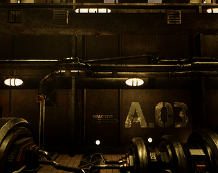
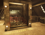
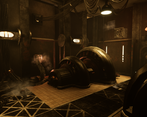
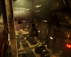
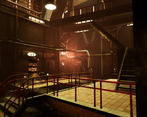
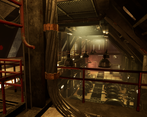
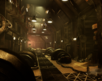
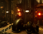
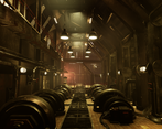
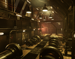
- I appreciated reading a synopsis of the workflows you made use of on page 2 but it would have been good to read a more detailed break down of them throughout the document rather than just pictures. I would have liked to have seen a breakdown of the reference you wanted to work towards. Your block out looks quite solid and it’s good to see the progress of the scene over time. The models in the scene look quite big in size. It would have been good to have more assets that help scale the scene throughout it eg. doors, ladders, trolleys, extinguishers, etc. Really pleased to see you using Houdini to create procedural meshes and that you’ve heavily used them in the scene. On cylindrical objects always add more geometry to the circumference to reduce the faceting you see between polygons (this can be more noticeable on larger objects). Also, include a bevel on objects with right-angle corners. This will help the light bend around the object instead of cutting off from one surface to the next. It looks like you’re using PBR textures and materials though I have an issue with them in that most of the metal is grungy yet the floor is quite clean. Try and get a more even spread of the grime next time. Additional set dressing would work well here too. The composition and lighting really draws the viewer into the scene and you get a good sense of depth with the fog. There’s a nice balance between the light and dark areas and the addition of the red light in the back of the room is a nice bit of detail and adds interest to the scene.
Challenge Tier
Sumo Digital Rising Star
Leave a comment
Log in with itch.io to leave a comment.


Comments
Research & Development
Moodboard has lots of interesting references and different feelings to the scene. I'd like to see a bit more research into what the place is supposed to be. I take it the main reference is actually a hydropower plant such as you could see next to dams? There's a bunch of reference on subjects such as Grand Coulee Dam or the Hoover Dam.
Creativity
The lighting, contrast and shape languages read well, and showcase a power plant. The screenshots look very nice as thumbnails, saying there are lots of things done right in there! :)
The next step would be to get closer to matching different materials and hitting proper texel density all throughout the scene, if that's what you'd like. On the other hand, expanding on the Houdini workflows might earn you a position as a terrain/technical/houdini artist in a game studio. It boils down to what you want to strive for, really. :)
Technical Art
I like the complex shaders and the intensive use of Houdini for the scene. It's hitting the technical side of things in an interesting way, but the complexity might be distracting a bit from the art side of things. You can get a lot of things done with tileable textures, trims and unique textures without the need of creating super complex shader networks that take quite a lot of time to iterate on.
The use of particles adds more interest to the scene.
The lighting can look very nice flying around in the scene. At times some of the objects aren't casting lights, which makes the scene feel a bit less of a real world location. Like you stated in the brief, the end result is a bit on the lower side on polycount for the bigger, rounded shapes of generators, but you modeled the gratings with hard edges, making the asset be more than 10k in the polycount (You could bake the grating, add the supports and frames as geometry).
Documentation
The text is easy to read and gives a nice glimpse into the development. The progress shots look very nice.
Final Presentation
The final screenshots look nice and sharp as screenshots, and the thumbnails look great.
Hi, thank you very much for the extensive feedback!
I'll be sure to take your advice to heart for future scenes and will take another pass at this project focusing on polycount and lightning.
I'm looking forward to indeed improve and expand upon my houdini workflow in particular,
while keeping in touch with the creative side of environment/asset building.
Thank you again for the valuable feedback, there is a lot to work with here and improve upon,
much appreciated.
Sincerely,
Elie