

Play game
Hidden Sanctuary (SFAS Entry)'s itch.io pageResults
| Criteria | Rank | Score* | Raw Score |
| Research & Development | #1 | 4.333 | 4.333 |
| Documentation | #1 | 4.833 | 4.833 |
| Presentation | #7 | 4.333 | 4.333 |
| Overall | #7 | 4.067 | 4.067 |
| Creative | #13 | 3.667 | 3.667 |
| Technical | #22 | 3.167 | 3.167 |
Ranked from 6 ratings. Score is adjusted from raw score by the median number of ratings per game in the jam.
Judge feedback
Judge feedback is anonymous and shown in a random order.
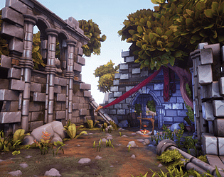
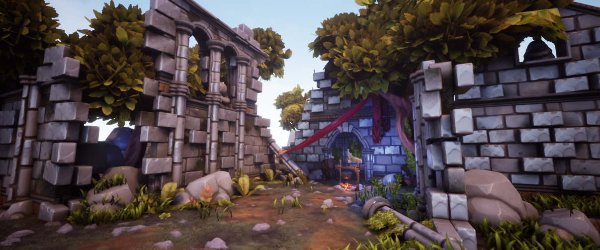
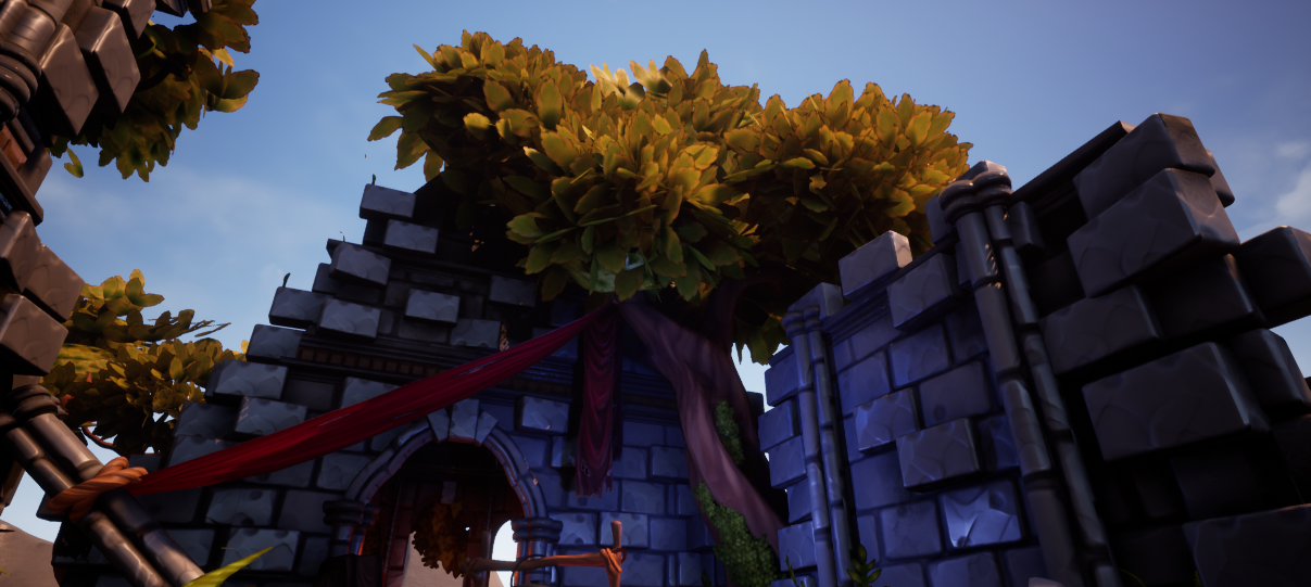
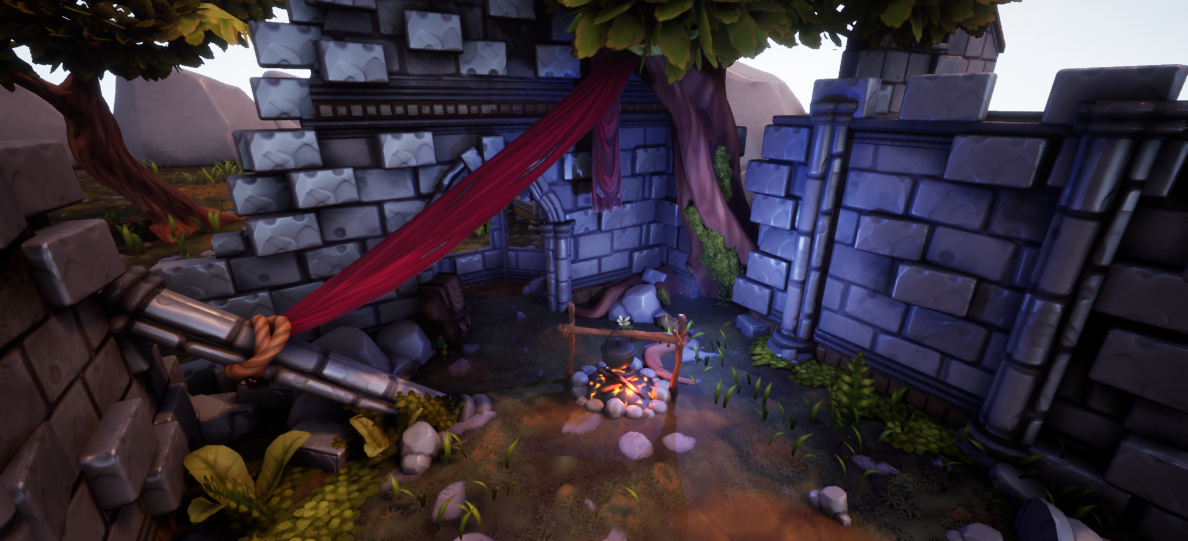
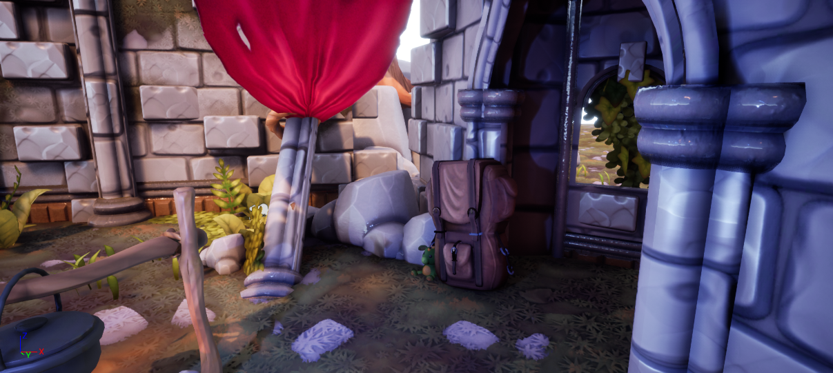
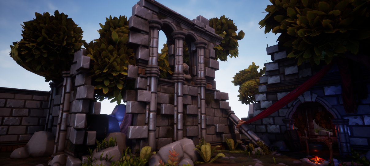
- Research & Development There is some good research and development in evidence, you put a lot of time and effort into this which is good to see. Using concept artists on Artstation and so on is (fully credited of course) is a really good way to find inspiration, and is good practice for a studio environment where you will be working to different art styles and so on. Technical Art Unfortunately there are some fundamental problems with the scene from a technical perspective, which detract from your goals: You haven't really got to grips with the whole PBR thing yet: parts of the walls and trims have zero roughness, which equates to absolute smoothness like plate glass and is inconsistent with the rest of the scene. The stones wall has metallic values. This gives the material a strange look. The ground material is all over the place. You tried to do something clever with the parallax mapping, but quickly hit the problem of not being able to use vertex blending. I don't think you dealt with this issue well, and the final material is a bit of a fudge. It would have been better not to use it in this case, and used regular geometry to add bumps and hillocks to your terrain, and scatter rocks and grass around. This would probably have been more performant as well. Alternatively, you could have tried to make it work with a single tiling texture set with parallax, and added as much variation as possible to the texture. Poly density wise, I think the rocks and trees are needlessly high, and should have been retopologised and baked. Texture wise I think you handled the stylised foliage quite well, as this can be tricky. The blend material on the wall was well-intentioned but the blend isn't set up correctly, for instance the diffuse used a different blend from the roughness and normal channels, so they don't match up. I feel you could have done more with the atmospherics and the glowing embers of the fire for instance. Creative Art Despite the good research we see a lot of these abandoned ruins in portfolios, and I don't feel there was anything that really made yours stand out. I appreciated your emphasis on narrative storytelling within your environment, which I think is really important. Unfortunately I think the narrative that we ended up with - of a traveller camping in some ruins - is not particularly inspiring. I would have liked to have some more hints at the nature of the ruins and civilization that created them - they started off quite church like, but then veered away from it, which is fair enough, but they ended up quite generic. I don't get a firm idea whether this is a fantasy setting in the way of a secondary world, or whether it is set in our world, in some point of history, or even contemporary. Also, from reading through your notes, I feel like you made a couple of wrong turns along the way. I really liked some of the early blockouts with the higher walls and the large broken window, and the early experiments with the circular floor were better than the final result in my opinion. I feel you could have reconciled this with the original concepts rather than just abandoning it - for instance, the modular pieces cound have been adjusted to create an eight or twelve side space. However, compositionally you pulled it together in the end - the addition of the tent awning, and the camp fire added a focal point and a colour accent, and really helped bring the scene together. Documentation Documentation is really detailed and well put together, with step by step details along the way. It really helped in communicating what you were trying to achieve. Final Presentation Final renders show good composition and layout, and show off the scene pretty well.
- First let me congratulate you on your piece, really like it, very atmospheric, tells a great little story. Please let me help you make this something truly awesome to put in your folio, it's so close, it just needs a few tweaks and I'm sure it's mainly because you ran out of time. So I opened the scene and was impressed to see you'd used POM. (Parallax Occlusion Mapping) Good stuff, it's just a bit setup wrong: Please see correct set up image link here -> https://pasteboard.co/ISxxSoM.png (let me know if this link doesn't work, you can find me online @TechArtHarper on twitter, DM me, or find me on linkedIn). Also, the floor needs moving and cast shadows turned off, remember that POM casts into the geo, this also means that unfortunately that when done correctly separate floor panels don't line up, so you need one big floor panel (which isn't great for performance..) but as a showcase piece have one large floor. Also, plug in the POM to the Pixel depth offset, from pdo of the node, this means that when you raise the floor the rocks will blend properly over the top of the other rocks etc. On top of that, i tweaked a lot of the values, min steps at 8000 is not great lol. Dialled it to more normal levels. If you have any more questions about how it all works, shoot me a message. I noticed the UV mapping on your pillars is a bit off. Fix that up. Won't take you long. Maybe stick with a constant scalar value for the metalness of the bricks, usually bricks aren't metal, it makes them look a little weird, if you want them shiny, just control the roughness and that should be more than enough, metalness is usually just for metals. Also in the post process volume, you notice how the exposure is having to work really hard to correct because the light is super dark, set your light to a normal lux level value, like 6, then can the control to manual and tweak that to around 12.5, this way it's nice and constant for his scene. If you want to make the shadows brighter, up the indirect light intensity and rebake. For the trees maybe try and bend your normals into a spherical shape, this will help them feel more bushy. See: https://www.artstation.com/artwork/1nxAVq Also be aware that the walls you made have 1) obvious repetition in the textures 2) walls would not be built like that, nor would fall down like that, take some time to consider the reality of construction and ruin. Some bricks are floating on the right of the image. Good stuff, Chris Harper Snr Technical Artist @ Splash Damage
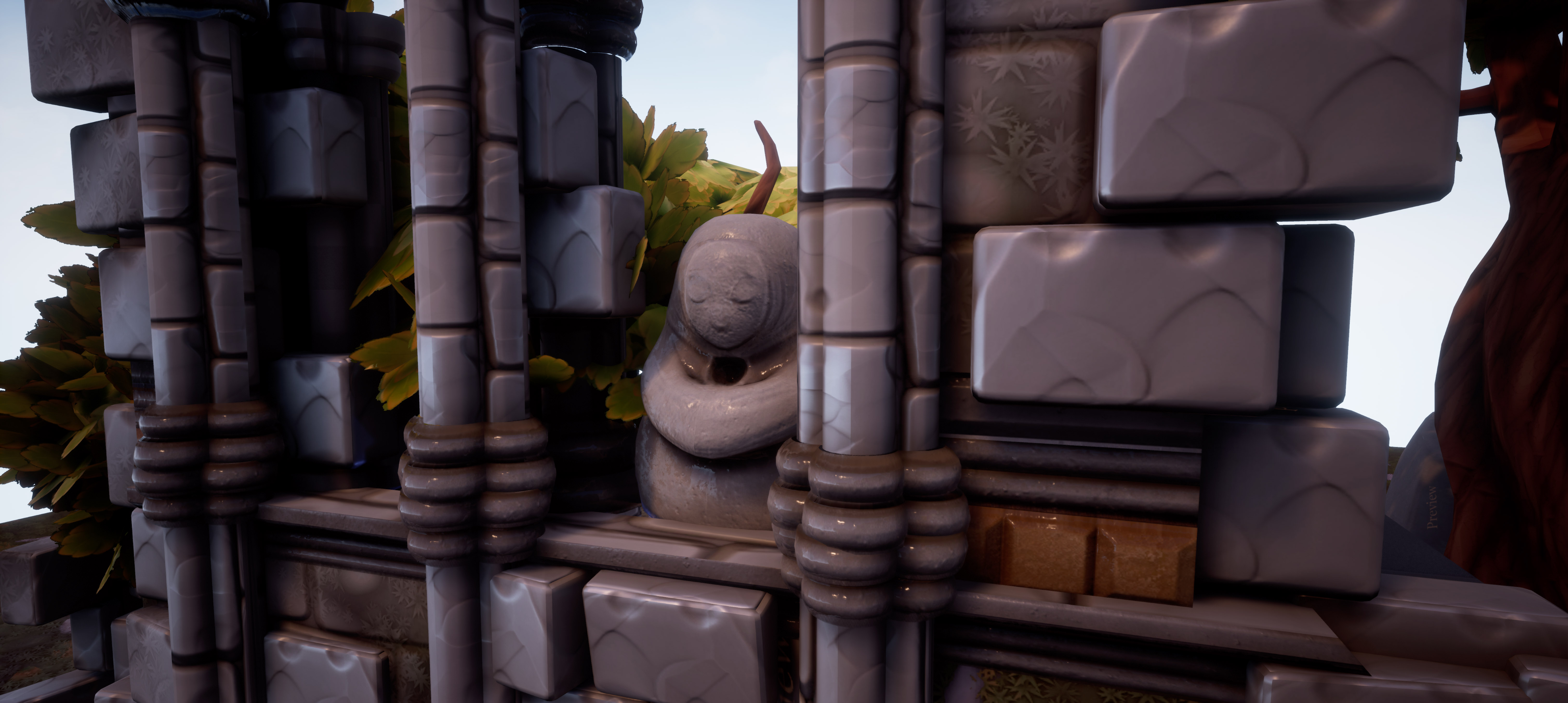
- Research & Development Research showcases scenes with similar aspects. However, they seem a bit broad and wide on the spectrum; narrowing things down might help with communicating the end goals of the scene. Props look great, but are they based on references as well or are they of some references? Creative Art The scene has nice atmosphere and good sense of color and palette. Blue light acts well breaking down the section. The style of materials follow a cohesive whole. Composition wise I feel like I want to go through the crack on the left, where the red cloth is pulling towards, yet it is blocking the path abit by being in front of it. The tree shape in the concept works may be a bit beter than the final one you did; this one is coming from behind the corner, when the sketched one was more visible with rounded shape around the bonfire to act more as a frame. The backpack and mother statue look nice and interesting but are a bit hidden right now. Having stone bricks as separate meshes could be a bit of a drag to further feel and enhance the scene, if we needed a layout change. Rocks on the ground are a bit big, and could be made as separate meshes that could be carefully spread and placed with vegetation tools. Ground could support the composition with path being a bit lower and edges having gained a bit more dust and dirt. Technical Art Meshes mostly seem well optimized. Lighting setup seems delicate and easy to work and adjust. There's a good use of trims and tileables. Reused texture space might be beneficial for props also. Object such as the 'lowpoly rock unwrapped' is too high on polycount, though. The leaves of trees being singular meshes is an interesting call, and works here, but might be hard to work with if there was a layout change, and would call for more instances in the scene. Parallax mapping material is a nice technique, but makes me feel a bit weird when the rocks seem to be under a layer of poured resin. The material also dropped the FPS for the project by quite a lot; I gained a lot smoother performance by disabling tempAA+Parallax Occlusion of that one map (shouldn't it be fed into other maps of the same material, too?) Was there maybe a reason to use a value of .1 to the opacity of the foliage? It seemed a bit broken in the delivered level with black stripes on my computer (could have been a light bake error as well?), so I changed the mask to connect to both of opacity and opacity mask. Making a Master Material and using instances of that material would be a good policy to pickup. Post process is nice in there. Lens - Exposure Min and Max brightness set to roughly the same number before starting to work on lights can help to disable the eye adaptation, which makes the lighting work a bit easier. I'd suggest having a look at metallic/roughness workflow guidelines from Allegorithmic based on metallic values on the rock materials; https://academy.substance3d.com/courses/the-pbr-guide-part-1 Documentation The font is a bit small, but there's a lot of text, and the thought process and decisions are spoken out well. Final Presentation The scene is presented well with interesting bits of the scene. Screenshots are of high quality and show different aspects of the scene well.
- Research & Development: Extensive research was done into defining the idea for the project, what you wanted to achieve with it, and what kind of narrative you wanted to get across in the environment; I can clearly see how your research influences your final concept. It was great reading through your commentary on the various decisions you had to make and how you approached them to come up with solutions. I also liked that you demonstrated that you’re not afraid of changing things around/iterating to get to a point you’re happy with it. To expand on the iteration point, I felt that in particular when you were trying out the lighting direction to draw the eye onto the structure, that it was fairly subtle variations. When blocking the lighting in, it’s good to make really big drastic changes in both intensity, colour, and time of day to really emphasise the idea behind what you want to do with it and the kind of emotion you’d like to evoke (of course toning it down for final). The idea of making big changes in the beginning also applies to meshes/compositional elements, as the more variation in ideas you generate at the beginning, the more of a selection you have to choose from and develop. Creative: I quite like the style you’ve got going on with the scene, the colours are strong, they pop in the thumbnails, and the way the screenshots are composed really adds a lot overall. The layout of the space is good, and the red cloth pulled across to frame where the travellers have their little setup with the campfire also help to make it inviting. It was a good decision to model some of the bricks and add them on top of the tileable to give them a better silhouette, this technique is used so much with tiling textures and you really notice it when it’s not there. For the trees (most foliage really), visually speaking you’ll want to put a focus on the overall silhouette and form of the asset i.e. treat the canopy like a volume of hair rather than individual branches/leaves. This way they’ll feel a lot more grounded in the environment as you can make it look like it has real weight and has drooped over time for example. You don’t notice much in the screenshots, but the ground looks a bit blurry with splotches dotted around/not as defined as it could be. For the cloth, even though it is a great addition to the scene, it feels as though it’s pulled quite tight across and think it would feel nicer if it looked like it had a bit more weight to it/drooped down more in the middle, just to relax it a bit. For visual consistency, it’s always a good idea to check your base colours in the viewport under ‘Lit’>’Buffer Visualisation’>’Base Color’. If they all feel right i.e. not too bright or dark, saturated or unsaturated, then it should help with consistency. You’ll notice the difference quite strongly in saturation between the leaves and the ground, so balancing these kinds of things will help. The blending is a good addition and allows for more unique looking assets with the tileables, however the way the ground texture is blended onto the bricks doesn’t quite work as you’d need to define it with a good blending mask to get a nicer transition between the two. Technical: It’s great that you’ve delved into designer a bit to make the materials as it is a really useful tool to learn, your general workflow of creating the assets is good (high poly, zbrush, bake etc), and I like that you optimised the foliage by getting as much as you can onto the one atlas sheet. There’s a few things I’d like to mention in terms of the optimisation of the scene and the assets though. For optimisation, the scene’s performance is heavily impacted by the foliage and the groundwork. The trees should be constructed in the modelling program (Maya in this case), and exported as one single asset. Therefore you wouldn’t be hand placing everything in engine and spawning hundreds of leaf card meshes. The same would go for the bricks on the wall, you’d place them with the modular asset to save on the number of meshes being spawned into the level. The same goes for creating the grass in the sense that you’d make clumps of grass outside of the engine typically using many blades to a single alpha and criss-crossing them, then using that single mesh in the engine rather than a single blade of grass. This method would of course increase the amount of overdraw, and there are a couple of scenarios where you would use the single blade, however I definitely wouldn’t for this scene and the other practice is usually the default preferred. It appears as though the floor is utilising POM (ParallaxOcclusionMapping), however the implementation of it yields undesirable results when looking at it in motion, with one texture appearing overlayed on top of the other rather than being used to add depth to the textures. Furthermore, for this type of situation you would use the landscape tool in unreal rather than many small squares duplicated across the floor as it’ll be far more optimal, and allow you to create some nice uniquely sculpted ground around the structure. Lastly, a few of the assets are rather high poly for what they’d need to be, and I would definitely recommend retopologising by hand things like the rock or the statue rather than using an automated workflow. I do however understand this may have been the choice to cut down on time. Presentation: The presentation is very good; screenshots are nicely composed, the project is clean, you’ve included additional sketchfab links to see the assets + flythrough video (would recommend looking into using cinematic cameras in the sequencer to get a more controlled/smooth flythrough, you can then really focus on the key compositional shots you’d like to hit in the motions). Documentation: The project is very well documented and enjoyable to read through. You’ve included a lot of research which drove your ideas for the project, showed problems you faced with your solutions, and had a good reflection of where you got with the project in the 3 weeks of working on it.
- Really great to see you breaking down the reference you gathered and finding artists that have a style that you want to try and replicate. Good to see your initial block out and how you added detail over time. Also great to see that you used a kit of parts from the beginning to help speed things up and stop you from creating unnecessary assets. Great to see a lighting block out at this stage and where you want the light/shadow to fall. Also great to see paintovers on screenshots and the direction you want to take the piece in. Foliage texture looks nice and efficient. You might want to consider using tiling textures on larger assets (like the tree bark) rather than trying to fit the UVs into the 0-1 space. Your rock sculpts and bakes look good but be careful of stretching the UVs. Good to see use of tiling textures and that you took the time to align your mesh blocks with those on the textures. All I would say is that it would have been good not to use the same stone texture for all of your protruding stone meshes. The style of the piece looks great, there’s consistency from asset to asset, the scene composition is good, I like that you’ve got a bit of story in it and the lighting works well. Really great work!
- Submission Title: Hidden Sanctuary Submission Tier: Search for a Star Assessor: Dominic Shaw Artist @ Firesprite Research & Development The documentation that you have made is really good and in depth, I like how you have found real world reference of what you wanted to make and not just images from other artist. You have done some really good exploration and idea generation and the concepts that you have done are really nice. Being able to concept things is a real advantage when making environments as it means that your work is more unique. The fact that you have researched the style that you wanted to make is really good too. The only thing that I would have liked to seen is more time plans and asset lists as the project management side of things is really important. Creative Art Overall, the environment that you have made is really nice and the style is good and matches what you were going for in your research. The composition and lighting of the environment is pretty good and I like the idea that you have gone for. There is some minor stuff which affects the overall style such as the bricks bit a bit to shiny which are making them not feel like brick so I would recommend changing the roughness value on them. The bricks also could do with some more variation as they look like the exact same brick repeated over and over again which breaks the realism of the environment. I noticed that you were looking at Sea of Thieves a lot for reference, It’s a small thing, but one of the main aspects on that game was making sure that the grass didn’t clip through any rocks so I would go back in to your environment and remove the grass that is clipping through the rocks. Technical Art I noticed that you took your rocks in to 3D coat to do the re-topology but I would have taken this in to Zbrush and dynameshed your rocks together and then used the Zremesher tool so that they are one mesh and doesn’t contain faces that you don’t see like you have in your current meshes. I noticed that a lot of the bricks had texture seams on them so this is something to be careful of when unwrapping them. It’s just a small, picky thing but this stuff is really important and it’s very noticeable in game. You used channel packing which is good but I noticed that on tile-able materials you didn’t channel pack so it could be good to make sure you are doing it on these textures too to help optimization. You used modularity and vertex painting pretty well and the way you approached making the environment was pretty good. The main thing that jumped out to me that needed improving was the ground material, you used the DitherTemporalAA which is a cool method but I felt that it gave you a strange affect here. This is because the leaves ended up looking like they floating and it didn’t feel like they were sat on top of the ground. I think to fix this, I would remove the leaves from your base texture and add these in to another texture that you would then vertex paint in small areas rather than having them everywhere and I would remove or just reduce the TemporalAA effect. The ground material itself could do with some more roughness variation and there were some points where you were getting Z-fighting due to the meshes overlapping. Documentation The documentation was really good and provided a good breakdown of all the workflows used. Final Presentation Overall, I think that you know the workflows and know what you are doing, the quality of the work is good and the style and presentation is really good. There are a few basic mistakes that need addressing such as the texture seams but overall you have done a good job of concepting the idea and then taking it through to a finished game environment.
Challenge Tier
Search For A Star
Leave a comment
Log in with itch.io to leave a comment.
Comments
Yes - It is TRULY a WONDERFUL Work you have made here - But where can i Download the actuall file - There is "only" the PDF here.....?