Play asset pack
The Elder Crypt's itch.io pageResults
| Criteria | Rank | Score* | Raw Score |
| Documentation | #53 | 2.582 | 3.333 |
| Presentation | #58 | 2.324 | 3.000 |
| Creative | #70 | 2.066 | 2.667 |
| Overall | #70 | 2.117 | 2.733 |
| Technical | #75 | 1.807 | 2.333 |
| Research & Development | #81 | 1.807 | 2.333 |
Ranked from 3 ratings. Score is adjusted from raw score by the median number of ratings per game in the jam.
Judge feedback
Judge feedback is anonymous and shown in a random order.
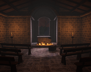
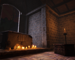
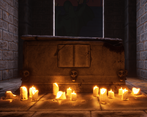
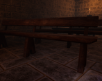
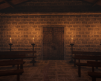
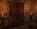
- Research & Development It's okay to do a concept sketch, but also to follow one reference as a main reference. Nice exploration to object shapes mood and materials. Creative Art The scene reads as a closed of altar/crypt. The lighting shows different aspects well, and gives a nice sense of directionality to the scene. All in all, the idea and narrative reads well in the scene. Pushing the quality of objects with trying to match for example thicknesses and silhouettes from high quality reference images would push the scene forward. It looks a a bit much like 3D right now. I'd suggest modelling different structures of wood as separate things also to low poly models instead of trying to push the baking process to everything. To add another layer of refinement, you could add irregularities to especially architectural modules. The sculpted tomb could use a solid hard surface base with the indents etc modeled with sub divisions, which then could be pushed to Zbrush to add slight, realistic looking edge wear for bakes, and the further material definitions and shapes could be done in Substance Painter actually. Technical Art Nice use of tileables. Nice channel packing there! Did you hit the 512 Texel density of 3rd person titles or 1024 or first person titles? If so, great! Zbrush is a valid approach. I'd suggest diving a bit into Substance Designer as well when you have the time, and look at what you can find at Substance Source. Megascans also has nice scans to look at. Uniques could also use maybe trims and tileables with vertex blending and breaking the shapes and silhouettes with geometry. Bench & roof support could maybe be merged into single trim sheet. Ceiling bricks would look interesting as separate bricks as low poly, too. Vertex paint material blends add an interest to scenes. Material instancing workflow is a nice policy to add to repertoire. Decal actors are also a nice feature of UE4. Documentation Nice documentation. Thanks for adding the texture maps there, helps judging by a lot. Final Presentation Nice images that showcase the scene well.
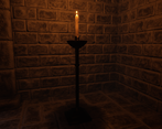
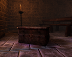
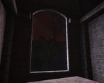
- Would have been good to see some annotated reference picking out things that you wanted to create. The block out looks good. Use of modelling in tiling texture creation is great to see. Bakes and textures look good but would benefit from some subtle height and colour variation, as well as stone rotation and slanting. Baking individual assets seems redundant as you could have used pre-existing tiling textures to make them. Likewise, one tiling wood texture would have sufficed instead of 3 baked assets. The blood material of the altar could be more reflective to make it look fresher. Good texturing on the candles, chest and doors. More could have been done with the lighting eg. a light shining through the window and more candles (and flames) around the scene. It would have been good to see a contrast in the lighting too eg. white/blue moonlight against the orange of the flames.
Challenge Tier
Search For A Star
Leave a comment
Log in with itch.io to leave a comment.


Comments
No one has posted a comment yet