


Play asset pack
Shady opuim den's itch.io pageResults
| Criteria | Rank | Score* | Raw Score |
| Creative | #17 | 3.578 | 4.000 |
| Presentation | #18 | 3.578 | 4.000 |
| Overall | #24 | 3.265 | 3.650 |
| Research & Development | #32 | 3.130 | 3.500 |
| Technical | #34 | 2.907 | 3.250 |
| Documentation | #35 | 3.130 | 3.500 |
Ranked from 4 ratings. Score is adjusted from raw score by the median number of ratings per game in the jam.
Judge feedback
Judge feedback is anonymous and shown in a random order.
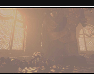
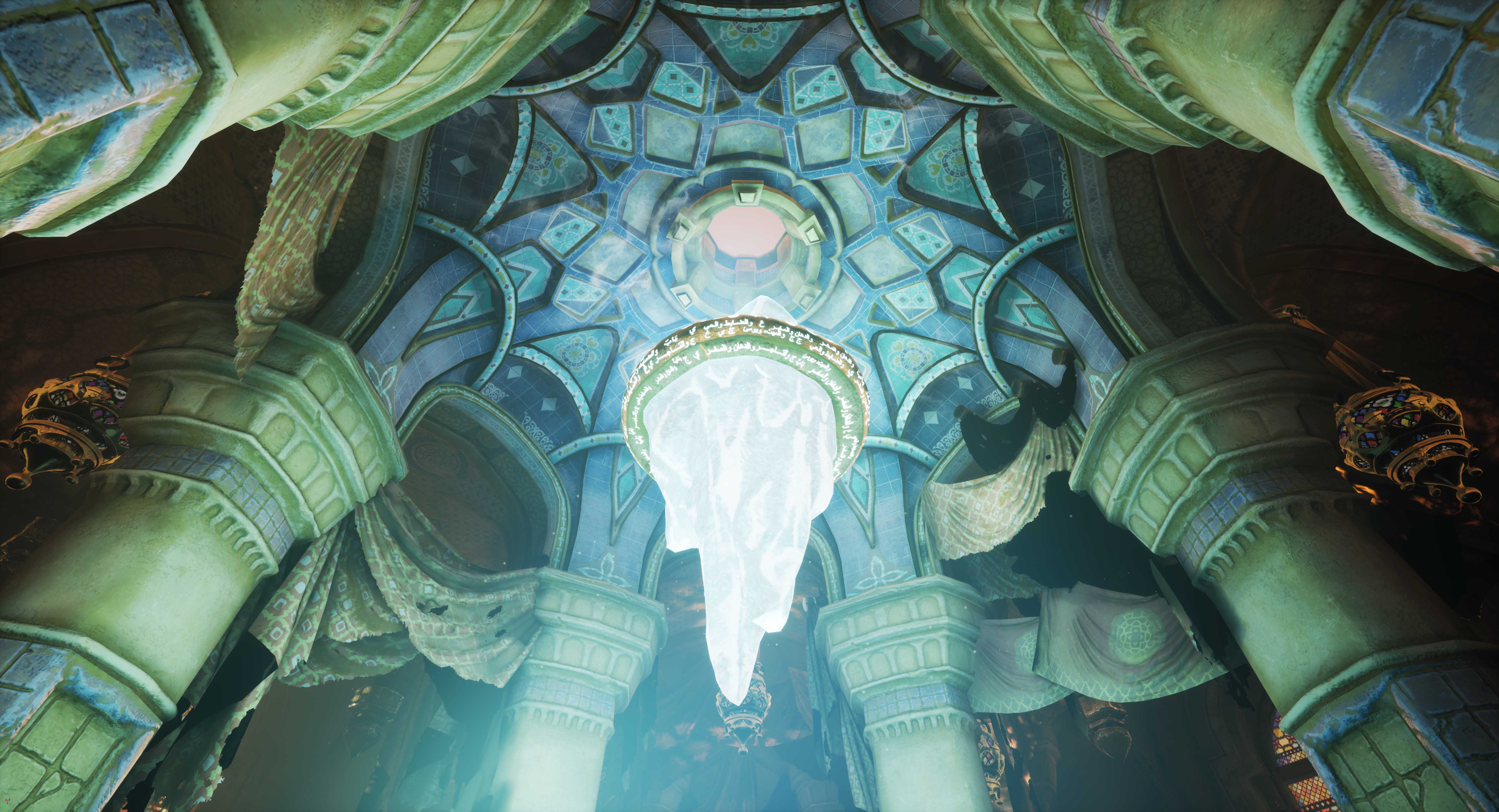
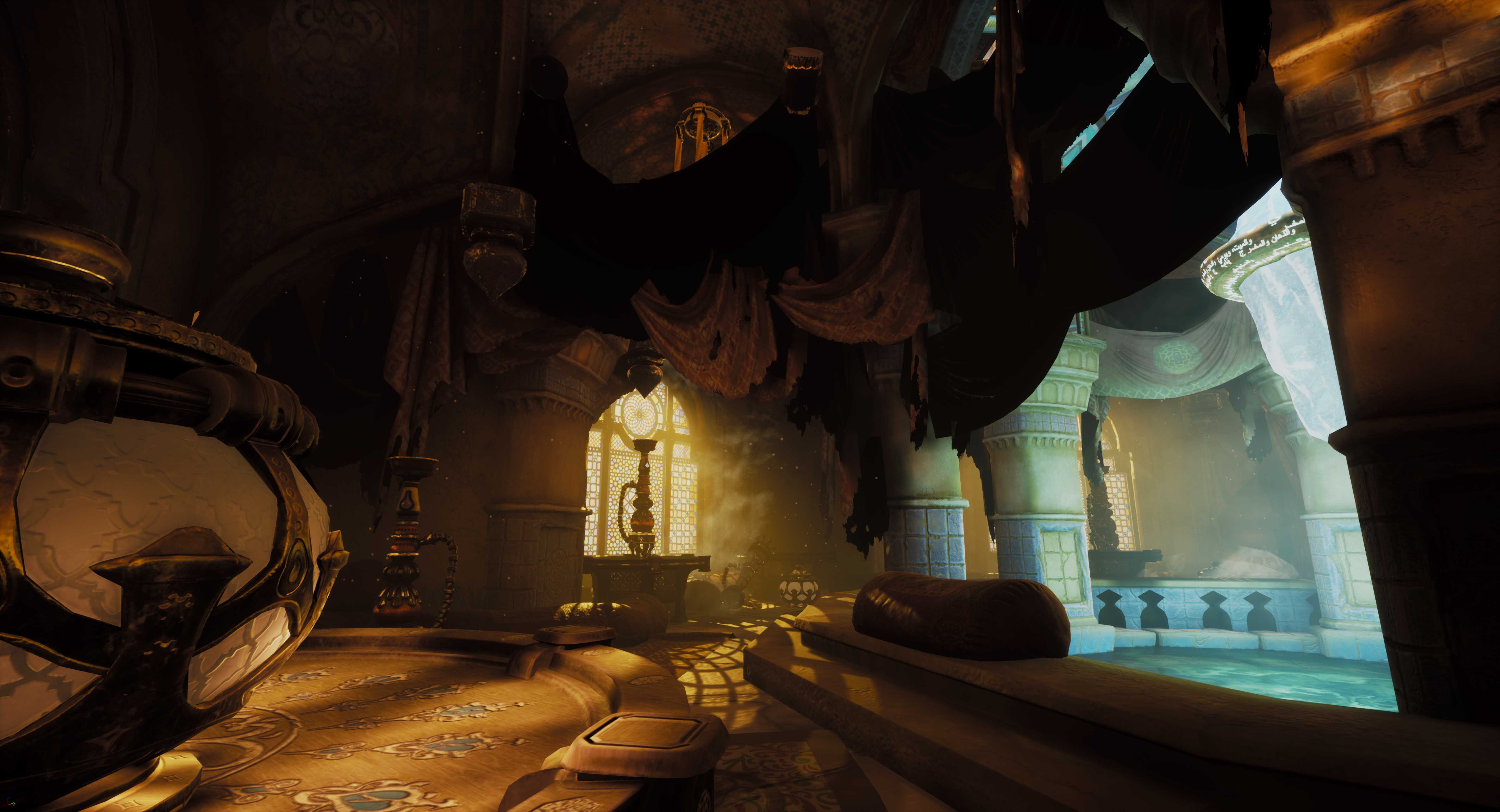
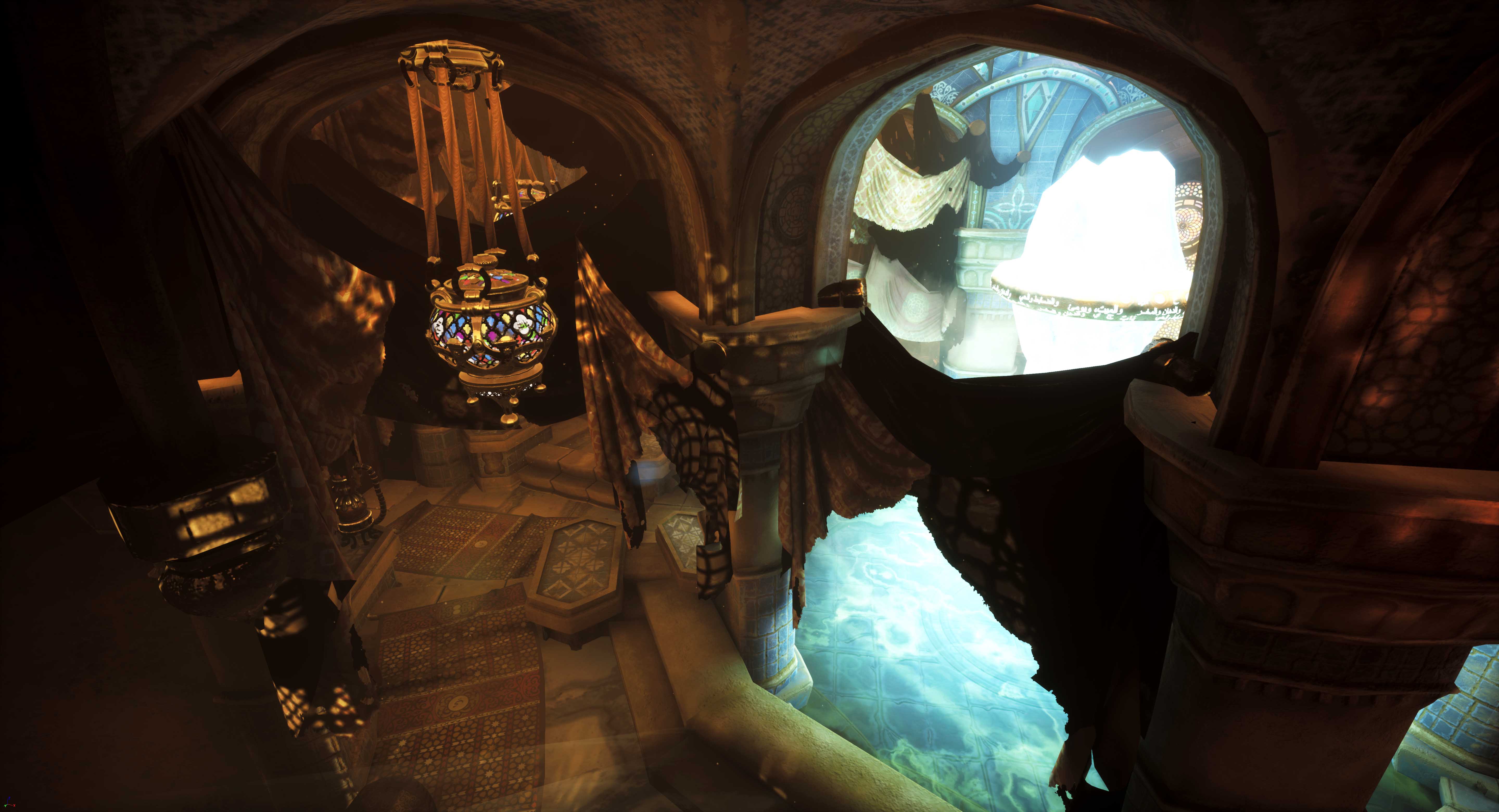
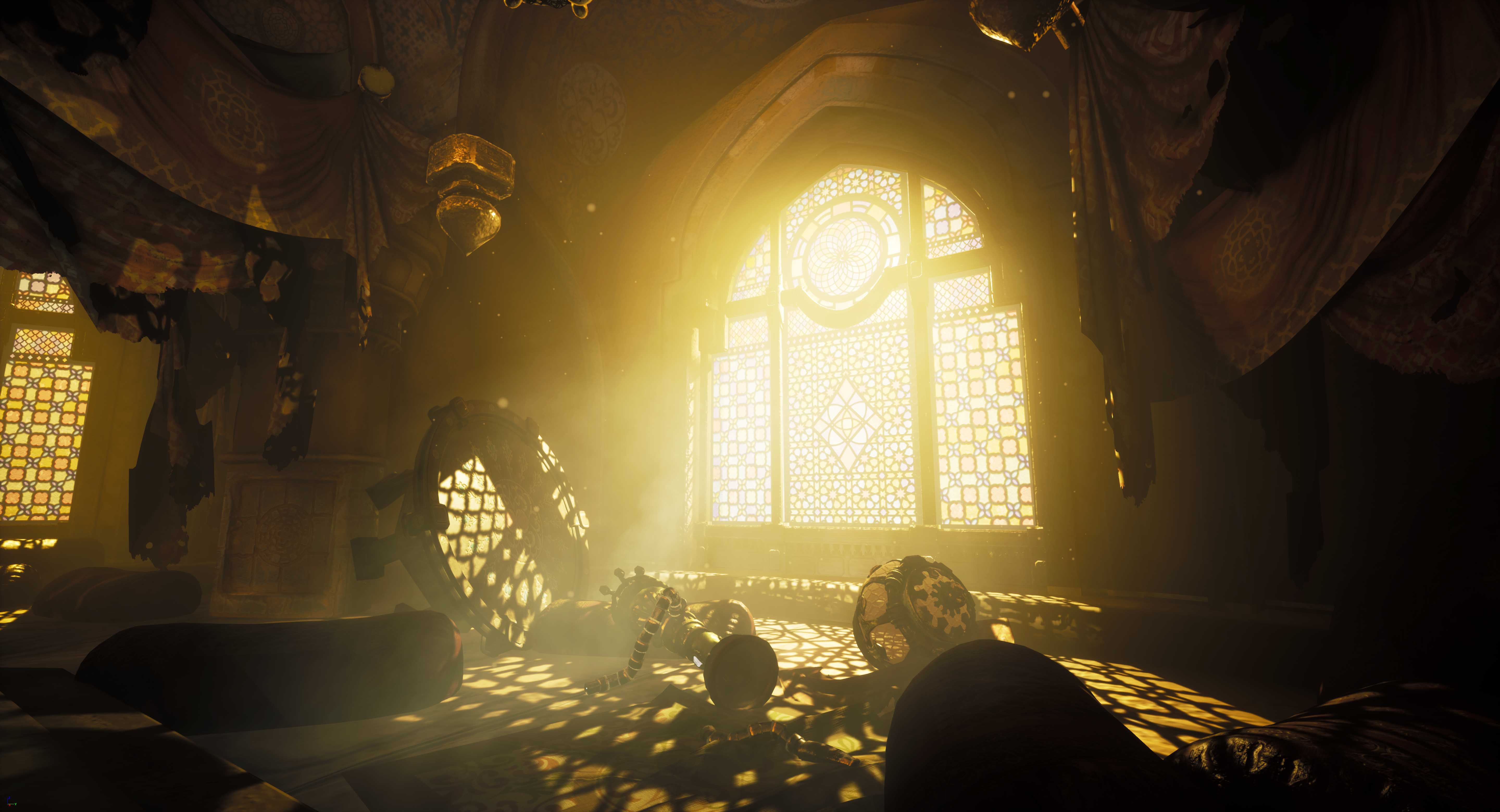
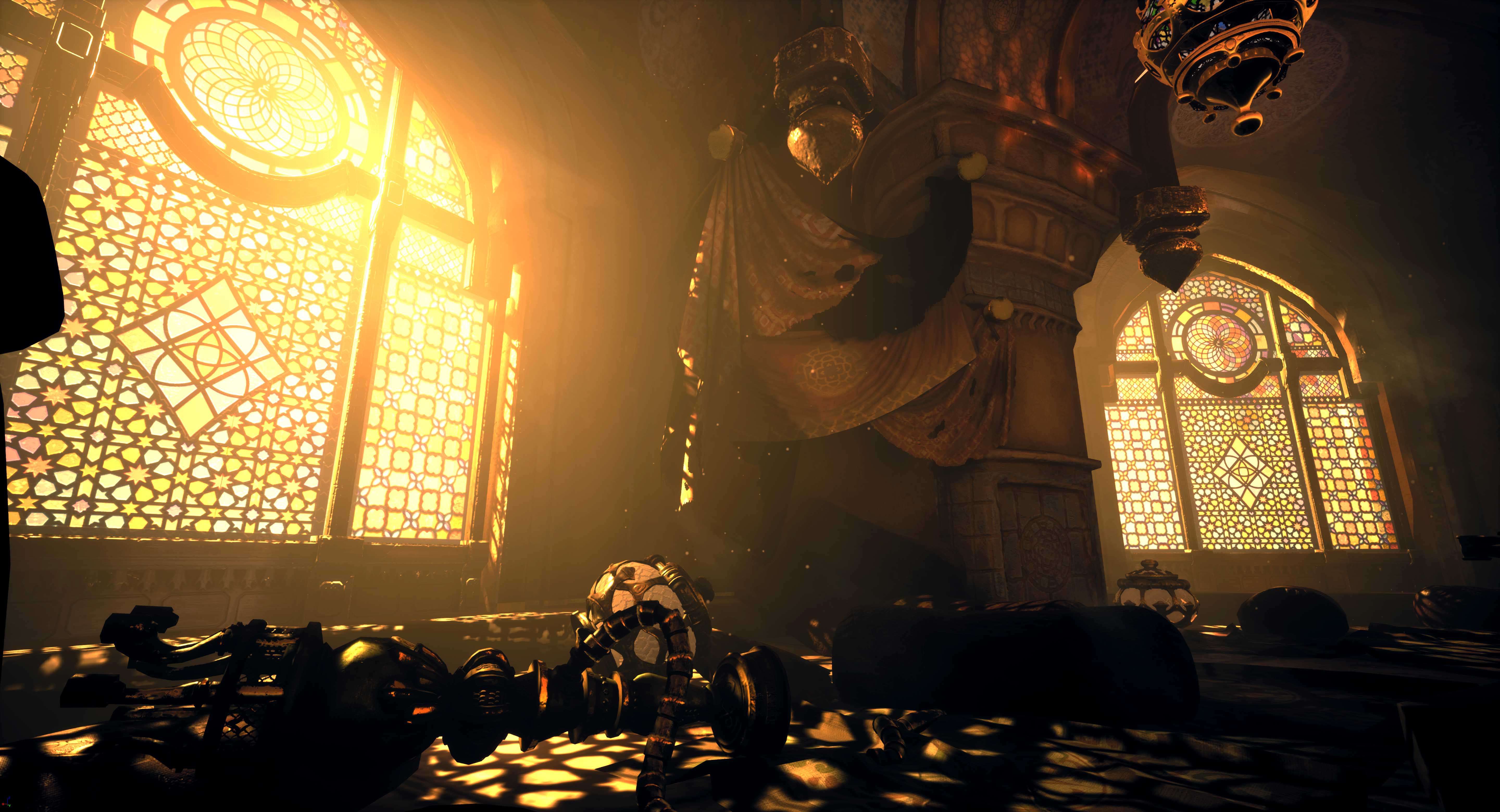
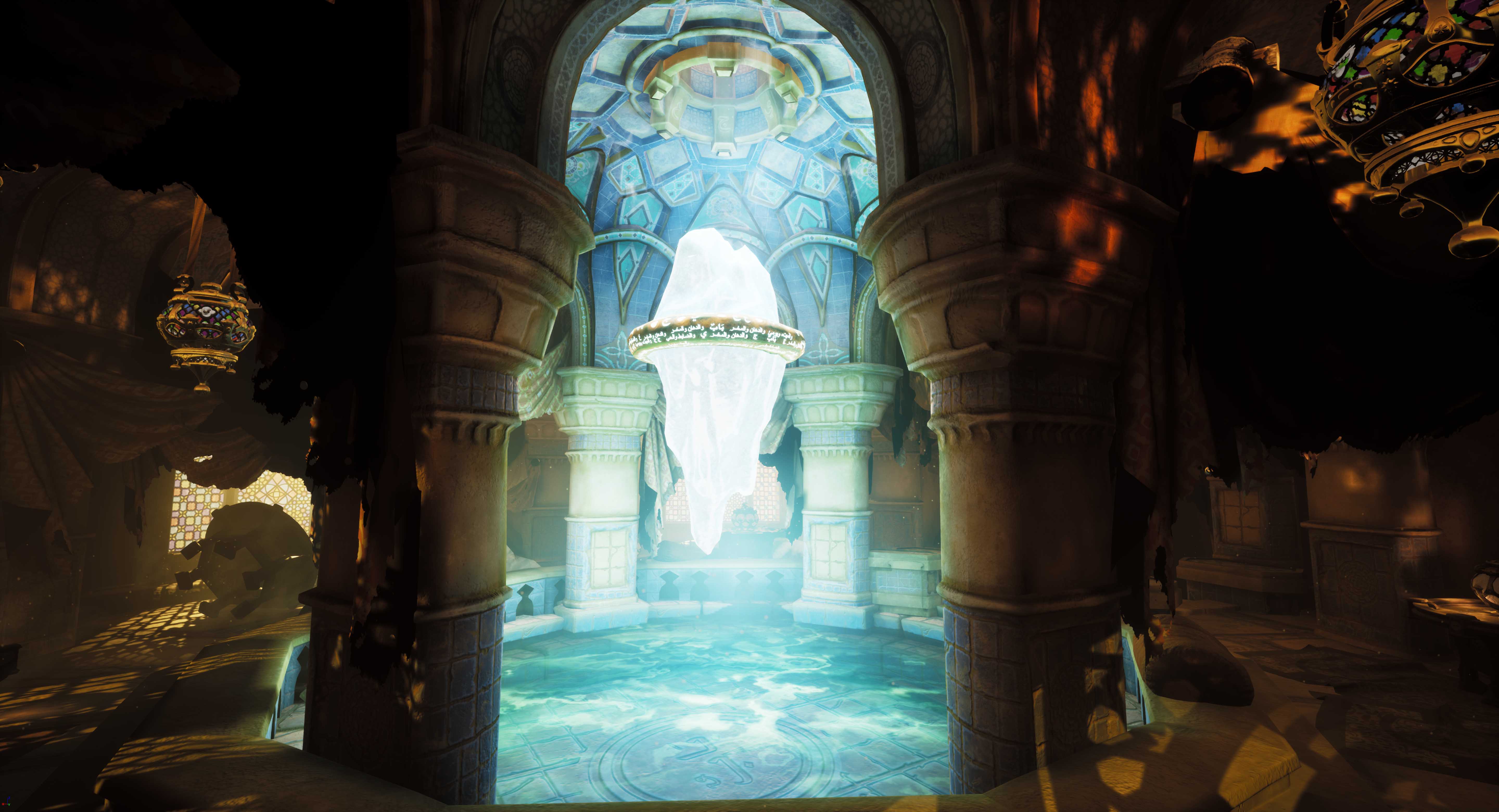
- Nice collection of references showing architecture, colours, patterns, layouts etc Its always good to try and get and use as much real life references as possible, it helps to sell your scene better if its based on reality. So by you looking for Arabic buildings and architecture mixed with fantastical structures from other games and movies can be very helpful. Nice job. Its good that you worked out the best layout for your scene, but next time try and work that out in the block out stage as quickly as you can, or else you will waste time going back and forth with more finished models. Time management is just as important as modeling and textures skills. Your process in only creating a part of the Dome is a good approach. Looking closely at the model in UE4 i do see a seam where either the material is not fully tileable or the lightmap does not have enough space. Depending on the platform your aiming for its always good to use normal maps. Ideally from a sculpt, and not rely heavily on texture detail alone. For the sculpt of the pillar, you need to ask yourself how old is this room. The wear on the pillar looks very soft, implying that its very old and potentially weather worn. I think you could have hardened up some of the sculpt details to make them stand out more. Baking and texturing your pillow, you mentioned that you had some issues, but felt it ok because it was on the underside of the pillows. Its best, if you have the time, to try and fix these issues, especially on individual props that can be reused and rotated around your scene. The crystal model is looking a little too soft. You could do with hardening up the sculpts and making it more angular. Look at both real work crystals and in game stuff to get an idea. You might want to spell check your documents and read over them to make sure they make sense before submission. Im sorry to hear about the passing of your grandmother. There was no need to you to continue with this project while a loved one was so ill, but i must praise you in getting as much work as you did given the circumstances. Renders/UE4: The bloom/lighting from the crystal area over the water is abit too bright. So much so its whiting out the details on the crystal. Also might be an idea to have some kind of support structures/polls connecting from the dome to the floating crystal. It might also help angle the eye towards the center piece. The areas outside around the pool (seating area) is abit too dark as well in places. Its a fine balance to get the lighting correct so that you can see everything that you want. It might be nice to have some light coming from the lanterns hanging from the ceiling around that area. The shot with the lighting coming in from the window is quite nice, even if the light is perhaps abit too bright. You have some gaps in the stone steps around the pool between each other. simple fix of making them slightly larger would fix. Besides some of the issues that you have mentioned in your document and given the time you spent on this, you should be proud of the work you did. If you get some free time, it might be nice to get back on to this and really push it. It would be a strong portfolio piece. Best of luck!
- Good to see a range of reference. It would have been good to see annotations and a small art test of the direction you wanted to take. Block out looks good and I’m glad you got some base materials in there as well as a lighting setup. Good use of a modular kit for the room itself though you may have found it easier to use tiling textures opposed to baking your sculpts (the pillar sculpt looks particularly soft where you’d expect it to be crisper). Prop asset modelling looks good as do the UVs and texturing. Good to see Marvellous Designer being used to create draped cloth and other fabrics. The crystal looks ok; I think it would have benefitted from having some sort of refraction and metallic value to it. I like the colour contrast in the lighting and you definitely get that feeling of closeness in the scene. I also like the different details you have in the roofing and shadows cast by the windows; adds a nice amount of detail.
- Hey, first of all, for a rising star, this is pretty cool. I wanted to have some input on this to help you improve it in future for a while, but first I had to go away and learn about persian opium dens ha. Also I'm curious in your documentation that you wrote "for the moonblood"? Are you secretly a vampire/werewolf cross breed or did I miss something there? Or did you mean, for the moodboard? Quick Tips: enable ambient occlusion in your post process volume, try intensity of 0.7 with radius of 75 and see how a lot of your objects are now much more grounded. Also on the water, don't set the refraction to such a low number it causes artifacts, also, below 1 is not what you want for the effect of water, try 1.1 it looks much better. Look up how this works in the Unreal documentation :) I love the mood you set, you really sold the story with the lighting and the supporting VFX, wonderful, keep focusing on this. Remember, its not always about the tiny details but the overall and selling the story. Which you did well in this. Good job! Chris Harper Snr Tech Artist @ Splash Damage
- Research & Development Research shows exploring different opportunities well. More exact prop/material/lighting reference catering towards one style and look might give a better idea of what you wanted to achieve. Ratios between materials, color palette and material separation could be maybe presented in a bit more direct and orderly manner. Taking a single image as main reference can work wonders to the cohesion of the scene. Creative Art The scene reads as a temple at first glance. I like the prop designs of lamps, fabrics, and smoke pipes. The color divides the spaces nicely. The architecture feels a bit less fancy compared to the props, and there are spaces that feel a bit forcefully filled with all sorts of fancy detail (I'm looking at the pillar here). The material definition could use an extra layer of polish and looking at high quality close-up reference. Sculpting work could maybe be given another go while keeping the final image and how reference material looks (edge sharpness can add a lot of feel for materials such as crystal and the pillar you made). Technical Art There's a nice sense of modularity in the scene. Lighting looks nice with bloom post process. The scene could benefit some extra research into scales of objects, pillars, feeling the space as player and added polycounts. For example, the steps could be made more interesting with making each rock a separate block, and adding irregularities to the silhouettes. Material blending and decals could also be a nice addition. Documentation The texts are well written, but feel a bit like running thoughts. Maybe try keeping one thing concisely on one page next time, and not letting it go to next slide? It's a bit distracting to me. Images are very nicely put. Final Presentation Images showcase the scene okay. The overall layout becomes apparent through documentation.
Challenge Tier
Sumo Digital Rising Star
Leave a comment
Log in with itch.io to leave a comment.
Comments
No one has posted a comment yet