

Play game
Neko Shrine's itch.io pageResults
| Criteria | Rank | Score* | Raw Score |
| Presentation | #13 | 3.833 | 3.833 |
| Creative | #13 | 3.667 | 3.667 |
| Documentation | #17 | 3.833 | 3.833 |
| Overall | #19 | 3.533 | 3.533 |
| Technical | #22 | 3.167 | 3.167 |
| Research & Development | #29 | 3.167 | 3.167 |
Ranked from 6 ratings. Score is adjusted from raw score by the median number of ratings per game in the jam.
Judge feedback
Judge feedback is anonymous and shown in a random order.
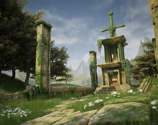
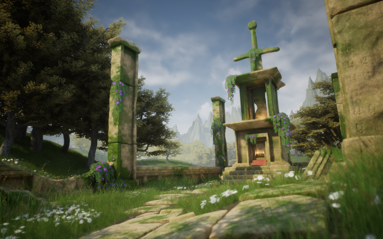
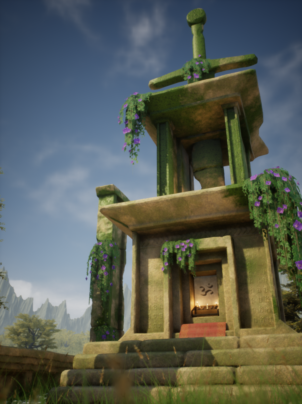
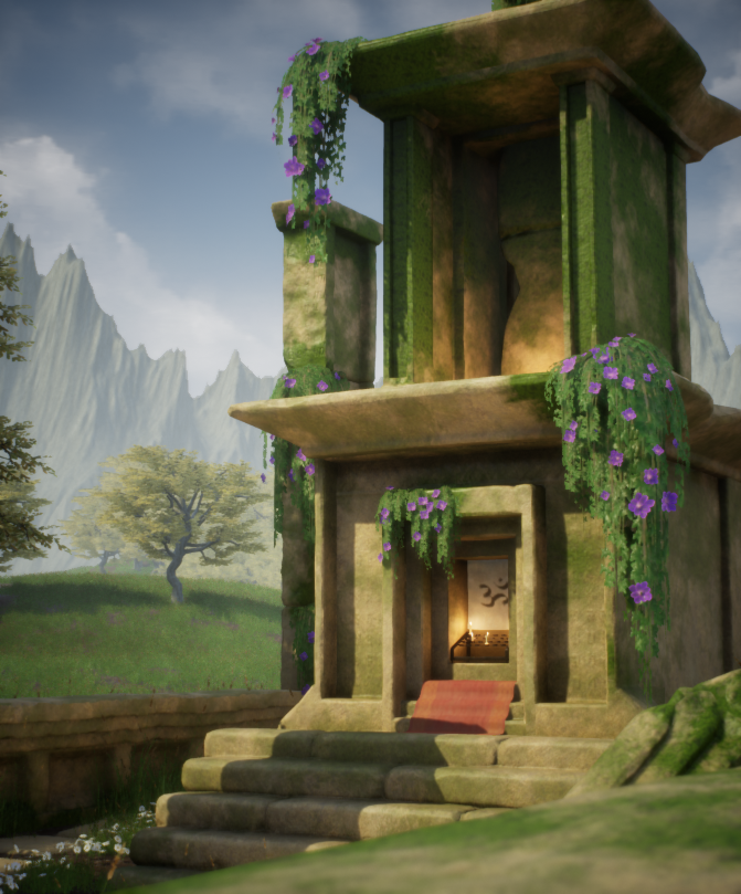
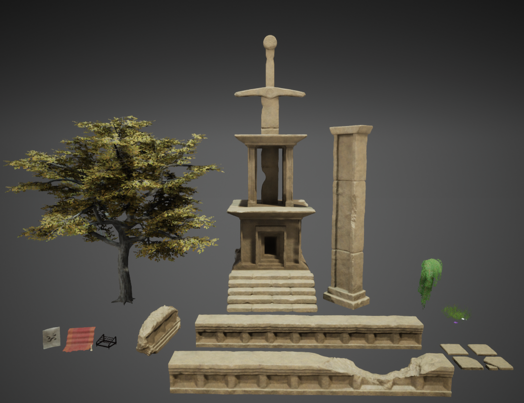
- Submission Title: Neko Shrine Submission Tier: Search for a Star Assessor: Dominic Shaw Artist @ Firesprite Research & Development You have done some good research into the props and materials that you need to make the environment and there is a good breakdown of all the methods you have used. I think that some time management stuff would have been nice to see such as time plans and asset lists as these can really help with production of large scale environments. Creative Art I think that you have matched the concept pretty well and I like that you have done a more realistic take on the props and materials. I also like that you didn’t go to extreme with the field of view of the image like the concept has done. The colours and mood is pretty appealing and there is some good composition. There are some aspects on the environment that is letting the piece down such as the background mountains, these are way too spikey and they don’t feel very natural. I would personal remove these from the image which will also help to improve the values of the image. The trees in the background have some good value separation from the mid ground which is good but I think that the colours of them are not saturated enough making this part of the image look washed out. I like that you went more realistic than the concept and the trees are looking really nice, I think to make to the environment more coherent I would improve the moss texture and the ivy foliage so that these more realistic too. With the moss I think that the roughness just needs turning down a bit as it looks a little too shiny. Technical Art You have used good vertex painting on the props with the moss texture which is a good workflow and you have kept optimization techniques such as modular pieces in mind that I can see from your documentation. I like that you used a master material which is a solid workflow but to help optimize this, you could look into channel packing your textures. I think that you could have gone further with your modularity of assets as the main shrine is quite a big prop to place on to one texture sheet, you could have broken this up more to increase texture resolution of the asset. The landscape material could do with some vertex painting to help break up that material, I know that you did this with the moss on the props so you could look into doing this on the ground too using landscape paint layers. Documentation There was a really good and detailed breakdown of your workflows with a good explanation of everything that you created. Final Presentation Overall, I think that is a good attempt at making the environment and you have a good knowledge of the workflows needed to make game environments. Moving forward, I would remove the background mountains and I think that you just need to look into improving your modular workflow, making sure that you keep texture density in mind.
- Good to see that you’ve complemented the chosen concept with reference from the real-world. It would have been good to see some more detailed annotations on them. Block out looks good; I like that you’ve included a lighting pass, filled out the background and angled the ground and meshes to better the composition. You would have benefitted from using a modular kit and tiling/trim textures to create your buildings. Using tiling/trim textures also means that you are not restricting your UVs to the 0-1 UV space. Your poly count on the columns is quite high and could be reduced quite significantly. Good to see that you’re baking your foliage onto cards and the frond placement on the tree looks good. The lighting and composition looks good. It would have been good to see differing heights of grass and gaps in the placement of it (to add break up). On the close up of your stone work you can see that it looks a little soft (crisp up the edges/surfaces in the sculpt).
- Artist – Nathaniel Ayling Category: Search for A Star Assessor: Anthony O Donnell – Lead Artist at Firesprite Work name: Neko Shrine Overall this piece captures the main elements of the chosen reference. The colour palette and lighting was observed well and respected. Research and Development /Documentation The document is clear and well written with nice presentation. Evidence of the research undertaken being used can be seen in the final work in terms of materials and foliage use. The process to blockout the scene and get a feel for the piece including lighting and camera angles before jumping to asset production shows an understanding of good workflow practices. Technical Art Geometry It was noted for time reasons the manmade elements were produced via decimation master apart from the main shire. Both have triangle counts higher than expected with a lot of them not contributing to the models silhouette and too much to justify it being for vertex painting. This doesn’t affect the final visual quality of the piece but is one to watch when creating art for games to be rendered in real-time. Materials and Textures The “OcclusionRoughnessMetallic” maps could have used a “constant” for the roughness and metallic across these types of textures as there was no variation and only a single value present. This would have allowed for the texture to just have the AO and save the other channels for other data such as grunge masks. Channel packing was used which was good. In the foliage textures the blue channel was left empty while the opacity was a separate texture. It’ll be more efficient to add this opacity texture to the blue channel of the foliage data texture. The tree foliage texture has some leaves being “clipped”. The use of tiling textures for the sandstone elements alongside macro detail normal with some exposed parameters in the material is a good way to go for this. Adding an additional layer of “grunge” dirt build up would have further helped in breaking up the tiling textures and added more interest to the elements. Creative Art Textures: The sandstone normal is very sharp and noisy. Given the chosen style having more cleaner areas would allow for the eye to rest more. The addition of the mountains in the distance adds a layer of parallax and a hint to a wider world which is nice. The sharpness of the peaks does draw the eye to them and fights against the focal point being the shrine a bit. Atmospheric perspective is reducing the issue luckily. Care was given to shot choices and the layout of the scenes contribution to the images. Sculpting of the pillars is quite nice and captured the majority of the detailing from the concept. Final Presentation The final piece of work closely matches the composition of the scene depicted in the concept. There are some elements such as the sword which being a bit longer in the concept that could be tweaked. In the final images regarding contrast of value and vibrancy of the colours it has not as closely captured the clarity of the source inspiration. Having a higher intensity directional light and dropping the intensity of the skylight with appropriate post process adjustments to increase the saturation and contrast would get the final look closer to the concept. The clarity of the carved inscriptions would have been improved if they contributed to the base colour and roughness and not just the normal. This would mean a change to the shader setup or the use of decals to allow for a non-destructive workflow and flexibility. It is an element prominent in the concept which would have improved the work being retained as it adds more visual interest to the scene.
- Research & Development Good research into real world and their local colors. Material references work well. Lighting reference and mood boards of similar matter could help also directing the end results to a specific goal. Development of the scene and assets is showcased well. Creative Art There's a light and colorful aesthetic with natural shades. Lighting looks great, the foliage and flowers look great and support end result. Scene is nice and cohesive. The main reference has an additional interest coming from sharper edge breakage. The main temple could look a bit more interesting with a bit more of medium/big scale interest in the silhouette (example of what I mean by this would for example to bend a ceiling to be lower in the middle and higher on the sides). The moss vertex paint blend feels a bit splodgy. I'd like to see some experiments with some large, medium, small scale assets in there, even if the painted concept doesn't have that. It could take the scene a step beyond the concept as well. Assets could have been left there by previous generations or something similar. As a 3D player space, it's a bit too perceived widely and doesn't look like something with a lot to explore. Technical Art Lighting looks nice, simple and easy to adjust. There's a good use of material blending for the moss. Post-process works well. Foliage looks great. Decimated objects look interesting silhouette-wise up close but could maybe have slightly fewer polygons. When I opened the scene, it felt a bit heavy; so I changed the cull distance Max setting for the grass foliage to 1000 and regained a lot of performance. As nice as the assets look with unique textures, I'd suggest looking into some solutions with tileables, trims and material blending for example the walls and pillars; blend normal and more broken material together and moss as another layer. Documentation Text is well written and easy to understand. Thought processes are captured in text. Final Presentation Images show the scene well. Renders have a nice quality to them.
Challenge Tier
Search For A Star
Leave a comment
Log in with itch.io to leave a comment.
Comments
No one has posted a comment yet