Play UE4 scene
Mid Century's itch.io pageResults
| Criteria | Rank | Score* | Raw Score |
| Documentation | #43 | 2.833 | 2.833 |
| Technical | #45 | 2.500 | 2.500 |
| Research & Development | #49 | 2.500 | 2.500 |
| Presentation | #50 | 2.500 | 2.500 |
| Overall | #50 | 2.533 | 2.533 |
| Creative | #59 | 2.333 | 2.333 |
Ranked from 6 ratings. Score is adjusted from raw score by the median number of ratings per game in the jam.
Judge feedback
Judge feedback is anonymous and shown in a random order.
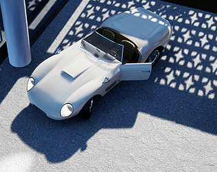
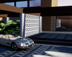
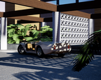
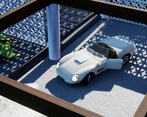
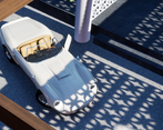
- This is an interesting and unusual subject for an environment, refreshing to see something that's not typically a game environment staple. The car has been well executed and is a deserving focal point for a scene. However, there are issues with the scene as a whole: - The environment is basic - it reads as boxes, cylinders and planes that have had simple tiling textures applied. Whilst the car was the focal point, more attention needs to be paid to the environment in order to create a more cohesive whole. Large scale forms have been created, but no details of medium and small scale have been considered to help create a believable environment. It looks like a textured blockout right now. - Baked lighting can be laborious, but it still gives the best results for static environments short of real-time ray tracing, which is a very advanced technique requiring hardware not yet available to most. This scene lacks proper GI style bounce light, something that really helps bring sunlit scenes to life and would help this scene enormously. - Scales issues - the ferns are too big, dwarfing the car. Also a variety of foliage would help, but I understand time constraints can make this difficult.
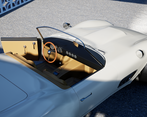
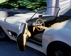
- Research & Development There's nice decision making for the car part. Development is shown nicely with blockout and production shots. The environment with architecture feels a bit like a bonus aspect to the scene. More reference about houses, materials and detail could add a lot with pushing the environment to the next level. Creative Art The Car looks nice in the editor; the lighting shows car's shapes in a nice fashion. The meshes could use a bit more interest and research into materials and how things are built to push them to the next level. Right now, it's a bit grounded in the realm of 3d without face weighted normals, material blends, irregularities, wear and tear, etc. Level of detail and interest give an idea that scales seem a bit off, even if they could work in real world. The layout feels also a bit narrow and untouched. Some presentation images have a shadow cast in a bit distracting way to the top of the car. Technical Art Car has been split to many materials. Channel packing textures is a good practice to cut down texture samples of the material. There's a good use of tileable textures. Box BSP usage is an interesting choice. There's a good idea of mesh instancing and modularity. Car could use maybe a few less polygons. Materials could use material instancing and material parameter usage. Deferred decals would add to the scene with material blending. Car interior could use a shader technique (eg.detail texture) with accompanied masks to give certain material feel to different parts. I'd suggest looking into post-processing volume to add that extra layer of realism and interest to your car renders. You may want to check out some free Unreal resources as well from the Epic Marketplace, such as Advanced Glass Material Pack & Amplify LUT pack. Lighting setup seems good and easy to iterate. Documentation The text is written well. Conclusion is nice to read. The spline-surface modelling method made me more curious about that method, as I hadn't explored it that much (My background comes a bit more from subdiv and mid-poly stuff, booleans and some lofts and other spline operations.) Final Presentation Images are nice and crisp.
- Would have been good to see more reference of the scene and car you wanted to create as well as a more detailed breakdown of what you liked and wanted to incorporate into your scene. Scene block out looks good and it’s good to see you adjusted it over time to find better compositions. Car modelling looks good but the textures could be a bit more detailed. PBR is being used but again, more detail in the diffuse/roughness would have been good to see. Always check the scale of assets; the ferns are ginormous! I can see you’ve opted for using a modular kit and tiling textures for the building but check the tiling amount and add more detail in places. The light and shadow really helps with the composition of shots. It might have been better to use a bolder colour on the car to help it stand out in the scene.
Challenge Tier
Search For A Star
Leave a comment
Log in with itch.io to leave a comment.



Comments
No one has posted a comment yet