Play asset pack
Cacti-Camp (Asset Pack / Scene)'s itch.io pageResults
| Criteria | Rank | Score* | Raw Score |
| Technical | #55 | 2.236 | 2.500 |
| Presentation | #62 | 2.236 | 2.500 |
| Creative | #63 | 2.236 | 2.500 |
| Overall | #67 | 2.147 | 2.400 |
| Documentation | #67 | 2.236 | 2.500 |
| Research & Development | #83 | 1.789 | 2.000 |
Ranked from 4 ratings. Score is adjusted from raw score by the median number of ratings per game in the jam.
Judge feedback
Judge feedback is anonymous and shown in a random order.
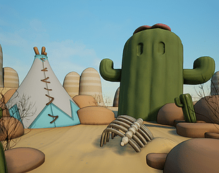
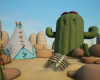
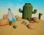
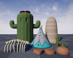
- Research & Development The research shows a clea main inspiration. Idea and style of the scene could benefit from looking a bit more into other stylized 3D, scales of objects etc. Creative Art The end result feels like a bit of a random experiment of several happily rounded objects in a bright and vivid environment. Striped approach to hills and soft shading look very nice and support the scene well. Technical Art There's nice usage of shared texture space for the rocks. Tent could maybe benefit from tiling texture approach. Lighting looks nice and soft, and easy to adjust. Objects benefit from round surfaces. Terrain tesselation might be a bit of an overkill with it not bringing a whole lot to the scene. The post processing volume with outlines is very cool and impressive. Documentation Documentation is short and sweet. The text is a bit funny to read, but gets the points across. Final Presentation Images are nice and sharp.
- Artist – Jarrod Cole Category: Search for A Star Assessor: Anthony O Donnell – Lead Artist at Firesprite Work name: Cacti Camp Research and Development /Documentation The production document is clear and gives some insight into the process. The planning of the foliage shown is a good way to deconstruct and make sense of complex assets. Technical Art Alpha overdraw was cut off the cards for the foliage which is great to see. Materials and Textures A different approach such as hand painted textures in Substance Painter of photoshop could have gotten a result closer to the final piece especially if coupled with a "toon" shader. The ground doesn't need tessallation as there is little height variation in the textures being used. Setting the height offset to 6+ makes it worthwhile to include as the effect is noticeable. Functions used within materials is nice to see and an efficient way to work. Channel packing was used but the ORM maps were not set to linear ( sRGB off) Creative Art Some of the style of the concept is captured in the modelling. Overall objects match the shape and form defined in the concept. Final Presentation The shape and forms of the concept were reproduced well but the texturing and asset placement in the scene lack the character of the piece. The concept is very light tonally but also a touch desaturated and pastel like in it's colour palette. Adjusting the lighting setup / textures or using a post process volume would be viable options to get the desired result.
- Well thought out goals based on the timeline. Nice to see some concepts for the foliage, with more time, would have been great to see more concepts like this Good to see a range of skills demonstrated in a small project, the concepting, the modelling, the material work. The final piece is charming and stylised, would have been nice to see a little more painterly style details in the texturing, but great effort all round!
- Even though you are following a piece of concept art it’s still good to gather reference so that you can see how things fit and sit together in the real world. This applies for both realistic and stylised pieces. It would have been good to see the scene blocked out from the beginning before diving into asset creation. This helps you check scale and composition early with little cost in time. Painting the foliage boards out is good to see but it would have been great to see these finished. I can also see the black outline from the shader but I think this could have been ramped up. The environment is quite flat in terms of lighting. I would have been good to have some direction to the light to make stronger shadows. Fog and tweaks to the post processing would have helped. The rocks and cacti could have done with more detailing so as to match the concept better.
Challenge Tier
Search For A Star
Leave a comment
Log in with itch.io to leave a comment.


Comments
No one has posted a comment yet