

Play Game Environment
The Conservatory's itch.io pageResults
| Criteria | Rank | Score* | Raw Score |
| Documentation | #9 | 4.025 | 4.500 |
| Research & Development | #16 | 3.578 | 4.000 |
| Overall | #33 | 2.996 | 3.350 |
| Creative | #45 | 2.683 | 3.000 |
| Presentation | #55 | 2.460 | 2.750 |
| Technical | #55 | 2.236 | 2.500 |
Ranked from 4 ratings. Score is adjusted from raw score by the median number of ratings per game in the jam.
Judge feedback
Judge feedback is anonymous.
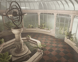
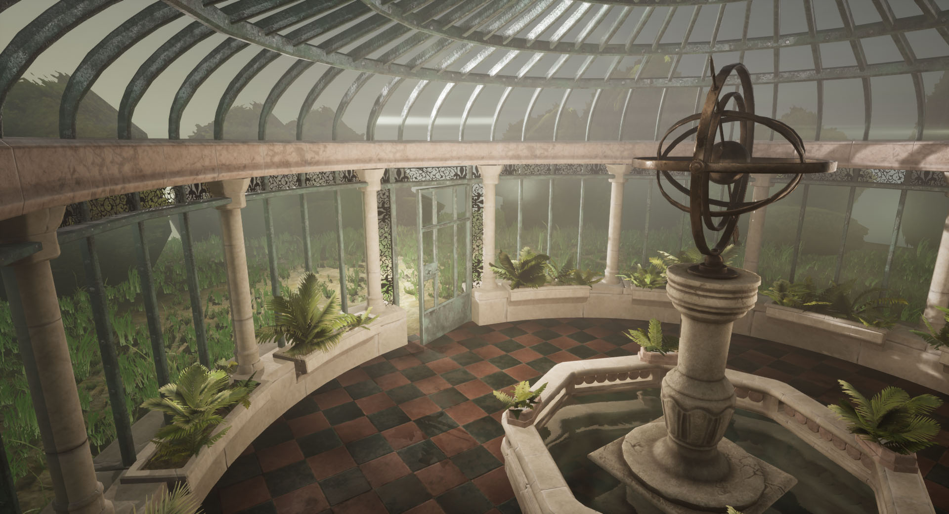
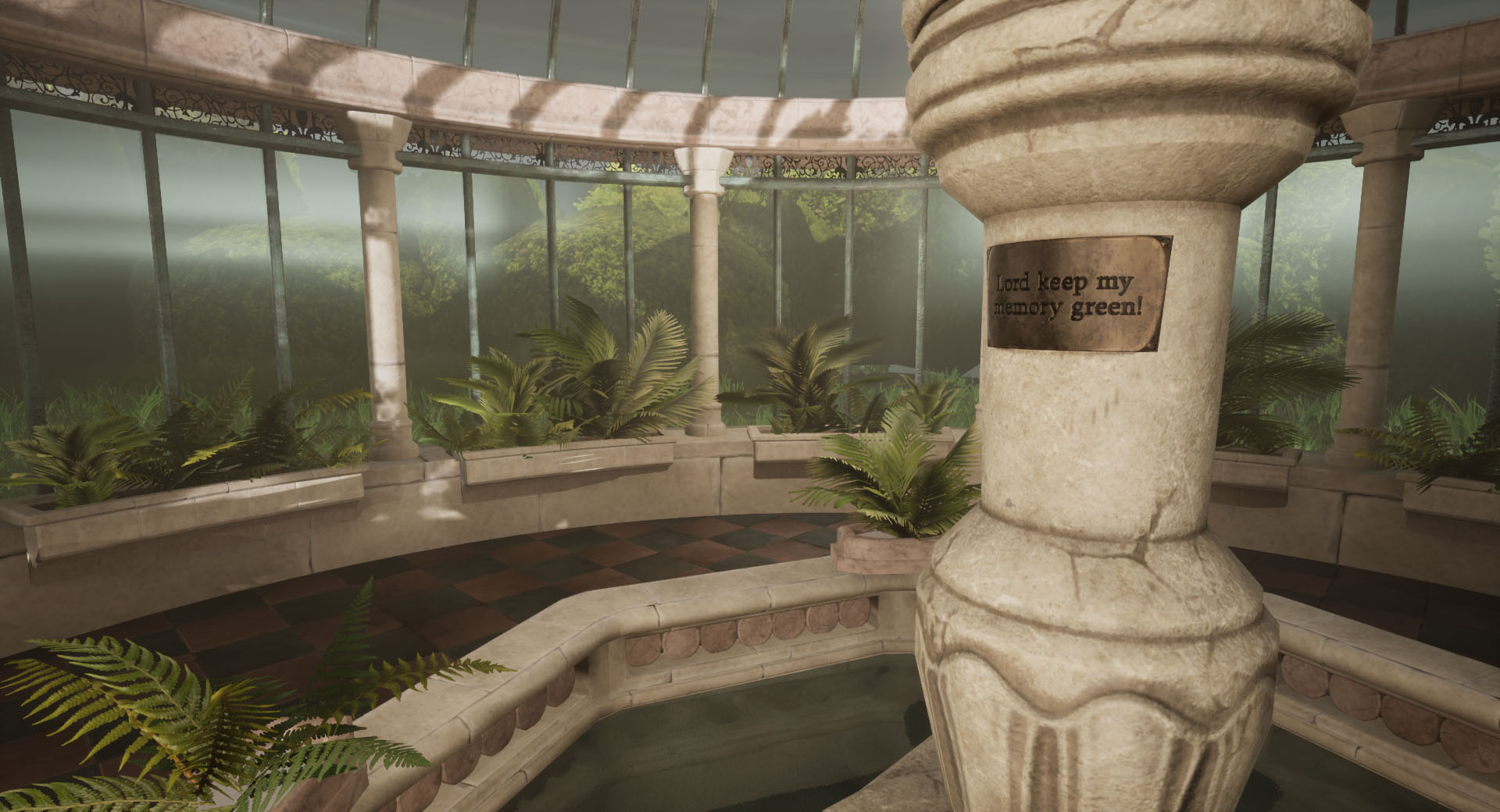
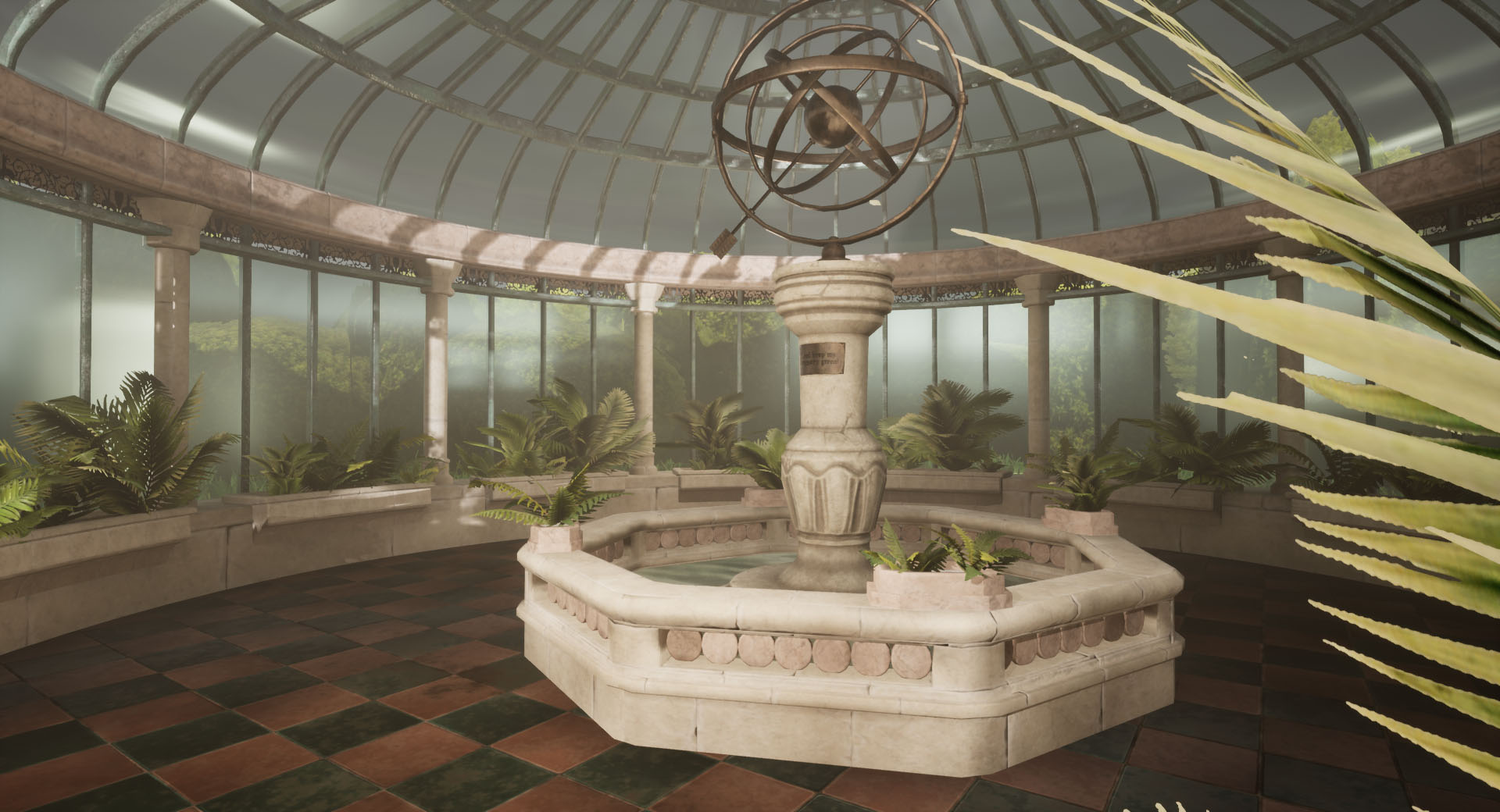
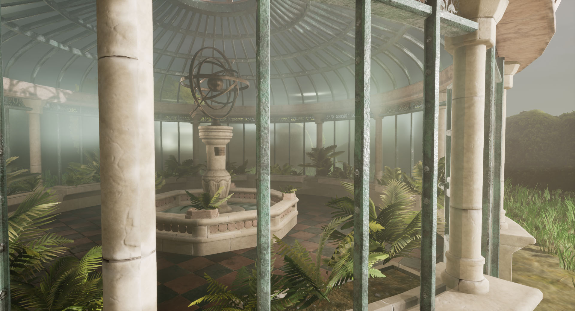
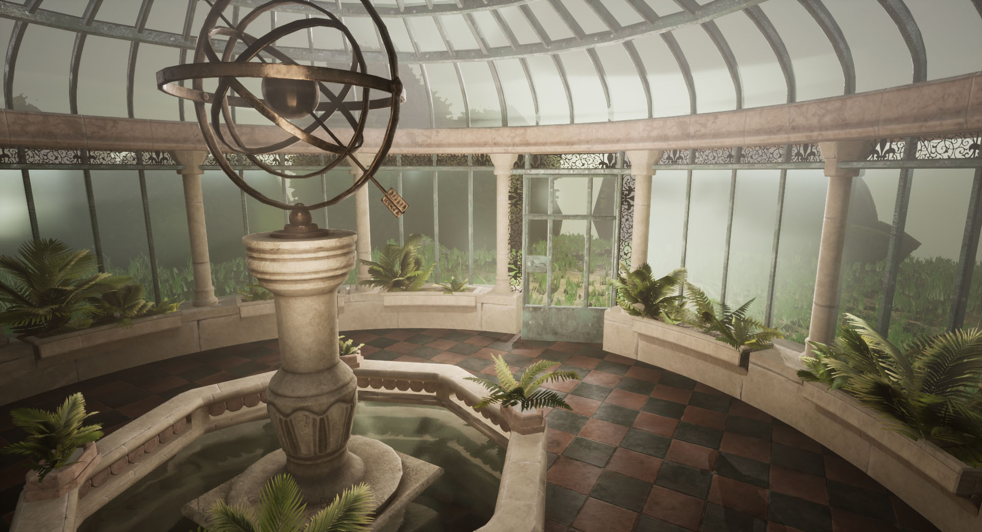
- I absolutely sympathise with the stressful workload from university getting in the way. And it's fantastic that you still found the time and motivation to do this. I think the scene has a nice peaceful feel to it, and I like the colours you chose. It's also a very interesting unique concept, which is why I was attracted to it. The biggest issue I noticed was that you spent a lot of the time working on the tehcnical issues, which didn't leave you with much actual artworking time. To me the technical skills are secondary, and the most important thing is what the final scene looks like. You concentrated on the big picture a lot of the time, and I personally find this to be an added stress, because then nothing is ever 100% finished. In the future I would suggest doing just one thing completely first, like a window or a pillar. You'll feel much more motivated when you can copy and paste something that already feels finished! I would use more polygons to create the basic shape of the conservatory. As it is modular, it's fine to spent a couple of days just adding detail to a model before even thinking of texturing it. The models you have are very basic, and could have been much higher poly, since they got reused a lot. For the floor, I would have added some cuts around the edges so the square tiles wouldn't reach the walls. A bit more subdivision and tiling textures there would make a big difference and make it look more purpose-built (like the Casa Loma-picture) The armillary could use some carvings around the rings (very simple tiling trims would work) to add more interest the the basic shape. The pond would look more interesting if there was more contrast in the thickness of elements. For example, if the bottom part was kept blocky, on top of it could be detailed iron bars, and after that another blockier railing. At the moment it's all very similar and a bit boring to the eye. I know this is similar to a reference image, but that pond is much bigger than yours, so the problem isn't so obvious. I also noticed that there is a lot of unnecessary subdivision in the circles around the pond that don't influence the silhouette. You chose 2 different types of ferns, and made different variations of them. I actually thought there was just one asset, as they do look very similar in the scene. It might have been better to choose two completely different foliage assets, such as a small palm tree (which you could have used as a bush when sank into the ground) and some trailing ivy, which is very romantic and was present in a lot of the reference images. At the moment, the room is quite empty and doesn't feel very organic. The door feels too modern and industrial for the scene. I would have expected more details ornaments and more intricate basic shape. The vista is green and very similar to the inside of the conservatory. It might have been a good idea to make the outside barren, maybe more autumn than summer. This would have added more contrast to the final scene. I think the original idea is solid and it's a really good blockout for a more detailed version in a later stage. I definitely think this will make a fabulous portfolio piece with a bit more rework.
Challenge Tier
Search For A Star
Leave a comment
Log in with itch.io to leave a comment.
Comments
Research & Development
I very much like the research done for how Conservatories look, how materials should look up close (with good reference for making materials in software such as Designer/Painter) and how the lighting and props should look and feel.
Due to time constraints, I presume, the narrative ideas haven't gotten that much of research that it would have given the impact of the grander ideas. There are lots of amazing and interesting images, which feels a bit like you wanted to do a much grander and bigger scene. The idea could be translated into an amazing scene, no doubt!
Creative Art
The scene looks nice and readable as thumbnails. The lighting and colors work together very well.
To add a bit more punch, I'd suggest researching a bit more in the vertex blends and trying to hit the material likenesses a bit closer to what your very good reference are showcasing. As an extra pointer, 3rd Person games use a texel density of 512, and 1st person shooters texel density of 1024. The scene could also be pushed further by adding meaningful interest and irregularities to the silhouettes with geometry, and introduction of sharper edge breakage might push the feeling of the trim sheet a bit further! :)
The lighting looks great, and makes things readable. However, as the light is so soft, I get a bit of the feeling we're on the inside of another greenhouse, as if there's a doubled diffusion going on. The glass shader is also tricky to get right, but for example I'd suggest to have a look at Advanced Glass Material Pack by Michal Orzelek, which was featured as Permanent Collection Unreal Engine Sponsored Content for April 2019.
Technical Art
The final work seems Game-Ready. Assets seem concise and coherent in the images. As a tip, you could split wall meshes into 14 pieces, with the pivot being at the center and rotate the instances around the pivot.
In fact, as previously mentioned, you could add more imperfections, breakage and interest to silhouettes and keep rounded surfaces more round (looking at the rounded edge of the decorative piece here). Workflow is not broken down in the presentation, so I can't say much about that, but the trim sheet approach is something used commonly in the industry.
Documentation
There are lots of beautiful pictures and the texts are easy to read. Production shots and WIPs are a bit on the missing side with reflective commentary.
Final Presentation
Final shots hold together very well composition wise. Tones, lights, colors, etc are very well established and feel coherent. Material work and ratio between clean and grimed surfaces could maybe be pushed a bit further for a bit more interesting end results.
Sorry for the late reply. Thank you so much for the detailed feedback, I appreciate it a lot and I intend to continue working on this and incorporate yours and the anonymous judges feedback.
They way I started creating the main structure was in individual pieces so good to know I started off on the right track at least! Thank you for also suggesting where to look for a glass shader as this was very tricky for me to work on. I will investigate this.
The anonymous judge suggested that to add more interest I could make the outside a different time of year, such as autumn and the inside is all green and full of life. Do you agree with this? Do you think this might also help with the contrast and perhaps make it not look like it's a greenhouse within a greenhouse?