Play asset pack
Steampunk Player Home's itch.io pageResults
| Criteria | Rank | Score* | Raw Score |
| Creative | #73 | 2.000 | 2.000 |
| Research & Development | #75 | 2.000 | 2.000 |
| Presentation | #76 | 1.800 | 1.800 |
| Documentation | #77 | 2.000 | 2.000 |
| Overall | #80 | 1.880 | 1.880 |
| Technical | #81 | 1.600 | 1.600 |
Ranked from 5 ratings. Score is adjusted from raw score by the median number of ratings per game in the jam.
Judge feedback
Judge feedback is anonymous and shown in a random order.
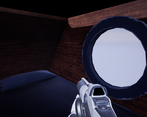
- Submission Title: Steampunk Player Home Submission Tier: Search for a Star Assessor: Dominic Shaw Artist @ Firesprite Research & Development The idea is pretty cool and there is some reference of the environment from other games. There was some good thought put into the layout but it would have been nice to see some real world reference of the assets in the documentation as well has a time plan and asset list of the environment has these are really important for production. Creative Art I’m unfortunately missing the UE4 file in the submit so I will try my best to give feedback on this based from the models and the FBX files of the meshes that was provided. The overall layout of the environment is good but I think that there is still a lot of improvement needed on the modelling of props, materials and lighting of the level. The entire architecture of the room was just one mesh, this could be broken up into modular pieces as this is a really good workflow for optimizing the level and speeding up the development time. The materials were lacking roughness, metallic and ambient occlusion maps from the screenshots of the materials I saw in the documentation file. Adding these maps will really improve the level and I recommend looking into Physically based rendering workflows. Here is a good tutorial for this: https://www.youtube.com/watch?v=PjGCtnEDDeU Technical Art I can’t really judge the technical side of this project with the few files that I was given. I did notice that the desk was made up of a lot of different boxes which will cause a lot of faces that won’t be seen and not needed. I would look into modelling techniques such as insetting and extruding so that things are more optimized and are connected together. Documentation There was an in depth step by step of the workflow taken to create this project which showed an insight into how you approached making this environment. I noticed that you used 3d Coat to texture your assets, I would try to lean Substance Painter as this is common practice for jobs in the Games Industry. Final Presentation When doing the final presentation, I would set up cameras inside the engine so that you don’t see the player weapon. Here is a guide on this https://docs.unrealengine.com/en-US/Gameplay/HowTo/UsingCameras/Blueprints/index.html I think that moving forward, I would recommend looking into texturing programs such as Substance Painter and focus on improving modelling skills and learning PBR workflows. I think that you have the ideas there and now it’s just all about learning the right workflows and programs.
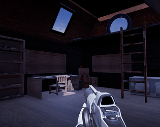
- Research & Development Sketches are nice. References consist of game art. There's nice showcase of not settling for the first idea that came to mind. I'd like to see some real life research, too, with high quality images of structures, materials and objects. :) There was nice exploration of the theme within concepts. Creative Art The scene looks like a player's home attic. Technical Art Amazing post-process volume and lighting setups. Here are a few search words to be used maybe for the future reference ; Tileable textures, trims, texel density (1024), reuse of texture space. Documentation I love your in-depth step-by-step documentation, image texts and the 'delivered zip file'. :) Final Presentation Screenshots are of high quality and show the scene well.
- Assessor: Anthony O Donnell – Lead Artist at Firesprite The scene appears like it's in it's early days of being created. The main assets and room layout is a good starting point. Details such as the edge wear in the texturing is good. The next steps of the scene beyond this would be to make some creative decisions on additional props and the visual design of them to capture the essence of steampunk. All the chosen concepts have a nice cluttered feel this aspect would be worth exploring especially given the overall goal by the artist described in the document. A technical review is not possible in full as only some models (FBX) were provided. Workflow wise the initial sketchwork and blockout to define the space and it's contents is a good approach. The idea for the scene is interesting. Best of luck with the next steps.
- Hey, I'm sorry you seemed to find this project really tough - I'm not sure how long you spent on it, but it doesn't quite live up to the concept you wanted to achieve. Before we begin, don't try and cover up that you didn't do much by writing long documentation detailing that you clicked the file window and changed import settings. It's not useful, unless it's particularly important or different from standard. The brief was to create a game ready environment, of which this is not. I would question, that if you had more commitments, that maybe it would have been a good idea to do one thing good rather than do this poorly and affect the other commitments too. There also isn't even a uproject file, you just sent me some fbx's. I do not presume to know your situation, but clearly you must see that this is not "game-ready". Before anything I would seriously ask yourself Are you over committed? Do one thing well Did you plan enough time for this? (Relates to above) Do you want to make games? I always see that people underestimate what it takes. It's not too late to change career. After this, then I'd say you need to watch a lot of tutorials and practice. Chris Harper Snr Technical Artist @ Splash Damage
Challenge Tier
Search For A Star
Leave a comment
Log in with itch.io to leave a comment.


Comments
No one has posted a comment yet