Play asset pack
A Quiet Place's itch.io pageResults
| Criteria | Rank | Score* | Raw Score |
| Technical | #18 | 3.333 | 3.333 |
| Documentation | #28 | 3.333 | 3.333 |
| Overall | #28 | 3.167 | 3.167 |
| Presentation | #29 | 3.167 | 3.167 |
| Research & Development | #29 | 3.167 | 3.167 |
| Creative | #39 | 2.833 | 2.833 |
Ranked from 6 ratings. Score is adjusted from raw score by the median number of ratings per game in the jam.
Judge feedback
Judge feedback is anonymous and shown in a random order.
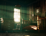
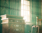
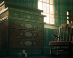
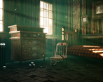
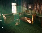
- Submission Title: A Quiet Place Submission Tier: Search for A Star Assessor: Dominic Shaw- Artist @ Firesprite Research & Development The research and development for this project was pretty good, there was a clear plan of action of how to approach making this environment. The way you choose to tackle the project and break up the environment was good but one thing I would have done differently is to treat the windows as their own props as there was a lot of detail such as blinds, broken glass and ivy which is missing in the final render. Creative Art Overall, I think that this is a solid attempt at making the environment and the approach was good. The composition matches the initial reference pretty well and the change of lighting to brighten up the windows and add the light shafts coming into the environment helps to create a focal point around the cabinet which makes the environment a little more interesting than the initial reference image and the overall mood is done pretty well. There are a few materials and values issues in the image which makes the environment hard to read and I think if you made these quick changes it would really help the overall look of the scene. The main thing is the values in the image, the decals on the walls are not readable due them being too close to the value of the wood material so you could fix this by brightening up the text a bit. There is also a lot of contrast in the image from the really bright light from the windows and the really dark shadows, this is mainly caused from the post process in this scene so I would tone this down a bit to avoid really dark shadows. Finally, the wood material on the wall is a bit too noisy and a bit too much contrast on the light and dark grain. Looking at the original reference, the wood grain is subtle which really helped make the image more readable. Technical Art Props Overall, the props match the scale of the initial reference and it’s not a bad attempt of making these assets. I think that the materials on the props still need a bit of work to really focus on the material definition of things and the bed sheet could do with being a bit dirtier as it feels out of place in this environment as it’s a bit too clean. The cabinet, I would have baked down the circle and diamond parts and then really made them a bit more reflective as at the moment they are lacking material definition. The main thing that I would have liked to seen is more channel packing on the roughness, ambient occlusion and metallic textures to further optimize the level. This would look at little like this: Red channel- AO Green Channel- Roughness Blue Channel- Metallic Then when you import the texture, change the compression settings in the texture to ‘Masks’ making sure that the sRGB value is turned off. There is a broken glass mesh on the windows but these are a bit hard to see due to the lighting which is a shame as this would be a really nice thing to have. I would have loved to see more detail on the window mesh too such as the blinds and ivy that was in the original reference and this would make the cast shadows from the lighting more interesting too. I think that the scene could do with smaller props around too as it looks a bit empty at the moment, but you have mentioned that you intend to do a pass of this in your documentation. The final thing that I think could be improved on is modularity of the wall, windows and pipe assets. This is a small scene intended for one key image so it’s not end of the world but if you were to make this environment in a studio environment, I would prefer for these assets to be made modular so that people can get as much reuse out of the as possible. At the moment the pipe is just one unique mesh on one texture sheet whilst this could have been a few different meshes such as a straight piece, corner piece and then it could be reused around the level a lot more. Materials You have used parallax occlusion for the tile-able materials which is a cool technique but I think that it’s a little too intense on the wood paneling and I think that the environment looks way more realistic when this stuff is subtle as in real life they wouldn’t have made this wood paneling wall so offset. Dropping down the height ratio value from 0.5 to 0.2 would really help with this. I think that the wood material is lacking the really nice colour changes that was in the initial reference that would have been caused by water damage and leaks, I think if this was added by either decals or vertex painting it would really help to show how old this environment is. Overall, I think that the materials need just some slight improvements in designer but you show a good working knowledge of the pipeline from Substance Designer to the engine and the decals that you’ve placed on the walls are really good story telling elements. Documentation The documentation shows good insight into the project and there is a clear breakdown of all the assets and materials. Overall, you have approached making this environment pretty well. Final Presentation I think that you show a good understanding of the pipeline and moving forward the main things that I would recommend focusing and improving on would be material definition in both designer and painter, values and optimization techniques such as channel packing.
- Good amount of reference gathered. It would have been good to see it annotated (what you wanted to recreate in your scene). Good to see an asset list and scene block out. All I would say at this stage is to get something in there that confirms the scale of the room (eg. a closed door or a chair). The room looks a little big in scale. Good to see some lighting in at this stage. Your tiling textures look good although I’d watch the height variation on the tiles. Your assets could do with bevels as they are looking a little boxy. The texturing is consistent from one asset to the next but they do look to be missing some PBR information. With the assets in the scene you can really see the difference in scale. Add things in to better confirm the scale or remove items that are causing the issue. I like that you’ve added contrasting colours to your lighting but the volumetric light from the windows is a little too distracting. The texture on the floor could do with less height variation and same with the wooden planks on the walls. The cubes on the floor look untextured, if so, remove these.
- The first impression I got was that all the surfaces are very noisy, almost as if there was a grain-filter over everything. The original image seems to have this too, but because the lighting in that is less contrasty, this isn't a problem. I also prefer blue colour scheme in the concept art over the brown and green you used. I would have liked to have seen more things changed from the concept art than just the lighting. You looked at different beds and drawers in your research, but I don't quite understand why, since you copied what was in the original image anyway. In the blockout phase you mention that it was important to get the angles and composition right. However, all you did was copy what was in the original image. It would have been much more interesting to see how you would frame a similar setting so it would be more your work, not someone else's. The floor tiles are a bit strange. There isn't any damage in them, but for some reason some of the have sunk more than others. It doesn't feel realistic, and I would have liked to have seen your references for it. In the final renders it looks almost industrial, not like a bedroom floor at all. Your models are very basic. You could have added much more detail and subdivision. The wood grain also doesn't follow logical flow in the picture frame and drawer, instead they look like they've just been box mapped. You have made HP versions of the assets but I'm not seeing much detail in them either, so it again feels they have been just added in there without actual purpose. The window frame doesn't have enough detail in it. The viewer's eye is immediately drawn to the source of the light, so you could have added much more ornamental iron bars to make it more interesting. It's a bit too basic as the moment. There are also some spelling mistakes and unfinished sentences in your documentation, that bring the overall presentation down. However, it's a good thing that you were able to show you can follow concept art, and I'm sure it has been a great learning experience for you. Don't be afraid to make your own art! It might help you to step away from concept art and bravely do your own thing. You clearly know the basics of modelling and you have knowledge of all different parts of the environment creation, so that's a great starting point.
- This is impressive work from someone clearly very capable and at ease with modern environment art workflows and software. The end result is atmospheric and follows the original concept quite closely. The documentation is also thorough, comprehensive and clear. My primary criticism would be the tonal values of the finished environment. It's a very contrasty piece, with extremely bright windows and large areas that are approaching black. This is an approach that can make for dramatic results, but is tricky as it can also make areas hard to read. The original concept is also contrasty, but areas like the window walls and the ceiling are still visible - there are very few areas that are completely black. The environment could benefit from certain textures, such as the wall wood, being lightened tonally, and possibly the secondary bounce light being boosted to stop areas going completely black. An example of a similar lighting approach, but with a lighter tone, is visible in the screenshot here, from the motel in the game Control. http://control.fandom.com/wiki/Oceanview_Motel Efforts have been made to ensure the lighting is still dramatic, but the environment remains readable as no areas are approaching completely black.
Challenge Tier
Search For A Star
Leave a comment
Log in with itch.io to leave a comment.


Comments
Research & Development
Research shows nice main concept. References for objects would be better, if they followed several images of one object (you could browse 2nd hand stores or using search words like 'used' to get some amazon/ebay or similar online stores as reference.)
Creative Art
The scene is a nightmare filled place with dream-esque lighting and atmosphere. Items, materials and scales all induce creepy shivers.
Dream-like lighting shows and reads well, even if it feels a bit more dream-like, and contrasting with the rest as such.
Objects could do with an additional look at the references, to capture the scales, widths, heights, negative space, detail and materials of objects. The overall scene might also be a bit too grungy, you could try introducing some flat surfaces in nice ratios, and the ceiling color is a bit funky.
Technical Art
UV packing seems optimized by most part (with the exception to lamp, what happened there?) I'd suggest reusing texture space, and maybe dividing materials to trims, tileables and uniques if necessary for bigger assets to hit the texel densities of 512 or 1024.
There's a nice use of volumetrics, dust particles, atmospheric fog. Cool texts on the decals ^^Light channel usage was also a nice thing I didn't know of.
Documentation
Documentation presents taken steps in a nice fashion with lots of pretty pictures. Asset breakdowns are done well.
Final Presentation
Images are of high quality and present the state of the scene. It's easy to tell what's going on.
Thank you very much for the feedback!