Play asset pack
Roman Encampment's itch.io pageResults
| Criteria | Rank | Score* | Raw Score |
| Documentation | #30 | 3.200 | 3.200 |
| Research & Development | #45 | 2.600 | 2.600 |
| Presentation | #46 | 2.600 | 2.600 |
| Overall | #46 | 2.640 | 2.640 |
| Technical | #50 | 2.400 | 2.400 |
| Creative | #55 | 2.400 | 2.400 |
Ranked from 5 ratings. Score is adjusted from raw score by the median number of ratings per game in the jam.
Judge feedback
Judge feedback is anonymous and shown in a random order.
- - Great documentation, very well presented - Really nice use of detailed mood boards and shows wide variety of influences - Would have been great to see some concept sketches around layout ideas and assets - Good thoughts around scene composition and camera - Nice to see research and technical documentation into procedural trees and how they worked for the scene. - Quite a challenge for a weeks worth of work, but good to see a breakdown of where changes could be made for a longer time span
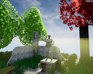
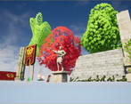
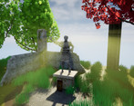
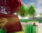
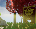
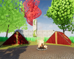
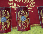
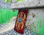
- Research & Development There are many different aspects of a Roman camp with lots of interesting detail. Creative Art The Roman objects look nice in a dreamy and vibrant scene. The statue looks stunning. Technical Art There's nice use of tileable texture and setting landscape material as its own thing. Bloom post process adds to the vibrant colors, but gives the sun a funny laser shooting feeling. Good use of simple grass wind. Here's a list of searchwords; tiling textures, one-way tiling textures, trim sheet, Master material, material instance, material attribute, texel density (512 for 3rd person, 1024 for first person titles). Meshes are well optimized. Lighting setup is simple and easy to iterate. Documentation Texts are written well. Images show process Final Presentation High quality renders.
- I can see your reference coming through in your initial blockout but it would have been better if your blockout was a bit more detailed eg. in your Maya scene you have the tent models but in UE4 you have cubes. Having a more detailed blockout in the engine will mean you can better lock down compositions earlier on. Also, 30x30m is a huge space. You say that you want to have both a realistic and stylised look to the environment. It would have been good for you to do some art tests of this look before creating any other assets to check that it is the look you want to continue with. Unfortunately I don’t think the art style has been executed successfully. The lighting is quite flat and the shot compositions could do with some work. It would have been good to see more texture break up on the ground and so short shrubbery to help break up the horizon. It’s good to see that you’ve included a post mortem on your scene.
Challenge Tier
Search For A Star
Leave a comment
Log in with itch.io to leave a comment.


Comments
No one has posted a comment yet