Play asset pack
Old Book Shop's itch.io pageResults
| Criteria | Rank | Score* | Raw Score |
| Research & Development | #29 | 3.167 | 3.167 |
| Documentation | #43 | 2.833 | 2.833 |
| Overall | #53 | 2.433 | 2.433 |
| Presentation | #65 | 2.167 | 2.167 |
| Technical | #69 | 2.000 | 2.000 |
| Creative | #73 | 2.000 | 2.000 |
Ranked from 6 ratings. Score is adjusted from raw score by the median number of ratings per game in the jam.
Judge feedback
Judge feedback is anonymous and shown in a random order.
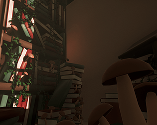
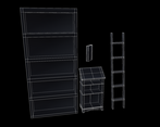
- - Good idea for subject in confined space mixing man made props with the natural environment, lots of opportunities to demonstrate skills in a manageable area. - God rays and dust particles would be a nice addition to give some volume and atmosphere in the scene - Good analysis in the documentation of the various aspects of the scene especially the lighting - The geometry looks to be tidy and optimal enough for real time use, there opportunities to optimise further but balance this with higher tri counts on select feature assets such as some books with pages visible. - Nice to see wire frames in the documentation images - Texturing seems very minimal / non existent not sure if this due to art style. Would suggest adding some book titles and page detail in texture maps and simple wood for the ladder and bookshelf. - Camera angles are too close to the subject matter given the lack of detail in the scene, suggest keeping screenshot angles at a distance to work better with the content. - Suggest doing more work on the materials, the ivy and mushrooms would benefit for having more specular. Books, bookcase and ladder all have similar material properties.
- Submission Title: Old book shop Submission Tier: Rising Star Assessor: Dominic Shaw Artist @ Firesprite Research & Development You have done some good research on the project and really broken down your thought process which was nice to see. It could be helpful in the future to do a breakdown of the environment, create asset lists, time plans and create a plan for how you are going to approach each part of the level which will really help with the development of the project. Creative Art I like the idea of the project and it has a nice composition. There is a lot of potential with this environment but at the moment there is a lot of improvement needed on the game art pipelines and workflows . Modelling- There was a lot of smoothing group issues on the models which made the shading of meshes look strange. One of the reasons for this is because the models are lacking Normal maps as they haven’t gone through the substance pipeline with a high to low poly bake. Another reason is that you need to manually set your smoothing groups inside of the modelling package. Here is a tutorial on smoothing groups: https://www.youtube.com/watch?v=M4Dw1abi30c This method is what I suggest looking into next because it will really help with your assets, all it is, is projecting a higher detailed mesh with nice chamfers and details on to a lower polygon mesh. Here is a good tutorial on it: https://www.youtube.com/watch?v=7DUIlBstbMI When modelling assets it’s best to use a scale reference such as a box for a human which is around 1.8m tall. Most items, you can google search the size of them and you can easily find the exact measurement of them which means you can copy these sizes into 3ds Max. That way you won’t have to be scaling meshes up to match other meshes as they will already be real world scale. Texturing- The main thing with texturing is that you are missing a lot the maps needed to take full advantage of the physically based rendering workflow. At the moment, you only have base colour on your assets, but if you had, normal, roughness, ambient occlusion and metallic maps this will really improve your assets. I would also suggest learning the program Substance painter for texturing instead of doing your texturing inside of Unreal. Moving forward, I would suggest working on a single prop and running it through this entire workflow and see what results you gain. The pipeline would look like this: 1. Model a high poly mesh with lots of details and chamfers 2. Model a low poly mesh that you will project the high poly on to. 3. Unwrap the low poly mesh 4. Take in to Substance Painter and bake your high poly to your low poly 5. Texture the low poly mesh in the program 6. Export out the textures to Unreal. You have some good ideas here and now it’s just about improving your game art skills to help make these ideas.
- Great to see annotated reference and lots of it! Your block out looks a bit simple. Refining this as much as you can before delving into production will help a lot. I like that you research the “Golden Hour” but as artists we don’t need to rely on the science that much; position the angle of the light so that it looks good in the shot. Your models are simplistic but as they are all like this I think it works. It would have been good to spend more time adding detail to the textures to really bring them to life. The log is a little intense and the lack of texture information makes the scene look like a block out. The scale of the leaves and mushrooms look a little off too.
- The research put into this project is admirable and comprehensive, so it's a shame that the artist ran out of time. I feel that the artist should give more consideration to the idea that form almost always follows function - environment artists must always think about WHY an environment is like it is and what it is used for, and not just about whether it looks good. So for instance - why and how are plants growing in this scene? Plants only grow where they have access to water, which this environment wouldn't provide. A broken wall or roof, exposing the interior to the elements, would serve to explain why the ivy and mushrooms are there. Thinking about function and consequence when constructing an environment always help add to its believability, and will often provide moments of inspiration for the artist. A broken wall would be interesting to model, bricks and broken plaster could be scattered around the floor, and mould and water damage would provide an interesting challenge to texture - all ideas that stem from thinking about why there are plants in this space. From a technical standpoint, the artist is approaching things the right way - thorough research and attempting to understand underlying principles. However, I think it would help for the artist to focus on smaller assets for now. Just build a few small props, be they a bit of furniture, a single plant, anything relatively small and self-contained, and focus on getting them to look as good as possible, from concept to modelling to texturing to finished presentation. This will help build good practice and workflows that can then be used to larger projects, and eventually entire environments.
- Research & Development There's a lot of nice research into real life. Creative Art End result is a nice little simplified scene with beautiful lighting. The scen reads very well, and shapes of objects look nice and translate well into what they are supposed to be. Technical Art Mesh smoothing could be taken another look at. There could be some texture work in the mix, and roughness could possibly vary a bit from material to material. There's some use of material instance. Post process and lighting works. Documentation File is filled with images and image captions. There might be a bit too much of explanation about each and every image so that it makes me feel like a dumb-dumb. Final Presentation Screenshots are of nice quality and show the scene well.
Challenge Tier
Sumo Digital Rising Star
Leave a comment
Log in with itch.io to leave a comment.


Comments
No one has posted a comment yet