Play asset pack
Lost Temple's itch.io pageResults
| Criteria | Rank | Score* | Raw Score |
| Overall | #2 | 4.175 | 4.175 |
| Documentation | #4 | 4.250 | 4.250 |
| Creative | #4 | 4.375 | 4.375 |
| Presentation | #5 | 4.375 | 4.375 |
| Technical | #5 | 3.875 | 3.875 |
| Research & Development | #5 | 4.000 | 4.000 |
Ranked from 8 ratings. Score is adjusted from raw score by the median number of ratings per game in the jam.
Judge feedback
Judge feedback is anonymous and shown in a random order.
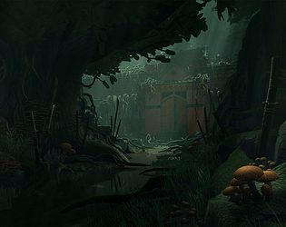
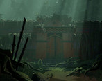
- Hello Jordan Noad Mault, Not a lot of comments to provide you. I will focus on the lighting aspect, it seems to me to be the next step to improve your environment. The overall mood is nice, it seems to be a hidden place with a lot of humidity. On the lighting side, I would expect a better focus on the building, especially the front (door/roof) to create different layers of readability. Currently if you desaturate your environment, the contraste is very low, which is not always a bad thing if you want to simulate a kind of pastel painting but you should keep always in mind the readability (the scene is for a game). Current impression is the look is too flat, and since you've a color palet very close (the building doesn't have a punchy red), the only way to fix it is by lighting. You could definitely improve the lighting by adding some rimlight on some assets like the building / tree / leaves. There is missing a layer of "high light" in the composition. Adding some particules like flying dust in the light shaft will add a layer of polish. You could probably fix all this issues by pushing a little bit your main light and by tweaking the color grading in the postprocess. Nice work! Quentin Papleux, Sr. Lighting artist, Sumo Digital
- All the images are a bit dark and need the values lifted. Be sure to check your histogram range! This scene needs another lighting pass aimed at bringing out forms and details in order to make everything more readable. After that, some focus should be spent to increase the quality on the more prominent assets, such as the foreground rocks and tree silhouettes. I have done some paint overs for you to help illustrate these points. Itch does not support image embedding so you need to paste this link manually. https://drive.google.com/drive/folders/1-4W7y71EjKGJJ6m49DSH0Jnkg-I9MVyf
- This is a strong entry to the competition, and there's a lot that's working well about this environment. It's atmospheric, nicely composed, has an intriguing focal point and a strong sense of narrative interest. It's also an interesting choice of environment, and a technical challenge too, as foliage - and especially trees - is something that takes some experience to get working well. I also liked the approach to the project - realising that the original scope was too broad, it's impressive that the artist scaled back and still managed to create a strong environment. The technical approach is also very good, with thought given to modularity, texture reuse, a kit bashing approach to the swords and a general good balance between artistic aspiration and sound technical considerations. Feedback: My main point would be one the artist has recognised themselves - the lighting. It's a shame, as it's not doing justice to the assets or the scene composition. It's too dark, the overall tonal level is dingy and that is hampering reading the scene. I would have the door picked out by a much stronger directional or spot light, really bring that up as the focal point of the scene and have the orange start to offer contrast to the muted greens. Then some bounce light from that to help pick out the swords, foliage and fungus etc. A small secondary light source or two in the dark foreground areas could also work - perhaps a lantern or two, giving a small, localised, warm light, would help provide a secondary focal point to this environment.
- Really nice looking environment, the composition really cough my eye at the first glance. Looked like a concept art painting. As you said, some of the areas you could improve, I know this is what you are doing :) , but besides the technical elements, some of the roots could use more detailed geometry, at least where the eye level of the player will be. Another thing you should check is the scale of the textures on vegetation and also the roots themselves on the temple. Somehow it makes the temple look off-scale, smaller then it is. On the lighting side, it is really nice what you have done with the highlight on the front sword, but it's missing a step. It would be better to have a longer pathway for the eye to travel in the environment and not just jump from the sword to the temple. You could fix that with another highlight on the other swords on the left side of the road, and somehow create a zig zag path to guide the eye around the entire scene having the temple as a prize. I can see there are some highlights but some light intensity tweaks can be done. If the skylight is not enough you could add some dim lights to help with that. Nice work on the materials and setting up the kits and research and last but not least the thumb-nailing and overall composition.
- Great to see tonnes of reference and sketches of what you wanted to achieve in your finished scene. I particularly like that you have included lighting ideas in these. Really great to see annotated reference and planning for your trim sheets. It would have been good to see your block out in the engine before you moved into production. Good to see use of modular kits, tiling textures and trim sheets. I like that you variation in your plant fronds and that you have baked you grass onto cards. It’s good to see that you changed your mind on the final look of the scene and explained your reasonings behind it but this could have been avoided if you spent time block out the scene, adding rough lighting and checking shot angles and compositions. Your mushroom models looking a little low-res in terms of geometry and the texturing leans more towards a stylised look. Your pine tree trunk looks very blocky and not natural. The final scene looks good. The lighting and compositions work well and the fog adds a good amount of depth to the scene. I like how dark and moody the scene is but be careful to not let the dark areas get too dark. Good work.
Challenge Tier
Search For A Star
Leave a comment
Log in with itch.io to leave a comment.


Comments
Research & Development
Research shows a huge amount of references showcasing different aspects of the scene. Sketches are presented well to showcase the idea of what you're looking to achieve.
Creative Art
The final scene is a beautiful scene with fantasy and dream like feeling. There's a strong sense of foreground, midground and background elements in the composition, as well as light and dark. Color palette shows and works well, helping with the fantasy aesthetic. Objects have interest to their silhouettes.
Technical Art
Polycount of the sword is very nice. Roots might adhere more to the fantastic feel if they were more round.
Volumetric lighting and fogs give the scene nice presentation.
There's nice adaptive tesselation on the ground, but the results might not be worth the high polycount of it for the scene.
Documentation
Lots of images and good text telling about different stages of development and reasoning behind made calls. Text is a bit chatty, but personal and shows deep understanding and desire to tell about the process.
Final Presentation
Screenshots show well atmospherics, readability and asset work in the scene.