Play asset pack
Cat Lady Lounge's itch.io pageResults
| Criteria | Rank | Score* | Raw Score |
| Documentation | #49 | 2.667 | 2.667 |
| Creative | #67 | 2.167 | 2.167 |
| Research & Development | #67 | 2.167 | 2.167 |
| Overall | #68 | 2.133 | 2.133 |
| Presentation | #70 | 2.000 | 2.000 |
| Technical | #79 | 1.667 | 1.667 |
Ranked from 6 ratings. Score is adjusted from raw score by the median number of ratings per game in the jam.
Judge feedback
Judge feedback is anonymous and shown in a random order.
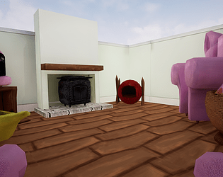
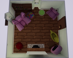
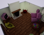
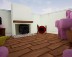
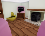
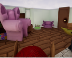
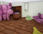
- This is a very creative scene. Its based on something that you are interested in so as a result you are able to envision a complete and detailed scene. Your reference is good and organized, and your drawovers are exploratory and thoughtful. The execution falls a bit short in a few places. The scale of the space is a bit cramped for a game ready environment. It is stylized yes, but if it were a game space it would be limited . I would try exploring a different shape for the room, (perhaps an L shape or even a rectangle) this would give you a stronger foundation to work with. The other place where it falls a bit short is texturing quality. There are visible seams in the floor texture and the other objects such as the basket of toys could stand to be a bit higher quality. Other than that, very creative and good job.
- Great to see a few of your own concepts of how the room might be laid out and a great early block out. I like how cluttered the room is. I also like that you’ve added in some character to the assets by not having them perfectly straight. The UV layouts look good for the most part; the table/cat bed has a few stretched polygons on it which is causing that “X”. This would have affected the baked maps. Good to see you identified this yourself but a shame that you abandoned them opposed to finding out why they weren’t working. Seeing that assets in UE4 feels like you’ve lost that “cozyness” you were getting in your block out. The floor texture scale could be smaller and you could have had a bit more detail in your texture maps eg. fabric detail, scratch marks, stains. If you weren’t including a ceiling then making the walls higher would have brought that “cozyness” back (and align with you reference a bit more). The lighting is flat. Having an open window with light streaming in would have added a lot to the scene. Adding clutter would also help the theme eg. picture frames of cats, cat toys, worn rugs, plants, anything to make the scene busier.
- Submission Title: Cat Lady Lounge Submission Tier: Search for a Star Assessor: Dominic Shaw Artist @ Firesprite Research & Development You have done a good breakdown of everything that you made in the project and I like that you did your own concept for the project. The project is a nice idea and has potential to be a good portfolio piece. Creative Art You have matched your concept quite well in terms of the layout. You missed out on some good lighting opportunities has you could have added an open window with a nice directional light coming through which would have added an extra layer of interest. Technical Art This is where I think you need more improvement, there are a lot of basic mistakes such as texture seams, unwrap and light map issues. Moving forward I would try to improve your skills across the full pipeline, I would focus mainly only one prop at a time to improve your modelling, unwrapping and texturing skills. In your documentation, I can tell that you know the pipeline, but you now just need to spend time improving your skills in each area. You have made good use of using the full UV space and not wasting any texture space which is nice to see. Documentation There was a good breakdown of everything, and it was easy to see how you went about making this environment. Final Presentation The final renders showed off the environment quite well and it’s easy to see every model in the scene. Overall, I like that you made a concept and followed the layout quite well but moving forward I would recommend practicing your modelling, unwrapping and texturing skills.
- Research & Development Different prop possibilities are explored with images. Real world reference is used judging from the text (basing something on own chair). Some additional looking into real-world references for shapes, sizes, detail, structure and materials work might help with pushing the scene to the next level. Creative Art The scene looks and feels as a dream-like, themed exploration into one's influence. Keep at it Technical Art Meshes have some polygons that might not add to the shape or silhouette of the object. Googling some dimensions of couches and such to use as the basis for objects could prove beneficial. Documentation There are nice images, and the process and decisions are written down. I like the influences. Final Presentation Images showcase well the end results. Nothing is hidden, and is clear to look at.
Challenge Tier
Search For A Star
Leave a comment
Log in with itch.io to leave a comment.


Comments
No one has posted a comment yet