

Play asset pack
[SfaS] Bastion's Keep's itch.io pageResults
| Criteria | Rank | Score* | Raw Score |
| Creative | #36 | 2.907 | 3.250 |
| Presentation | #41 | 2.683 | 3.000 |
| Technical | #48 | 2.460 | 2.750 |
| Overall | #54 | 2.415 | 2.700 |
| Documentation | #67 | 2.236 | 2.500 |
| Research & Development | #83 | 1.789 | 2.000 |
Ranked from 4 ratings. Score is adjusted from raw score by the median number of ratings per game in the jam.
Judge feedback
Judge feedback is anonymous and shown in a random order.
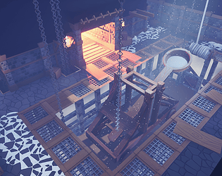
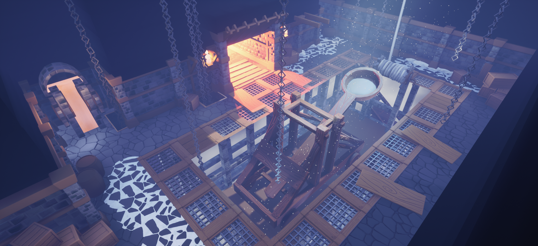
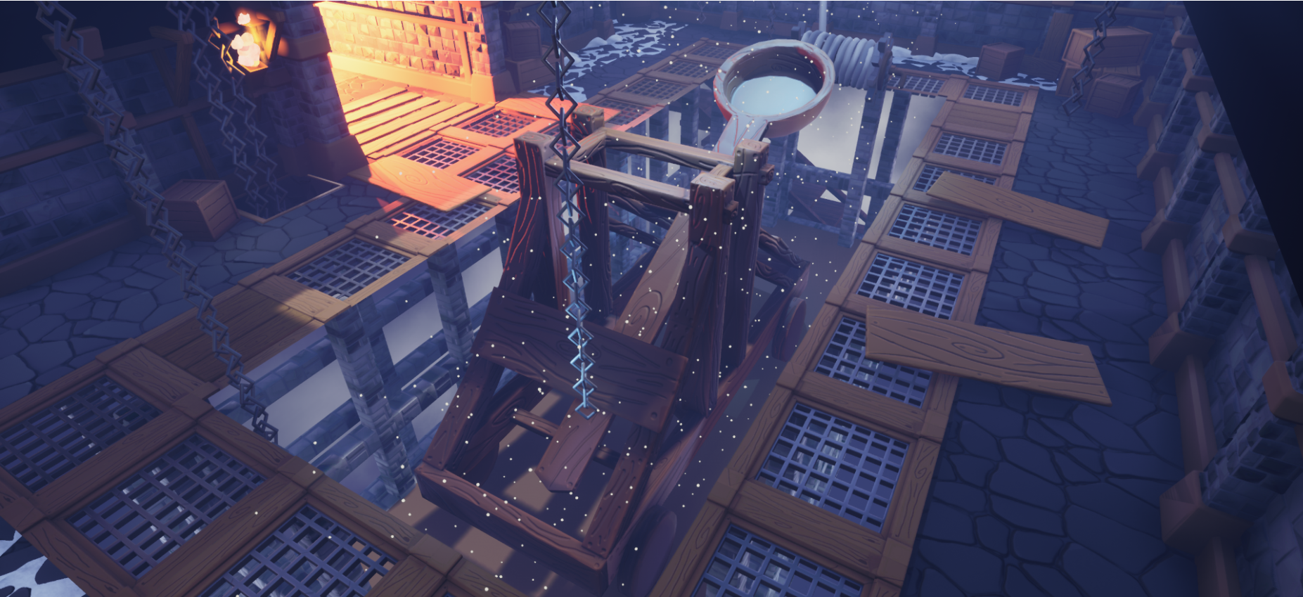
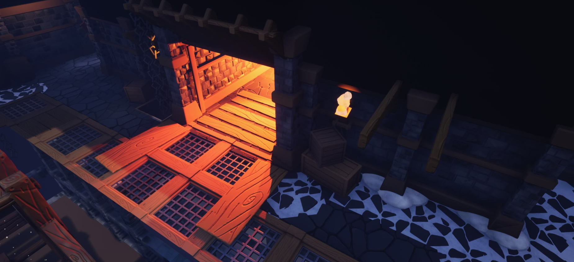
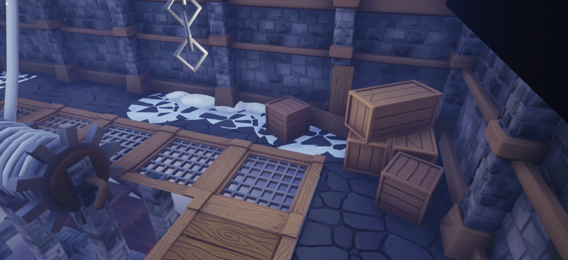
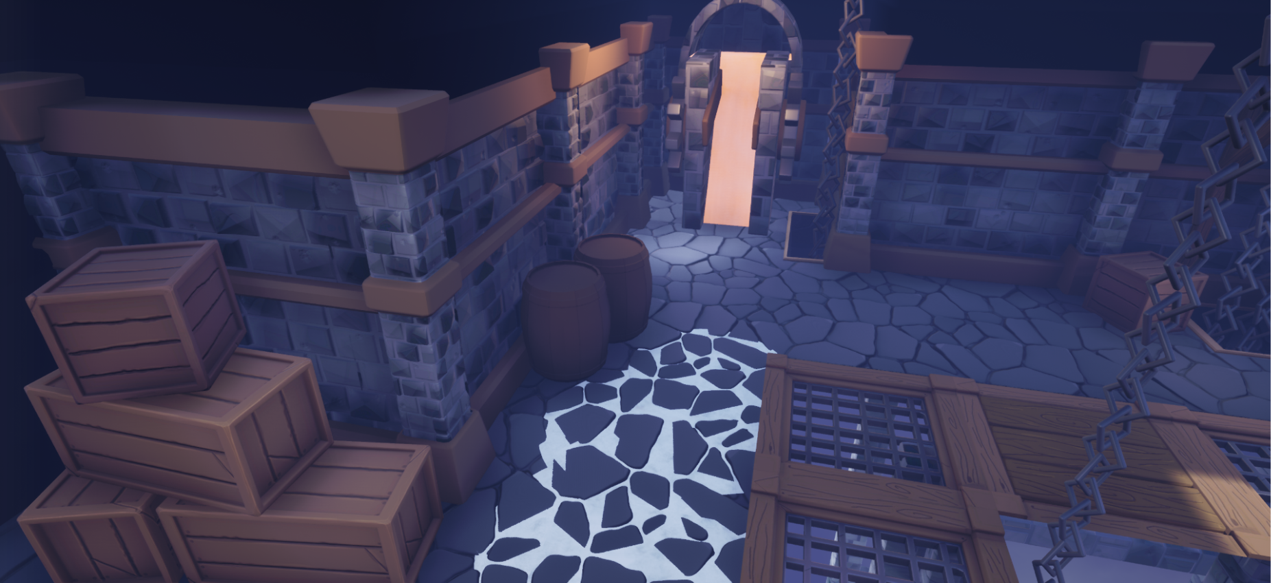
- This project shows potential, but has clearly suffered from being rushed. The artist is aware of this though, and I understand from personal experience how a project like this can take more time than anticipated, especially if other deadlines are also looming. Hopefully this will prove a decent learning point for the artist - plan ahead and factor in everything you want to do beforehand, then add a bit more time on just in case! Feedback: This environment is actually strong in terms of the major forms, readability and lighting - but it feels more like the early stages of an environment. There is a lack of detail in both the geometry (the hanging chains are too low-poly for instance) and especially the textures, which aren't much more than flat colour in many places. But the fundamentals are there, which is why I think it shows potential - I see environments that have had effort expended on small fiddly details, but haven't got the basics right - form, composition, readability, lighting. This is the opposite of that - and it's much easier to add detail once the basics are in place. With more work, this could become an excellent portfolio piece, but right now feels incomplete.
- You’ve stated in your documentation that you haven’t included many notes of your pre-production due to other commitments. This is unfortunate as pre-production is probably the most important part of the process. If you get your reference and art tests working here then the rest of the project will fall into place. Blockout looks nice and detailed though it would be consistent with it eg. have a blockout of the centre element in it too. Good to see the use of a modular kit for the walls. All the assets look uniform in terms of modelling (straight edges at right angles). It would have been good to have wonky planks and slightly curved edges. You can get a lot of character into assets in this way. The textures are a mixture of stylised (stone) and realistic (snow) looks. Pre-production testing would have unified this. Good to see a contrast in the light colour but the image still looks quite flat. It could be because the fog start distance is close to the camera. You can see the skydome through the environment. It would have been better to use the kit parts you already had to fill out the remainder of the environment.
- Research & Development The research shows an interesting stylized concept. Looking a bit more into the subject matter would help with the definition of style direction and pushing the level of detail a bit further. Creative Art Lighting works well and helps with player guidance. Scene reads well with a working color palette and material ratios. I'd suggest doing a bit more research into subject matter and materials and picking some good high quality reference for objects, materials and structures. The style is a bit different from the showcased main reference. Technical Art Lighting looks good with color and atmospherics. Vertex blends are a nice addition to the ground. The UV usage is great on the catapult, but as a large prop, it might be better texture memory wise to cut it down to trim textures and unique parts. Reusing of texture space is a common policy in the industry. For architecture, I'd like to see use of trims and tileable textures. You can bake them down later if the results produce too many draw calls. Grates showcase extra polygons that don't adhere to the shape and silhouette of the object, which is not ideal. Documentation Documentation looks nice, is easy to read and a breeze to browse through. Final Presentation Renders showcase the results well and are easy to look at.
Challenge Tier
Search For A Star
Leave a comment
Log in with itch.io to leave a comment.
Comments
No one has posted a comment yet