Play game
Alchemists workshop's itch.io pageResults
| Criteria | Rank | Score* | Raw Score |
| Technical | #52 | 2.324 | 3.000 |
| Documentation | #53 | 2.582 | 3.333 |
| Research & Development | #56 | 2.324 | 3.000 |
| Presentation | #66 | 2.066 | 2.667 |
| Overall | #66 | 2.221 | 2.867 |
| Creative | #81 | 1.807 | 2.333 |
Ranked from 3 ratings. Score is adjusted from raw score by the median number of ratings per game in the jam.
Judge feedback
Judge feedback is anonymous and shown in a random order.
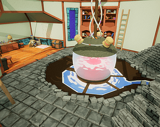
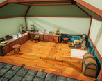
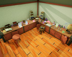
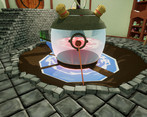
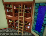
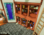
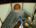
- Would have been good to see annotated reference eg. what parts you liked, and then small tests of the style on individual assets. Stylised doesn’t necessarily mean low poly geometry only; any extra geometry/texture detailing you can add to assets will help add character and bring the style to life. No explanation as to why the original concept was changed to an Alchemist’s Workshop. Good block out and UE4 shader work. Scale of textures needs addressing and depth of parallaxing. Individual stones/bricks would look neater if they were baked. Reference the real world when building scenes and watch out for tiling texture seams eg. Stair steps don’t match up; bricks around pit intersect with floor with no cover up. Lighting is flat. Would have been good to have a window for light to fall in from and stronger shot compositions.
- Research & Development Well researched and thought out, very good references found. I think that a little more time could have been taken to review them. And keep referring back to them during the process to see how close you are. I feel a big issue is grab ref, and never refer back to it. Creative I think it's got a vibe which is forming, you need to spend more time looking at lighting to set the mood, I feel like I'm in a hospital in there. Again, your references are the key to help you here and I feel you ignored them. Technical Polycounts aren't the worst, you could have taken more time and care but there was a tight deadline. My main issue is misused materials and shaders, I like the fact you've taken the time to work out how to use POM. There's many moveable lights, you could get greater results by baking. Presentation It's passable, again I thin you could have looked harder at your reference and thought about composition of the scene a little more. The textures and lighting do not feel right for the mood it seems like you were trying to achieve, Documentation Good clean documentation, well written. It suffers from the same issues as the rest. I think it looks like you just needed more time. Go back and take more time to fix this up and it could be magical. Chris Harper Snr Technical Artist @ Splash Damage
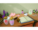
- It's really good to see how you developed the idea through blockout models and adjusted what you planned to build in response to feedback and time constraints. On a technical level the work you put into creating materials/vfx and investigating solutions to the problems you encountered is strong. I would be careful not to overuse the parallax effect, it works well on the walls, less so on the steps or low poly geometry. There is some nice texturing although the texturing style is a bit inconsistent. For example the wood textures are very stylized while the walls have a more realistic feel and the choice to make some of the stone walls turquoise is a bit jarring when compared to the floor. Like you say in your conclusion, lighting would play a big part in improving the look and mood of the scene so its good to here that you plan to learn more about it.
- Research & Development There's a lot of concept and and game reference material. I'd like to see some of their real-world counterparts; after all, they are also based around objects we know mostly. Development processes are shown to detail. Creative Art The scene looks like a nice little dungeon with imaginative elements. Researching a bit more into reference on how stairs are built, bricks are laid, water ways done, could prove beneficial and help push the scene to a new level. Tackling more lighting side of things would help bringing moods of concepts to the scene. Technical Art There's a lot of great reuse of textures. It's cool you tackled shader effects, parallax etc. Google is my best friend when it comes to dimensions of objects; never underestimate it Documentation Texts are informative and good to read. There are lots of supporting imagery for the texts. Final Presentation Screenshots look fine and dandy.
Challenge Tier
Sumo Digital Rising Star
Leave a comment
Log in with itch.io to leave a comment.


Comments
No one has posted a comment yet