Play asset pack
The Dragon Slayer's Sword's itch.io pageResults
| Criteria | Rank | Score* | Raw Score |
| Research & Development | #60 | 2.236 | 2.500 |
| Creative | #63 | 2.236 | 2.500 |
| Technical | #64 | 2.012 | 2.250 |
| Documentation | #67 | 2.236 | 2.500 |
| Overall | #71 | 2.102 | 2.350 |
| Presentation | #79 | 1.789 | 2.000 |
Ranked from 4 ratings. Score is adjusted from raw score by the median number of ratings per game in the jam.
Judge feedback
Judge feedback is anonymous.
- It would have been good to see annotated reference and any style art tests. There’s no block out. This is a vital step in production and should not be missed out. The block out allows you to see the environment as a whole without committing that much time to it. It also allows you to set up shot angles and how they might work with lighting. This, in turn, helps you work out which assets you should prioritise and which aren’t needed. You’re UV layouts look like a mixed bag: the sword UVs look good but the rock UVs don’t as the seams are at weird junctures. Aim to have less seams and have them in places that the player is not likely to see. Group assets of similar materials onto the same UV sheet. I can see use of PBR textures and shaders in the environment but I think the modelling let’s it down as the geometry is quite low and that you have no baked normal information. The lighting is quite flat too. It would have been good to have some fog in the scene to help add a feeling of depth to the environment. It’s good to see you doing a post mortem on your scene at the end.
Challenge Tier
Search For A Star
Leave a comment
Log in with itch.io to leave a comment.


Comments
Research & Development
There's good amount of reference and inspirational images. To help with taking the scene to the next level, I'd suggest having some more high quality references that showcase more intricate detail of objects and material work, as well as how structures are built in similar places.
Creative Art
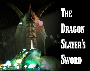
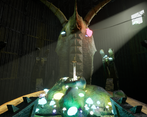
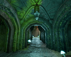
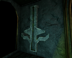
The scene reads as a nice dungeon-crawling endspace with dark fantasy-esque feeling. There's a nice usage of decorative runes and ornaments. The lighting showcases interesting areas, but feels a bit dark at times.
Technical Art
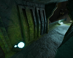
There's some nice vertex blending going on at the surfaces to introduce the moss to the models. Emissive mushrooms also add an intriguing flare to the scene.
The polygon usage is a bit on the lower end for rounded surfaces. I'd suggest diggin a bit deeper into texel density (512 is common for 3rd person games, 1024 for 1st person), and taking it from there to UV mapping and using tiling textures and shared texture space. Having a look at some wireframes from this generation console titles might prove useful as well; https://www.artstation.com/artwork/r0466 https://www.artstation.com/edgar_a_martinez
Documentation
The scene development is broken down well in text and image format.
Final Presentation
Images are of high quality and showcase well the subject matter.