

Play asset pack
Art studio's itch.io pageResults
| Criteria | Rank | Score* | Raw Score |
| Presentation | #36 | 2.907 | 3.250 |
| Creative | #51 | 2.460 | 2.750 |
| Technical | #55 | 2.236 | 2.500 |
| Overall | #57 | 2.370 | 2.650 |
| Documentation | #67 | 2.236 | 2.500 |
| Research & Development | #72 | 2.012 | 2.250 |
Ranked from 4 ratings. Score is adjusted from raw score by the median number of ratings per game in the jam.
Judge feedback
Judge feedback is anonymous and shown in a random order.
- Research & Development Preproduction and blockout stages are shown well. There's a clear idea of what sort of props there should be. There's good research to production techniques. I'd like to see specific references of brushes easels etc., even if they would be referenced from your own real-life specific items, to see different aspects of the materials, shapes, structure etc. For example, second hand stores can have interesting images with used equipment with irregularities, wear and tear. Creative Art Analogous color palette with warm shades and lighting give a nice, warm and comfortable feeling. Getting a bit more structure and detail to modules, materials and objects could help pushing the scene to the next level. Some extra splodges of colour and irregularities could also spice the feeling of real world. Technical Art Unwraps look nice and optimized. Roundedness of the architecture could ask for a few more polygons. It's great you tackled software you weren't super familiar with. Reuse of texture space by dividing things to trims, tileables and uniques might help with pushing the texel density to match 512 or 1024. Combining modules can help getting rid of some lightmap errors (can be done in-engine; select modules->RMB->Combine Actors to Static Mesh) mesh . Materials could use Master Material, Material Instancing and Material Parameter approach. Greyscale images could be channelpacked (Painter is paving way for Occlusion Roughness Metallic as the default channel packed texture). Post process might add an extra feeling with bloom and LUTs. You could also maybe look for lightmass portal and its use. Documentation Text is well written. The process is delivered well and in a clear manner. Final Presentation Good quality renders.
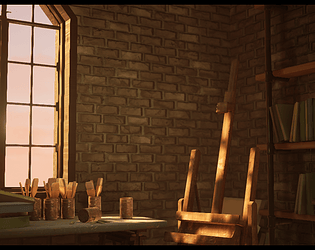
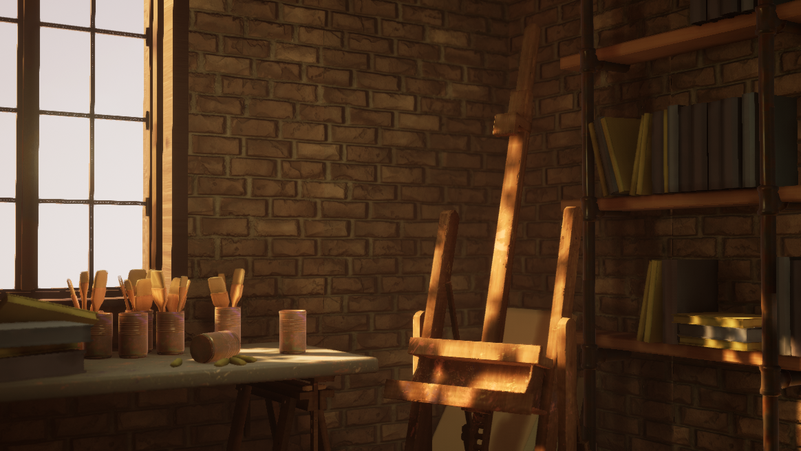
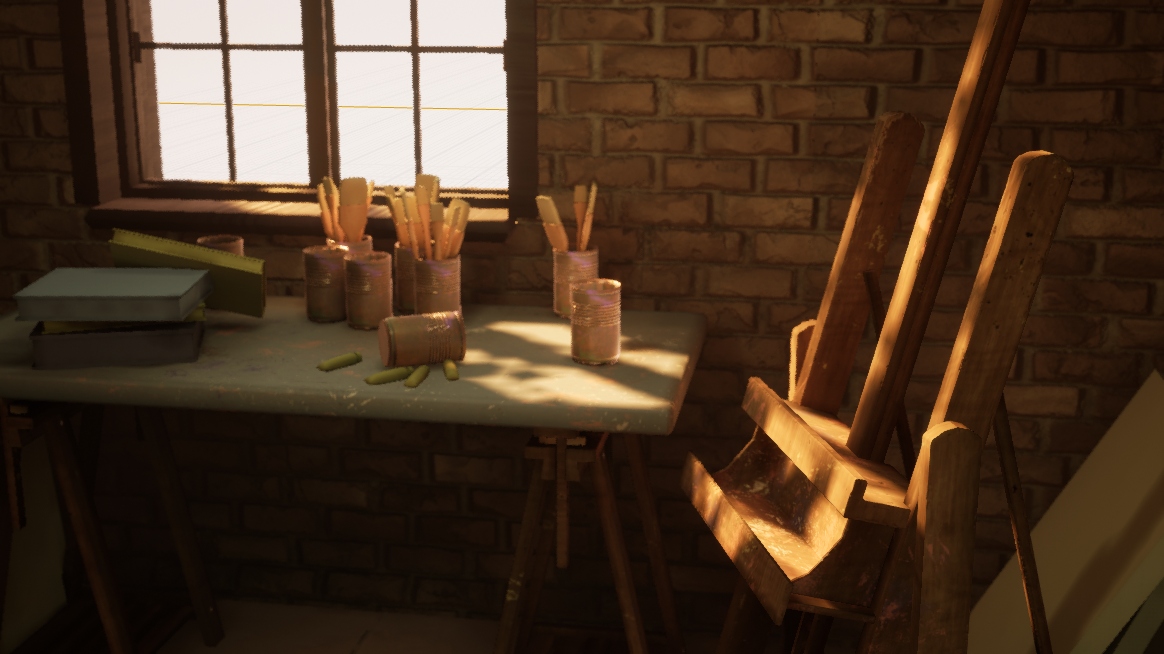
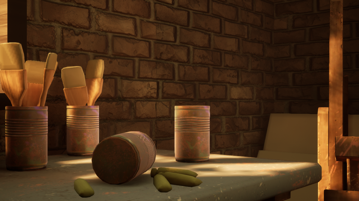
- Submission Title: Art Studio Submission Tier: Rising Star Assessor: Dominic Shaw Artist @ Firesprite Research & Development You played around with a few different ideas before finally settling on the Art Studio environment so there was some good thought put into the idea. There was also some good research into the lighting and props that you wanted to make for the project once you settled on the final idea. There was a rough sketch and block out for one of the other ideas of a room but I think to further help the development of this project, it could have benefited from having a rough concept and block out first and then a breakdown of the environment with time plans and an asset list. I use a free website called ‘Trello’ for all of my time management and asset lists which really help with the development and keeping track of a project. Creative Art In the documentation, you stated that the environment is still work in progress so I will try to give mainly feedback on how you can improve the environment. I think that the project has a lot of potential and you should really keep working at it. Currently, there is a good base environment, the composition, mood and lighting are at a good start and now all you need to do is keep refining all the props and adding more story telling elements. Moving forward, I would improve the props that are already in the scene and keep adding more details such as graphics and fonts on the books rather than flat colours and then I would add more variation of props, especially on the desk. The window could do with more detail such as some glass and blinds because the window is one of the focal points and It could also be nice to have a small environment outside. This will help sell where the environment is in the world and help with the story telling. I would also add artwork on to the blank canvases laying around the scene to add more visual interest and you could have more spilt paint on the desk. Technical Art I noticed in the documentation that there was a page about fixing the seams on the brick walls modular pieces, to help fix this even more I would remove the pixel depth offset from the brick material and add light maps to this mesh. Optimization is key in games so I would look into channel packing your textures for the roughness, ambient occlusion and metallic textures to further optimize the level. This would look at little like this: Red channel- AO Green Channel- Roughness Blue Channel- Metallic Then when you import the texture, change the compression settings in the texture to ‘Masks’ making sure that the sRGB value is turned off. There was some good use of modularity in the level which shows knowledge of how environments are normally made. The use of substance designer for the textures is a decent skill to have and to take this one step further, you could look into vertex painting and have a second concrete texture to break up the brick material. This would be a very useful workflow to learn. The props themselves was good modelling wise but texturing wise they could do with some more work. There were a few props such as the window with UV stretching so you need to make sure that the props are unwrapped correctly before moving on to the texturing stage. The easel looked a little low resolution which will have been caused due to the UV shells being too small on the texture sheet which is another thing to look out for. When importing the meshes into unreal, it’s a good practice to make sure they are all facing upright and the pivot point is correct so that you can just drag the props into the scene and not have to rotate them. I noticed that a lot of the props was imported with the wrong rotation in to the project. When applying the materials to the props, I would apply them in the content browser rather than just dragging them on to the mesh inside of unreal too so that when you drag a new prop in you don’t have to keep reapplying the materials. Documentation The documentation showed good prop breakdowns and it showed insight in to the project. The research was enough to make the scene and for your future projects, I would recommend doing assets lists, concepts and time plans as this will really help the development. Final Presentation The final presentation has a nice composition and focal point. Overall, I think that you know the pipeline and now just needs to fine tune each stage so that there are no basic mistakes such as UV stretching. The composition and layout of the environment is good, and I think moving forward you need to add more prop variation and storytelling elements. This environment is a really good base to start from now and has the potential to be a really nice project.
- It would have been good to see more reference and some annotation about what you liked and wanted to replicate from it. I like that you have included a colour palette you wanted to aim for. It would have also been good to see a small art test of the direction you wanted to take the piece in. I can see you’ve skipped the block out stage and plunged straight into production. Be wary of doing this as you can set a lot up in the block out that you can rely on later eg. asset importance, lighting, shot angles, composition. Models and UV layouts look good. If you’re making use of hard edges make sure to split your UV islands accordingly. You’ve stated that you watched tutorials for your textures. This is good for learning but I would have liked to have seen your attempts at them without aid. The light and shadow really adds to the scene though it would have been good to have a bit more colour in the scene: it’s a warm orange/brown at the moment, adding in a contrasting blue would really make it pop. I also like that you stuck to a small scene rather than filling an entire space. Good work!
- Research & Development: The idea of an artist’s studio for the scene is a good choice of subject matter as there’s plenty of opportunity to add personality to it and give it a real sense of connection with the viewer. I like that you mentioned the use of the soft warm light to try and evoke the ‘comfort’ feeling when viewing, and have gathered real life references of assets/lighting to work from. It’s really good to see that you tried out various ideas and weren’t afraid of trying out another one completely different to see if that worked better than the previous. Iterations from the base idea you have in mind is super important to develop the whole scene in general, and usually the first thing you think of isn’t the best idea. You mentioned that both ideas had many iterations/blockouts, and it would have been nice to include that in the documentation to see the progression in composition, layout/structure, lighting etc. I couldn’t see a mention of what sort of style you were aiming for (maybe realistic as they were modelled from realistic measurements), though it’s good to also gather references of the kind of art style you’d like to achieve and use to benchmark your work to see if you’re hitting the key notes of that particular style. If it is realistic, you’d use real life references to create the assets & materials, but maybe some similar shots from a game that hold the base quality you’d like to achieve. Creative: To really push this scene, in the end it’ll definitely need a lot of story elements to develop a narrative that works well with the kind of mood you’re going for which is ‘comfortable & warm’. This could involve elements such as posters for pops of colour, personal belongings such as clothes, backpack, a plate of half finished food etc (come up with others too as these are just basic but you get the idea), just to show that the person it belongs to is actually living in that space and making it their own. Another thing which might be cool to add is an exterior panoramic image to give the illusion of more outside of the window, maybe a cityscape to show they’re high up in an apartment or something, even if it’s subtle it’ll make a big difference to how it feels. It’d also be nice to experiment more with the actual structure of the room, maybe expand it a little and play about with more interesting shapes rather than just being a box. Maybe create some pillars in the wall with a structured arch over the window with some beams across the ceiling etc. This will help it feel a lot more tangible as a space. Technical: Considering you mentioned that this is your first UE4 scene and having learnt designer/painter fairly recently, this is a great outcome. As you mentioned in your reflective thought, you’ve learnt an overall idea for some of the workflows to create the art required, as well as how to put the scene together in the engine and what things to prioritise in the project - Typically priority is the bigger picture with the largest elements and basic shapes first, progressing towards smaller details as you develop the scene. I noticed that you haven’t used material instances, this is fine for a small scene, however, to do things optimally and keep it simple, I’d recommend looking into material instances and how to utilise them. Typically you would make a master material for certain types of shaders e.g. opaque, translucent, foliage, glass, decal etc, and set them up with parameters than you can change in the material instance. One of the simplest but useful things is making a parameter that allows you to colour tint the material. This way you can achieve the variation in your book colours in real time/no recompiling by just using the colour picker and authoring the diffuse material as a mid grey. If you want it to be brighter, simply increase the value in the colour picker above 1. Something I’d also like to recommend looking through is the PBR guide by allegorithmic (free online pdf), as understanding how PBR works and putting it into practice when creating your materials is extremely helpful to improve the quality of work and keep things consistent. For lighting, if you haven’t looked at the UE4 lighting academy by 51Daedalus on youtube, I’d highly recommend it to get into a good mentality on how to approach lighting a scene. Lastly, when I opened the scene I saw that the reflection capture was outside rather than inside the room, if you place it inside and build you’ll instantly notice the metallic stool looking much nicer as the reflection capture is now capturing a 360 view of the inside and using that as the reflection on the stool instead of the outside. Presentation: Overall the presentation of the project is clear, you’ve got a nice feeling to the scene so far, and I like the direction it’s going. When the project is done, it’ll be nice to have an additional video of a few panning shots and close ups of the smaller assets with interesting angles to really show a variety of aspects of the scene. Documentation: The documentation is short and to the point and covers the necessary areas to get an overview for the project. It would be cool to see a little bit more elaboration on some things such as ‘fixing a problem when it showed up’, aside from lightmaps and tiling texture errors, what were the issues you faced and how did you overcome those? Was there anything particularly challenging that you had to try a few different things to get to the final outcome? Your reflective summary was good as you mentioned it was a WIP and there’s still plenty you’d like to do to improve it. Other things which could be talked about here are what would you have done differently if you were to start the project again? Did you look for feedback as you progressed through the project and if so, what was it & did you choose to implement it?
Challenge Tier
Sumo Digital Rising Star
Leave a comment
Log in with itch.io to leave a comment.
Comments
No one has posted a comment yet