

Play asset pack
Bounty Hunters Retreat's itch.io pageResults
| Criteria | Rank | Score* | Raw Score |
| Documentation | #51 | 2.600 | 2.600 |
| Creative | #55 | 2.400 | 2.400 |
| Technical | #60 | 2.200 | 2.200 |
| Overall | #62 | 2.320 | 2.320 |
| Presentation | #63 | 2.200 | 2.200 |
| Research & Development | #65 | 2.200 | 2.200 |
Ranked from 5 ratings. Score is adjusted from raw score by the median number of ratings per game in the jam.
Judge feedback
Judge feedback is anonymous and shown in a random order.
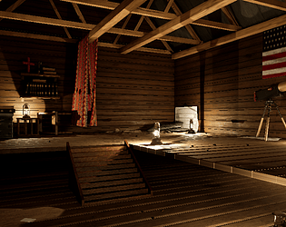
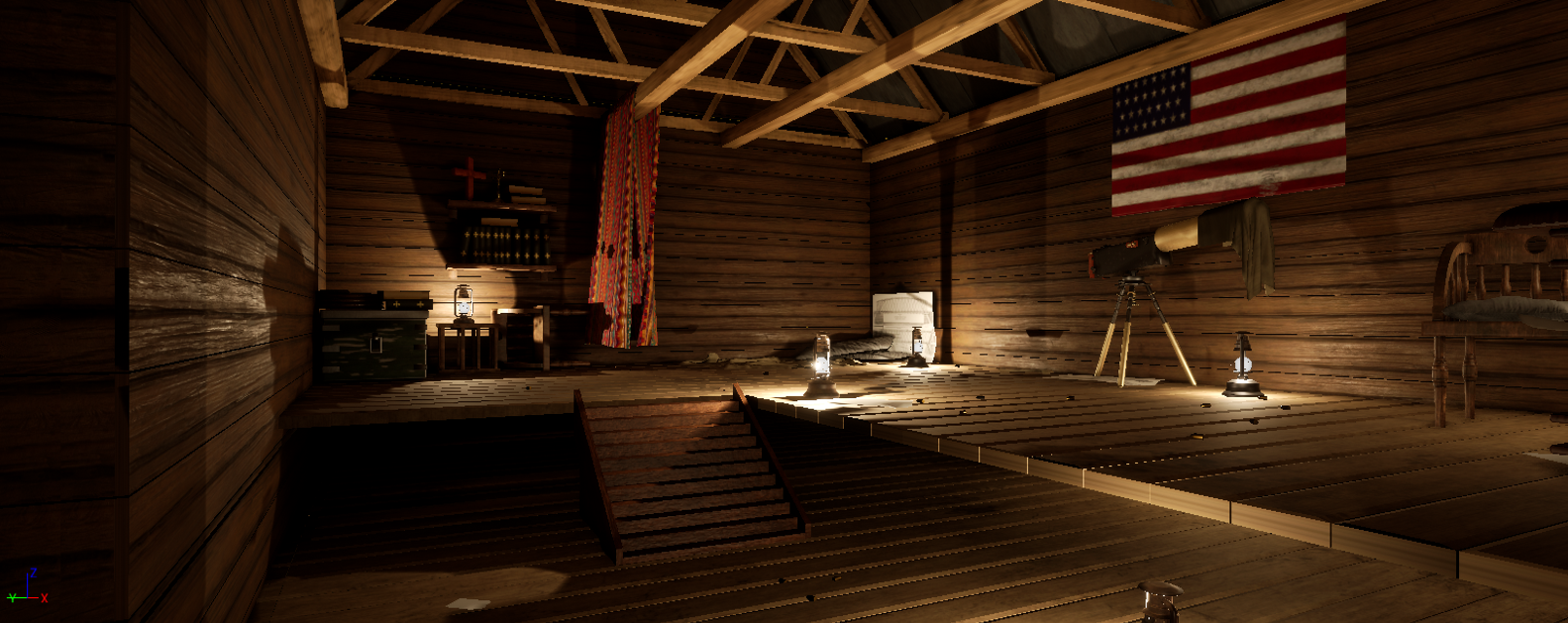
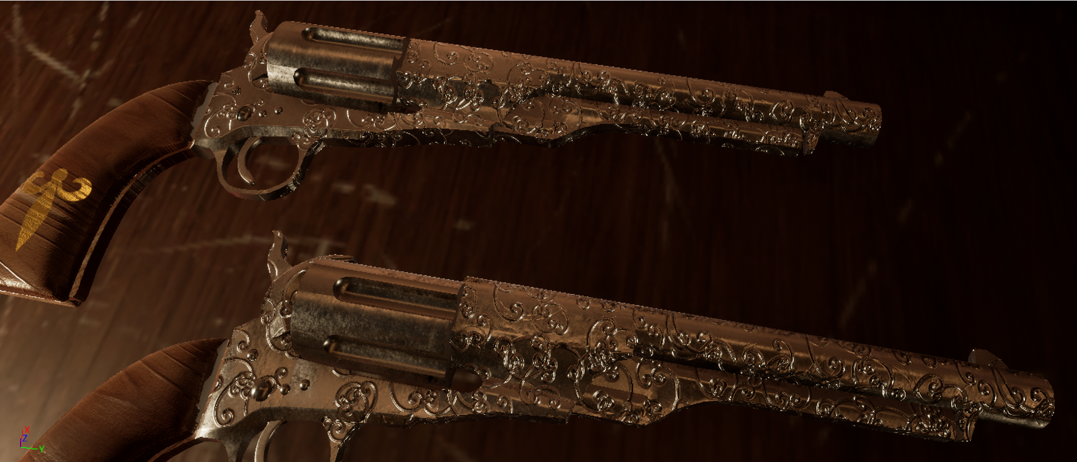
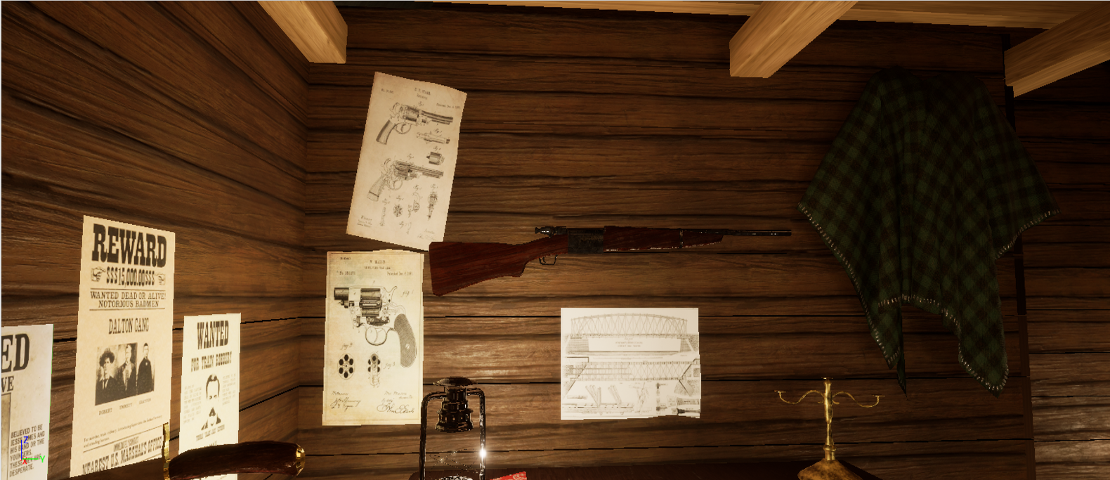
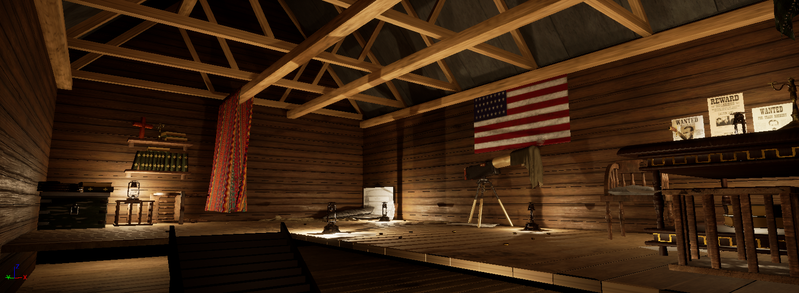
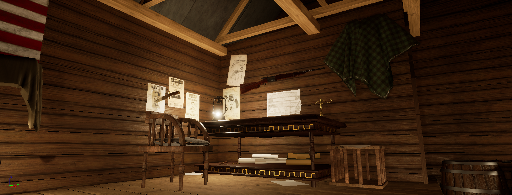
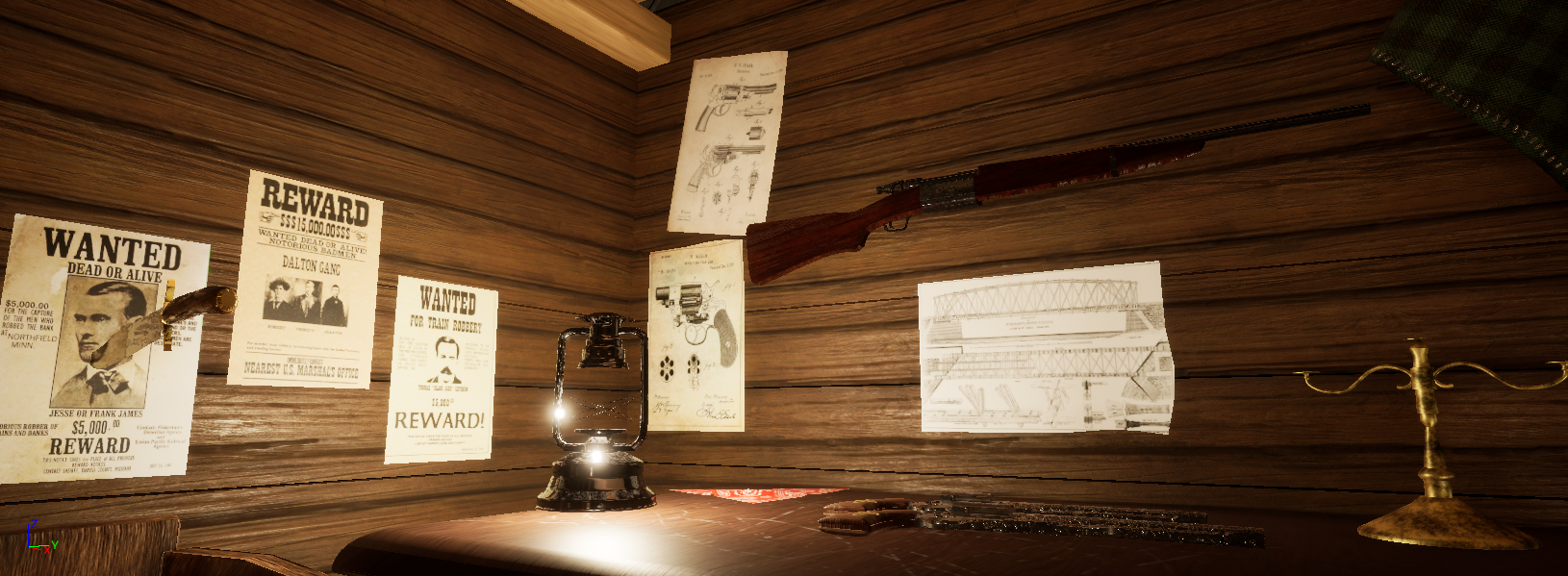
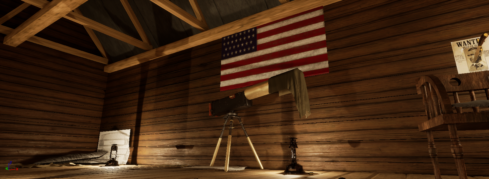
- - Good choice of subject with lots of creative scope - Lighting could be improved with some alternative light sources such as candles, some atmosphere with slight fog would be good too. - The overall look is very clean, would be nice to have a more rusty, old, worn, dusty look to suggest the age and use. - The download was very big, important for real time environments things are optimised in texture, geometry etc. - Important a door is included to show where access to the hut comes from. - Improve collisions as character floated above lower floor. - Recommend heavily optimising geometry to make scene lighter, the lamps in particular were extremely high poly for a real time environment. - The roof beams intersect with the wall geometry would be nice for parts like this to have model detail that shows how construction would work in real life - The guns looked to have some nice detail but could be improved with more of a bespoke texture that didn't have as much tiling and also not looking quite so new. - In the screenshot showing the guns suggest making the table have a higher resolution texture, important texture detail holds up at specific views, either more res on the table or less on the guns. - The design of the split level space doesn't look high enough to be another floor, suggest modelling it hide the lower floor sides to suggest its split level as its on a hillside.
- Submission Title: Bounty Hunter’s Retreat Submission Tier: Search for a Star Assessor: Dominic Shaw Artist @ Firesprite Research & Development You have done some good research and I like that you found additional reference for all the assets rather than just using the concept that you had. I would have liked to see some time management stuff such as asset lists and time plans has these help a lot with the development of the project. Creative Art I think that you have done well getting all props in required for the competition and I like the fabric that you have done in the scene. I think that the environment could do with more of a focal point so that you know exactly where you are meant to be looking and what the main prop is. I think that the lighting could do with another pass to get more shadows in places such as the corners and you could have even added a window or two to get some nice light shafts coming into the scene which will add another layer of interest to the environment. I know that this is an attic space but can still have windows in them. It would have also been nice to see more dirt and grunge in places but overall, it’s a nice environment with some good story telling elements such as the reward posters. Technical Art I think that you have a good understand of the pipeline but there are just some areas that still need improving to make this environment as good as possible which I will talk about below. The main thing that would have helped this project is by making it more modular, you have made the walls modular which is a good workflow, but you have modeled the panels into the mesh when this isn’t needed. You could have just mapped your tile-able wood material to a flat plane which would have got rid of the black lines going across the environment as no light would be shining through. You could have also made the wooden beams more modular rather than one big mesh and then just run a tiling texture over them. There is currently a lot of UV errors on this mesh that could have been solved but mapping the UV’s to a tiling texture. There are some nice props in the scene, but you need to be more careful to not make the normal map so intense on some objects such as the guns. There are also some high poly meshes that could be made a lot lower poly count such as the pistol. Keeping low poly counts will help to optimize the level so this is important to keep in mind. Other ways you could have help optimized the level is by channel packing the ambient occlusion, roughness and metallic maps into one texture which would look like this: • Red Channel- Ambient Occlusion • Green Channel- Roughness • Blue Channel- Metallic Then make sure that the texture compression is set to ‘Masks’ for this texture. Documentation There was a nice breakdown of each of the props and I got a good insight into your workflow, but it would have been nice to also see a good breakdown of the materials. Final Presentation There are some nice compositions in the final images with a nice range of establishing and close-up shots of the environment. You have a good basic understanding of the pipeline and now it’s just about improving each stage of the process. Moving forward, I would suggest doing another lighting pass of the level, optimizing some of the props and make the normal maps more subtle.
Challenge Tier
Search For A Star
Leave a comment
Log in with itch.io to leave a comment.
Comments
Research & Development
There are cool images of old worn wooden structures and smaller props to fill out the scene. Bigger props with which you could easily populate the place quite fast, are a bit missing here.
There could also maybe be a bit too more research into how things are built. Concrete slabs as roof don't seem very accurate of a material to be put on top of wooden walls. The support structure also strikes out as a bit odd with pentagon in the middle, which could of course be argued to be a funny design choice.
Creative Art
Texture work looks great on tileable surfaces and clothing on most parts. The lighting is done in way to give nice contrast with lighter and darker spots.
To push the scene a bit further, I might suggest adding some sort of window and support the structure a bit more. Structural interest is a bit missing with, for example, the roof frame sitting on top of clipping wood beams, and the meshes could use with some extra carefully placed irregularities to add mesh interest to papers, structures and reused props. Getting detail like wood grains to match real world directions would also add quite a lot to the feeling real world objects.
Technical Art
Some of your materials include macro texture extras, which shows interest towards the subject.
Walls and floors look optimized. Objects are a bit on the higher end on polycount, and maybe tells a bit that the center of attention should be on the weaponry and clothing.
Documentation
The documentation shows references and has peaks into the development of the scene. It's a good practice to block out more of the scene in one go and then dig deeper into working on the detail and props. Some basic materials might help with defining the looks.
Final Presentation
Presentation shows interesting angles of the space. Screenshots have sharp edges and could maybe showcase a bit more of the details put into textures and objects.