Play asset pack
Calm Basement Project's itch.io pageResults
| Criteria | Rank | Score* | Raw Score |
| Technical | #64 | 2.012 | 2.250 |
| Presentation | #79 | 1.789 | 2.000 |
| Documentation | #84 | 1.565 | 1.750 |
| Overall | #84 | 1.744 | 1.950 |
| Creative | #85 | 1.789 | 2.000 |
| Research & Development | #85 | 1.565 | 1.750 |
Ranked from 4 ratings. Score is adjusted from raw score by the median number of ratings per game in the jam.
Judge feedback
Judge feedback is anonymous and shown in a random order.
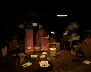
- A note for future documents: have clear section headers for each stage of the process. It’s hard to see when your pre-production stopped and production started. It would have also been good to see the workflow of how you modelled and textured your assets. It would have been good to see annotated reference and a block out of what you wanted to create. I can see you made several props and baked them to make your texture maps. The textures don’t look to be PBR, I’m not sure if you were creating a stylised or realistic scene. It is good to see a small cluttered scene though and I think the lighting works. I t would have been good to see some contrast in the lighting (introducing some blue light to help counter the red/brown in the scene. Adding (or faking) the bounce light would help and having the shadows a dark blue/purple instead of black would also help lift the scene.
- Research & Development There are nice images different elements of the scene. I'd like to see some high resolution reference of the objects; sometimes looking for used versions of the things like cardboard boxes, pianos and such can show more interesting source materials for 3D production, as the wear, tear, smudges and other surface and shape irregularities can add a lot of interest to things. Lighting and mood references to support narrative could possibly help pushing lighting and atmosphere to the next level. Creative Art The scen reads as a place filled with boxes and drawings. I had a lot of fun looking at different drawings. Lighting works well to showcase the area. Color usage is analogous and reads well, while the main focus reads very clearly as the bed. Smaller spots of color could help. If I look at basement references with not much everyday usage for the family, I'd make a connection of concrete as the floor and wall material; right now it feels a bit like dark attic due to a simple material choice like that. Meshes and materials could maybe use a polish pass, and meshes would look more interesting with some irregularities. Adding some interesting structures to the ceiling and walls could help with feeling more confident about lighting work that could showcase other areas of the scene. Technical Art Meshes seem fairly optimized. There's a nice usage of tileables. There's a good use of post-process. Materials could benefit from master material and material instances. I'd suggest researching the specular input usage for Unreal's shader. For next scene, set your sights to achieve 512 or 1024 texel density and take that as a guideline to UVing your props and modules, trims and one-way tiling textures can also help to get those. I personally use the exposure's min & max values at 1 and start working on my lights from there (with values set to lumens) Documentation Text is well written. There's a good use of color and images. Final Presentation Texts are nice and crisp and showcase the scene well.
- This is a nice idea for an environment, with potential for some intriguing narrative elements. However, I feel the execution has been fairly rushed, meaning it doesn't live up to the promise of the idea. The environment is nicely dressed, with a believable level of clutter, variety and range of scales. However, the lighting is too dark, which isn't doing justice to the prop work. I realise it's a dark basement, but at least one light - the main ceiling light preferably - needs to be brighter, providing more of a focal point and throwing more bounce light around the scene to reveal things. Too much of the final scene is in complete darkness - compare with the original inspirational image. This has a lot more bounce light coming from a strong principal light source, meaning even areas towards the edges are still readable without becoming black. I also would have liked to see some individual prop breakdowns in the documentation - the darkness of the scene means it's very difficult to judge the asset work.
Challenge Tier
Sumo Digital Rising Star


Leave a comment
Log in with itch.io to leave a comment.